Swift CG User Manual
Swift (previously known as tOG 2D) is a GUI based editor and assembly environment for RT Software’s OEM render engine and provides an advanced toolset that facilitates reusability of graphical content for fast graphic creation.

Reference Manual
|
About |
Description |
|
Revision |
4.6_4 |
|
History |
October 2020 |
|
Authors |
Jason Wood; Justin Avery |
Overview
The Application
Swift (previously known as tOG 2D) is a GUI based editor and assembly environment for RT Software’s OEM render engine, and provides an advanced toolset that facilitates reusability of graphical content for fast graphic creation.
Swift provides the interface that enables designers to author graphical templates, by importing graphics assets produced in industry standard content creation applications, such as Adobe Creative Suite.
Inputs for dynamic content, such as text, bitmap, or video clips are added during the template creation process from within the Swift editor.
The types of graphics that are authored with Swift are typically channel bugs, lower thirds, snipes, tickers and squeezebacks that form branded promotional content for channel networks.
Accessing and Using the Manual
The Swift manual is the operator’s reference manual that details all the features, functionality and tools accessible in the current version of Swift.
Some examples are given where appropriate to clarify use but to see more in-depth, training-related material on creative operational usage, techniques and workflows please refer to the appropriate training materials and tutorials.
The manual is accessible from the RT Software website, available to registered users via login and password:
From within the application itself, links are provided to the above address. The manual is currently in pdf format, and requires the appropriate plugin from Adobe to read. The Swift manual has indexed contents enabling click and go to page functionality.
Project Components
Directory Structure
Swift holds all of the assets and graphics required to run a show in a coherent set of directories called a project. See below.
The Project directory shown to the right is a set of mostly empty subdirectories that are created by Swift in a specific location on the disk.
The user will define the name of the Project directory and a project file will automatically be created with the same name, inside the Project directory.
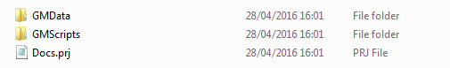
The project is laid out under two directories. GMScript holds the graphic and graphic sequences. GMData holds the graphical elements themselves.
- GMScript
- Templates
- Lib
- Stacks
- Save
- Backups
- GMData
- CGProgram
- Extruders
- FBX
- Fonts
- Geometry
- Images
- LineStyles
- Maps
- Materials
- Paths
- Plugins
- Shaders
- Skeleton
- Sounds
- StaticMaps
- Textures
- VR
The sub directories and directories are automatically created and named by Swift and should not be renamed under most circumstances.
Project Folder
When a new project is created, it will be filled with the folders mentioned above and a file.
Project files (.prj)
Project files are created automatically when a new project is made. The project file is placed in the root of the Project folder and is suffixed “.prj”. It contains default project information including the project name itself. It can be opened and edited with a standard text editor.
Script and associated files
There are commonly up to 4 files created with each new template which are associated with it.
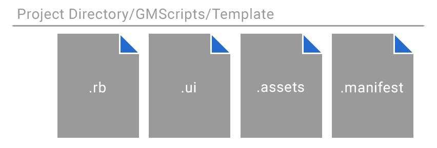
Script files (.rb)
Script files are created automatically when a new graphic template is saved. The script file itself is more commonly referred to as a graphic or template. The script file is always saved in the GMScripts/Template folder and is suffixed “.rb”. It contains default script information including the Swift version. It is a Ruby file and can be opened and edited with a standard text editor.
User Interface files (.ui)
User interface files are created automatically only when a new graphic template that contains an input is saved. The user interface file is saved in the GMScripts/Template folder and is suffixed .ui. It only contains information regarding the properties of the input for generating the graphical user interface.
Asset files (.assets)
Asset files are created automatically when a new graphic template is saved. The asset file is saved in the GMScripts/Template folder and is suffixed .assets. It only contains information regarding imported assets. It can be opened with a standard text editor.
Manifest files (.manifest)
Manifest files are created automatically when a new graphic template is saved. The manifest file is saved in the GMScripts/Template folder and is suffixed .manifest. It only contains information regarding methods and inputs. It can be opened with a standard text editor.
Interface overview
The Swift GUI is comprised of 5 main areas:
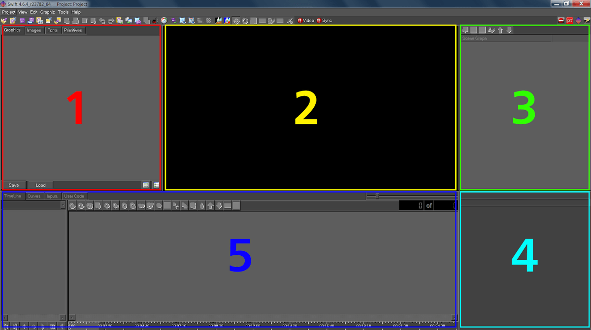
Project Tabs (1)
Graphics
- All the templates (also called graphics or scripts) are displayed here
Images
- All imported images and movie clips are displayed here
Fonts
- All imported fonts are displayed here
Preview Window (2)
- A visual of the template is displayed here
Scenegraph Editor (3)
- The nodes used in the template are arranged and displayed here
Node Editor (4)
- The properties of every editable node are displayed here
Timeline Editor (5)
Timeline
- A traditional timeline is displayed here
Curves
- Animation curve behaviours are displayed here
Inputs
- Functionality for dynamic inputs are displayed and edited here
User Code
- Ruby user code is displayed and edited here
Project menu
Projects in Swift are typically used to contain graphic templates relevant to one particular use or client. For example, if the Playout solution requires the transmission of 8 separate networks, it would be realistic to create 8 projects, each project only containing templates relevant for that network only.
New Project
To create a new project, click on the pull down menu “Project” and select “New” or click the new icon on the project toolbar. This will pop up the New Project dialogue:
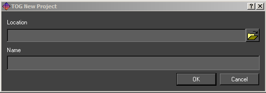
Select a suitable location and name for the project and press OK. A new project subdirectory will be created in the location specified and named appropriately. The subdirectory will also be filled with all the subdirectories Swift needs.
Open
Select Open from the project drop down or toolbar to open an existing project. Navigate to the required project directory and select the associated “.prj” file. Once selected, any open project will be closed and the selected project will load into Swift.
Save
Select Save from the project drop down or toolbar to save the currently open project. The user will be prompted to save the current graphic and modified Shaders.
Save As
Select Save As from the project drop down or toolbar to save the current project to another location. The user is prompted for a new project file name and directory. The project will then be saved to the new directory using the name provided.
Recently Opened
Selecting this from the project drop down will display a list of recently opened projects. Selecting an item from the list will have the same effect as browsing for and opening a project via the Project -> Open menu option.
Close
Selecting Close from the project drop down or toolbar will close the currently opened project. The user will be prompted whether or not to save any changes which have been made to the project.
Project Settings
Selecting Project Settings from the project drop down or toolbar will pop up the Project settings dialogue. This provides the full path name to the project file itself and four general settings under the tabbed headings.
Export Project
Selecting Export Project from the project drop down will open an export project wizard, following this will export your work. It will first prompt to ask if it is ok close the currently open project. After selecting yes, it will then present the choice of exporting as a Folder or a Zip, a project destination, an asset prefix and a regenerate script manifests.
Generate Manifests
Selecting Generate Manifests from the project drop down will close the currently open graphic and generate the “.assets”, “.manifest” files for all of the graphics in the project as well as any files for the project “.prj” file itself.
Project Settings
Script Directories
This allows the user to specify locations for the project components located in GMScripts (see: Directory Structure).
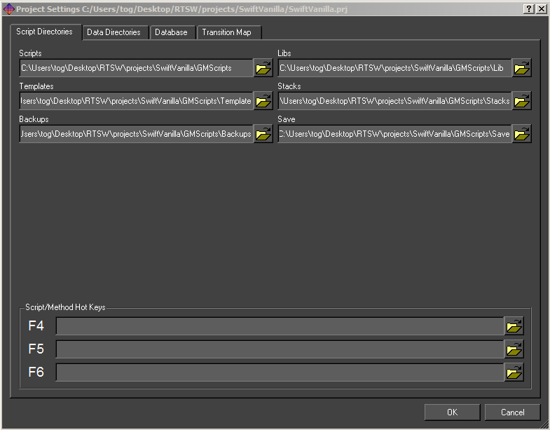
Scripts
This is the top directory GMScripts, which contains the following:
Templates
These are the main graphics that are run from playout, live or sports
Libraries
These are reusable drop in modules that may be used in templates.
Stacks
This is the location of graphic sequences saved from playout or sports.
Backups
This is the location of auto and manual backups made during edit.
Save
This is not used.
To change the current location, click on the file chooser button, navigate to the new location and press OK.
Script/Method Hot keys
This allows a user to assign up to 3 graphics to the function keys F4, F5 and F6. These are only used in Playout.
Data Directories
The Data Directories tab allows the user to specify locations of project assets located in GMData (see: Directory Structure). The default location is in the project folder, it is possible to change the locations of them, click on the file chooser button, navigate to the new location and press OK.
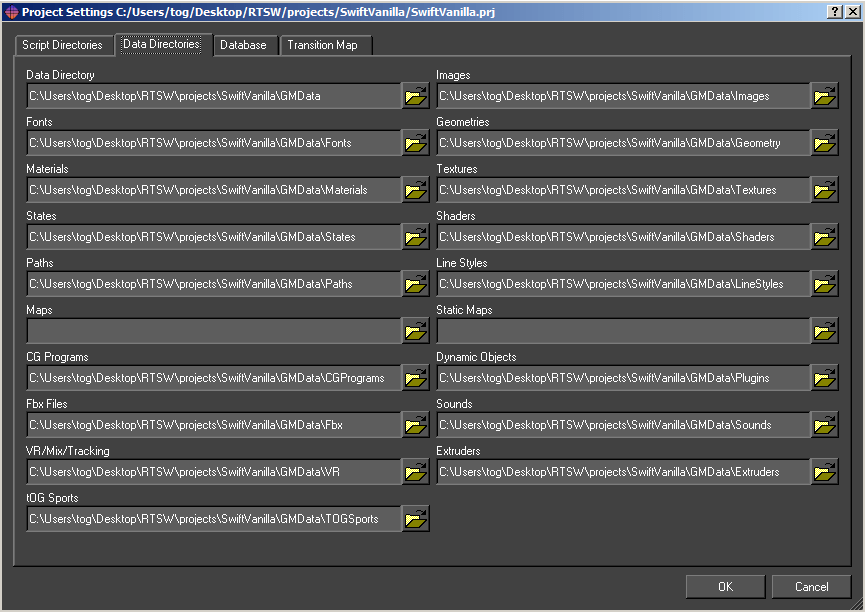
Data Directory
This is the main GMData folder. It should contain the following directories:
Images
This folder holds all of the images that have been imported into Swift.
Fonts
This folder holds all of the fonts that have been imported into Swift.
Materials
This folder holds all of the materials for the project.
Textures
This folder holds texture information. Textures reference the images in the project and give Swift additional information about how to display them.
Shaders
This folder holds Shaders. Shaders tell Swift what states, textures and materials to look for.
Folders Not in Use for 2D
Many folders in Swift are useful for tOG 3D so that it is possible to open 2D projects in the 3D editor. Though these folders may contain some default files, there will be no need to edit or remove them.
Database
The Database tab allows the user to specify databases for this project. Databases are available as sources on data inputs when building graphics. See the section on Inputs under timeline. Swift has built in support for MySQL, Postgres or any database that provides an ODBC bridge.
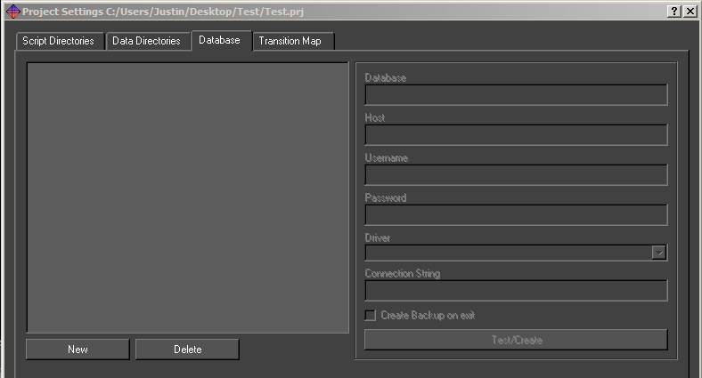
To create a new database select “New” and fill in the details. Remember to type return after each entry. Once the database is created click Test/Create to test the connection. If the database does not exist then Swift will prompt to create it.
Database
The name of the database. For each database selected in the list appropriate names for Host, Username, Password and Driver are required for input.
Host
Type the Host name in this field. This can be a URL or IP address.
Username
Type the Username in this field.
Password
Type the Password in this field. If there is no password leave this blank.
Driver
Select a driver from the drop down list.
New
Creates a new Database. This will prompt for a database name, then fill out the fields on the right with default information. Click the Test/Create button to apply the changes.
Delete
Deletes selected database from the list.
Transition Map
When running graphics in a live environment, it is a common requirement to have some level of automation over which graphics are on air, and which ones are not.
As a simple example, imagine that you have a Lower Third graphic, and a Full Form graphic. Having both on the screen at once would cause the graphics to overlap, so you want to make sure that both cannot be on screen at the same time.
You could do this manually, by calling the appropriate methods yourself, but this puts the workload onto the operator, who may make mistakes.
Transition Maps allow the logic of how graphics interact to be specified at design time.
NOTE: Changes to the transition map are only saved when Ok is pressed.
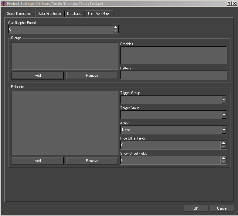
Groups
The transition map logic works as relationships between groups of graphics.
To add a group, click the Add button. To delete a group, click the Remove button.
A group can be anything that you wish. These would all be valid groups :
- Lower Third Strap
- Bug
- Full Frame Graphic
- Election Map
- Clock
- Stats Graphic
Graphics can be added to groups. A graphic can be in as many groups as is required. Taking the example groups as mentioned above, a clock graphic could be in both the Clock group, and the Lower Third Strap group. Similarly a histogram graphic might be in both the Stats graphic and the Full Frame Graphic groups.
The Graphics list shows a list of all graphics in the project, with graphics in the currently selected group appearing selected.
Ctrl+Click to select or deselect new graphics into the currently selected group.
Relations
Relations define actions that occur when a graphic is run in Swift. The type (action) of the relation will occur if :
- A graphic is currently on-screen from the source group.
- The graphic coming on is from the destination group.
- The action will apply to all graphics that currently match these criteria.
The available actions are described in the following table:
|
Action |
Description |
|
BringOn |
Call the bringOn method of the graphic in the source group |
|
TakeOff |
Call the takeOff method of the graphic in the source group |
|
HideShow |
Call the hide method of the graphic in the source group when a graphic from the destination group leaves the screen. Once there are no graphics from the destination group on screen again, call the show method. |
View Menu
Switch to Playout Mode
This option will switch Swift to the Playout Mode for testing graphics. The Playout Mode is explained in more detail later in this manual.
Edit Menu
The Edit menu contains the controls for Undo/Redo, and the Preferences where configuration for internal parameters and external devices can be accessed.
Undo/Redo

Undo/Redo is accessible via the Edit menu or via the toolbar. Swift supports undo/redo by saving the complete graphic before any operation that might alter it.
These undo/redo files are saved in the Backups directory of the project. The depth of undo/redo is only limited by disk space. The user can regress and progress through these files using the Undo and Redo tools on this menu.
Note: The hotkey for Undo/Redo is: Ctrl + z
Preferences
There are a range of parameters held within Swift which define its operational environment.
Once specified, they do not change. They are accessible through the Preference Dialogue under the Edit menu tab or the Edit toolbar. (You can also access these in Playout).
Protocol tab
The protocol tab allows the setup of devices that control Swift, or that Swift can communicate with.
For more information on controlling Swift remotely, see the Playout manual, and Live manual.
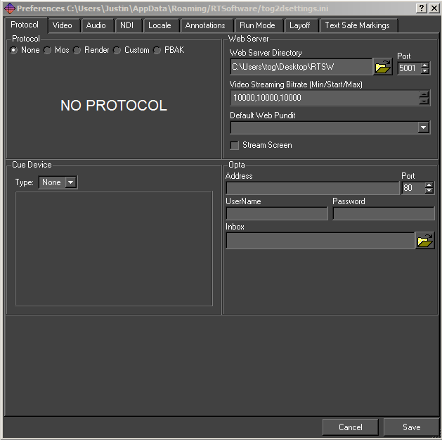
The Protocol section sets up a protocol that Swift will receive commands from.
None
Swift is not being controlled externally. This is the default
MOS
Swift can be controlled by sending MOS messages to it using sockets. This is mainly used for playing graphics and methods. The protocol is described in the Live manual.
|
Parameter |
Description |
|
MosID |
The identifier for the Swift system when running in Live mode. Included in all MOS messages sent between the systems. |
|
NcsID |
The identifier for the application controlling Swift remotely. Included in all MOS messages sent between the systems. |
|
Encoding |
The character set encoding of the messages, either unicode (utf8) or ascii. |
|
Timeout |
If a message is not received by Swift within this time the client application is disconnected. Usually, the systems should heartbeat each other more regularly than this timeout time. |
|
Lower Port |
The client application send commands on a socket connected to this port. |
|
Upper Port |
The client application reads status messages from a socket connected to this port. |
|
Cache Scripts |
If this is selected Swift will not clear out and destroy graphics after they are no longer needed. SWIFT keeps and reuses them. This speeds up loading. |
Render
Render mode in Swift allows the user to connect Swift to other renderers. For more information, see the Playout documentation.
Custom
The Custom protocol tab allows a 3rd party to attach their own protocol layer. This is
achieved through the use of a shared object – either dso (linux) or dll (windows). This means that you can repurpose existing interfaces to drive Swift. See the Plugin manual for more info.
|
Parameter |
Description |
|
Port Number |
The port number for socket connections between the systems. |
|
Address |
The server address. This is only required by a client, it is blank for a server. |
Web Server
It is possible to communicate and control Swift over standard Web Protocols. For more information, see the Web Api manual.
|
Parameters |
Description |
|
Web Server Directory |
The Web Server Directory defines the root directory for the web server. Any files in this directory or it’s subdirectories will be served up by Swift when requested via a HTTP request (for example, from a web browser) |
|
Port |
The port determines which port the web server listens on. Setting the port to 0 disables the web server and the web APIs |
|
Video Streaming Bitrate |
Video streaming will adapt to the network constraints to provide the best experience possible. The bitrate will start at the Starting bitrate (the middle of the three values), and based on the performance of the network, the bitrate may grow up to but no more than the Maximum value, or shrink to no less than the Minimum bitrate. The bitrates are in kilobits/second. |
|
Default Web Pundit |
Allows the selection of a default pundit to be used by a web page. The web page must be designed to make use of the default web pundit, as it can override this settings if it wishes. |
Cue Device
Swift graphics can contain cue points which allow sequences and animations to be paused. Cue devices provide a remote means of triggering cue points allowing the graphic to continue with the next animation block. Swift supports 3 device types, GPI, serial and Wii.
GPI
The gpi device consists of either 2 or 16 inputs depending on the device installed (see External Devices in the next section). Select the checkbox to assign which GPI channel triggers the cue
Serial
|
Parameters |
Description |
|
Device |
This defines the serial port address, It has the form /dev/ttyS0/1/2… under Linux and com0/1/2 under Windows |
|
Device Baud Rate or Input Number |
If the cue device is a serial port address then this will be the baud rate. |
Video tab
The Video tab allows a user to specify the video devices in use, formats, size, filtering, keying and more, for broadcast SD/HD video in and out. Note that depending on what you change, you will have to restart Swift for it to take effect (you will be prompted when this is the case).
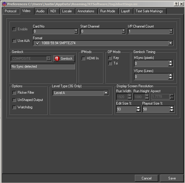
Output format
Choose the appropriate video format from the drop-down menu.
Resolution
If a video output is selected, this will determine the Run Width and Height. For all cards except Custom these values are fixed. In custom mode, the user can specify the Run Width and Height and aspect ratio.
Run Width
The width of the output window
Run Height
The height of the output window
Aspect Ratio
The ratio of width to height of the run window
Edit Width
The width of the edit window, within the scene editor window
Edit Height
The height of the edit window, within the scene editor window
Playout Size %
This determines the size of the preview screen in Playout mode as a percentage of the render size. If the user is running HD then this should be set at 50%.
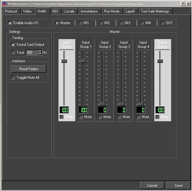
Audio tab
This option will load the OpenAL sound manager when Swift restarts. With this you can play out .wav files or output sound from mpeg streams. Please ensure no other device is using the sound device when you select this option.
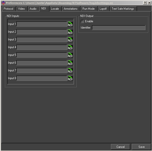
NDI tab
Locale tab
The locale allows the user to define some start up options for project launch paths and associated files.
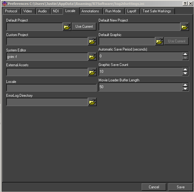
Default Project
If Swift is loaded up and no project is included in the command arguments, then the project specified here is loaded. If this is blank, then nothing is loaded on startup (unless included in command line arguments).
Default New Project Directory
New projects are created in this directory.
Custom Project
The custom Project option is not applicable to Swift.
Automatic Save Period (seconds)
If this is non-zero, Swift saves the current project, graphic and Shaders periodically at the interval.
Import Directory
This directory is periodically checked for new files to import into the current project.
Graphic Save Count
The maximum number of graphic backups maintained by Swift.
Locale
Specifies the Locale i.e. the geographic location. This is used to determine local differences to time and language.
Annotations tab
This groups together preferences concerned with interaction on the screen.
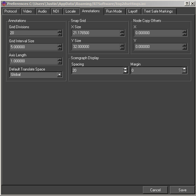
Snap Grid X Size
The x interval in the snap to grid. The default value is 21.1675.
Snap Grid Y Size
The y interval in the snap to grid. The default value is 32.
Node Copy Offsets X
Offsets the x position on node copy by the specified amount.
Node Copy Offsets Y
Offsets the y position on node copy by the specified amount.
Run Mode tab
Run Mode has 3 options.
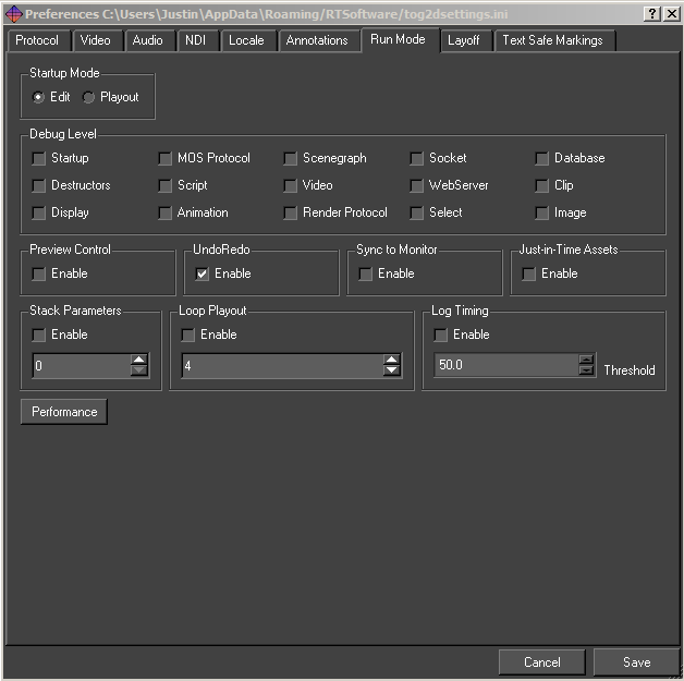
Undo/Redo
Turns on an off the undo/redo manager. The undo/redo manager. The default is set to on.
Loop Playout
Enables the looping of stacks in Playout for testing purposes.
Stack Parameters
Stack parameters enable the user to define how many inputs become available to testing in Playout. Clicking Enable will mean the value entered will provide this many inputs.
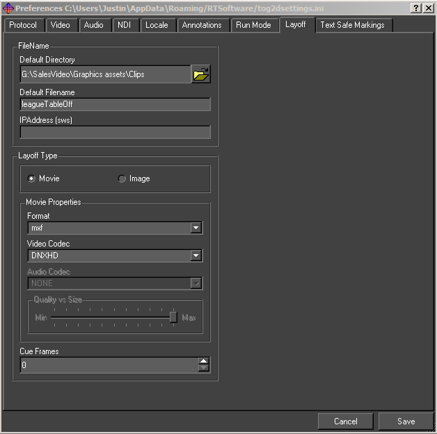
Layoff tab
The layoff tab allows you to choose the file format that will be used when laying off graphics as movies or image sequences to disk.
The settings here are used when :
- Laying off a graphic sequence from the editor. (See page )
- Laying off a graphic sequence from playout. (See the playout manual)
- Recording a tOG Sports stack sequence to disk. (See the tOG sports manual)
|
Option |
Description |
|
Layoff Filename |
The name of the file that will be laid off. The correct file extension will be automatically applied based on the format settings |
|
Layoff Type |
Whether you are laying off a movie or an image sequence This affects the format options available. |
|
De Interlace |
If checked, the video will not be rendered interlaced, even when the video format of Swift is an interlaced format. |
|
Cue Frames |
This specifies how many frames before and after the video will be recorded before the video starts properly. |
Movie Layoff Options
|
Option |
Description |
|
Format |
The file format that will be saved. For example, .mov, .avi. |
|
Video Codec |
The video codec that will be used. The choice is limited by the chosen format. |
|
Audio Codec |
The audio codec that will be used. The choice is limited by the chosen format. |
|
Movie Bitrate |
The movie bitrate that will be used, if appropriate (not all video codecs support a range of bitrates) |
|
Frames Per Second |
The number of frames per second that the movie should be played at. |
Image Layoff Options
|
Option |
Description |
|
Separate Alpha |
Write the alpha of each image out as a separate file. |
|
Zip Files |
Save images into a zip file. |
|
Odd Field Dominance |
Frames are interlaced by using the odd field of the first frame with the even frames of the second. |
Video Layoff Formats
|
Format |
Available Video Codecs |
|
mpg |
MPEG1, MPEG2 |
|
avi |
MPEG1, MPEG2, MPEG4, MJPEG, FLV, UNCOMPRESSED YUV422, UNCOMPRESSED BGR, UNCOMPRESSED BGRA, HUFFYUV, HUFFYUV+ALPHA, TARGA, |
|
mov |
MJPEG, MPEG2, DNXHD, MPEG4, QTRLE |
|
mxf |
DV100, AVC50, AVC100, DNXHD, MPEG2, |
|
dv |
DV100, AVC50, AVC100, |
|
flv |
FLV |
|
m4v |
MPEG4 |
|
mp4 |
MPEG4 |
|
wmv |
WMV |
|
tmv |
TMV |
|
mkv |
MPEG2, MPEG4, MJPEG, FLV, HUFFYUV, HUFFYUV+ALPHA |
Text Safe Markings
SWIFT displays the text safe area on the screen when in Edit mode. These text safe areas are setup here. Swift has its own values for safe areas for various formats but these areas can vary from geographic area to geographic and from broadcaster to broadcaster.
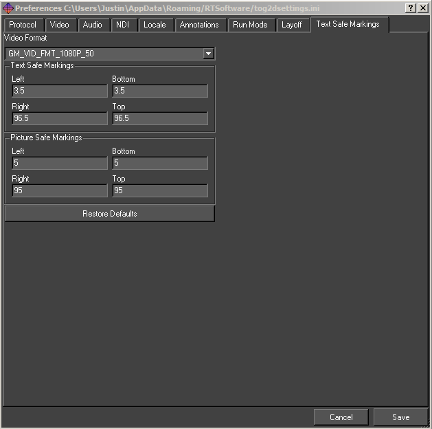
Video Format
Selecting an option from this dropdown menu will supply the fields underneath with the correct information for that format.
Text Safe Markings and Picture Safe Markings
These settings can be customized if a video format doesn’t match the broadcaster’s safe markings.
Restore Defaults
Resets the safe areas to defaults.
Graphic Menu
The Graphic Menu contains all the items related to individual graphics or scripts contained within a project. The graphic options are also accessible via the toolbar pictured below.

New
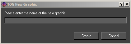
Create a new graphic and provide a name. This will typically be the first action to do after creating a project.
Open
The Open dialog presents a list of graphics in the current project. If an icon has been generated for the graphic it will be displayed, otherwise the Swift generic graphic icon will be displayed.
Double click on the icon or select the icon and click on Load Graphic to open the graphic.
Save
Save the currently open graphic.
Save As
Save the currently open graphic under a new file name.
Edit
Offers various options to the user regarding object node, transfer type and ordering priorities for graphics (scripts).
Includes
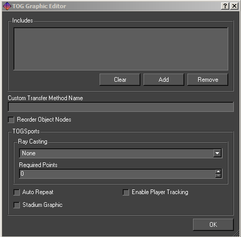
The user can manage the ruby modules used by the graphic. Ruby modules extend the functionality of the language.
Custom Transfer Method Name
Not available in Swift.
Reorder Object Nodes
Reorder the object nodes in a graphic after transfer to match the order in the graphic.
Note: tOG Sports is not available in Swift.
Recently Opened
Display a list of recently opened graphics. Selecting an item from the list will have the same effect as browsing for and opening a project via the Graphic -> Open menu option.
Reload
Reload the current graphic from disk. All changes to the graphic will be lost. Changes to assets will be unaffected as they are saved independently from the graphic.
Load last undo
Loads the last undo from disk, this is used in unlikely event of Swift crashing. The user can then restore the graphic to the state before the crash.
Export
Exports a graphics and all the assets used in it to the specified directory.
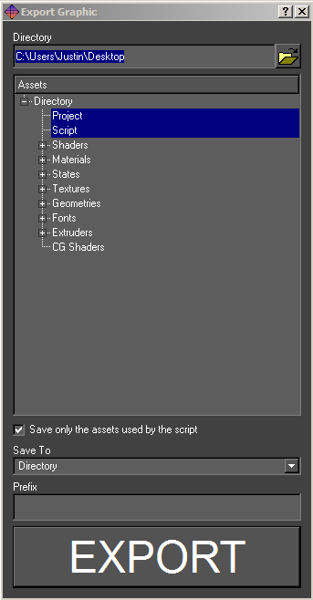
Directory
The assets and script will be saved to this directory.
Assets
The types of assets to export. If Project is selected, a project file will be created in the export directory which references that directory. This effectively exports the graphics into its own project. This will also cause all assets to be renamed (by prefixing their names with the export directory) making them unique (so this script and its assets can be imported safely into another
Save only the assets saved by the script
Checking this option will not save assets that are not referenced within the script. Any movie files imported, but not referenced with an input will not be exported.
Save to Directory
Saves to a parent folder with all sub-folders and files
Save to zip
Saves to a single zip file
Prefix
Type a prefix that will append a prefix to every file exported.
Revert
This will revert the current graphic back to the previous save, any changes made will be lost.
Close
Close the currently open graphic.
Tools Menu
The tools menu offers options for the import, clean-up and performance testing.
Import
Import is used to import external assets into Swift. The user selects a list of files using the file chooser. Files can be removed and the list cleared using the scissors and trashcan icons. When images, movies or fonts are imported into Swift, they are copied into the ~GMData/Images directory associated with that project. Import Progress shows overall progress and progress per item.
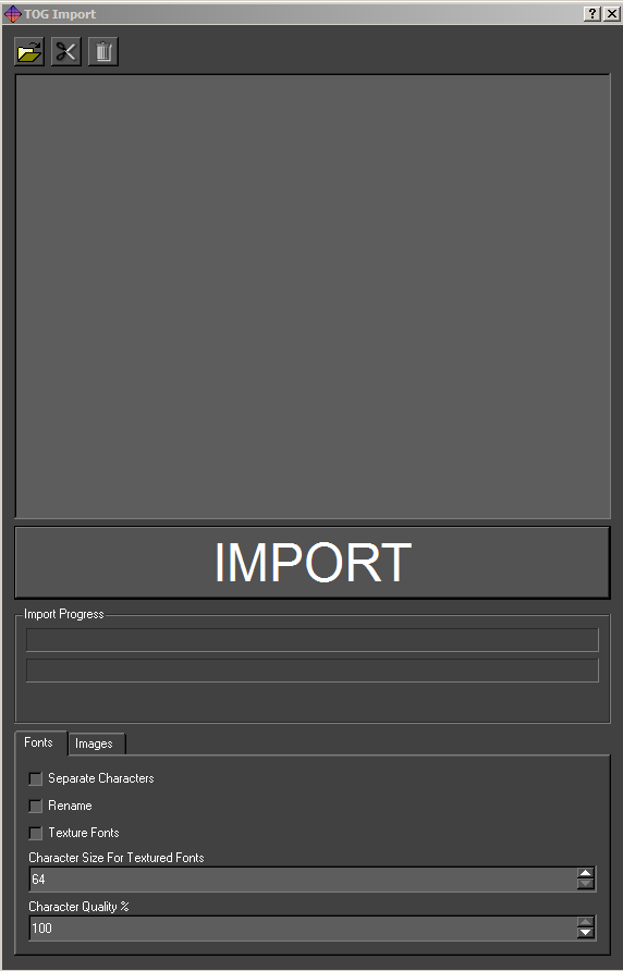
Fonts
Swift can import true type fonts. When imported the fonts are converted into Swift’s internal format, for speed of loading and rendering.
Fonts can be imported as Geometric Text, or Textured Text.
Texture Fonts
Checking the Texture Fonts option, imports each character of a font as a bitmap. A subfolder in the GMData/Fonts directory will appear and contain all the character set for the font as bitmaps. These can be post processed in an image editing application such as Adobe Photoshop if required.
Images
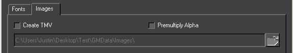
Selecting the Images tab within the Import dialogue will provide further options for the import of images and image sequences.
Importing image files
Swift supports a large number of image types, including .jpg, .gif, .tga, .tif, .png and bmp. The recommended file type for still images is .png files.
- All major image manipulation programs support it.
- Images are defined as 24bit and can have an 8 bit alpha channel
- Images are saved with lossless compression, so the image remains intact.
- Targa files are also recommended because they carry alpha information which Swift interprets on import.
Note: Importing an image into a project in Swift automatically copies it to the correct part of the project directory structure.
Importing movie files
Swift has support for various video formats. Swift uses FFMPEG in order to read these formats, and supports most of the formats that FFMPEG supports. Check the official FFMPEG website for a full list of video codecs located below.
http://ffmpeg.org/general.html#Video-Codecs
Note: Please refer to the appropriate Appendix for definitive information on video standards, wrappers, codecs and file formats for use in Swift.
Create TMV
tOG Motion Video files (TMV) are like QuickTime movies, but are native to Swift. TMV files are generated from image sequences, typically a Targa stream. TMV files interpret alpha information from image sequences, and deploy the transparency accordingly upon use. TMV files are ideal for small areas of the screen that contain looping animations.
When you select the Create TMV checkbox, select all the files in the sequence in the import dialogue. In the name field, type the name that you want your TMV file to be called and click the Import button.
Premultiply Alpha
Select this option if you want to premultiply the alpha channel of your images on import.
Importing assets from other Swift Projects
Swift can import files from a different Swift project into the current project. Simply select the items you require and click Import.
- .geo geometry
- .sha shader
- .mat material
- .sta state
- .txt texture
- .fnt fonts
Importing a file from a different project will copy it to the correct place in the project.
Importing ZIP files
If you import a zip file into the import dialog, the entire contents of the zip file will be selected to be imported. This is very useful in combination with the Export option to quickly export a graphic and all its assets from one project and import it into another.
Screen Grab
The Screen Grab tool will save the current frame in the editor graphics window out to disk. A file save dialogue pops up to allow choosing of a file to write the image to. When Save is pressed the image will be saved out.
Generate Icon
The Generate Icon tool, generates a thumbnail image for the graphic based on the preview window at the time the menu item was clicked. This icon will then replace the default icon in the Graphics tab, this is helpful for project management.
Clean Project
The clean project tool analyses your project, and lets you remove unused assets.
Purpose
As a project evolves, you will find that there will be elements that you used early on that you replace with other elements. For example, you may have been through several iterations of strap design, replacing old assets with new ones each time. These old assets may not be used anywhere in your project, but they are still loaded in. This has four undesirable effects:
- Your project takes longer to load on startup by loading unneeded assets.
- You project places a greater strain on system resources than it needs to.
- Your project is physically larger on disk, making it more difficult to transfer from one machine to another.
- Clutters up the project making it difficult to find the correct assets.
Cleaning Your Project
To access the clean project tool, load the project, and select clean Project from the Tools menu. See below:
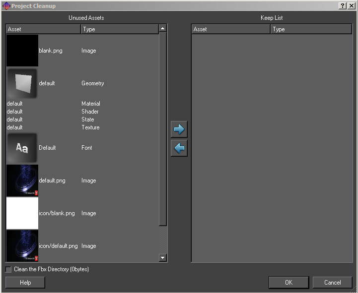
Note: Swift will ask you to save your graphic if you have one open; this is to make sure that any recent changes to the project are available to the clean-up tool.
After analysing your project, the clean-up tool will pop up the following dialog.
The list contains two lists, with buttons for moving assets between the two lists, allowing you to manually select all the assets you would like to keep, or discard.
Unused Assets
This list contains all of the assets that have been located that the project cleanup script believes are not used in your project.
Keep List
It is possible to move assets from the Unused Assets list into the Keep list in order not to lose them during clean up. This can be helpful if there is an animation, input or user code that switches assets since Swift will not be able to detect this.
To move assets from on list to the other, select the assets (either singly or multiple select), and click on the left/right arrows to move the assets from one list to the other.
Note: You should check the unused asset list before continuing.
Performing the operation
After pressing OK, Swift will ask the user whether to permanently deletethe assets in the unused assets list, or back them up. When backing up the assets, Swift will ask for a directory to store them in.
Note: Deleting assets is a permanent operation, and there is no way to recover them. If in doubt, choose the backup option.
Note: When backing up assets, it is good practice to choose a new, empty directory. This will make it easy to move assets back into the project if any removed assets were required.
The project will now be reloaded automatically to take into account the final list of assets. Note any errors that occur and compare them with any errors that occurred before the clean operation. The list should be the same, or possibly reduced.
Testing your project
After cleaning your project, perform a full test of all graphics to verify that the removed assets have not had any undesired effects. In particular, check graphics that set geometries, shaders or textures using inputs, user code or animators.
Performance Dialog
Timing and Performance
Provides tools for testing and diagnosing performance issues within graphics.
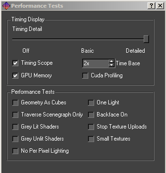
Timing Display
These options change the level of timing detail that is overlaid over the graphics. See the Performance Annotations/HUD section below for more information.
Timing Detail
Off: Do not display any timing data.
Basic: Display basic timing information, suitable for measuring the performance of all graphics.
Detailed: Display comprehensive timing, which contains information that may be necessary to provide RT Software’s support.
Timing Scope
The timing scope provides basic timing information on a line graph.
Time Base
Chooses the zoom level of the timing scope.
Performance Annotations/HUD
When you activate the Timing Display performance options, the viewport will be overlaid with debug information, so it is possible to check the performance of the graphic. The Timing Scope enabled and the Time Base set to 2. It’s important to remember that the performance you get inside the editor may not be the same as the performance from playout, or other automation tools.
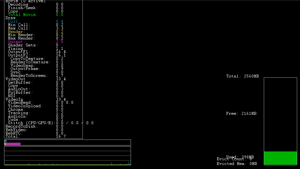
Timing Detail
The list of tasks under “Draw” are stages of the render being completed in milliseconds per frame. The number next to Total is the most important to look at, lower is better. Finding the target milliseconds per frame are calculated by dividing the target framerate by 1000. For example 1000/60frames per second gives 16.67ms.
NOTE: Critical values will be highlighted in cyan and yellow.
Bar graph and Timing Scope
The bar graph displays the usage of both the processor (blue) and the graphics card (yellow). Creators should try to keep the bars as far left as possible for the best performance. The timing scope below the bar graph displays the same information but shows it over a span of time, this can be very helpful while playing through methods to determine where any slowdowns are.
Performance Tests
The performance tests deliberately disable or change the way the scene renders in order to help find performance problems. For more information look at the Performance Troubleshooting Guide.
Note: The performance tests are only active while the dialog stays open. This is intentional as a safeguard from them being left on by accident.
Geometry as Cubes
Render all geometries as cubes. Tests for geometry complexity bottlenecks, such as dense polygonal meshes.
Note: Although Swift can’t use complex 3D meshes, geometric fonts could cause slowdowns.
Traverse SceneGraph Only
Do not render anything, but traverse the SceneGraph. Tests for SceneGraph complexity bottlenecks.
Grey Lit Shaders
Render all geometries with the same, lit shader. Tests for shader complexity bottlenecks. If this fixes slowdowns it is possible that they were caused by large textures, a lot of textures or complex shaders such as shaders with animations.
Grey Unlit Shaders
Render all geometries with the same, unlit shader. Tests for shader complexity bottlenecks. If this fixes slowdowns then it is possible that it is caused by lights. There may be too many lights in the scene, or too many lights in close proximity to each other.
No Per Pixel Lighting
Turns off all per pixel lighting and Cg Effects. Tests for pixel shader complexity bottlenecks. This is related to Gray Unlit Shaders but test whether per pixel lighting is the cause.
Note: Per Pixel Lighting is disabled in Swift since there is no 3D geometry to render.
One Light
Prevents more than one light being active when rendering. Tests for lighting-related bottleneck issues.
Backface On
Turns back face culling on. Tests whether back face culling has a significant effect on performance.
Stop Texture Uploads
Stops dynamic textures from being uploaded to the graphics card. This includes movies and TMVs. Tests to see if there is a texture upload bottleneck.
Small Textures
Replaces all textures with a single small texture. Tests to see if large textures are causing bottleneck issues.
Note: All of the shaders in Swift are unlit, therefore testing performance with the Grey Lit, Grey Unlit or One Light performance options is unnecessary.
Help Menu
All links: RT Software website and FTP
About: Editor and software versions
Preview Window Interaction
Interaction covers all on-screen manipulation of objects within the 2d space. This section covers:
- Interaction tools/toolbar icons
- Selecting objects either on-screen or via the scenegraph
- Interacting with selected objects (Translate, Rotate and Scale)
- Handling multiple selection and using tools with multiple selections
- Editable nodes
Interaction toolbar
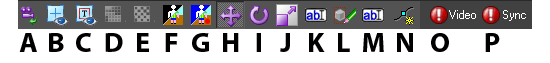
The Interaction toolbar is located above the Preview window:
(A) Reset camera view (after a zoom)
(B) Show Crosshairs: This displays a crosshairs and centre screen to assist layout.
(C) Text and Action Safe: Displays safe areas defined in the preferences.
(D) Snap to Grid: Snaps the selected objects to the defined grid.
(E) Background Checker Board: Displays a checker board on the render window.
(F) Show Key. Displays the alpha transparency of the composite as black and white.
(G) Show Video: Displays the incoming video connected to the video in.
(H) Translate: Select this icon to translate objects in the viewport.
(I) Rotate: Select this icon to rotate objects in the viewport.
(J) Scale: Select this icon to scale objects in the viewport.
(K) Edit Text: Select this icon to edit text.
(L) Clear Selection: Select this icon to clear the bounding box.
(M) Toggle Text Boxes: Toggles all text max size boxes on.
(N) Keyframe Mode: Allows the editing of keyframes on screen.
(O) Check video input (Red=Input error; Green=Input source found and displayed).
(P) Check video genlock sync (Red=Sync error; Green=Input genlock source found).
Selection
Selection of objects is performed by clicking on them with the left mouse button from within one of the camera views. Once an object is selected a red bounding box is rendered around the object to indicate that is has been selected. Multiple selection is performed by holding down the Shift key whilst picking objects in a camera view. A bounding box will be drawn around each selected object to indicate that they are selected.
Multiple Selection
Multiple objects can be selected via the picking interface as well as single objects. When multiple objects are selected, they can still be manipulated using the standard tools. Objects are multiply selected by holding down the shift key. When multiple objects are selected the on-screen interaction tools are always displayed at the location of the first node. This is a useful indicator of which node was the first to be selected.
Object Interaction
On-screen manipulation refers to the process of interacting with objects in the world directly from one of the camera views available in Swift. Interacting with an object is performed by selecting the object on-screen, the type of interaction control used depends upon the current mode of interaction.
Conventions
All interactors conform to certain conventions:
Colours are used to indicate the axis a tool or a part of a tool will operate in:
- Red for the x-axis (horizontal)
- Green for the y-axis (vertical)
All tools have two types of operation:
Free
- All mouse movement is mapped back to the interaction tool.
- Movement can occur in any of the two axes:
Constrained
- Movement is restricted to a single axis
This mode is activated by selecting the appropriate handle on the on-screen interactor. Constrained motion is performed by holding down the Shift key when using a particular interaction tool
Free movement
Dragging an object about using the free translation causes the object to remain under the mouse cursor at all times. The actual translation caused by this moving potentially moves the selected object in two dimensions.
Translation
Translation can be performed either by simply grabbing an object on-screen and dragging it or via the use of the axis handles on the translate tool. Dragging an object will cause it to move exactly where the mouse cursor is on-screen.
Rotation
Rotation in the 2d editor only works on the z axis – the axis that goes “into” the screen.
Scale
As per all other interactors the scale tool allows free scaling and axis constrained scaling. The scaling handles are always displayed at a fixed distance away from the centre of the tool irrespective of the actual scale factor of the transform.
As the scale handles are moved the length of the corresponding axes will update to reflect the change in scale, but upon releasing the mouse button the axes will jump back to their default length. The selected scale will remain applied to the object. This approach is used to make the scale tool usable when dealing with small or large scale factors.
Editing Text
Text can be edited directly on screen. Simply select text edit from the interaction drop down menu then click on any visible Text or double click on text in the graphics window to begin editing.
Text can be selected via the mouse and a cursor will be displayed within the text to indicate where editing will occur.
Note: to easily see where text nodes exist on the graphics window use the toggle text box on the graphics window toolbar.
All the standard editing keys (Arrow Keys, Home, End, Delete and alpha numeric keys) are usable. For example with the text as selected above, pressing Delete will remove the selected characters.
Scenegraph Editor
A Scenegraph is a way of ordering the nodes contained in the scene into a hierarchy where parent nodes affect child nodes.
The Scenegraph is basically a tree (really an n-tree as it can have as many nodes as required), in which some action takes place before proceeding to the children nodes.
Scenegraph Toolbar
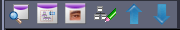
The Scenegraph Toolbar contains 5 options:
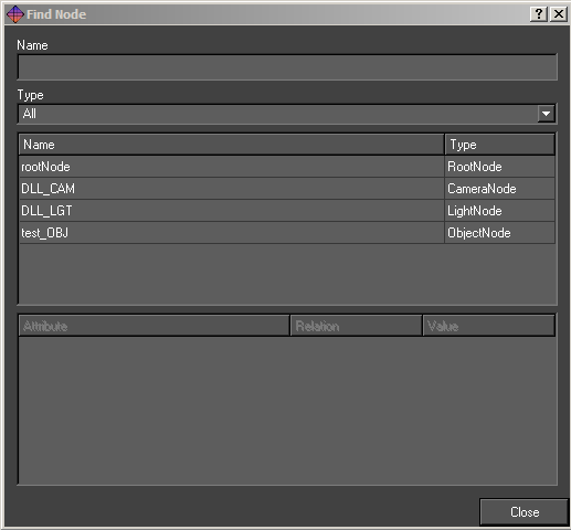
Find

Click the Find tool to search the Scenegraph for particular nodes.
See below:
- Name:Will display all the nodes in the scenegraph that match the letters typed in so far.
- Type: Sorts the list of nodes by type of node.
Toggle Basic Editor

Clicking this icon to toggle between the Basic editor (the default) and the Links editor. See below:
Note: For a full descriptions of Links, refer to the Links section.
Object Node Editor

Click this icon to edit the Object Node
The object node is used to specify the layer order of graphic templates.
When graphic templates are scheduled so that more than one is on-screen at once, Swift enables the use of the Layer feature:
A layer with a higher number than another layer will appear on top of that layer on output. Or example:
If a graphic with layer number 0 is scheduled, any graphic that is scheduled with a higher number will appear “above” that graphic.
Clear Scenegraph

Click this icon to clear the scenegraph.
Move Nodes Up or Down

Click the up and down arrows to move nodes up and down the scenegraph.
Dragging a Node
The user can select a node in the Scenegraph and drag it onto another node. As in the last section, if the node has a circle with cross going through it, then the node cannot be moved to the current location as this will result in an invalid scenegraph. Once the user drops the node back into the Scenegraph a small menu will appear with the following options:
Move the branch:
Moves the node and any child nodes
Link to:
Creates a link between the two nodes (see Node/Basic node)
Copy the attributes:
(only works on some nodes) Copy the dragged nodes attributes to the node the mouse pointer is over.
Cancel:
Cancel the move.
Right Click Context Menu
Right clicking on a node in the scenegraph will cause a drop down menu to appear. This menu will also appear if the user right clicks on the screen, see below:Toggle Display
This affects the nodes visibility in the scene.
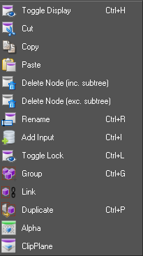
Cut
The selected node and all of its child nodes will be cut out of the Scenegraph.
Copy
This will take a copy of the selected node and all of its child nodes.
Paste
This will paste the contents of the clip board (anything copied or cut from the scenegraph, and any child nodes it has) into the scenegraph as a child of the currently selected node.
Delete Node [inc.subtree]
This will delete the currently selected node and all of its child nodes.
Delete Node [exc.subtree]
This will delete the currently selected node only.
Rename
Type in the new name for the node and press enter to confirm. The user can enter a substitution command of the form “/<old pattern>/<new pattern>”. This command will be applied to the node and all its children e.g. to prepped a sub-tree of nodes with “lower3rd_” use the following command “/^/lower3rd_/” where ^ matches the start of the name.
Add input
Adds an input to the node (see inputs).
Toggle lock
Locks a whole sub tree together so dragging any part of it on the graphics window will cause the entire tree to be dragged as if the top transform node has been selected.
Group
Adds a transform node above the selected node/nodes.
Link
Creates a link between the two nodes (see Node/Basic node).
Duplicate
Adds a duplicate node above the selected node.
Graphic and Asset Tabs
The main graphics templates and project assets are accessible from 4 tabbed menus: Graphics, Images, Fonts and Primitives.
Graphic Tab
Description
References the GMScripts/Template folder within the project and contains all the templates within the project:
- Save Saves the current template
- Load Loads another template
- Icon view Displays the templates as two column of icons
- List view Displays the templates as a list
Usage
- Double-clicking on a graphic thumbnail makes the template editable
Images Tab
Description
- References the GMData/Images folder of the project
- Contains all image assets imported into the project
- Images can be both still and moving clips
Usage
- Click and drag an image to the Preview Window
Fonts Tab
Description
- References the GMData/Fonts folder of the project
- Contains all font assets imported into the project
Usage
- Click and drag a font to the Preview Window
Primitives Tab
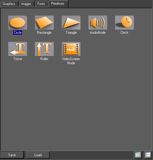
Description
Primitives describe the basic objects in Swift
Circle, Rectangle and Triangle creates corresponding shapes for use in the templates
Usage
- Click and drag any primitive to the Preview Window except the Audio Node
- Click and drag the AudioNode to the Scenegraph
VideoScreenNode
Renders the selected video input channel full screen and screen aligned.
Usage
Add a video screen node to the scenegraph, requires a shader above it. The shader must have lighting disabled and no texture.
Interface
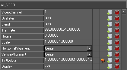
- Video Channel Selects video in channel
- Use filter Enables anisotropic filtering
- Translate Translates the video screen node in x or y
- Rotate Rotates the video screen node in z
- Scale Scales the video screen node in x or y
HorizontalAlignment
|
Property |
Description |
|
Centre |
Sets the video screen node pivot point to centre |
|
Left |
Sets the video screen node pivot point to Left |
|
Right |
Sets the video screen node pivot point to Right |
VerticalAlignment
|
Property |
Description |
|
Centre |
Sets the video screen node pivot point to centre |
|
Top |
Sets the video screen node pivot point to Top |
|
Bottom |
Sets the video screen node pivot point to Centre |
|
Display |
Sets the display to visible or invisible (true or false) |
|
InhibitAnimation |
Inhibits animated properties within duplicate node |
|
InhibitAnimationRecursively |
Inhibits animated properties within duplicate node’s child objects |
|
ClearRepeatAnimators |
Clears repeat animators |
|
AnimationDelay |
Sets the delay in fields of animators |
Clock Node
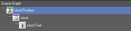
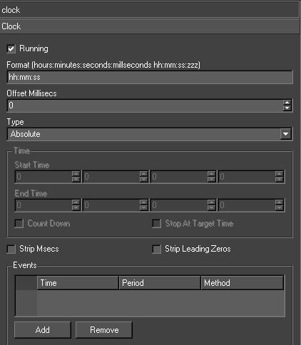
The Clock node provides the ability to render several different types of timers on screen. The clock can display the system time (with an offset), the elapsed time since a specified time and countdown clocks.
Usage
The user creates a Clock node above a text node. The clock time is then written into that text on every frame. Step animators can be used to set, start and stop the timer.
Interface
Interaction
|
Property |
Description |
|
Running |
Starts and stops the clock |
|
Format |
The format of the text the clock node writes into the text node. The fullest format possible is hh:mm:ss:zzz (eg. 23:59:59:999). The colons can of course be replaced by and character. ap can be used for am/pm |
|
Offset Millisecs |
When displaying the system time, this offset can be used to match an external clock |
|
Type |
There are three types of clock – see below |
|
Start Time |
The time the clock will start at |
|
End Time |
The end time for the clock |
|
Countdown |
The clock counts down to zero time |
|
Stop At Target Time |
The countdown clock stops when the zero time is reached and doesn’t count through to the next day |
Clock Types
|
Clock Type |
Description |
|
Absolute |
Shows the system time |
|
Supplied Time Plus Elapsed Time |
Shows the clock counting up from supplied time |
|
Supplied Time Minus Elapsed Time |
Shows the clock counting down from the supplied time to the zero time |
Events
An event is a method that is called when a certain time is reached
|
Property |
Description |
|
Time |
Time from supplied time at which the first event is triggered |
|
Period |
The event is re-triggered at intervals of this period after the first event time |
|
Method |
The method that will be called as an action of the event |
|
Add |
Add an event |
|
Remove |
Remove selected event |
Notes and Exceptions
Internally, the system clock is used to keep track of the time and not the counting of fields. This means time does not become incorrect when frames are dropped.
Ticker and Roller Nodes
Provides support for tickers and rolling credits.
Usage
A Ticker in Swift is a continuously moving stream of graphic items. This can be classic tickers moving right to left across the screen. It can also be credit rolls moving up/down the screen. The graphic item can be as complex as the user is prepared to build.
To create a ticker popup the custom browser and drag the required ticker type onto the screen (there are two possible tickers – ticker or roller
Interface
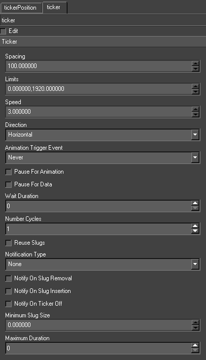
This sets general ticker attributes
|
Property |
Description |
|
Edit |
Swaps the ticker between Edit and Live modes. When editing, the slugs are displayed stationary. In live mode, the ticker animates as it would in live mode. |
|
Spacing |
The distance between the slugs. |
|
Limits |
The limits at which the Ticker node draws two clip planes. The slugs appear through one clip plane and disappear into the other. |
|
Speed |
The amount the slugs move in a frame. It can also be negative for left-to-right and bottom-to- top tickers. |
|
Direction |
The direction of the ticker to either Horizontal or Vertical. |
|
AnimateOffMethod |
If the ticker has a numberCycles greater than zero, there is no way to know from a scripting point-of-view when the ticker has stopped. It is impossible to clean up any graphical items that may frame the ticker. If the user supplies an AnimateOff method, the method is called when the ticker runs out of data. |
|
Animation Trigger Event |
Animators on a slug’s nodes have a special type Trigger. These animators can be triggered on certain events. |
|
Pause for Animation |
Pause until the trigger animation is complete |
|
Pause for Data |
When the last slug is fully on, the ticker stops streaming the slugs until more data is available. This is only applicable to tickers with network and interface data types and gives the effect of slugs being pushed onto the ticker. |
|
Wait Duration |
The ticker pauses for this number of frames after each slug becomes visible |
|
Number of Cycles |
The number times to repeat a batch of ticker data. In a database ticker a batch is the result of the select statement etc |
|
Reuse Slug |
Saves away old slugs then they are removed and if any new slug contains the same data it uses the save version. |
|
Notify on Slug Removal |
This is only applicable when controlling Swift externally using the MOS protocol. It sends a message back to the client whenever a slug is removed. |
Source
The ticker can be automatically driven by different data sources. It is updated on each frame. Existing slugs are moved. If there is room, another slug is created and fed from the specified data source. If a slug drops of the end it is removed.
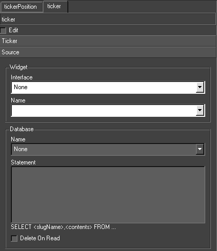
Widget Interface
The type of the data source – None, Database, MOS Parameter or Widget.
Select a user interface and a widget from it. The Ticker node gets its data from this widget. The widget is usually a LineEdit, one line containing the slug Node name and the next containing the contents. Swift uses QT to create user interfaces and their widgets.
Widget Name
The name for the source
Database
A database is supplied with the installation. Select the database and specify the select statement. This statement should have the form:
|
‘SELECT <slugName>,<slugContents> FROM…’ |
The contents contains a tilde separated list of values used to update the updateable fields. Swift retrieves the data from the database when the Ticker node has to create a new slug and the data previously retrieved is exhausted. This provides the data for the next set of slugs.
MOS parameter
The controlling program sends a special UPDATETICKER command to Swift. This is detailed in the section on Remote Control.
Update
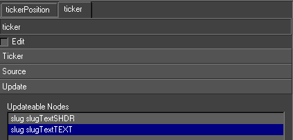
Before specifying the data source, first select what nodes are to be updated. Click on the Update tab. This contains a list of all Shader, Geometry and Text nodes in the slug. Only these nodes can be updated by the data source.
Fixed Slugs
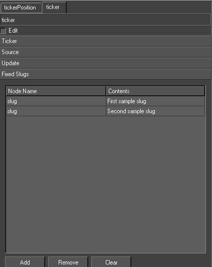
The user can specify the slugName and contents directly in a table on the interface. This data is the saved to the graphic. The Ticker node will cycle around the list of slugs indefinitely or until the number of cycles is reached.
|
Button |
Description |
|
Add |
Add a new slug |
|
Remove |
Removes selected slug |
|
Clear |
Clears all the slugs |
Node Editor Tabs
When a node is selected in the scenegraph, an editor specific to that node is displayed beneath the scenegraph.
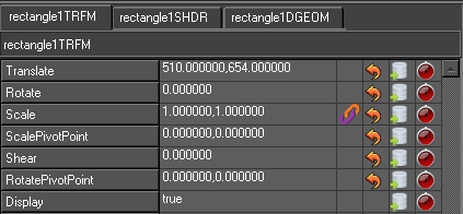
TRFM Editor TAB
TRFM stands for transform. This editor primarily enables the editing and manipulation of position, scale and rotation of graphical objects.
|
Property |
Description |
|
Translate |
Translates the object in x or y |
|
Rotate |
Rotates the object in Z |
|
Scale |
Scales the object in X or Y |
|
ScalePivotPoint |
The pivot point from the origin of the transform around which it scales |
|
Shear |
Sets the shear part of the transform |
|
RotatePivotPoint |
The pivot point from the origin of the transform around which it rotates |
|
Display |
Sets the display to visible or invisible (true or false visibility) |
|
InhibitAnimation |
Inhibits animated properties within a duplicate node |
|
InhibitAnimationRecursively |
Inhibits animated properties within a duplicate node’s child objects |
|
ClearRepeatAnimators |
Clears repeat animators |
|
AnimationDelay |
Sets the delay in fields of animators |
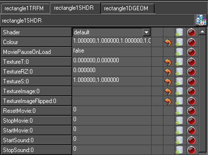
SHDR Editor TAB
There are two shader editors in Swift. Many of the features and tools are shared between them:
- Shader Tab Editor
- Advanced Shader Editor
Note: The former is accessed automatically when a node in the scenegraph is selected, and can be viewed by selecting the Shader tab.
SHDR stands for shader. This editor primarily enables the editing and manipulation of image, colour and visual properties of an object.
|
Property |
Description |
|
Shader |
Sets the shader with a drop down menu |
|
Colour |
Sets the diffuse colour of an object |
|
MoviePauseOnLoad |
Pauses a movie clip when the graphic is called |
|
TextureT |
Translates the texture on the DGEOM in x or y – if one is present |
|
TextureRz |
Rotates the texture on the DGEOM in x or y – if one is present |
|
TextureS |
Scales the texture on the DGEOM in x or y – if one is present |
|
TextureImage |
Sets an still image onto the texture |
|
TextureImageFlipped |
Sets either a still image or clip onto the texture |
|
ResetMovie |
Resets the clip to the first frame |
|
StopMovie |
Stops a clip at the frame specified |
|
StartMovie |
Starts a clip at the frame specified |
|
StopSound |
Stops a sound at the frame specified |
|
VolumeMaster |
Sets ganged volumes for all 16 audio channels |
|
MuteMaster |
Sets ganged mutes for all 16 audio channels |
|
TextureCopyFrame |
Sets the duration for a tmv sequence |
|
Display |
Sets the display to visible or invisible (true or false visibility) |
|
InhibitAnimation |
Inhibits animated properties within a duplicate node |
|
InhibitAnimationRecursively |
Inhibits animated properties within a duplicate node’s child objects |
|
ClearRepeatAnimators |
Clears repeat animators |
|
AnimationDelay |
Sets the delay in fields of animators |
DGEOM Editor TAB
DGEOM stands for dynamic geometry. There are 3 dynamic geometries in Swift: Circle, Rectangle and Triangle. This editor primarily enables the editing and manipulation of geometry-specific parameters including aspect ratio.
|
Property |
Description |
|
Type |
Sets the dynamic geometry to Rectangle, Circle or Triangle |
|
RectangleTXSize |
No function |
|
RectangleTYSize |
No function |
|
RectangleSize |
Sets the size in pixels |
|
RectangleRadius |
Sets a radius for rounded corners of rectangles |
|
RectangleSizeToTexture |
Sets the rectangle to conform to bitmap size (true or false) |
|
Rectangle Stretch Mode |
Sets the rectangle to: Size to Image Letterbox aspect ratio Pillarbox aspect ratio |
|
Display |
Sets the display to visible or invisible (true or false visibility) |
|
InhibitAnimation |
Inhibits animated properties within a duplicate node |
|
InhibitAnimationRecursively |
Inhibits animated properties within a duplicate node’s child objects |
|
ClearRepeatAnimators |
Clears repeat animators |
|
AnimationDelay |
Sets the delay in fields of animators |
Triangle and circle DGEOM options
Equivalent options for triangles and circles are available in the DGEOM Editor.
Reset values

This button enables the rest of current values defaults
Scale linkage

This button enables the linking of x to y scale values
Add Input

This button column adds an input to be added into the corresponding parameters
Add Animator

This button column adds a default-specific animator to the timeline.
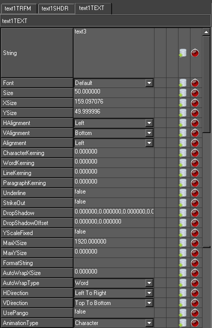
Text Editor Tab
Editing Text
Text can be edited directly on screen once Edit mode has been entered. Simply select text edit from the interaction drop down menu then click on any visible Text or double click on text in the graphics window to begin editing. Text can be selected via the mouse and a cursor will be displayed within the text to indicate where editing will occur.
NOTE: To easily see where text nodes exist on the graphics window use the toggle text box on the graphics window toolbar. All the standard editing keys (Arrow Keys, Home, End, Delete and alpha numeric keys) are usable. For example with the text as selected above, pressing Delete will remove the selected characters.
Text Markup
Markup changes the display of attributes of sections of the content by inserting HTML type tags. As the tag is typed into the editor, it will change its appearance on screen and may even disappear. Its not possible to edit on screen directly. They are usually included in inputs or in parameter lists when we are driven remotely.
|
Attribute |
Example |
Description |
|
Shader |
<s default>some content</s> |
<s shader>TEXT</s> |
|
Font |
<f Swis721_BT_Bold>some content</f> |
<f font>TEXT</f> |
|
Underline |
<u>some content</u> |
<u>TEXT</u> |
|
Strikeout |
<so>some content</so> |
<so>TEXT</so> |
|
Extrude |
<e>some content</e> |
<e>TEXT</e> |
|
Outline |
<o>some content</o> |
<o>TEXT</o> |
|
Kerning |
<k 0.1,0,0,0>some content</k> |
<k character,word,line,paragraph>TEXT</k> |
|
DropShadow |
<ds 0,0,0,0.5,0.1,0.1>some content</ds> |
<ds red,green,blue,alpha,xoffset,yoffset> TEXT</ds> |
|
Translate |
<tv 0,1,0>some content</tv> |
<tv x,y,z>TEXT</tv> |
|
Scale |
<sv 0.1,0.1,1>some content</sv> |
<sv x,y,z>TEXT</sv> |
Changing Content using Links
You can link the String property of a text node to other afields to automatically update the string on the text. This can be useful for generating clocking up text when generating a bar chart, for example. By linking the String property to the Scale property of the bar, and setting suitable scale and biases in the link, the height of the bar could be displayed.
When you link most properties to String, you will get a floating point value with 6 decimal places. For example, 5.251392. This is not very useful. It is common to want to reduce the number of decimal places, and also to add text at the beginning and end of the string.
This can be done using the Format option on the the Advanced tab. For example,
- F %.2f%%
- Converts the previous example output 5.25%
Editing Text on Screen
Double clicking on the text puts the editor into on screen editing mode for editable nodes. Select text and the cursor shows up at the selected character. Move the cursor using the arrow keys. Move to the start of the string using the Home key. Move to the end using the End key. Delete characters using the Backspace key. Type to insert characters. Select and highlight a part of the contents by dragging cursor. Type over the highlighted section or delete it using the Backspace key. Changes on the screen should be matched by changes in the contents widget on the TextNode editor (including cursor position and highlighting).
Click on the text with the right mouse button with the control key held down. This pops up a menu of editors. Choose ‘text1’ and the TextNode editor appears on the bottom right of the interface.
Interface
This interface handles the content of the Text node.
|
Attribute |
Description |
|
String |
Sets the text string |
|
Font |
Sets the font from the drop down menu |
|
Size |
Sets the size in pixel height of the font (50px default) |
|
XSize |
Is the size of the incoming text string in x |
|
Ysize |
Is equal to the Size |
Alignment
|
Attribute |
Description |
|
Horizontal Alignment |
The horizontal alignment (Left/Centre/Right) |
|
Vertical Alignment |
The vertical alignment (Bottom/Centre/Top) |
|
Overall Alignment |
Combined with the Horizontal alignment this determines the x position of each line of a block of text. For example, if a Text node is Left aligned, all the lines line up with x = 0.0. If the Overall alignment is Centre, the longest line is found and this is used to centre the whole text about its y axis |
|
Character/Word/Line /Paragraph |
This changes the spacing between characters, words and lines. Swift fully uses the layout information in any font. These are used to tweak the basic kerning and leading. This can be set on highlighted spans. |
|
Max XSize |
This fits the whole string into a certain horizontal extent. If the width of the text exceeds this value the whole text node is scaled so it fits |
|
Max YSize |
This fits the whole string into a certain vertical extent. If the height of the text exceeds this value the whole text node is scaled so it fits |
|
Autowrap XSize |
Any line of text which is longer than the specified size is split up at the nearest previous space and a newline is inserted. |
|
Autowrap Type |
Sets the autowrap type to Word or Letter |
Styles
|
Attribute |
Description |
|
Underline |
Underlines the selected text |
|
StrikeOut |
Strikes out the selected text |
|
Drop Shadow |
Sets the drop shadow for the selected text |
|
Drop Shadow Offset |
Sets the drop shadow offset for the selected text |
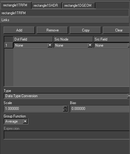
Links Editor Tabs
Links connect node attributes together. A link contains the source and destination nodes and attributes and the mapping between them. A classic use is to link the size and position of a square geometry to a text’s position and size. The geometry will the fit the text exactly whatever the contents of the text. This is the only way to fit geometry to a text (short of using user code) where the contents of the text is dynamic (eg. in a ticker).
When a node is created its AFields are set up, these are basically the nodes attributes. They can be linked to attributes of other nodes e.g. a Transform node sets up TranslateX and TranslateY.
Links tabs enable access to linking TRMS, SHDR and DGEOM Afields as required.
|
Attribute |
Description |
|
Dst Field |
The destination field of the current node |
|
Src Node |
The source node |
|
Src Field |
The source field in the source node. |
The link is evaluated on every traverse of the scenegraph. A list of the attributes from all the sources is compiled. From this list, the value of the attribute in the destination node is derived. There are two methods for deriving the destination value.
Data Type Conversion
|
Option |
Description |
|
Scale |
This is multiplied with the result of the group function |
|
Bias |
This is added to the result of the group function |
|
Group Function |
The specified function (e.g. Average) is applied to all the source field values |
|
Expression |
The specified expression is applied to all the source field values. For example, if there are three sources “(p1+p2+p3)/3.0” is equivalent to the group function Average |
The best possible match between source and destination is made based on the data types. For instance, if the source is a float and the destination is a string data type, the float is written into the string contents. The most important case is float-to-float because the source can be scaled and biased.
|
From-To |
String |
Float |
Int |
Bool |
Enum |
|
String |
Copy |
Read from string |
Read from string |
Read from string |
Use Enum maps |
|
Float |
write into string |
Copy with scale and bias |
Convert |
NA |
NA |
|
Int |
write into string |
Convert |
Copy |
Convert |
Convert |
|
Bool |
write into string |
NA |
Convert |
Copy |
NA |
|
Enum |
Use Enum Maps |
NA |
Convert |
NA |
Copy |
Range Mapping
The user specifies a set of ranges of source values and corresponding destination values. If the source value falls within one of the source value ranges, the destination field is assigned the destination value.
See this example:
|
Source Value |
Destination Value |
|
-100000.0 |
|
|
-0.1 |
GM_VA_Top |
|
0.1 |
GM_VA_Centre |
|
100000.0 |
GM_VA_Bottom |
This mapping is to link the vertical alignment of a Text node to the y scale of a Transform node (ie. a histogram column with text on top). If the scale is positive then the destination value will be GM_VA_Bottom and the text will sit on top of the column. If the scale falls between -0.1 and 0.0, the destination value will be GM_VA_Centre and the text will straddle the base of the column. If the scale is negative the destination value will be GM_VA_Top and the text will sit just below the column. These values are calculated every frame and the decision where the text sits will dynamically follow the scaling of the column.
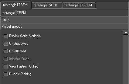
Miscellaneous Options
These options are available for all node types.
|
Option |
Description |
|
Explicit Script Variable |
Creates explicit script variables for nodes for which this is set |
|
Unshadowed |
These nodes are not included in the shadow map calculation if under a Shadow node |
|
Unreflected |
These nodes are not included in the reflected scene if under a Mirror node |
|
Initialise Once |
For nodes above object nodes, if this is set the node will only initialised in the first graphic it appears in. It is not initialised in subsequent graphics. |
|
View Frustum Culled |
Whether view frustum culling affects the node. |
|
Hide From Render |
Do not draw this node while rendering the scene. The node will still be drawn whenpicking. This is useful when working with touch nodes. |
|
Hide From Picking |
Do not draw this node when picking. This is useful when working with touch nodes. |
TimeLine Editor tab
The TimeLine Editor in Swift borrows much from editors in standard content creation applications from Adobe, Avid or Autodesk. From this interface, template designers are able to edit the duration and temporal position of components, set the appropriate actions that specify the Method and order the animated components in a layered fashion.
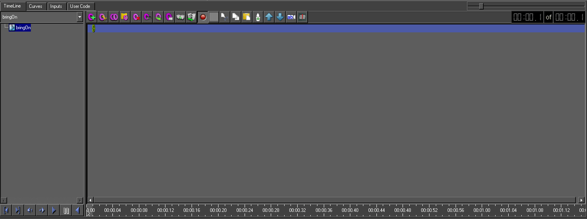
Methods
Methods in Swift are the part of the graphic that contains information about animations, their durations, and inputs that is called by the controlling application to play to air. Use the drop-down menu to select the Method you want to create animations in. In Swift there are 2 Methods:
- bringOn
- takeOff
Blocks
There is only 1 Block in Swift and it represented by the green line that is always uppermost in the TimeLine Editor. The green line defines the total duration of the Block, which in Swift is the total duration of the Method, including any delays specified in the Curves Editor.
TimeLine Toolbar

|
Action |
Description |
|
Add Method |
Creates a new method |
|
Cut Method |
Cuts a method ready for pasting |
|
Copy Method |
Copies the current method |
|
Paste Method |
Pastes the current method |
|
Delete Method |
Deletes the current method |
|
Rename Method |
Renames the current method |
|
Export Method |
Exports the current method |
|
Layoff Method |
Lays off to clip or sequence the current method |
|
Add new Block |
Add a new block |
|
Split Block |
Splits the selected block |
|
Flip |
Flips the animation |
|
Cut |
Cut current selection |
|
Copy |
Copy current selection |
|
Paste |
Pastes the current previous cut / copy |
|
Delete |
Delete current selection |
|
Up arrow |
Moves the current selection up |
|
Down arrow |
Moves the current selection down |
|
Rename |
Renames current selection |
|
Scrub movie clip |
Enables the scrubbing of clips when toggled |
Transport Controls
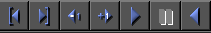
Universally standard Transport Controls are used to play through animations. See below:
In addition to the standard transport controls, the timeline can be “scrubbed” using the cursor. Click and drag in the timebar region at the bottom of the timeline. See below:

Field Counter
The Field Counter is a timecode display, and is calibrated to number each separate field.
Note: There are 2 fields to every frame of video.
The first timecode box represents the position of the cursor in the TimeLine.
The second timecode box represents the total duration of the Method.
Zoom
Drag the Zoom Slider left or right to focus the view in large or small time metrics. See below:

Creating Animations
There are two different techniques that you utilise to create animations in Swift. The concept behind animations in Swift is very similar to standard content creation applications such as those from Adobe or Autodesk, using “keyframes” to set values of the properties of objects at certain points on a timeline.
Adding Keyframes

Click once in the Animator Icon column of the property you want to animate. See below:
This will create two keyframes, at a set duration of 50 fields, and become visible in the TimeLine. This component is called an Animator. You can animate virtually all the properties of every object in Swift.
Note: When you add Translate or Scale keyframes, two Animators appear in the TimeLine corresponding to the x and y values associated with position and size information.
Selecting Animators
To select an Animator, either click on the bar or on the object name in the left hand column. Use the Ctrl key and Shift key respectively to select multiple Animators in the standard Windows way.
Editing Animator Durations
You can edit the durations of Animators in the TimeLine by clicking and dragging the ends of the Animator bar left or right. See below:
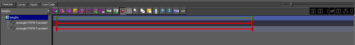
Moving Animators in time
You can move an within the timeline Animator, by clicking in the middle of the Animator bar, and dragging left or right. See below:
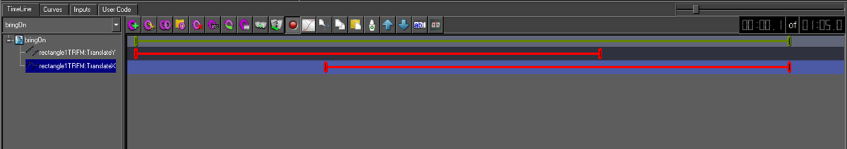
Node to scenegraph dragging
You can also create an animation by dragging a node from the scenegraph and dropping it onto the ruler near the start frame, at the bottom of the TimeLine window. This will cause Swift to pop up a dialog. See below:
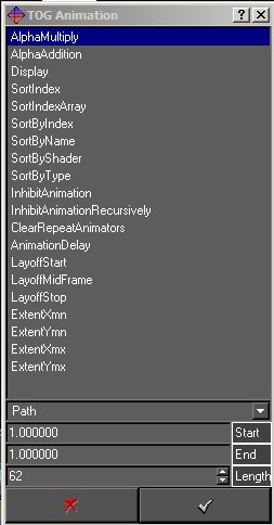
Note: You can do this with all nodes, but unless you drag a Group, Alpha or Clip Plane node to the ruler, you will only be presented with options to animate properties at the geometry level. For nearly all situations, use the Animator Icons within the respective editors to create your keyframes.
|
Option |
Description |
|
Path |
Select Path type from drop-down menu |
|
Start |
Animator start value |
|
End |
Animator end value |
|
Length |
Duration in fields |
Curves Editor tab
The Curves Editor is the window that is used to edit points on an animator and to change the shape of the curve to change the behaviour of your animation. There are 4 types of curves used in Swift. These are Path, Ramp, Step and Cyclic.
Animators: Path Type
Path Animators are commonly known as Bezier curves and are represented in the TimeLine by a red bar. Path Animators (Bezier curves) are common to many standard content creation applications, and they allow the user to change the shape of a curve. When bezier curves are used, there are always at least two keyframes that form the curve. See below:
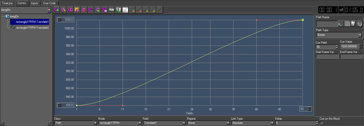
Keyframe points
A keyframe (value) point is represented by a yellow dot on the Curves Editor. The keyframe represents a knot or value in the path. The vertical displacement of the point is the value of the curve at that point. The horizontal position of the point is the point in the timeline at which the value occurs.
Selecting a keyframe
To select a keyframe, click the yellow dot. A green bounding box will signify its selection.
Editing the curve
To edit the shape of a bezier curve, select the keyframe and then click and drag its “handle” represented by a red dot at the end of the red line. If a keyframe has both an incoming and outgoing curve there will be two control handles on the knot.
Note: For animating motion, a typical use of bezier curves is to induce an “ease-in” or “ease-out” characteristic to the movement of an object.
Editing keyframes visually
To change the value of a keyframe, select it and drag it to the required position in the Curves Editor.
Editing keyframes manually
To edit Path Animators (Bezier curves) manually, select the keyframe and use the input options below:
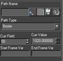
|
Option |
Description |
|
Current Value |
To change the value of a keyframe, use the Curr Value string |
|
Current Field |
To change the value of a keyframe, use the Curr Frame string |
|
Path Name |
Not accessible in Swift |
|
Path Type |
Use the menu to select alternative curve type |
Grid sizes
The two spin boxes on the left of the curve editing canvas control the value and frame ranges.
|
Option |
Description |
|
Max Grid Size |
To change or enter a new Max Size |
|
Min Grid Size |
To change or enter a new Min Size |
Animators: Ramp Type
Ramp Animators are represented in the TimeLine by a yellow bar. Ramps are in fact straight linear lines between two points.
Note: Animators that use Ramp curves only contain two keyframes.
Editing keyframes visually
To change the value of a keyframe, select it and drag it to the required position in the Curves Editor.
Editing keyframes manually
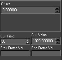
To edit Ramp Animators manually, select the keyframe and use the input options below:
Offset
Sets an offset for the ramp by the specified amount
Animators: Step Type
Step Animators are represented in the TimeLine by a 1 field blue bar. Step Animators set a single value on a specific frame.
Note: Step Animators only contain one keyframe.
Editing keyframes visually
To change the value of a keyframe, select it and drag it to the required position in the Curves Editor.
Editing keyframes manually
To edit Step Animators manually, select the keyframe and use the input options below:
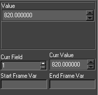
Value
The Step animator interface will change depending on the field value selected. If the Field value is a float a point edit control will display, For a boolean a check box will appear, For a string value an edit field will appear and for an integer value a spin box will appear.
Animators: Cyclic Type
Cyclic Animators are represented in the TimeLine by a cyan bar. Cyclic Animators enable a continuous oscillation of animations.
Editing keyframes visually
To change the value of a keyframe, select it and drag it to the required position in the Curves Editor.
Editing keyframes manually
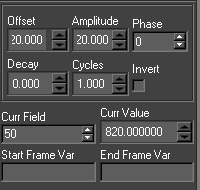
To edit Cyclic Animators manually, use the input options below:
Phase
At what point in the cycle the animation should start (0-90)
Amplitude
The height of the oscillations
Offset
Oscillate from one value to another
Decay
Rate at which the oscillations die off
Cycles
The frequency of oscillation
Invert
Clamp oscillations to positive or negative cycles
Common Properties
All animation types support the following common attributes. See below:

Class
The Class specifies the type of animation curve. Use this drop-down menu to change curve type for your selected animator.
Node
This is the list of nodes in the Scenegraph that can be animated.
Field
For a given node this is a list of all fields in that node that can be animated. Note that the fields are restricted to the animation type specified. For Cycle, Path and Ramp these are always real (floating point) values. Step Animators will include Integers, Booleans and Strings.
Repeat
Specifies if the animation should repeat and how it should repeat:
Repeat
For Ramp and Cyclic. Continues the animation infinitely.
Repeat/Reset
For Ramp, Path, Cycle and Step. This is the same as Repeat except the animation will reset to the beginning when it reaches the end.
Reset
For Ramp, Cycle and Path. The animation will reset to its first frame value at the end.
Link Type
Specifies where the initial value comes from.
Absolute
Use the value calculated from the animation.
Relative
Use the current field value as the start value and recalculate the path from this value. This is useful if the user does not know ahead of time the value the field will be starting from.
Relative Offset
Not used.
Offset
Use the current field value as an offset to the animation.
Delay
This is used for text character and Duplicate node animations where the animator is animating multiple objects.
Field Parameter
Parameter passed to the animator that will affect its operation. At the moment, it is used to determine the end of a clip plane animation based on the extent of the nodes underneath it eg. clip on text even when its length is not known beforehand.
Inputs tab
Inputs are the mechanism through which Swift associates external data with node and animator attributes. The Inputs editor is part of the Timeline editor and is accessed through the input tab.
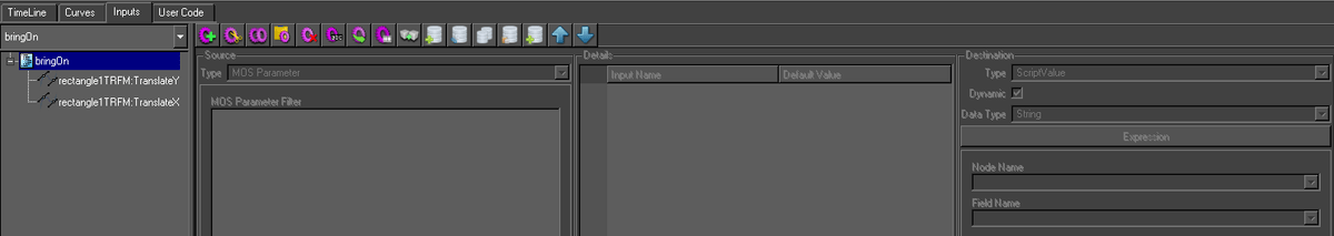
Inputs can be added, removed, cut and pasted. Inputs are added to the current block so a destination attribute can have more than one input but they must all be on different blocks.
Inputs happen in two stages. First the source data is retrieved. Second, this data is written to the destination. Any user code specified for the block is run between these two stages. This is why input sources have script variables associated with them. The source data is assigned to this variable in the graphic. The user code can then manipulate this script variable. The results of this manipulation will be then written to the destination.
All destination data will be automatically converted to an appropriate form before it is written. For example, an input on a Text nodes font field will be converted from a string to a pointer to a Swift font.
An input on an animator will change the final value of the animation and cause it to be recalculated. An input can be put on a Step animator. When the Step animator is animated the input is evaluated. This allows inputs to be run at a specific frame not just the start of a block.
Details
This lists all the inputs on the current block. Change the block and the list will change. More than one input can be selected and selected inputs can be deleted, copied and cut.
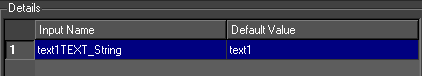
|
Option |
Description |
|
Input Name |
The name of the input. It is recommend the user uses sensible names which describe what the input does. For example, lineWidth, showBarChart, translateX |
|
Default Value |
The value to set the input to if none is received. |
Source
The user selects the source type for the input. There are nine types of input sources.
|
Source Type |
Description |
|
Widget |
The source is a widget in a user interface supplied with the graphic. |
|
MOS Parameter |
The source is from a name/value pair sent to the method by some external means, for example a MOS connection. |
|
Database |
The source is a database query |
|
Script Variable |
The source is an existing script variable inside of Swift. |
|
Constant |
The source is a constant value |
|
SceneGraph |
The source is the current value associated with part of the scenegraph. |
|
Touch Parameter |
The source is a touch parameter when this method has been triggered by a touch event. |
|
TOG Sports |
The source is data generated in TOGSports. |
|
Command |
The source is the output of a command run externally to Swift. |
Widget
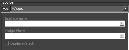
The interface widgets come from user interfaces. A user interface is associated with a graphic in the Graphic editor. The user interfaces for a project are stored in the Template graphics directory. The interface can be laid out in Qt Designer externally to Swift and then imported. Alternatively, Qt Designer can be run up for the graphic chooser. When the interface is saved, it is saved automatically to the Templates directory. Swift can also automatically generate interfaces if required.
When Swift is in Playout mode and a graphic is selected, if it has an associated user interface, this is popped up under the stack (if display in stack is set to true). The user enters values and stacks the graphic. These values will be the sources for Interface Widget inputs.
Almost any widget can be used. If a list is used, normally its contents would be retrieved as a string. If its position is required just end its name in ‘_ascii_’. It is worthwhile naming the widgets in a consistent manner eg. for a QComboBox of fonts for a Text node called title, titleFontCB would be useful.
Display in Stack
If this is set then this parameter will be listed with the method when it is stacked in Playout mode.
MOS Parameter
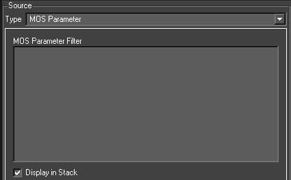
The MOS Parameter source type allows access to any name/value pairs of data that have been made available to the method.
The xml MOS messages received by Swift as part of the Remote protocol will contain parameters as name/value pairs. Swift will use the name of this input to retrieve the value for this name from the list of name value pairs. This value it then written to the destination.
It is also possible to add your own parameters in user code, which is useful when calling methods from within other methods.
Filter
Only used when generating interfaces. This allows customisation of the widget created from an input.
If the input updates a font/shader/geometry/texture then the contents of this is used as a regular expression to limit the items in the combo box widget normally produced for these types of inputs (e.g. a texture image being updated and the filter is
/home/tog/*.tga – this filter will cause the file chooser widget generated to default to the directory /home/tog and the file chooser filter will be set to .tga files).
Otherwise this can be used to override the default creation of a line edit and replace this with a combo box. The filter would then contain the location of a file used to set the contents of the combo box (e.g. a text string being updated. Normally a line edit would be generated and the value entered into this would update the text string. If filter is specified to be a file which contains on different lines Left Right, a combo box would be generated with Left and Right as the two choices). When one of these is selected the value will be added to the text string.
Display in Stack
If this is set then this parameter will be listed with the method when it is stacked in Playout mode.
Database
The database source allows you to query a database, and use the result of the query as the data for the input.
Databases are set up via the Project Settings dialog.
There are two forms of the database source editor. A full SQL select statement can be entered into one (allowing all the power and flexibility of SQL data selection). The other is simpler and builds an SQL statement up from its component sections. This makes it easier for an SQL novice.
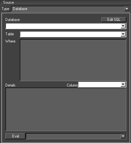
At the moment, the input source is evaluated ie. when its associated block is run, the database is accessed and the statement run on it.
Edit SQL
The user can move between the two interfaces and the statement (or as much has been entered) will be transferred.
NOTE: Complex statements cannot be handled by the simple SQL editor. In this situation, Swift will stay in the full SQL editor to avoid corrupting the SQL statement.
Database
The database of the source – from the project database list
Table
A list of the tables in the database. Only one can be selected. To do table joins use the complete statement entry interface
Where
Insert the where clause here (minus the WHERE)
Column
A list of the columns in the selected table. If selected the column is added to the Details widget
Details
This determines what columns (and manipulation of those columns) are retrieved.
Eval
This evaluates the statement and puts the result into the combo box.
Database Statement
When using the “full” mode, The complete SQL statement is shown here.
Variable Interpolation
You can use variable interpolation to include global variables and the results from other inputs in database SQL queries.
Script Variable
This source type allows access to a ruby script variable that has been previously set up in the graphic. For example, a script variable that was the output of a previous input can be piped into another input.
Constant
This value is read in from the default value specified in the input details table.
Scenegraph
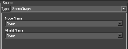
The scenegraph source allows a value from a node in the scenegraph to be used as an input source.
NodeName
Chooses the node that the value will come from.
AFieldName
Chooses the property on the node that the value will be read from.
Touch Parameter and Tog Sports
Are not supported in Swift
Command
Allows an external command to be run. The standard output from the external command will be used as the source value for the input.
For example, C:/Windows/System32/whoami.exe will return the name of the computer that Swift is running on.
You can pass command line parameters to the command you are running by including them like you would normally in a batch script.
You can also use variable interpolation (described below) to allow the values from ruby global variables, and from other inputs in Swift to be used as part of the command line.
NOTE: Commands do not run inside of the editor. Instead, the default value will always be returned. To see the output of your command, run in Live, Playout or Sports modes.
WARNING: Swift will pause execution of the script until the external command returns. The Command source type should only be used with commands that return quickly. If you run a command that does not exit, Swift will become unresponsive.
Variable Interpolation
You can use variable interpolation to include global variables and the results from other inputs on the command line.
Variable Interpolation on Database and Command Inputs
A powerful feature of Swift is that you can modify the Database Input sql queries, and the Command input command line using existing parameters in the system. This can be done for global variables and for MOS parameters.
In order to do this, use square brackets in part of your statement. For example :
|
SELECT name FROM addressbook WHERE address = ‘[$currentAddress]’ |
Here, $currentAddress is a Ruby global variable that we would have previously set up with an address via user code. Note that in order for this to be a correct sql statement, we still need to quote the result with ‘’ outside of the square brackets.
Alternatively, the value that we use might be passed to the method. To access the method data, specify the parameter name directly.
|
SELECT name FROM addressbook WHERE address = ‘[currentAddress]’ |
Here, currentAddress would have been set up externally via e.g. mos, another method, a touch event, etc. Method data is populated when an input is evaluated, so any input from a previous block in the same method can be used in a database query.
- Method data can also be populated using the Method Data output type.
Finally, method data can be set in user code as follows :
|
data.setInputValue(<blockName>, <inputName>, <value>) |
Default values for interpolation
When running in the editor, quite often there is no data available. You can choose a default value by adding :<defaultValue> to the square brackets, as follows :
|
SELECT name FROM addressbook WHERE address = ‘[currentAddress:12 Chesney Street]’ |
Destination
All input destinations share the two combo boxes below.
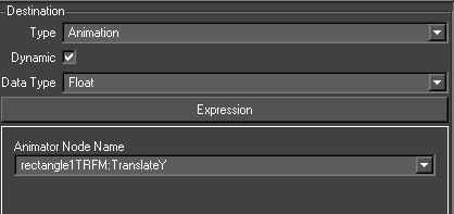
Dynamic
A dynamic input will be evaluated every time the input is run. In most situations, this should be checked.
If an input is not dynamic, it will only be evaluated at the start of the method, the first time that method is run. This can be useful if you are using dynamic data sources, and want to be sure that they don’t change halfway through a graphic.
Data Type
This sets the datatype (string, float, int etc) of the source. If the source is going to be manipulated in user code, it is sometimes useful to set the datatype of the script variable
There are five types of input destinations
|
Destination Type |
Description |
|
ScriptValue |
The data is stored in a script value, nothing else happens |
|
SceneGraph |
The data is pushed to an animatable property (AField) on a node. |
|
Animator |
The data is used as the end value of an animator |
|
MethodData |
The data is parsed as a list of name/value pairs and used to create new data that can be used in future blocks. The data can be accessed using the MOS Parameter input type. |
|
TOGSports |
The data is used to run one of a number of TOG Sports specific actions. |
Scenegraph
The evaluated source of the input will be converted and written to this field when the block is run.
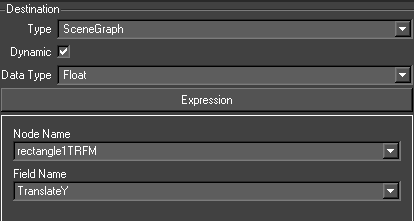
Node Name
The destination node in the scenegraph
Field Name
The field on the node selected above
Script Value
This creates a ruby script variable and assigns the source to it.
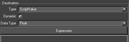
Animation
This lists the animators on the current block as <node_name>.<field_name>. The evaluated source of the input will be written to the final value of the animator when it is added to the node. For a Path animator, this will cause the path to be recalculated.
Animator Node Name
This contains the node:field value
NOTE: If the target node is part of a Duplicate nodes prototype node, the results of the source evaluation will be a list and will be distributed among the duplicates. If the source is a database, the list will be the results of the SQL statement. If the source is a constant value, the source will be divided in to a list of strings using ‘~’ as a separator. MOS Parameter and Interface Widget sources are handled similarly.
Method Data
The method data destination type allows the data from the input to be parsed and converted into data parameters that can then be used by the MOS input source type in future inputs.
For example, a common situation is where I want to run a database query that returns a table of data. I want each column of data to populate a different node in the scenegraph.
|
Name |
Age |
Address |
|
Joe Bloggs |
22 |
3 Kipling Yard |
|
John Doe |
42 |
17 Bloomsbury Avenue |
Method Data Example
Normally this would be achieved using three inputs as below:
|
Source Query |
Dest node->afield |
|
SELECT Name FROM table; |
nameTEXT->String |
|
SELECT Age FROM table; |
ageTEXT->String |
|
SELECT Address FROM table; |
addressTEXT->String |
However, if the query takes a long time to run, running the query 3 times can be undesirable. It would be better if we could run the query as follows :
|
SELECT Name, Age, Address FROM table; |
However, in this case, the data would be interleaved and we would not be able to directly output it into our destination nodes.
Method data solves this by allowing us to form our query so that Method data will split the data up.
MethodData Format
The Method Data destination type expects the input to be in the following format :
|
<param1>=<value1>;;<param2>=<value2>;;<param3>=<value3>;; |
Each parameter definition should contain the name of the parameter to be set, followed by an equal sign, followed by the value, followed by two semi colons.
If you pass multiple parameters of the same name in the input, they will be collated together and formed into an array. For example :
|
param1=1;;param1=2;;param1=3;; |
This will result in the input param1 containing the values 1~2~3.It is also acceptable to pass arrays of parameter updates to the method data input. For example:
|
param1=1~param1=2~param1=3 has the same affect as using semicolons. |
Returning to our example, the database query can be turned into a single query that follows the convention expected by method data by using CONCAT to construct the string.
|
SELECT CONCAT(‘name=’,Name,’;;age=’,Age,’;;address=’,Address,’;;’) FROM table; |
We can feed this to a method data destination, and then use mos parameters to pull out the parsed information, stored in name, age and address.
|
Source |
Dest node->afield |
|
SELECT CONCAT(‘name=’,Name,’;;age=’,Age,’;;address=’,Address,’;;’) FROM table; |
METHODDATA Destination |
|
name (MOS parameter) |
nameTEXT->String |
|
age (MOS parameter) |
ageTEXT->String |
|
address (MOS parameter) |
addressTEXT->String |
The method data is most useful when used with the database query source type, as above, and for the command source type, if you write an external command that understands the format expected by Swift.
TOG Sports
This destination type is unsupported
User Code tab
This page allows to user to enter the user code for the current block. The use code block can be made blocking by selecting the toolbar option.
All of a Swift scene is scriptable. Although a suitably large portion of the scripting potential is exposed via Swift’s editor interface, there are still times when the user will want to achieve something that is not directly possible. For these situations, the user can use user code.
User code allows the user to add their own ruby scripting code at strategic locations in the Swift script in order to achieve the desired result.
User code differs from editing the script manually by hand, as it is marked up by the editor so that it knows that it is user code and will load/save it correctly.
See the <scripting> documentation for a thorough examination of scripting code. User code is block based – each animation block has its own User Code Block.
Note: User code is written using ruby.
Changing Input Results using User Code
Quite often, it is useful to be able to take an input and modify it’s value before applying it to the Scenegraph. Take a simple example. The input provides a true/false value (either via a checkbox in the interface, or via a database entry). The user wants an object to turn red if the answer is true, and blue if the answer is false. How is this achieved? One answer is to write some user code in order to perform the logic.
Whenever the user creates an input, destination variable name must be chosen. This becomes a variable in Ruby, that can then manipulated using user code.
Let’s take the example given above, and see how this works.
We have the following inputs to control the material colour from a database query SELECT isTrue FROM myTable:
|
Src Name |
Src Query |
Dst Node |
Dst Field |
Dst Variable Name |
|
RedInput |
SELECT isTrue FROM myTable |
shaderNode |
MaterialDiffuseR |
redColour |
|
GreenInput |
SELECT isTrue FROM myTable |
shaderNode |
MaterialDiffuseG |
greenColour |
|
BlueInput |
SELECT isTrue FROM myTable |
shaderNode |
MaterialDiffuseB |
blueColour |
We have one input per material colour element. In this case, we want the red green and blue components to be controlled by the same value from the database, but each could be controlled by a separate value.
A true/false query coming into Swift will give us the value of 1 for true, and 0 for false. So, in the above case, if isTrue is true, our material will be set to the colour 1,1,1 (white), and if it is false, will be set to 0,0,0 (black).
Note: Refer to the chapter on user APIs for more information on user code in the Edit-3d manual
Advanced Shader Editor
The advanced shader editor has many options for creating desired materials. Swift has been limited in the Advanced Shader Editor to use only one texture since 2D graphics don’t require expensive surface shading. Other 3D related settings will either be disabled or have no effect on the shader. The Advanced Shader Editor will allow for controlling texture animations, panning, tinting, blend alphas and more.
Shader, material, texture and state editing are all done from a single window with a tabbed interface to choose which item is being edited. There is a common control bar used to choose which item is being edited as well as controls for the saving and loading of items: The contents of the drop down list will alter depending upon which tab (Shader, Material, Texture or State) is currently selected and will contain a list of all of the items of the current type.
A shader consists of a material, a state and textures. A single shader can be referenced by any number of shader nodes in a graphic.
NOTE: A change to a shader will affect any objects that have a shader node that references the shader. If in doubt create a new shader.
Usage
Use the Tools Menus and select Advanced Shader Editor. This editor then occupies the Node Editor Tab area at the bottom right of the interface.
Saving changes
Changes to shaders, materials, textures and states are not automatically saved. Changes are remembered in the editor, but the Save button (see below) must be used to make the changes permanent.

When saving state, material and textures the dialog will prompt whether the user wants to save just that item or all changed items. See below:
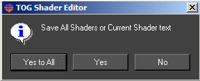
Choosing the Save All option will save all changes to all items of that category (state, material or texture) that have changed. Saving a shader also saves its material, state and texture.
Advanced Shader tab
The Shader tab contains all the settings associated with assigning its 3 sub-components. See below:
- Shader
- Material
- State
- Texture
Note: Only 2 textures can be applied in Swift: Texture0 and Texture1
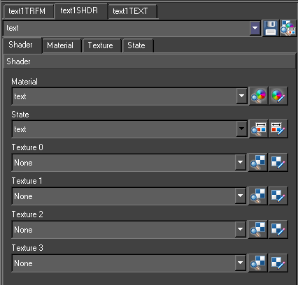
Advanced Material Tab
The Material tab contains all the properties associated with the material only. See below:
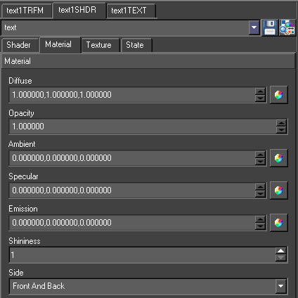
Note: A Material can be shared by more than one Shader.
Diffuse
Specifies the diffuse material colour used for lighting. The Diffuse colour is perceived as the colour of the object itself. It is the colour that the object reveals under pure white light. Type in RGB values or use the colour wheel icon to select a colour.
Opacity
Specify an explicit alpha value for an object via it’s material. Controls the degree of transparency of an object. Type in a normalised value, where 1 is fully opaque and 0 is totally transparent.
Ambient
Specifies the ambient material colour used for lighting. Ambient light is generalized lighting not attributable to the direct rays from a specific light source. Without ambient light, objects in shadow would be completely black. Type in RGB values or use the colour wheel icon to select a colour.
Specular
Specifies the specular material colour used for lighting. Specular colour is what we most commonly think of as a highlight. The colour of a specular highlight is typically the colour of the light source itself. The highlight size is controlled in turn by the “Shininess” value. Type in RGB values or use the colour wheel icon to select a colour.
Emission
Specifies the emission material colour used for lighting. Emission works exactly like Ambient colour, and can be thought of as “self illumination”. Type in RGB values or use the colour wheel icon to select a colour.
Shininess
Specifies the specular exponent of the surface. The Shininess controls the spread of specular highlight. Enter a higher value to achieve small, tight highlights. Enter a lower value to achieve a very shiny, burned out highlight.
Side
Specifies whether this material is set for the front, back or front and back of the object.
Advanced Texture Tab
The Texture tab contains all the properties associated with the material only. This page contains all the controls for setting up a shaders texturing. It handles just one texture at a time. The texture tab has 8 sub menus, each relevant to a particular aspect of how to manipulate and apply bitmapped images and video sources to the surfaces of objects. See below:
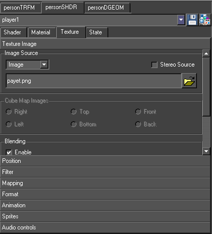
Texture Image sub-menu
Select this checkbox and use the browser to locate an image or video file saved on disc, normally in the projects /GMData/Images directory.
Video I/P1 through I/P4
Select this checkbox for assigning incoming live video source other than the main squeezed source. Checking this box will cause the video data to be fed into the texture.
Cube Map Images
Cube maps are not supported in Swift
Blending
The Blending modes supported in Swift are:
Modulate
Multiply texture colour with material colour
Decal
Mixes texture colour with material colour using texture colour alpha
Blend
Blend texture colour with blend colour
Blend Colour uses the colour wheel icon to select a blend colour
Replace
Replaces material colour with texture colour
Add
Adds texture colour and material colour
Position sub-menu
Position is used to apply a transformation to the texture coordinates prior to applying the texture to the model – this moves, rotates and scales the texture on the object surface. See below:
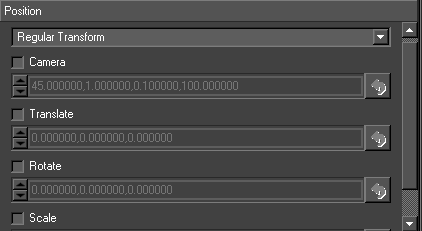
Camera
Specifies a camera perspective transformation to apply to the texture coordinates. The four values are in order field-of-view, aspect ratio, near clip plane and far clip plane. This is used for projective texture e.g. the texture is like the film in a cinema projector which is projected onto the screen and audience.
Translate
Specifies a translation to the texture coordinates.
Rotate
Specifies a rotation to the texture coordinates (specified as x, y, z angles).
Scale
Specifies a scale factor to the texture coordinates.
Note: Swift only supports transforms and scales on the x and y axis, and the z axis on rotations only.
Filter sub-menu
Filtering controls the appearance of the texture image when it is rendered smaller or larger than its original size. There is a performance versus quality trade off with different filtering options. The filter settings are:
Minification
The texture minification function is used when the texture must be shrunk in size. For example if the user has a 100 pixel texture that needs to be applied to a 10 pixel wide geometry, set the minification process to one of the settings below:
- Nearest
- Linear
- Nearest MipMap Nearest
- Linear MipMap Nearest
- Nearest MipMap Linear
- Linear MipMap Linear
Magnification
The texture magnification function is used when the texture must be enlarged in size. For example if the user has a 10 pixel texture that needs to be applied to a 100 pixel wide geometry, set the magnification process to either Nearest or Linear.
Flicker Enable
Accepts a number between 0 and 16 and controls the level of Anisotropic filtering. The cost of this becomes more expensive the higher the level of flicker filtering applied. Click the checkbox and enter a value (default 2).
LOD (level of detail)
Specifies the range of level of details to use for MipMap selection. Enter minimum and maximum level of detail (default 0, 99).
Level
Specifies which MipMap levels texture data is available for/generated for. Enter Base level and Max Level values (default 0, 99)
Mapping sub-menu
Mapping is not supported in Swift
Format sub-menu
The page sets the format of the texture as a whole (e.g. 1D, 2D etc.) and the format of each pixel (e.g. RGBA etc.). See below:
Target:
Target 1D specifies that the image is a row of pixels. Target 2D specifies that the image is a grid of pixels. The image dimensions should be powers of 2 otherwise the graphics card will use time to scale the image.
Texture Cube Map:
Specifies that six 2D images are required and that they surround the textured objects as the sides of a cube e.g. sky boxes. The images should all be the same size.
Texture 3D:
Specifies that the image is a 3D grid of pixels.
Texture Rectangle:
Specifies that the image is a grid of pixels. The image dimensions need not be powers of 2.
Internal Format:
Most of the items in this drop down have numbers to correlate with their colour bit information. They have been omitted from this documentation.
|
Option |
Description |
|
Alpha 4/8/12/16 |
Read the image as an alpha |
|
Luminance 4/8/12/16 |
Read the image as luminance (Brightness) |
|
Luminance Alpha |
Read the image as luminance + alpha |
|
Luminance32f Arb |
Read the image as 32bit luminance |
|
Intensity 4/8/12/16 |
Read the image as intensity |
|
R3 G3 B2 |
Read the image as RGB332 |
|
RGB 4/8/12/16 |
Read the image as RGB |
|
RGBA 4/8/12/16 |
Read the image as RGB with Alpha |
RGBA is default and will suffice for most images, if the image lacks alpha then there may be some performance gain changing the format to RGB, likewise if there is no colour there may be some performance gain switching to Luminance.
Wrapping
Controls whether the texture will tile on the surface it is applied to.
“Repeat” will tile the texture, “Clamp” will disable the tiling and “Clamp to Edge” will repeat the texture’s edge.
- S = Horizontal
- R = Depth, (Not used in Swift)
- T = Vertical tiling.
Note: When not working with tiled textures setting the texture to “Clamp” may not improve performance.
Animation
This section allows the user to alter Motion Video/TMV playback in Swift.
Bounce
When this is enabled, the TMV will rewind itself when it reaches the end of its loop.
Frame Delay:
Number of frames to delay the video’s playback by. For example, if the video is 25 frames per second, using a frame delay of 25 will play back the video at 1 frame per second.
Number Loops:
The number of loops the video will play before stopping. Setting this number to 0 will play the video infinitely.
Information:
This box contains some information about the video that is loaded.
Number of Frames: This is only available for TMVs, it will display the number of frames in the TMV.
Dimensions
How large the video is in pixels, width then height (resolution)
Reset Image:
Resets the video before playing, best left enabled.
Note: Reset Image needs to be enabled in order to use the Pause on Load checkbox under the “Miscellaneous” section.
Sprites
This menu allows the user to control the sprites texture coordinates. This is not useful for Swift.
Wrapping:
Texture wrapping controls how the texture data is referenced when texture coordinates are outside the standard range of 0…1. For a repeating pattern the mode would be set to repeat, but if only a single copy of the texture image should be displayed the mode would be set to clamp.
Repeat:
Causes the texture to be repeated i.e. the texture point referenced by the coordinates 1.5 is the same as the texture point referenced by 0.5.
Clamp:
Causes the texture to not be repeated. When texture coordinates outside the range 0…1 are encountered the values are simply clamped to the range 0…1. This results in the colour value from the edge of the texture being used at any locations where texture coordinates are outside the 0…1 range.
Clamp To Edge:
Very similar to clamp, but ensures that the colour value that is repeated is the exact value that occurs at the edge of the texture rather than an interpolated colour.
Animation sub-menu
This page sets the parameters for animated textures (for textures with a movie file as an image source as opposed to a single image).
Frame Delay
Specifies the number of frames to delay the animation by.
Number Loops
Controls the number of times the animation is looped.
Bounce
Controls how the animation loops. If bounce is enabled, once the end of the animation is reached the animation will play backwards from the end back to the start rather than jumping straight from the end back to the start.
Sprites sub-menu
This page sets up the generation of texture coordinates for point sprites.
Audio sub-menu
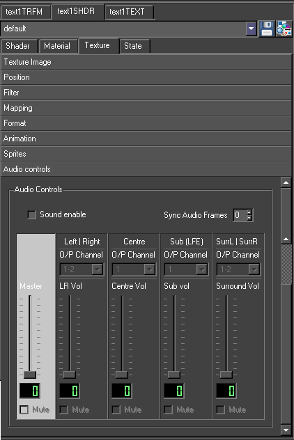
Sound Enable
Enables sound on the template
ync Audio Frame
Provides ync audio Frame options
Advanced State Tab
Most state parameters have both an Enable and an On/Off control. On/Off refers to whether or not the particular state is controlled in the Shader.
Enabling or disabling a state is only used if the particular type of state control is set to be on. For example if depth control is set to On, this means that the depth buffer tests are affected by this Shader. Then there are two possible options:
Enabled is checked – this means that the depth buffer tests are set by this Shader (because the control is set to on) and the test is set to be enabled.
Enabled is not checked – this means that the depth buffer tests are set by this Shader (because the control is set to on) and the test is set to be disabled.
If a state doesn’t specify a value for a piece of state (the control is set to Off), then the state will be set to its default value.
General sub-menu
The general options are added to cut down the complexity of the state editor. For a full description of each option see the relevant section.
|
Option |
Description |
|
Reset |
Enables all of the options below |
|
Backface culling |
Enable / disable backface culling |
|
Lighting |
Enable / disable lighting |
|
Depth test |
Enable / disable depth test |
|
Transparency |
Sets the blending to be SRC_ALPHA, ONE_MINUS_DST_ALPHA |
|
Key |
Sets the alpha blending to be ONE_MINUS_DST_ALPHA, ONE |
Depth Control sub-menu
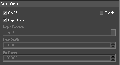
|
Option |
Description |
|
Depth |
Alters how and whether depth buffer tests are used whilst rendering |
|
Depth Mask |
Controls whether or not the depth buffer is written to whilst rendering. Default value is true |
|
Depth Function |
Controls the depth test function to use when rendering . Default value is Lequal |
|
Near Depth |
Modifies the smallest possible value in the depth buffer. Default value is 0 |
|
Far Depth |
Modifies the largest possible value in the depth buffer. Default value is 1 |
Blending sub-menu
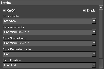
|
Option |
Description |
|
Blending |
Controls how rendered pixels are combined with existing pixels already in the output |
|
Source Factor |
Controls how the colour value obtained from the object currently being rendered is used to control the output. Default value is Src Alpha |
|
Destination Factor |
Controls how the colour value obtained from the screen buffer being rendered to is used to control the output. Default value is One Minus Src Alpha |
|
Alpha Source Factor |
Controls how the alpha value obtained from the object currently being rendered is used to control the output. Default value is None |
|
Alpha Destination Factor |
Controls how the alpha value obtained from the screen buffer being rendered to is used to control the output. Default value is None |
|
Blend Equation |
Specifies an equation used to combine source and destination pixels together. 1 Default value is Func Add. 1 Min or Max overrides any settings for source and destination factors |
|
Add |
Computes the source and destination values using the specified factors and then adds the blended source and destination values together to produce the final output. This is the default mode of operation |
|
Subtract |
Works like add but performs a subtraction of the blended destination value from the blended source value |
|
Blend Colour |
Specifies a colour value to use when a constant blending factor is chosen |
Lighting sub-menu
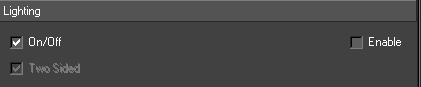
|
Option |
Description |
|
Lighting |
Controls the lighting state underneath the Shader node |
|
Two sided |
Lights both the back side and front side of the object |
|
Shader Model |
Smooth or Flat and indicates whether or not lighting values are interpolated across individual polygons. If the model is set to flat each polygon will be shaded with a single lighting value. Default value is Flat |
|
Colour Control |
Single Colour or Separate Specular. This controls how the specular lighting is applied to the object. With separate specular the texture is modulated with the ambient and diffuse lighting terms and then the specular component is added on top to give a noticeable highlight. Using single colour means that the combined ambient, diffuse and specular terms are used to modulate the texture. Default value is Single Colour |
Operations sub-menu
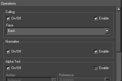
|
Option |
Description |
|
Culling |
Culling refers to the removal of polygons that are not facing the camera during rendering. The culling cuts down on the amount of rendering that needs to be performed and hence improves performance. Culling however only works when an object is a completely closed piece of geometry. Hence in certain situations culling needs to be disabled. A polygon is defined as back facing if the normal of the polygon is facing away from the camera. Front facing polygons are ones whose normal are facing towards the camera |
|
Normalize |
Controls whether the graphics hardware re-normalises the surface normals passed to it. This is used when a supplied piece of geometry does not have unit length surface normals. If surface normals are not of unit length lighting calculations will not behave as expected as they expect unit length surface normals. Visually normals not being correctly normalised will appear as overly bright lighting with very coarse highlights |
|
Alpha Test |
Alpha test specifies a test function and a test value. Each pixel is evaluated by comparing the current pixels alpha value using the comparison function against the reference value and if the expression evaluates to true the pixel is rendered otherwise it is disregarded. Action: The comparison function used in the alpha test. Reference: The value used in the comparison operations |
|
Scissor Test |
Scissor test evaluates each pixel being drawn against a bounding box. If the pixel is inside it is drawn otherwise it is disregarded |
|
Box |
The location and dimensions of the box. The box is specified in screen space coordinates |
|
Colour Mask |
The colour mask specifies which colour channels are written to when pixels are written out to the display. By default all three colour channels and the alpha channel are written to |
|
Red, Green, Blue and Alpha |
Controls which channel is written to |
Points sub-menu
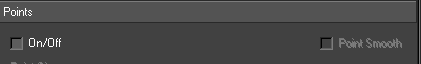
This page controls the parameters for rendering points. These values are only applicable if an object is being rendered using points.
|
Option |
Description |
|
Point Smooth |
Controls whether the points are drawn using alpha blending or not to produce smooth edges |
|
Points Size |
Specifies the size to render the point in pixels |
|
Min Point Size |
Specifies the minimum size to render the point in pixels |
|
Max Point Size |
Specifies the maximum size to render the point in pixels |
|
Distance Attenuation |
Specifies constant, linear and quadratic attenuation terms for the point size. The attenuation is based on the distance of the point from the camera |
|
Fade Threshold |
Is a size in pixels which if the size of a point is above it’s alpha value will be modulated to fade the point out |
|
Lines sub-menu |
Specifies the width of any lines drawn. This value is only applicable if an object is being rendered using lines |
|
Line Width |
Specifies the width of the line in pixels |
Polygons sub-menu
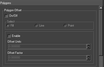
|
Option |
Description |
|
Polygon Offset |
Polygon offset affects the depth values written to the depth buffer when a polygon is rendered |
|
Polygon Face Mode |
Polygon face mode controls how polygons are drawn – either as filled polygons, lines or points. Lines are drawn for each edge of the polygon or points for each of vertex of the polygon. Different drawing modes can be specified for back and front facing polygons (see for more details on back and front facing polygons) |
Stencil sub-menu
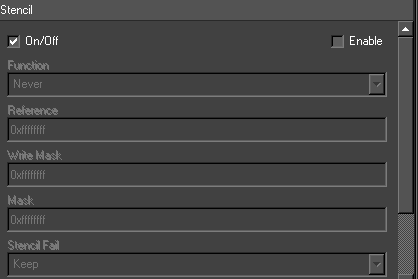
This is advanced OpenGL functionality and requires an in depth knowledge of OpenGL to use.
|
Option |
Description |
|
Function |
Stencil test (None, Less, Lequal, Greater, Gequal, Equal, Not Equal, Always) |
|
Reference |
Reference value for stencil test |
|
Write Mask |
The stencil bit planes to be written to |
|
Mask |
Used in the stencil test |
|
Stencil Fail |
What to do if the stencil test fails (e.g. Keep, Zero, Replace, Incr, Dec, Invert) |
|
Depth Fail |
What to do if the depth test fails (e.g. Keep, Zero, Replace, Incr, Dec, Invert) |
|
Depth Pass |
What to do if the depth test passes (e.g. Keep, Zero, Replace, Incr, Dec, Invert) |
Playout Editor
Overview
This manual covers the Playout mode of Swift. Playout provides a user interface to play out stacks of templated graphics in Swift. An operator can stack graphics and methods, configure graphic elements (for example, changing text), and play them out. The aim of this manual is to provide the user with the knowledge necessary to operate Swift in Playout mode. This manual assumes that you have already built or been provided with your graphics.
Terminology
This is a glossary of commonly used terms.
Graphic Template
A graphic that is built in design and edit. It is called a template because it expects additional information to be provided before it can be broadcast. For example, a templated lower third strap would be built to accept any text line.
Page
A page is a templated graphic that has been filled out with the relevant information. You can have multiple pages for each templated graphic, and each of those pages can provide different information. For example, a templated graphic that displays a lower third strap may be paged twice, once with the presenters name and one with a story headline. There is no limit to the number of pages that can be created from a templated graphic.
Stack
The stack provides a list of pages in a particular order. These can be played through in order, or out of order depending on your workflow.
Method
A method is part of a templated graphic. Each method will make a graphic behave in a certain way. Some common examples are methods to animate a graphic on, animate a graphic off, and to change the information displayed on a graphic.
Preview
Preview lets you view what a page will look like without taking it to air. This is done by showing only the last frame of the animation.
Object Transition
Playout graphics can be setup to animate automatically when certain graphics are played in sequence. This is achieved using specially named methods, and the process is called Object Transitions. See the design and edit manual for more details.
Workflow
This section describes the steps in the process of bringing graphics from the design stage through to being broadcast live.
Swift Editor
- Add inputs for customization
- Generate interfaces
- Save template
Playout Editor
- Select template
- Modify settings
- Add to stack
- Playout stack live
Playout workflow and rationale
Playout is one of the interfaces an operator may use to test or play graphics to air on a Swift system.
- Graphic Templates for Playout are built using Swift.
- This involves adding inputs, which allow the graphic to be customised from with the Playout interface.
- The interfaces that are used within Playout to customise the graphics are automatically generated based on the inputs that you provide.
- Finally, the graphic template is saved.
- This graphic is then available in Playout.
- An operator selects a template and populates the template with information.
- A populated template is called a page.
- The page is then added to the stack, and is then ready to be played out.
- If the operator makes a mistake, he can simply reselect the page in the stack and modify its contents.
- To play a page in the stack, the operator selects the graphic to playout, and presses take.
Setup for standalone Playout (with no preview)
A Playout system may be used in various configurations depending on your exact requirements. The following is a typical example of how Playout would be used as part of the Swift Pro solution. The simplest Playout system is a standalone machine, with Swift only. No special setup is required in this case. The operator sees the same live output on their Playout interface as what is seen on the video output.
Manual Operation
Entering Playout Mode/Interface
Playout mode can be activated from the View menu (View->Switch To Playout Mode), or by clicking on the playout icon on the toolbar.

You can also switch to playout mode by pressing the Escape key. You can also launch Swift directly into Playout mode by using the relevant launcher icon.
The interface consists of six main sections
- Preview window
- Control buttons
- Stack
- Graphic templates browser
- Method browser
- Graphic interfaces
There is also a set of tools on a toolbar at the top of the template interface for managing the templates and template directories.

Playout Toolbar
|
Tool |
Description |
|
A |
Open Project |
|
B |
Project Settings |
|
C |
Preferences |
|
D |
Screengrab |
|
E |
Generate icon for current script |
|
F |
Performance Dialog |
|
G |
Toggle (show or hide) Method browser |
|
H |
Toggle (show or hide) User Interfaces |
|
I |
Loop stack playback |
|
J |
Video attached and detected (turns green from red if detected) |
|
K |
Video attached and synchronised (turns green from red if detected) |
Preview window (1)
The preview window shows graphics on the operators screen. When the operator is taking graphics to air, the preview window will show the same graphics as are going out live. If your system is setup with preview enabled, the preview window will show you the next graphic that is going to be aired.
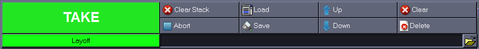
Control Buttons (2)
TAKE
The take button broadcasts the current graphic or cue’s the current graphic if it is on a cue point. The graphic will also appear in the preview window. The button will change from green to red while the graphic is animating. Once the animate is complete the Take button will revert to green. Note that the stack is inoperative while the graphic is animating.
Clear Stack
Clears the stack, but does not abort any running graphics.
Abort
Aborts all graphic. This will also abort all on air graphis. The selection is returned to the top of the stack.
Load and Save
Stack Loads a graphics stack from file and appends it to the end of the current stack.
Up and Down arrows
Moves the currently selected graphic or method up in the stack.
Clear (F11)
Aborts the current graphic and clears the stack. This will stop the graphic from being broadcast.
Delete
Script Deletes the currently selected script from the stack.
Layoff
Render the current stack to a movie file or image sequence.
Stack (3)
The stack holds a list of graphic instances that are setup and ready to be run. Each graphic shows the name of the graphic, an image representing the graphic, and details of the contents of that graphic.
The graphic that is currently live is highlighted in RED in the stack. The graphic highlighted in BLUE is the graphic that will be taken to next. Usually, this will be the next graphic in the stack, but you can choose a new graphic by clicking it with the mouse.
Selecting a graphic will also make it active for modification via the graphic interfaces, and make it the target for stack manipulation.
Graphic template browser (4)
The template list contains all of the graphic templates known to the Swift system. A graphics template needs to be populated with content to make a graphic that can be taken to. For most graphics, content consists of textual content, but also covers alignment of text, the size of font to use, and other aspects of the graphic that are user-definable.
As well as graphics templates, the template list also shows stacks. A stack may hold a single graphic or multiple graphics. These graphics already have their parameters specified and there is no custom interface for a stack. When you drag or double click a stack, it will be expanded into the graphics stack in the same ways as if you had loaded it using the Load Stack button.
The directory tree to the left of the graphics allows you to navigate and manage your graphics. You can create directories in which to store stacks and pages, and you can drag stacks, pages and graphics from one directory to another by dragging between the directories.
Method browser (5)
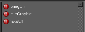
The method browser exposes the methods within the template to the operator.
Graphic interfaces (6)
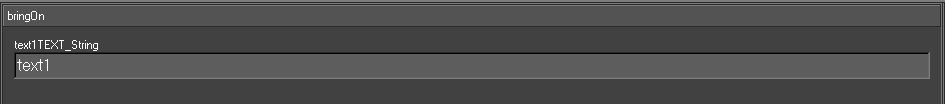
When you select a graphic in the stack or in the graphic template list, a relevant interface will open up.
Each interface is custom built for it’s graphic to allow the relevant content to be entered. For instance, the example shown to the right is designed for one line straps, and allows you to change the alignment of the text, the text itself, and the font size.
If you select a graphic from the graphic stack the interface will be populated with the values for that graphic. If the graphic was selected in the graphic template list, the interface will keep the values last entered into it.
Note : Some graphics, such as the SubsBug and NextBug graphics have no available options for the user to select. In these cases, the interface will remain on the last interface it was on, and is not used by the graphic.
All of the graphic interfaces have two common buttons at the top. The UPDATE button updates the graphic currently stacked.
Operations
Stacking a graphic
To stack a graphic, you can :
- Drag and drop a graphic from the Graphic List (4) into the Stack (3).
- Alternatively, double click the graphic in the Graphic List (4) The graphic will appear as the last item on the stack.
Editing a graphic
A stacked graphic will display a user interface (6) containing parameters that you can change. The parameters and the makeup of the user interface are set up as part of the procedure for editing the graphic. (For more details, refer to Inputs in the Design and Edit Manual)
Note: Editing the values in the user interface will automatically update the graphic in the stack. In order to see the changes on output, you must take the graphic again.
The current values for all graphics can be seen next to their name in the stack.
Selecting and taking a graphic
Select the graphic that you want to take by clicking on it. In the Stack (3). The selected graphic appears in blue.
To take a graphic, select the graphic in the stack, and press either the green Take button on the operator panel, or press the enter key on the numpad.
Whilst the graphic is animating, the graphic in the stack will turn red. Once it has finished animating, it will turn green.
NOTE – if the graphic has finished, the selection will now point at the next graphic in the stack, and pressing take will take this graphic.
NOTE – Some graphics are multi-stage, and require a number of takes to fully animate.
Rearranging the Stack
Graphics in the stack can be rearranged by:
- Click and dragging a graphic somewhere else in the stack. The graphic will be moved after whichever item you drop it on.
- Alternatively, use the Up and Down Operator Buttons (2)
Clearing Stacked Graphics
- To delete a graphic from the stack, select the graphic and click on the Delete Operator Button (2)
- To abort all graphics and clear the stack, click on the Clear Operator Button (2). Alternatively, you can use the keyboard shortcut F11.
Aborting a Graphic
To abort the currently running graphic, click the Abort Operator Button (2). Alternatively, you can use the keyboard shortcut F12.
- Abort will clear all Swift output. You can then run graphics from fresh.
Playing methods
A graphic may contain a number of methods. Each method is a way in which the graphic can be animated. Methods are created as part of the graphic design process.
Any methods that were exported when designing the graphic can be selected and played back directly from the Playout interface.
To view available methods :
Press the Show/Hide Method Player toggle on the toolbar above the script chooser.
- This shows the Method List. (5)
- The method list shows you available methods for the graphic. If this list is empty, the graphic does not have methods.
To stack a method :
- Double click a method to add it to the stack.
NOTE : methods appear indented beneath the graphic that they run on. Methods cannot be mixed with methods from other graphics.
To play a method :
The graphic must have been played first.
- Click on the method in the stack, and hit take.
- Methods can contain editable parameters, these can be updated in the same way as they are for graphics.
Loading and Saving Stacks
A stack of graphics, including all parameter values, can be saved for use at a later date. To save a stack for later use, click on the Save Stack button. A file dialog will open allowing you to save the stack with the name of your choice.
You can insert a predefined stack or page to the current stack by clicking on the Load Stack Operator Button (2). An open file dialog will appear that allows you top select a predefined stack and load it.
Stack Looping
In some situations it is useful to set a stack of graphics to play automatically and continuously loop. This is useful when testing graphics, or if using Swift in a demonstration mode. Turn on stack looping to do this.
Page Stacks
A page stack allows you to recall one or more graphics by typing in a page number. To create a page stack :
- Setup the stack of graphics as normal.
- Click on Save Stack.
- When asked to give the stack a filename, save it as the page number that you want to recall it on. For example, naming your stack 524 will allow it to be recalled using that page number.
To recall a page stack :
- Hold down the Alt key
- Type the page number of your stack on the numeric keypad.
- Release Alt
NOTE: Calling a page stack will automatically clear any stack that you currently have loaded and replace it with the page stack. The first graphic in the stack will be taken automatically.
The loaded stack will be inserted after the next graphic (highlighted in BLUE on the interface).
Note: If you want the loaded stack to replace the current stack, click the Clear Stack button or press F11 first.
Layoff to disk
You can render a stack of graphics to disk as a movie or an image sequence. In Swift, this is called Layoff. To choose your recording format, open the Preferences, and go to the layoff tab. The user can specify how Swift will layoff graphics to disk here.
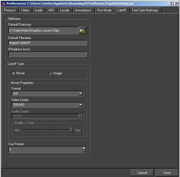
Destination Directory
The files are written to this directory.
Destination Name
The files have the form (for an image sequence) <Destination Name>@0000.png.
Format
Choose the file format to layoff to. Image formats will layoff to image sequences, while movie formats will lay off to movies. Recommended image formats are png, jpg, tga. Recommended movie formats are mov, avi.
Cue Frames
When laying off, Swift does not pause for cues but it will loop on the current frame for Cue Frames.
Separate Alpha
Write the alpha of each frame as a separate file.
Field Render
Combine successive pairs of frames by interlacing their fields.
Odd Field Dominance
Frames are interlaced by using the odd field of the first frame with the even frames of the second. Turning this off reverses this behaviour.
Movie Bit Rate
Sets the bit rate for movies i.e. the smaller the bit rate to poorer the quality and vice-versa
Video codec
If using video, also specify a video format. Depending on your chosen codec, you may want to set the bitrate as well. The following codecs are supported :
Mpeg2
Lossy encoding, can only lay off the fill channel.
Mpeg4
Lossy encoding, better quality at comparable bitrates to mpeg2, takes longer to render. Can only lay off the fill channel.
UNCOMPRESSED
Uncompressed, Fill channel only. Best quality but very big filesize.
UNCOMPRESSED+A
Same as UNCOMPRESSED, but also saves the Alpha channel.
HUFFYUV+A
Lossless compression, Fill and Alpha channel. Roughly half the file size of uncompressed.
Controlling Multiple Playouts
Playout systems can be set up to communicate with each other, allowing synchronised output from multiple machines from a single user interface. It can also allow multiple user interfaces to control a single live machine.
When using playout, the common protocol to use is the Render protocol. To set this :
- Open preferences.
- Go to the protocol tab
- Set the protocol to Render
Some examples of when you would connect multiple Playout systems together :
A multi-camera VR set
Each camera output is rendered using a seperate Swift machine. The operator controls all cameras from a single machine.
A newsroom system
A Playout machine may be controlled directly, as well as from multiple other content providers withing the system.
Preview
When preview is a requirement, two Swift machines can be connected. One will be set up as a Preview machine, the other will be set up as the Broadcast machine. They will communicate to provide preview/live functionality.
Render mode in Swift allows the user to connect Swift to other renderers. The render mode makes this seamless from the user’s point of view. A Playout system can be either a Master or a Slave. A master controls the user interface, and tells the Slave what to render. A Slave can accept connections from multiple Masters.
Port Number
The port number for socket connections between the systems.
Address
The server address. This is only required by a Master, it is blank for a Slave.
Examining the Scenegraph
It is sometimes useful when testing graphics to view the scenegraph from within playout.
NOTE: This functionality is provided for testing purposes only. Changes made to the scenegraph are not saved once the graphic is cleared. Shader changes can be saved. Making modifications to the scenegraph from within playout is allowed, but the results can be unpredictable and may cause the system to crash or hang. Do not use the scenegraph view from within playout on a mission critical machine.
To view the scenegraph, Press F9. For more information on the scenegraph, see the Design and Edit documentation.
Document Summary
This manual has covered the Design & Edit mode of Swift in varying levels of detail. After completing training and tutorials, the user should be familiar with basic operations in Swift and be able to use this manual as reference and reference support.
Training, including video tutorials, onsite and remote modes of learning are all supported for every Swift use-case environment. For more information please visit:
https://rtsw.co.uk/training-courses_/
Further information
Please refer to further documentation for control interfaces, asset management, infrastructure and sports products.
Release Notes
APPENDICES
1: Asset preparation
The purpose of this appendix is to outline and detail the steps required to produce MXF wrapped XDCAM assets for use with Swift graphics tools.
1.1: Using ffmpeg from the command line
Swift is compatible with ffmpeg.
Movies without embedded audio
In this example a clip called Show_01_Footage.mov will be transcoded to a clip called output.mxf:
|
ffmpeg -i Show_01_Footage.mov -pix_fmt yuv422p -vcodec mpeg2video -non_linear_quant 1 -flags +ildct+ilme -intra_vlc 1 -qmax 3 -lmin “1*QP2LAMBDA” -rc_max_vbv_use 1 -rc_min_vbv_use 1 -g 1 -b:v 50000k -minrate 50000k -maxrate 50000k -bufsize 8000k -an output.mxf |
For image sequences
In this example an image sequence starting Footage_00001.png will be transcoded to a clip called output.mxf:
|
ffmpeg -f image2 -i “BS40702_%05d.tga” -pix_fmt yuv422p -vcodec mpeg2video -non_linear_quant 1 -flags +ildct+ilme -intra_vlc 1 -qmax 3 -lmin “1*QP2LAMBDA” -rc_max_vbv_use 1 -rc_min_vbv_use 1 -g 1 -b:v 50000k -minrate 50000k -maxrate 50000k -bufsize 8000k -an output.mxf |
Note: Ensure that smart quotes is turned off
1.2: Using Adobe After Effects
Once you have added your comp to the Render Queue, choose the following settings from the Output Module, Main Options tab.
Format
In the Main Options, Format drop-down menu list, choose:
- MXF OP1a
Audio
This format is not compatible with audio. Please see section on creating clips with embedded audio, later in this appendix.
- Ensure the Audio Output is off.
Video Output Module
In the Video Output Module, click the Format Options from the drop-down menu.
- Select XDCAMHD 50 PAL (4:2:2) Video Codec
1.3: Using Media Encoder
Launch Media Encoder and add your composite
Format for clips with no embedded audio
- Choose MXF OP1a
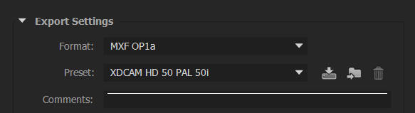
- Choose the XDCAMHD 50 PAL 50i (4:2:2) codec
Disable audio
- Ensure that the audio is turned off
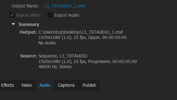
Advanced Options
Further options allow for correct settings for GOP parameters
- Check Force Fixed-length GOPs
- Check Force Closed GOPs
Field rendering
There are 2 options that are available for movie output:
- XDCAMHD 50PAL 25p
- XDCAMHD 50PAL 50i
Choose the correct option for your requirements
For clips that require embedded audio
- Choose the DNxHD MXF OP1a format
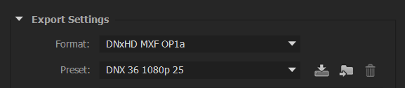
- Select the DNX 36 1080p 25 Preset
- Use the Default Audio settings
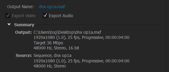
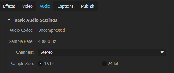
- Use the Default Video settings
2: Supported formats
The following input and output formats are supported in Swift.
Note: Standards are as follows:
- PAL
- NTSC
- 720p
- 1080i
- 1080p
2.1: Input wrappers
- avi
- mov
- mxf(op1a)
- mpg
- mp4
- m4v
- wmv
- dv
- flv
2.2: Input Codecs
- WMV1/2/3
- mpeg
- mpeg2
- mpeg4 pt2
- mjpeg
- H263
- H264
- ProRes
- AVC50/100
- DNxHD
- HuffyYUV
- MJpeg
- FLV
- VC-1
- DV25/50/100
- YUV420/2 (raw)
2.3: MPG output formats
- mpeg1
- mpeg 2
2.4: AVI output formats
- mpeg1
- mpeg2
- mpeg4
- mjpeg
- flv
- YUV422
- BGR
- BGRA
- Huffyuv
- Huffyuv+alpha
- targa
- dv – DV25/50/100*
2.5: MXF output formats
- DV25/50/100*
- AVC50/100*
- DNxHD
- mpeg2
2.6: MOV output formats
- qtRLE(animation)
- mjpeg
- mpeg2
- dnxhd
2.7: MISC output formats
- flv
- tmv (RT internal format)
Standards denoted * are only available with MainConcept License
Note: From sports, clips will be Upscaled/Downscaled to the currently configured standard: IntraFrame is preferred (GOP 1)
3: Command line arguments
There are a number of command line arguments with which you can start Swift to override the default preference settings.
|
Command Line Argument |
Description |
|
–help |
Show a help message listing available command line arguments |
|
–version |
Show the current version of Swift and exit |
|
–prefs <file> |
Load the specified preferences file instead of the usual preferences file. |
|
–project <file> |
Load the specified project instead of the project in preferences |
|
–customProject <file> |
Load the specified project instead of the custom project in preferences |
|
–noProject |
Do not load the project specified in preferences |
|
–noCustomProject |
Do not load the custom project specified in preferences |
|
–cue <port> |
Set the port for a serial cue device |
|
–run <runMode> |
Sets the mode that Swift will run up in, overriding the mode set in preferences. SWIFT must be licensed for the mode specified for this to work. Current available modes are playout, live, edit, and sports |
|
–preview |
Runs up Swift as a preview renderer |
|
–diags <true/false> |
Show or hide the diagnostics window in live mode. |
|
–remote <mosid> <ncsid> <encoding> <timeout> <upperport> <lowerport> |
Turn on remote mos control |
|
–cache |
Enable caching of scripts when running in the remote mos control mode |
|
–custom <addr> <port> |
custom plugin protocol control (use addr=none for server) |
|
–render <addr><port> |
tog->tog client/server (use addr=none for server) |
|
–plugin <dir> |
Specify a directory to load plugins from |
|
–sound <true/false> |
Enable sound |
|
–qscreen <0/1> |
dual Quadro SDI o/p |
|
–locale <locale> |
Choose a locale |
|
–analyser |
enable parallel port for logic analyser |
|
–dvsCard <#num> |
dvs video card number |
|
–systemDir <dir> |
override the Swift system directory |
|
–messagesDirectory <dir> |
directory for offline render messages |
|
–controlURL <url> |
control machine for remote scenegraph interaction |
|
–layerRouting |
Enables layer routing. See the layer node reference for more details. |
|
–SDI2 |
Enables a second set of SDI output channels, if available |
|
–mux |
Turns on Foreground/background alpha-muxing, compatible with Ultimatte external mixing. |
|
–vr <vr_type> <vr_file> |
Allows you to specify the VR tracking type and calibration file from the command line. |
|
–videoDisplayRender (true/false) |
Turns on or off the monitor render display |
|
–punditInterface <punditDir> |
Specify the name of the pundit .pro file from the command line. |
|
–skinDirectory <skinDir> |
Specify the tog sports pundit skin directory from the command line. |
|
–lws <web_directory> <port> |
Setup the tog web server from the command line. |
