Swift CG+ User Manual
The Swift CG + manual is the operators reference manual that details all the features, functionality and tools accessible in your version of Swift CG +. Some examples are given where appropriate to clarify use but to see more in-depth, training-related material on creative operational usage, techniques and workflows please refer to the appropriate training materials and tutorials

Reference Manual
| About | Description |
| Revision | 4.6_4 |
| History | For 4.6_1 to 4.6_4 versions |
| Authors | Jason Wood; Justin Avery |
Overview
About this manual
The Swift CG + manual is the operators reference manual that details all the features, functionality and tools accessible in your version of Swift CG +. Some examples are given where appropriate to clarify use but to see more in-depth, training-related material on creative operational usage, techniques and workflows please refer to the appropriate training materials and tutorials.
About Swift CG +
Swift CG + provides all of the tools required to create all graphics that can be ran through Swift. This includes
- Template graphics, which can be driven via Playout, or controlled remotely using Swift Live and a suitable Custom Control application
- Tactic Telestration graphics
- Rich touchscreen-driven graphics applications
- Graphics for use on systems that have an embedded dll.
- Swift CG + is used before transmission to produce the graphics that will be ran live.
Swift CG + has evolved around the premise that designers will originate graphics with traditional content creation applications – such as those from Adobe and Autodesk – and a Swift Live operator will then import them as “assets”. The imported assets are then used as components in the template creation process. The Swift CG + application provides the toolset that facilitates the templatisation of graphical content.
Swift CG + scripts and projects
All Swift CG+ graphics sit inside a project. A project contains all of the assets required by the graphics that are in it – Examples of assets are fonts, geometries and images.
Graphics are stored on disk as a Ruby Script, with the .rb extension. Ruby is a scripting language, details are available at https://www.ruby-lang.org. Due to this, it is quite common for the words “Graphic” and “Script” to be used interchangeably. They refer to the same thing.
The graphic file contains :
- Information on the scenegraph – the hierarchy of graphical elements that are required to render the graphic.
- References to assets, such as bitmaps, fonts and geometries
- Methods, which contain instructions on how to animate the graphic, which external data should be used to populate the graphic.
The Swift CG + gui
Swift CG +’s Graphical User interface borrows much from traditional content creation applications. Incorporating a 3d viewport with virtual camera paradigm will be familiar to all those working with any traditional 3d application. The scrubbable timeline, key frameable graphics, curves and scenegraph editors that enable flexible node-based editing, (adopting the standard parent-child hierarchy) will also be familiar to experienced editors, motion graphic designers and compositors.
The GUI also provides all the drag and drop tools that allow the user to establish MOS inputs, connections to database information, user code extensions, scripting and the capability of generating external interfaces specific to any given projects’ requirements that all IT specialists will be accustomed to.
Command line arguments
There are a number of command line arguments with which you can start Swift to override the default preference settings.
| Command Line Argument | Description |
| –help | Show a help message listing available command line arguments |
| –version | Show the current version of Swift and exit |
| –prefs <file> | Load the specified preferences file instead of the usual preferences file. |
| –project <file> | Load the specified project instead of the project in preferences |
| –customProject <file> | Load the specified project instead of the custom project in preferences |
| –noProject | Do not load the project specified in preferences |
| –noCustomProject | Do not load the custom project specified in preferences |
| –cue <port> | Set the port for a serial cue device |
| –run <runMode> | Sets the mode that Swift will run up in, overriding the
mode set in preferences. Swift must be licensed for the mode specified for this to work. Current available modes are playout, live, edit, and sports |
| –preview | Runs up Swift as a preview renderer |
| –diags <true/false> | Show or hide the diagnostics window in live mode. |
| –remote <mosid> <ncsid> <encoding> <timeout> <upperport>
<lowerport> |
Turn on remote mos control |
| –cache | Enable caching of scripts when running in the remote mos control mode |
| –custom <addr> <port> | custom plugin protocol control (use addr=none
for server) |
| –render <addr><port> | Swift->Swift client/server (use addr=none for server) |
| –plugin <dir> | Specify a directory to load plugins from |
| –sound <true/false> | Enable sound |
| –qscreen <0/1> | dual Quadro SDI o/p |
| –locale <locale> | Choose a locale |
| –analyser | enable parallel port for logic analyser |
| –dvsCard <#num> | dvs video card number |
| –systemDir <dir> | override the Swift system directory |
| –messagesDirectory <dir> | directory for offline render messages |
| –controlURL <url> | control machine for remote scenegraph interaction |
| –layerRouting | Enables layer routing. See the layer node reference for more details. |
| –SDI2 | Enables a second set of SDI output channels, if available |
| –mux | Turns on Foreground/background alpha-muxing, compatible with Ultimatte external mixing. |
| –vr <vr_type> <vr_file> | Allows you to specify the VR tracking type and calibration file from the command line. |
| –videoDisplayRender (true/false) | Turns on or off the monitor render display |
| –punditInterface <punditDir> | Specify the name of the pundit .pro file from the command line. |
| –skinDirectory <skinDir> | Specify the Swift sports pundit skin directory from the command line. |
| –lws <web_directory> <port> | Setup the Swift web server from the command line. |
Project Menu
Overview
Swift holds all of the assets and graphics required to run a show in a set of directories called a project.
The Project directory (shown to the right) contains a set of sub-directories. When creating a project, the user will choose the name of the Project directory and a project file will automatically be created with the same name, inside the Project directory.
The project is laid out under two directories:
- GMScript
- Templates
- Lib
- Stacks
- Save
- Backups
- GMData
- CGProgram
- Extruders
- FBX
- Fonts
- Geometry
- Images
- LineStyles
- Maps
- Materials
- Paths
- Plugins
- Shaders
- Skeleton
- Sounds
- StaticMaps
- Textures
- VR
GMScript holds the graphics files, and other files relating to the live playout of the graphics. GMData holds the assets that are used by the graphics.
The subdirectories and directories are automatically created and named by Swift and should not be renamed under most circumstances.
The project options are accessible via the Project menu or via the project toolbar.

New Project
To create a new project, click on the pull down menu “Project” and select “New” or click the new icon on the project toolbar. This will popup the New Project dialog:
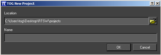
Select a suitable location and name for the project and press OK. A new project and all related subdirectories will automatically be created. The project directory and profile file (.prj) will have the name specified.
Open
Select Open from the project drop down or toolbar to open an existing project. This will pop up the standard file chooser. Navigate to the required project directory and select the associated .prj file. Once selected, any open project will be closed and the selected project will load into Swift.
Save
Select Save from the project drop down or toolbar to save your currently open project. The user will be prompted to save the current graphic and modified shaders.
Save As
Select Save As from the project drop down or toolbar to save the current project to another location. The user is prompted for a new project file name and directory. The project will then be saved to the new directory using the name provided.
Recently Opened
Selecting this from the project drop down will display a list of recently opened projects.
Selecting an item from the list will have the same effect as browsing for and opening a project via the Project -> Open menu option.
Close
Selecting Close from the project drop down or toolbar will close the currently opened project. The user will be prompted whether or not to save any changes which have been made to the project.
Project Settings
Selecting Project Settings from the project drop down or toolbar will pop up the Project settings dialog.
This shows the name and path of the currently loaded project, and the following tabs allow settings to be changed
Script Directories
This tab shows the directory paths inside of this project. It is possible to point these directories to new locations from this tab. However, this is very rarely needed.
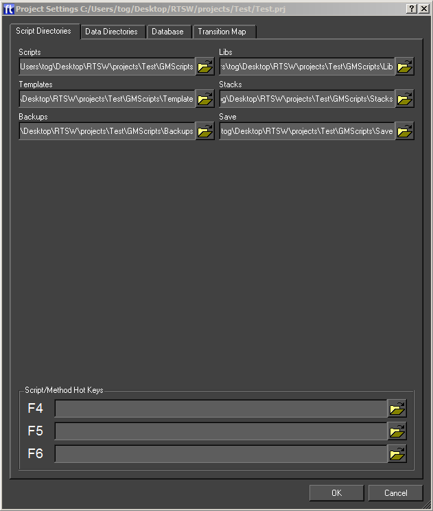
- Scripts – This is the top directory that contains the following:
- Templates – These are the main graphics that are run from playout, live or sports
- Libraries – These are reusable drop-in modules that may be used in templates.
- Stacks – This is the location of graphic sequences saved from playout or sports.
- Backups – This is the location of auto and manual backups made during edit.
- Saved Scripts – This is not used.
Hotkeys
In playout, it is possible to trigger graphics by using hotkeys. Up to three hotkeys can be created, on the function keys F4, F5 and F6
Data Directories
The Data Directory tab allows the user to specify locations project assets.
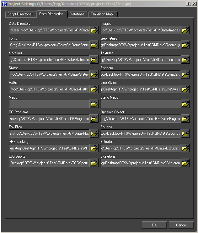
- Images
- Fonts
- Geometries
- Materials
- Textures
- States
- Shaders
- Paths
- Line Styles
- Maps
- Static Maps
- CG Programs
- Dynamic Objects
- Fbx files
- Sounds
- VR/Mix/Tracking Data
- Extruders
- Tog Sports
- Skeletons
To change the current location, click on the file chooser button, navigate to the new location and press OK.
Database
The Database tab allows the user to specify databases for this project.
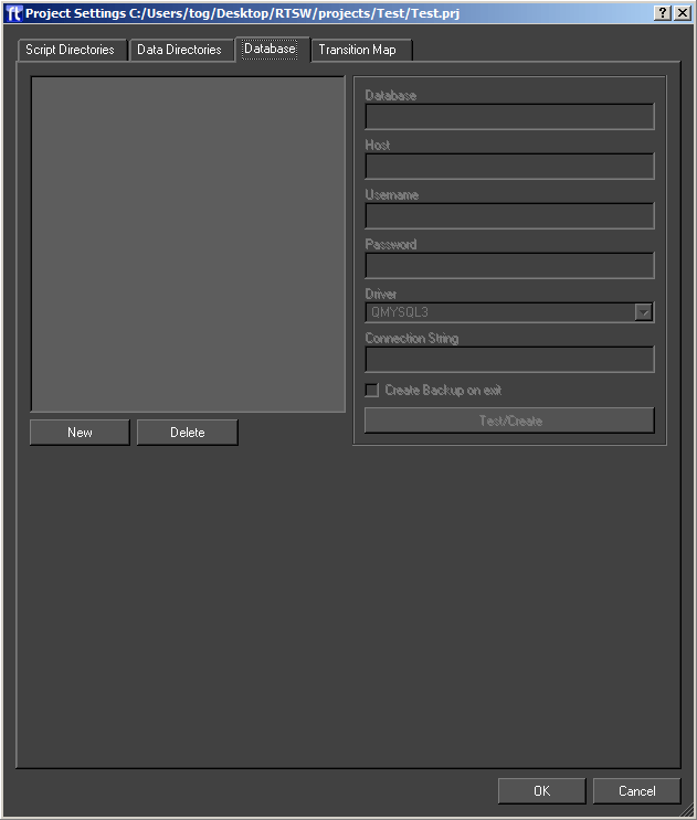
Databases are one means of providing external data to a graphic. See the section on Inputs under timeline. Swift has built in support for mySQL and any database that provides an ODBC bridge.
To create a new database click New and fill in the details. Remember to type return after each entry. Once the database is created click Test/Create to test the connection. If the database does not exist then you will be prompted to create it.
Clicking Delete will remove the database from the project. It will not drop the database from the database server.
| Option | Description |
| Database | The name of the database. |
| Host | Type the Host name of the database server in this field. This can be a URL or IP address. |
| Username | The username required to connect to the database server |
| Password | The password required to connect to the database server |
| Driver | Choose the driver that is correct for the database server. For Mysql, choose QMYSQL3, for ODBC database, choose QODBC3 |
Transition Map
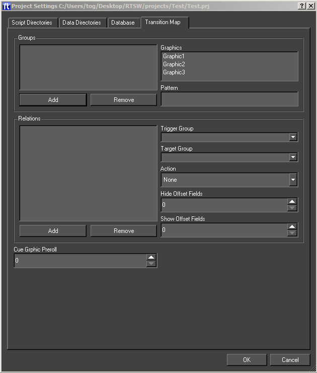
When running graphics in a live environment, it is a common requirement to have some level of automation over which graphics are on air, and which ones are not.
As a simple example, imagine that you have a Lower Third graphic, and a Full Form graphic. Having both on the screen at once would cause the graphics to overlap, so you want to make sure that both cannot be on screen at the same time.
You could do this manually, by calling the appropriate methods yourself, but this puts the workload onto the operator, who may make mistakes.
Transition Maps allow the logic of how graphics interact to be specified at design time.
NOTE: Changes to the transition map are only saved when Ok is pressed.
Groups
The transition map logic works as relationships between groups of graphics.
To add a group, click the Add button. To delete a group, click the Remove button.
A group can be anything that you wish. These would all be valid groups :
- Lower Third Strap
- Bug
- Full Frame Graphic
- Election Map
- Clock
- Stats Graphic
Graphics can be added to groups. A graphic can be in as many groups as is required. Taking the example groups as mentioned above, a clock graphic could be in both the Clock group, and the Lower Third Strap group. Similarly a hisSwiftram graphic might be in both the Stats graphic and the Full Frame Graphic groups.
The Graphics list shows a list of all graphics in the project, with graphics in the currently selected group appearing selected.
Ctrl+Click to select or deselect new graphics into the currently selected group.
Relations
Relations define actions that occur when a graphic is run in Swift. The type (action) of the relation will occur if :
- a graphic is currently on-screen from the source group.
- The graphic coming on is from the destination group.
The action will apply to all graphics that currently match these criteria.
The available actions are described in the following table:
| Action | Description |
| BringOn | Call the bringOn method of the graphic in the source group |
| TakeOff | Call the takeOff method of the graphic in the source group |
| HideShow | Call the hide method of the graphic in the source group when a graphic from the destination group leaves the screen. Once there are no graphics from the destination group on screen again, call the show method. |
Edit Menu
The Edit menu contains the controls for Undo/Redo, Preferences and configuration for External Devices.
Undo/Redo
Undo/Redo ia accessible via the Edit menu or via the toolbar. Swift supports undo/redo by saving the complete graphic before any operation that might alter it.

These undo/redo files are saved in the Backups directory of the project. The depth of undo/redo is only limited by disk space. The user can regress and progress through these files using the Undo and Redo tools on this menu.
Preferences
Overview
There are a range of parameters held within Swift which define its operational environment. Once specified, they do not usually change. They are accessible through the Preference Dialog under the Edit menu tab or the Edit toolbar. (You can also access these in Playout, Live and Sports). Note also that some of these parameters may be overridden through command line arguments (see page ).
Preferences are split up into the following sections:
| Tab | Description |
| Protocol | Communication protocols and cue devices. |
| Video | SD/HD Video in and out setup. |
| Audio | Audio pass through and output. |
| Style | Swift look and feel setup. |
| Locale | Where to look for things and defaults. |
| Annotations | Display and interaction setup. |
| Run Mode | Run up mode and debugging. |
| Layoff | Render to disk setup. |
| Text Safe Markings | Text and picture safe setup. |
Protocol Tab
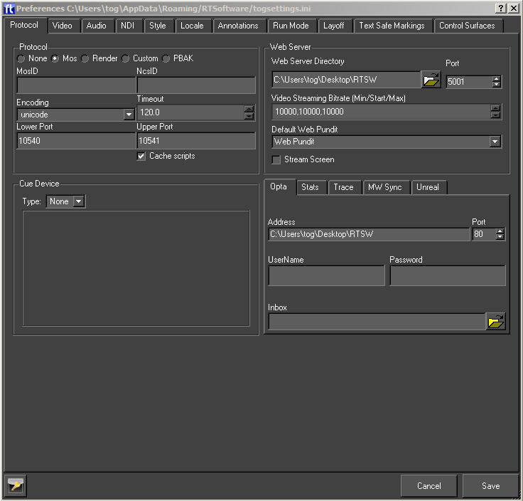
The protocol tab allows the setup of devices that control Swift, or that Swift can communicate with.
For more information on controlling Swift remotely, see the Swift Playout manual, and Swift Live manual.
Protocol
The Protocol section sets up a protocol that Swift will receive commands from.
None
Swift is not being controlled externally. This is the default
MOS
Swift can be controlled by sending MOS messages to it using sockets. This is mainly used for playing graphics and methods. The protocol is described in the Live manual.
| Parameter | Description |
| MosID | The identifier for the Swift system when running in Live mode. Included in all MOS messages sent between the systems. |
| NcsID | The identifier for the application controlling Swift remotely. Included in all MOS messages sent between the systems. |
| Encoding | The character set encoding of the messages, either unicode (utf8) or ascii. |
| Timeout | If a message is not received by Swift within this time the client application is disconnected. Usually, the systems should heartbeat each other more regularly than this timeout time. |
| Lower Port | The client application send commands on a socket connected to this port. |
| Upper Port | The client application reads status messages from a socket connected to this port. |
| Cache Scripts | If this is selected Swift will not clear out and destroy graphics after they are no longer needed. Swift keeps and reuses them. This speeds up loading. |
Render
Render mode in Swift allows the user to connect Swift to other Swifts. For more information, see the Playout documentation.
Custom
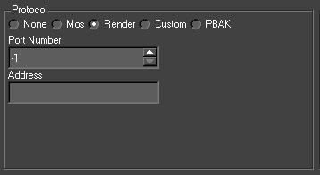
The Custom protocol tab allows a 3rd party to attach their own protocol layer.
This is achieved through the use of a shared object – either dso (linux) or dll (windows). This means that you can repurpose existing interfaces to drive Swift. See the Plugin manual for more info.
| Parameter | Description |
| Port Number | The port number for socket connections between the systems. |
| Address | The server address. This is only required by a client, it is blank for a server. |
Web Server
It is possible to communicate and control Swift over standard Web Protocols. For more information, see the Swift Web Api manual
| Parameters | Description |
| Web Server Directory | The Web Server Directory defines the root directory for the Swift web server. Any files in this directory or it’s subdirectories will be served up by Swift when requested via a HTTP request (for example, from a web browser) |
| Port | The port determines which port the Swift web server listens on. Setting the port to 0 disables the web server and the web APIs |
| Video Streaming Bitrate | Video streaming will adapt to the network constraints to provide the best experience possible. The bitrate will start at the Starting bitrate (the middle of the three values), and based on the performance of the network, the bitrate may grow up to but no more than the Maximum value, or shrink to no less than the Minimum bitrate. The bitrates are in kilobits/second. |
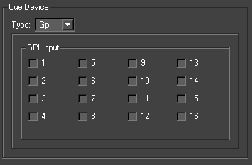
Cue Device
Swift graphics can contain cue points which allow sequences and animations to be paused. Cue devices provide a remote means of triggering cue points allowing the graphic to continue with the next animation block. Swift supports 3 device types, GPI, serial and Wii.
GPI
The gpi device consists of either 2 or 16 inputs depending on the device installed (see External Devices in the next section). Select the checkbox to assign which GPI channel triggers the cue.
Serial
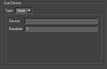
| Parameters | Description |
| Device | This defines the serial port address, It has the form /dev/ttyS0/1/2… under Linux and com0/1/2 under Windows |
| Device Baud Rate or Input Number | If the cue device is a serial port address then this will be the baud rate. |
Video Tab
The Video tab allows a user to specify the video devices in use, formats, size, filtering, keying etc for broadcast SD/HD video in and out. Note that depending on what you change, you will have to restart Swift for it to take effect (you will be prompted when this is the case).
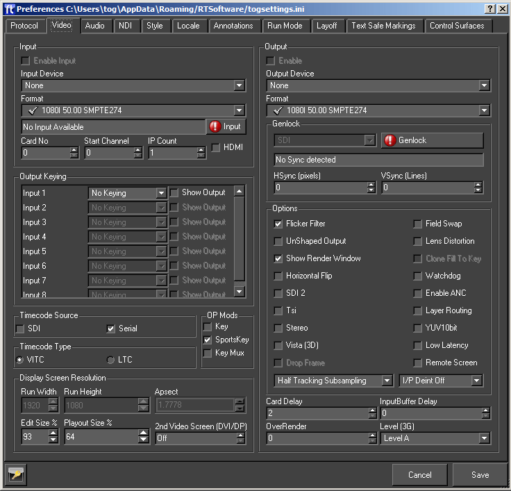
Output
Changes in this section require a restart of Swift to take effect.
| Parameter | Description |
| Enable Output | Enable the Video output. |
| Enable Stereo | Enables Stereo Output |
| GPU Direct | |
| Output Device | Select the required output device |
| Format | Select the video output format. |
When a video output device is chosen, certain options will automatically be selected (these are the default values for the device) and some will be greyed out (these are not supported by the device).
Once a device has been selected the output format can be chosen from the drop down list. The formats with a tick next to them are supported by the chosen card and the ones with a red cross are not supported.
Genlock
There is also a drop down menu called GenLock (Generator lock) which can be used to select (if not grayed out) which device will be used for synchronisation. The options are INTERNAL, COMPOSITE and SDI. If you choose COMPOSITE, you MUST have an analog composite (back & burst) signal connected to the video cards ref-in connector. If you select SDI then Swift will lock to the video input signal. Note that in both cases, if no signal is present then the video will lock to an internally generated clock.
Output Options
Each format has a different default setting for the options shown, these will be greyed out unless a custom format is selected, in which case they can be adjusted manually to suit the user.
Under the heading control there are seven checkboxes which can be selected (as mentioned above these will be set to the default settings of the chosen video device) this may involve some of them being grayed out as they are not supported by the device.
The checkboxes which are not greyed out can be selected and unselected as required by the user.
| Parameter | Description |
| Flicker Filter | Applies a field based filter to the video out to reduce the effect of scan line aliasing |
| Unshaped Output | If checked, the fill will reflect the transparent states of graphics on the screen, and this will be reflected in the fill output. If the box is unchecked, Fill will only contain Fill information, and Key will contain all transparency information. The default is shaped output |
| Show Render Window | This will cause the render window to be displayed (or not) during Live mode |
| Horizontal Flip | |
| Field Swap | This will swap the field orientation when running interlaced video. This may be necessary in VR if you are keying over another source and the keyer cannot handle an odd field delay. |
| Lens Distortion | Enables Lens Distortion when Swift is rendering through a VR tracking system. |
| Colour Bars | Displays colour bars through the SDI output. |
| Watchdog | |
| HSync (pixels) | Alter the horizontal genlock synchronization of the SDI video feed. |
| VSync (pixels) | Alter the vertical genlock synchronization of the SDI video feed. |
| Out Delay | Alter the output delay on the video card. |
| OverRender | When rendering with lens distortion, the video output will be distorted causing either a barrel distortion or pincushion distortion effect. Without overrender, gaps appear around the edge of the screen where there are no pixels to fill the distorted area. Overrender fills in the gaps left by this effect. The exact value to use varies based on the amount of lens distortion being applied by the lens that you are using. The value is specified as a percentage of the entire screen size. 10 is a good starting point. |
Input
This sets up the Video input for Swift. Usually this does not have to be selected since the system will automatically select the input based on your output setting. The only excep- tion to this is when you use the nVidia SDI card. In this case you need to setup the video in card separately
Enabling the keyer will cause the keyer on-board the video card to be enabled. This au- tomatically keys the graphics onto the incoming video input. NOTE: Do not use this key- er if you are reading in and using the internal chroma keyer.
As you choose each device certain options will automatically be selected (these are the default values for the device) and some will be grayed out (these are not supported by the device).
Once a device has been selected the output format can be chosen from the drop down list. The formats with a tick next to them are supported by the chosen card and the ones with a red cross are not supported.
Timecode Source
Choose the timecode source, used with the Sony 9 Pin Plugin.
- SDI – get timecode embedded into the SDI feed.
- Serial – get data embedded into the serial feed.
Timecode Type
Choose the type of timecode to use, when multiple are available.
- VITC – use VITC timecode
- LTC – use LTC timecode.
Output Keying
Choose the keying type used for each input channel.
| Key Type | Description |
| None | Swift does not key the video, only Swift graphics will be output. |
| Chroma | Use the Swift HSV chroma keyer |
| Segment | Use the Swift segment keyer |
| Blue Matte Keyer | For use with Blue screen environments |
| Green Matte Keyer | For use with Green screen environments |
| Red Matte Keyer | For completeness, a red matte keyer is included. |
| Software Linear | Swift graphics linearly keyed over the top of the video input. |
| LAB Keyer | Use the Swift LAB chroma Keyer. LAB is an alternative colour space to HSV. |
| Segment L Lab | Use the segment keyer using LAB rather than RGB colour space. |
Display Screen Resolution
If a video output is selected, this will determine the Run Width and Height. For all cards except Custom these values are fixed. In custom mode, the user can specify the Run Width and Height and aspect ratio.
| Parameter | Description |
| Run Width | The width of the output window |
| Run Height | The height of the output window |
| Aspect Ratio | The ratio of width to height of the run window |
| Edit Width | The width of the edit window, within the scene editor window |
| Edit Height | The height of the edit window, within the scene editor window |
| Playout Size % | This determines the size of the preview screen in Playout mode as a percentage of the render size. If the user is running HD then this should be at least 50% |
Second SDI card
In addition to the options available on the preference panel, you can also configure a second NVIDIA SDI Output board, allowing Swift to output multiple SDI outputs. When used in conjunction with Layer Routing (see layer nodes), you can control which graphics are displayed on each output.
In order to use this configuration, you need a machine with the following cards :
- 2 NVIDIA Quaddro 5000 or K5000 cards.
- 2 NVIDIA SDI Output cards compatible with the Quaddro cards that you are using.
- This configuration generates 2 Fill, 2 Key outputs.
- The outputs appear as follows on the two cards.
| Card “Fill” Output | |
| First SDI Output Board | SDI 1 Fill |
| Second SDI Output Board | SDI 2 Fill |
To enable the second output board, add –sdi2 to the command line when running up Swift.
Ultimatte Alpha Muxing
The ultimatte keyer can take 2 Fill/Key inputs. However, the key channels need to be combined and fed into the keyer on the same SDI cable.
To enable this mode of operation, as well as specifying –sdi2, specify –mux
The following outputs will be generated by Swift.
| Card “Fill” Output | |
| First SDI Output Board | SDI 1 Fill |
| Second SDI Output Board | SDI 1/2 Muxed Key |
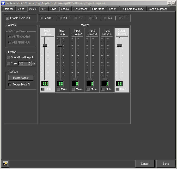
Audio Tab
This option will load the OpenAL sound manager when Swift restarts. With this you can play out .wav files or output sound from mpeg streams. Please ensure no other device is using the sound device when you select this option.
Style Tab
This is used to customise the interface of Swift so it suits the user.
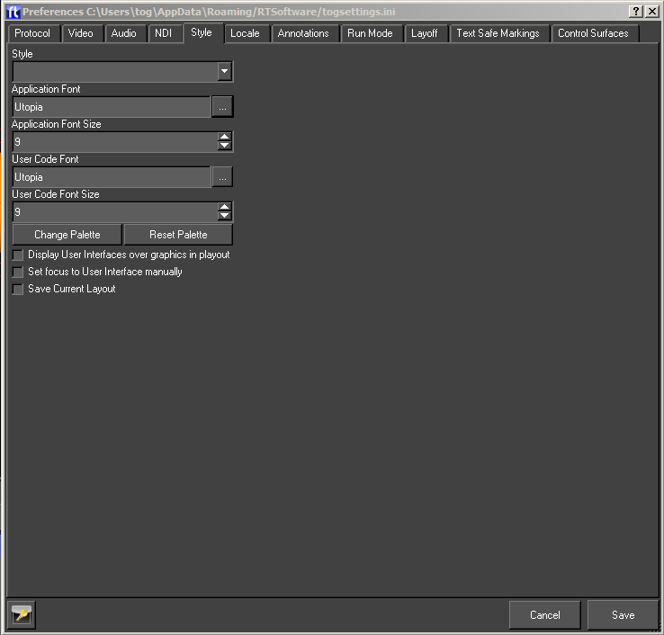
| Parameter | Description |
| Style | These are preset styles which can be selected from the drop down menu and affect the appearance of the interface. |
| Application Font | The font for all text on the interface |
| Application Size | The font size for all text on the interface. |
| User Code Font | The font for the user code editor. |
| User Code Size | The font size for the user code editor. |
| Display User Interfaces over Graphics in Playout | When in Playout mode, the user interface is added to the interface not under the stack but over the graphics icon view. |
| Save Current Layout | This saves the current layout of all the windows within the editor. |
Locale Tab
The locale tab contains settings that relate to how and what Swift loads on startup.
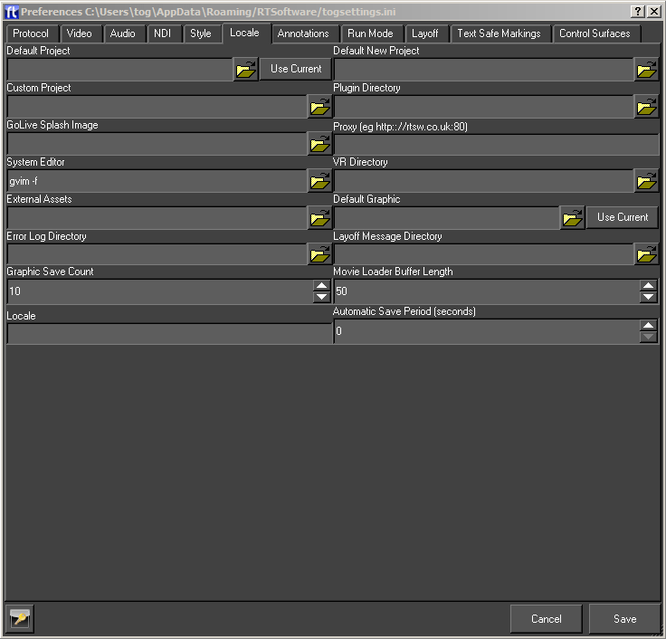
| Option | Description |
| Default Project | If Swift is loaded up and no project is included in the command arguments then the project specified here is loaded. If this is blank then nothing is loaded on startup (unless included in command line arguments). |
| Default New Project | New projects are created in this directory. |
| Custom Project | Allows a custom project to be specified. Custom projects load in parallel with a normal project (called the base project when running with a custom project). Assets in the custom project are used in preferences to the same assets in the base project. |
| Plugin Directory | This is the directory which contains any plugins intended to be used across more than one project. Plugins in a project’s Plugins directory can only be used within that project and are unloaded when the project is closed. |
| GoLive Splash Image | The image that will be shown on the load up of Swift Live mode, the splash screen will stay covering the output window until a script is loaded. |
| Proxy | If Swift is accessing data across a firewall (e.g. Streaming a movie from the internet into a texture), this is where the proxy is specified to enable http tunneling. |
| System Editor | Whenever a considerable amount of text needs editing (e.g. User code or the SQL statement of a database input), the text can be popped up in this editor. |
| VR Directory | This directory is external to any project and contains the VR setup files. |
| Import Directory | This directory is periodically checked for new files to import into the current project. |
| Default Graphic | This graphic is loaded when Swift is started. |
| External Assets | This directory contains external assets that will be loaded when a project is loaded. |
| Automatic Save Period | If this is non-zero, Swift saves the current project, graphic and shaders periodically at the interval. |
| Graphic Save Count | The maximum number of graphic backups maintained by Swift. |
| Layoff Message Directory | MOS messages are gathered into sequences starting with commands to play methods whose name ends with On and ending with commands to play methods whose name ends with Off. These sequences are then saved to this directory. These messages are used to automatically layoff graphics to disk. |
| Locale | Specifies the Locale i.e. the geographic location. This is used to determine local differences to time and language. |
Annotations Tab
Annotations are graphical elements that appear on screen whilst editing to provide information or control handles for manipulation.
This tab also contains options that control how new cameras and objects are added to the scene by default.
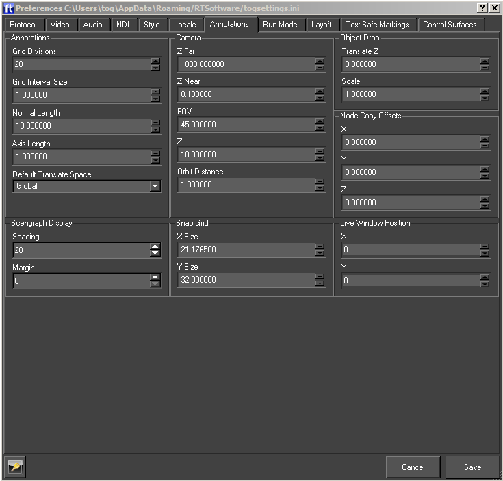
| Option | Description |
| Axis Length | The length of the axis in the window |
| Grid Interval Size | Distance between each grid line |
| Grid Divisions | Number of divisions in the grid |
| Normal Length | The normals of normals when turned on in edit mode. |
| Default Translate Space | The normals of normals when turned on in edit mode. |
| Camera Z Near | Sets the default near clip plane of the camera. |
| Camera Z Far | Sets the default far clip plane for the camera. |
| Camera FOV | Use this to set the default field of view for any camera which is dropped into the scene. |
| Camera Z | This is the same as above but only for cameras dropped into the scene. |
| Camera Orbit Distance | The distance along the viewpoint of the global camera about which the global camera revolves when orbiting |
| Scenegraph Margins | The margins on the scenegraph editor around the scenegraph tree |
| Scenegraph Spacing | The distance in pixels between each item in the scenegraph editor. |
| Object Translate Z | The default Z world coordinates of objects (not cameras, see below) which are dropped in the scene, the objects X and Y coordinates will come from the mouse position at the time they are dropped. |
| Object Scale | Used the initialise the scale on Transform nodes when objects are created. |
| Snap Grid X Size | The x interval in the snap to grid. |
| Snap Grid Y Size | The y interval in the snap to grid |
| Live Window Position X | The x position of the render window when Swift is run in Live mode. |
Run Mode Tab
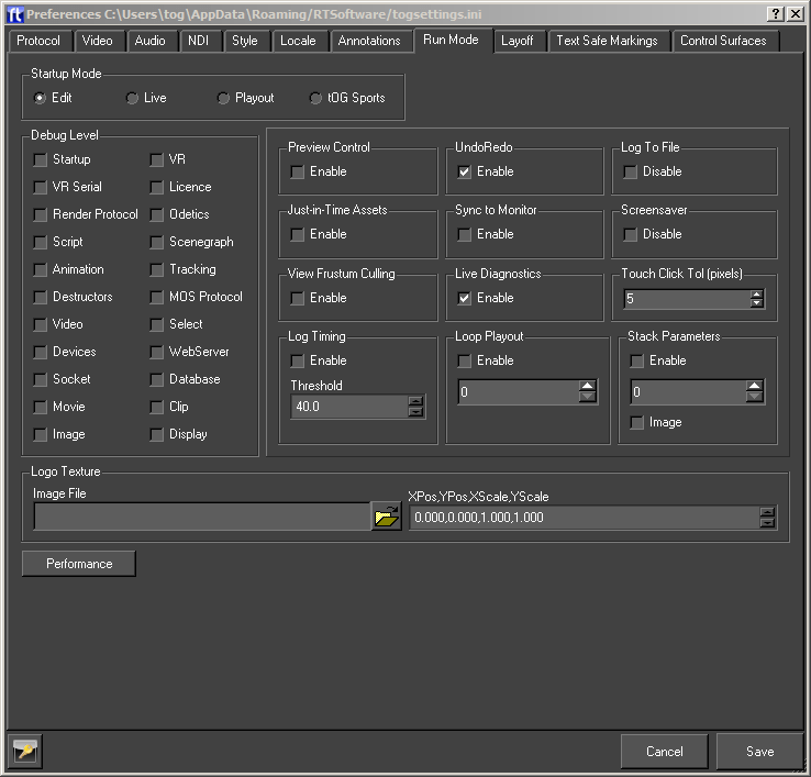
This tab lets you set the mode that Swift starts in, some run time options, and allows you to turn various debug options on and off.
Startup Mode
This sets the mode Swift will be in when next started up.
| Run Mode | Description |
| Edit | The Swift CG+ interface |
| Playout | The playout interface |
| Live | A “black box” render window with no GUI, suitable for remote control |
| Sports | Swift Sports |
Debug Level
Swift can give very detailed output about several aspects of its operation. You may be asked to turn these on by support when fault checking.
NOTE: Debug levels should not be left checked on a live machine unless you are explicitly told to by RTSoftware support, as doing so can cause performance issues.
However, the following debug levels can be useful while building and fault checking
| Debug Level | Description |
| MOS Protocol | Whenever you use MOS the message sent and received are printed outputting Timing – This turns on a screen display showing the timings of various parts of Swift render. You can use this to determine if you are running at frame rate. |
| Database | Logs all database queries that are made by Swift. This can be useful when fault checking why a database query is not working correctly, as you can see the query after all value interpolation has been applied. |
| VR | Logs the computed camera position that Swift is using when working with a VR system. This is useful for checking that the values are what you expect them to be. |
| VR Serial | Logs the raw serial data that comes from a VR system. This is represented in hexadecimal. If you understand the raw serial data feed, this can be used to check that the data being received from the VR system is correct. |
| WebServer | Logs connections and requests to and from the built in web server. This is useful when building and fault checking web applications on top of Swift |
Preview Control
Swift preferences can be saved into two files, the default file if this option is not selected, and a preview file if this option is selected. This allows two configurations on the same machine. The preview configuration can be designed so as to reduce the render time for each frame (eg. select a small render window size). So as well as running a Swift in Playout mode, a Swift in Preview mode can be run at the same time on the same machine. When Swift is run in Preview mode, only certain frames are displayed (e.g. at the end of blocks), which give a preview of graphics to come. The two Swifts communicate and the Preview Swift is driven by the Playout one. This allows an operator to see what graphic is next on line.
Undo/Redo
Turns on and off the undo/redo manager. The undo/redo manager.
Loop Playout
To play through a stack of graphics in Playout mode, the user must press Take continually. If this is selected, Swift automatically plays each graphic in turn, pausing for Delay seconds between each one and restarting when the end of the stack is reached.
Just-in-Time Assets
Assets (e.g. Shaders, fonts) are loaded in two stages. Usually all the assets are read off disk and converted to a form suitable for use with graphic cards. If this is selected then only the first stage is done when the project is loaded. Second stage is only done when the asset is needed. Fonts should be saved out as individual meshes – this is an option in the Text Node editor.
Log To File
By default, Swift logs diagnostic information to a file, as well as printing it to the command window. This option allows you to disable the writing of log files.
Only check this if you are told to by RT Software support, as without log files, any issues with your system cannot be diagnosed as quickly.
Log files are written to the following places:
| Operating System | Log Directory |
| Window | C:/Program Files/Swift/log |
| Linux | /var/log/Swift |
Live Diagnostics
Enabling live diagnostics adds some additional diagnostic information to the live mode of Swift. Rather than just being a render window, additional information is provided to show the running state of the machine.
View Fustrum Culling
Enable view frustum culling of the scenegraph. If this is not checked, then view fustrum culling will not be applied, even if it is checked on individual nodes in the scenegraph.
ScreenSaver
Allows Swift to disable the screensaver on the operating system.
Touch
This setting affects how Swift processes gestures that come from a touch screen.
| Parameter | Description |
| Click Tolerance(pixels) | Changes how far a touch has to move (in pixels) before it is recognised as a drag gesture rather than a click gesture. For small touch screens this value can normally be left small, |
Stack Parameters
In playout, the stack can display parameters next to the graphic or method.
| Parameter | Description |
| Enabled | Check this to make parameters visible in the playout stack |
| Num Parameters | Set the maximum number of parameters that will be displayed next to each graphic or method in the stack. |
Layoff Tab
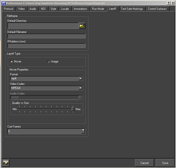
The user cas specify how Swift will layoff graphics to disk here. See the playout documentation for details.
NOTE: Files can be laid off in Swift CG+ using the timeline editor layoff method tool.
Text Safe Markings
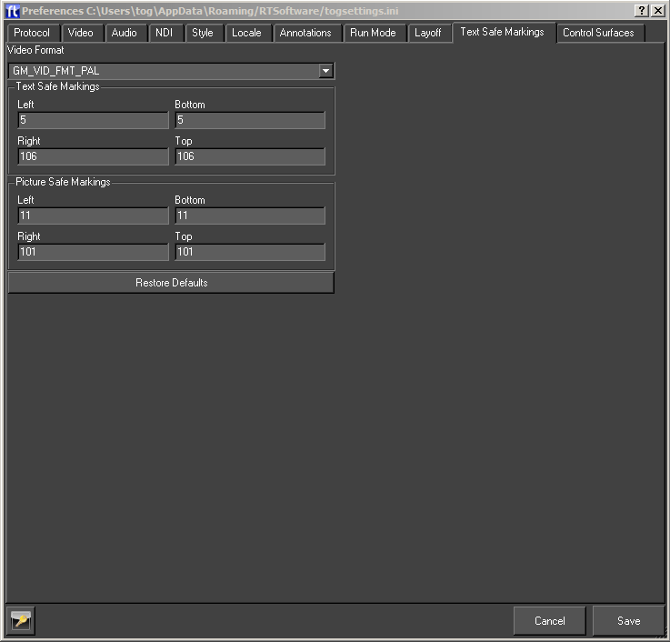
Swift displays the text safe area on the screen when in Edit mode. These text safe ar- eas are set up here. Swift has its own values for safe areas for various formats but these areas can vary from geographic area to geographic and from broadcaster to broadcaster.
| Option | Description |
| Video Format | The format for which to specify the safe areas. |
| Text Safe Area | The rectangle within which text will not be clipped off for the given video format. |
| Picture Safe Area | The rectangle within which picture will not be clipped off for the given video format. |
| Restore Defaults | Reset the safe areas to Swift’s own values. |
Graphic Menu
Overview
A full description of Swift Graphics and how they are stored can be found in the chapter User APIs (page )
The graphic options are accessible via the Graphic menu or via this toolbar:

New
Create a new graphic, library object or Swift sports graphic within the currently loaded project.
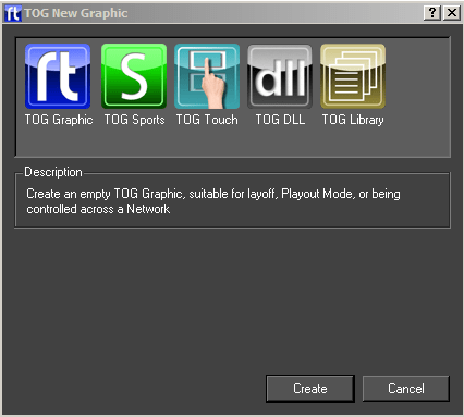
Double click on the required item.
Open
The Open dialog presents a list of graphics in the current project. If an icon has been generated for the graphic it will be displayed, otherwise the Swift generic graphic icon will be displayed.
Double click on the icon or select the icon and click on Load Graphic to open the graphic.
Save
Save the currently open graphic.
Save As
Save the currently open graphic under a new filename.
Edit
Opens the Swift CG+ Editor. This allows for certain graphic-specific properties to be changed.
Includes
The user can manage the ruby modules used by the graphic. Ruby modules extend the functionality of the language.

Custom Transfer Method Name
Not available.
Reorder Object Nodes
Reorder the object nodes in a graphic after transfer to match the order in the graphic..
Swift Sports
These only apply to Swift Sports graphics – refer to the Swift Sports Manual.
Recently Opened
Display a list of recently opened graphics. Selecting an item from the list will have the same effect as browsing for and opening a project via the Graphic -> Open menu option.
Reload
Reload the current graphic from disk. All changes to the graphic will be lost. Changes to assets will be unaffected as they are saved independently from the graphic.
Load last undo
Loads the last undo from disk, this is used in unlikely event of Swift crashing. The user can then restore the graphic to the state before the crash.
Generate interface
Creates an interface that can be used to specify all the graphic inputs.
Export
Exports a graphics and all the assets used in it to the specified directory.
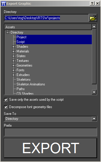
Directory
The assets and script will be saved to this directory.
Assets
The types of assets to export. If Project is selected, a project file will be created in the export directory which references that directory. This effectively exports the graphics into its own project. This will also cause all assets to be renamed (by prefixing their names with the export directory) making them unique (so this script and its assets can be imported safely into another.
Options
Further options:
- Zip – create a zip file from the export directory.
- In Use – only export assets that are used by the script otherwise export ALL assets.
Revert
Each time Swift saves a graphic it also saves a version of the graphic to the backup graphic directory (GMGraphicBackups inside the project directory) with a timestamp added to the filename. Choosing the Revert option will cause Swift to load the previously saved version of the graphic and overwrite the current graphic with the previous version.
Close
Close the currently open graphic.
Tools Menu
Overview
Tools provides a number of operations that do not fit under other categories. Tools are an important part of an efficient workflow inside of Swift.
The tools options in Swift are accessible via the Tools menu or via the toolbar.

Import
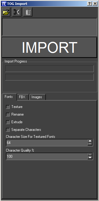
The import options are accessed from the Tools menu. Import is used to import external assets into Swift.
The user selects a list of files using the file chooser. Files can be removed and the list cleared. The user then just presses the import button to import all the files.
| Option | Description |
| Add | Opens a file browser to add new entries to the import list |
| Cut | Removes the selected entries from the import list |
| Clear | Clears the import list |
| Import List | A list of all of the files that will be imported. |
| IMPORT | Begin Importing the files in the import list |
| Import Progress | Shows progress of the import operation. Some import operations can take several minutes. |
| Fonts | Font specific parameters |
| FBX | FBX specific parameters. |
| Images | Image specific parameters. |
Importable Assets
The following assets can be imported into Swift
| Asset type | Description |
| Swift assets (.geo, .sha, .mat, .sta,.txt, .pth, .lns, .fnt, .dso) | Existing Swift-created assets, normally exported from an existing Swift project.
Importing a file from a different project will copy it to the correct place in the project. Note:In order to import a shader correctly, the user should make sure that the material, textures and state that the shader uses are imported first; otherwise they will not be available in the project and the shader will be incomplete. |
| Maya .OBJ files | Maya .OBJ files can be generated in Maya and several other 3d modelers. They contain mesh data, but do not support shaders, materials or textures.
Maya .OBJ files have no special options for loading, when imported they are converted into Geometries and copied into the Geometry directory. Recommendation: Use FBX files instead wherever possible. |
| Fonts (.ttf) | Swift can import true type fonts. When imported the fonts are converted into Swift’s internal format, for speed of loading and rendering. |
| Images (.jpg, .png, .tif, .tga, etc) | Swift can import a wide range of image formats. |
| Movies (.mov, .avi, .mp4, .flv, etc) | Swift can import a wide range of movie formats.
Note: Some movie codecs are better for use in Swift than others. |
| User Interface files (.ui) | These files are copied into the GMScript/Template directory of the project. They are created using the Qt3 Designer application. |
| Swift Scripts (.rb) | This is the Swift Graphic itself – it is copied into the GMScript/Template directory. |
| CGFX Shader Programs (.CGFX) | CG Shaders allow complex graphics effects to be used in a graphic. They are copied to the appropriate directory. |
| HDR files | These files are High-dynamic-range images that are used by some CGFX shaders. They are copied to the appropriate directory. |
Importing ZIP files
If you import a zip file into the import dialog, the entire contents of the zip file will be selected to be imported. This is very useful in combination with the 5.11 option to quickly export a graphic and all its assets from one project and import it into another.
Importing Fonts
Fonts can be imported as Geometric Text, or Textured Text. Geometric text models each character of the text as a 3D model, which produces very smooth anti-aliased text on output that can be scaled to any size without quality loss. Textured text displays text as a series of images. This has the advantage that the images can be manipulated in an image manipulation program such as Photoshop to create effects that could not be achieved with simple text. In most cases geometric text is used.
The import dialog has a font specific tab, that contains options for importing fonts.
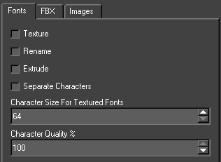
Texture
Import as textured text, rather than geometric text.
Rename
If checked, allows the user to rename a font to something different from what the TrueType font suggests that it is.
Overwrite
Overwrite fonts already imported into Swift without asking for confirmation on each font. This is useful if the user is importing a number of fonts and want to automatically overwrite fonts without being prompted each time. For general usage, leave Textured and Extruded checkboxes unchecked.
Extrude
For geometric text, selecting this will cause the characters to be extruded into 3D.
Importing FBX
Fbx is a file interchange format used for importing and exporting 3D models, shaders and animations from various 3D animation packages. Fbx is supported by all the major 3d software developers including:
- Autodesk Maya
- Autodesk 3DS Max
- Cinema 4D
- Softimage
- Newtek Lightwave 3D
Make sure that the latest version of the Fbx plugin is installed in the 3D animation software. For a more detailed description of FBX workflow usage for Swift, refer to the training and tutorials manuals.
Swift supports the following FBX features for importing geometry.
- 3D Meshes
- Nurbs (There is no control over the import; they are converted into 3D Meshes as they enter Swift)
- Material colours and Textures:
- Textures only in the diffuse channel
- Multi sub object materials are supported
- Recursive materials are not supported (multi materials within multi materials)
- Cameras
- Cameras can be targeted or free
- Lights
- Omni lights
- Spot Lights
- Directional Lights
- Animations:
- On the mesh, lights and camera
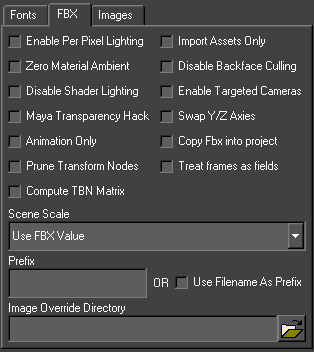
FBX Import Options
To import an Fbx file, create or load a graphic, and then go to the import dialog and add the fbx file to the list of files to import.
| Option | Description |
| Enable Per Pixel Lighting | Enables per pixel lighting on imported geometry as default. |
| Zero Material Ambient | Some 3D modelers such as 3D Studio Max use diffuse and ambient in a way that causes objects to import into Swift with too much ambient lighting, causing the objects to look bright and flat. Checking this checkbox will cause Swift to zero the ambient levels in all imported materials, improving the overall lighting of the scene in most cases. |
| Disable Shader Lighting | Instructs the FBX importer to ignore lighting on import, and to disable lighting on all generated shaders. This is useful if the model that is being imported has lighting baked into the textures. |
| Maya Transparency Hack | Maya reports a transparency colour that Swift converts to a grayscale for use as a transparency scale. |
| Animation only | Overwrites all animation channels |
| Import Assets Only | If this option is selected, Geometries, Materials, Textures, Shaders and States will be imported from the FBX file, but the Scenegraph structure will not be recreated. |
| Disable Back Face Culling | By default, Swift back-face culls (does not draw faces turned away from the camera) all objects for performance reasons. Unfortunately, this distinction is not always as easily recognizable inside of 3d design packages, causing objects to appear with faces the wrong way round, causing holes to appear. Enabling this option will turn off backface culling.
WARNING : Turning off back face culling should only be done as a last resort, as it can impact the time it takes for the scene to render. Whenever possible, let the artist know that faces are the wrong way round so that the problem can be fixed in the original 3D model. |
| Enable Targeted Cameras | Enables the targeting of imported cameras via linking a null node within the scenegraph. |
| Swap Y/Z Axis | By default, some 3D packages will export FBX files with the Y/Z axes swapped compared to how Swift uses them. This will instruct the fbx importer to attempt to swap the axes back around. Note that this may not work as desired, especially if there are complex rotate animations in affect. If in doubt, leave unchecked and fix the rotation issue by either rotating the model in the 3D application, or by applying an additional transform inside of Swift. |
| Scene Scale | Allows the user to input a scale value for imported objects, or reset generic units to cm, m, ft and ins etc. |
| Prefix | A common problem when importing multiple 3D objects into the same project is the issue of dealing with materials and objects with conflicting names. This option prefixes a string to the beginning of all material, geometry, shader and texture names to guarantee that they are unique. For example, if the prefix string is set to ‘car_’ and a material is called ‘default01’, the resultant material will be saved out as ‘car1_default01’ |
| Image Override Directory | Some FBX files do not have the textures embedded into the file, but are provided separately in an images directory. The texture override directory contains the relevant textures. |
Importing Images
Swift supports a large number of image types, including .jpg, .gif, .tga, .tif, .png, .bmp, and .sgi.
We recommend .png files for images, because
- all major image manipulation programs support it.
- images are defined as 24 bit and can have an 8 bit alpha channel
- images are saved with lossless compression, so the image remains intact.
- they are, in our experience, the least problematic image format to use.
Importing an image into a project in Swift automatically copies it to the correct part of the project directory structure.
Swift has support for various video formats. Swift uses ffmpeg (ffmpeg homepage) in order to read these formats, and supports most of the formats that ffmpeg supports.
For broadcast use, we recommend that MPEG 4 encoded files with a bit rate of at least 5000Kbit/s are used.
When movies are imported into Swift, they are copied into the ~GMData/Images directory associated with that project.
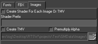
| Option | Description |
| Create Shader for each Image or TMV | Automatically creates a shader for each imported image or sequence |
| Shader Prefix | Appends a prefix for easy scenegraph management |
| Create TMV | Creates a TMV file from an image sequence |
TMV files
TMV files are Swift Movie Files. Typically they are generated from image sequences that often contain alpha channel information. By selecting all of the images in a sequence, Swift then creates a .tmv file that it places inside the ~GMData/Images directory. This file can be utilised in just the same way as any image or movie file for use as a texture or background.
The import dialog has an image specific tab, that contains options for importing images.
Maximum Image Sizes
Graphics hardware has limits on the size of images that can be drawn; the current limits are textures up to 4096×4096 in size. If the user has an image that is larger in width or height than this, either break it down into smaller images.
Creating Optimal Image Sequences
There are four ways to have animated textures in Swift. Firstly, there are streaming movie formats, such as MPEG. These are the preferred format for long animated sequences with no alpha channel.
There are several movie formats that support an alpha. The simplest is uncompressed mpeg. There are also very specific codecs like the Avid Meridien Codec which also support alpha. Please see the ffmpeg online documentation for codecs supported by Swift.
The user can also have a texture accept an input video from the video card as source for the texture.
Swift can also have a texture accept input from the result of a dynamic texture node. For short animations, especially when transparency is involved or where non-linear
animations are performed to the timing (for example, reversing the animation) the user can use an animated sequence of images. However, loading these into Swift is slow. In order to speed the loading time up, the user can convert image sequences into a TMV.
Import Conflict Resolution
When importing assets, it is possible that you will have a conflict between an existing asset and the newly imported asset. For example, if two assets share the same name.
The conflict resolution dialog allows these conflicts to be resolved.
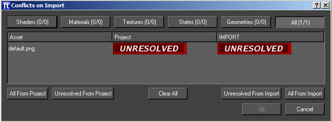
The conflict resolution dialog shows the assets in conflict, and allows the user to individually select which assets should be imported from the FBX file, and which should be kept from the project.
Along the top of the dialog, there are buttons that filter on the various asset types. Clicking the All button displays all conflicts.
Next to each button, there is a count (for example, 5/10) which shows the number of unresolved conflicts, compared to the total conflicts in that group. In order to continue, all conflicts need to be resolved.
The main window shows each conflict in the current filter group, and shows whether they are unresolved, or resolved in favour of the FBX version, or the Project version of the asset.
Finally, there are several buttons for mass manipulation of the resolved states.
| Option | Description |
| All To Project | Resolves all assets in the given group in favour of the assets already in the project. |
| Unresolved To Project | Resolves all assets in the given group that have not already been resolved to the project. |
| Clear All | Cancels and resolutions that have been made in the current group, returning everything to being unresolved. |
| Unresolved to Fbx | Resolves all assets in the given group that have not already been resolved to the Fbx assets |
| All To Fbx | Resolves all assets in the given group in favour of the assets in the Fbx file. |
| Ok | Accepts the current resolutions, and proceeds with the import. The user is only allowed to do this once all conflicts are resolved. |
| Cancel | Cancels the import process of the FBX file; if cancelled now, the import will not happen. |
Screen Grab
The Screen Grab option will save the current frame in the editor graphics window out to disk. A file save dialog pops up to allow choosing of a file to write the image to. When Save is pressed the image will be saved out.
Generate Icon
Generates an icon for the currently loaded graphic. The icon is based on what is currently visible in the scene.
Reload Interfaces
This menu option reloads any custom user interfaces defined in the project. User interfaces are created externally to Swift and if they are edited while Swift is running they need to be reloaded.
User interfaces are created using the external program Qt3 Designer.
Data View
This interface allows the user to manage the external data being fed to Swift
The user can set up this data and then run the graphic to check the correctness of the graphics inputs.
Database
Lets you browse the database connected to the Swift machine.
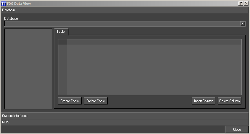
| Option | Description |
| Database | A list of the databases in the current project. Selecting one will fill out the list on the left side with the tables in the database. |
| Table | This page contains a table widget showing all the columns in the table filled out with the data in the table. The data is editable |
| Create Table | Create a new table in the database and add it to the table list. |
| Delete Table | Delete the selected table from the database. |
| Insert Column | Insert a column in the selected table. The user will be prompted for the column name and type. |
| Delete Column | Delete the selected column. |
MOS
This sends MOS protocol messages to Swift. The user can create a .tcf file in the usual way and then load it into this interface. The user can then load and play graphics and methods as well as control tickers and update graphic elements directly.
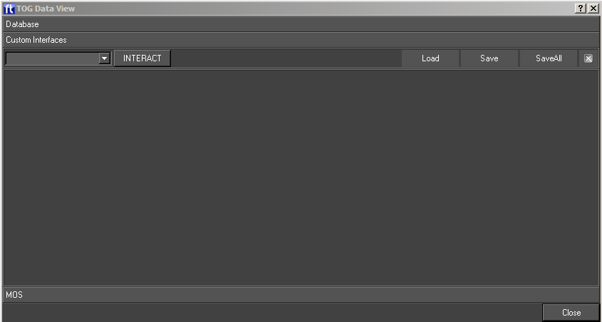
Project
Script
The user selects a project file and the corresponding .tcf file is loaded and the interface is filled out with lists of graphics and their methods.
- Selects a graphic and a message is sent to Swift to load and play it..
Method
- Selects a method and fills out the parameter table.
Control
This is a set of buttons to play, abort and animate on methods. The user can also send messages to disconnect and quit from Swift and to clear the scenegraph.
Parameters
A table of method parameters. The value for each parameter can be changed.
Ticker Fields
Send the details of a slug to a ticker. The user specifies the ticker and slug nodes and the contents of the slug.
Update a scenegraph node directly. The user specified the node and field to be updated and the new value.
Communications
This shows the actual xml sent to and received back from Swift.
User Interface
This shows all the user interfaces defined for the project. The user can flip through them and enter values. These values will be used when graphics are run and widget inputs evaluated.
Clean Project
The clean project tool analyses your project, and lets you remove unused assets.
Why you should clean your project
As a project evolves, you will find that there will be elements that you used early on that you replace with other elements. For example, you may have been through several iterations of strap design, replacing old assets with new ones each time. These old assets may not be used anywhere in your project, but they are still loaded at startup. This has three undesirable effects :
- Your project takes longer to load on startup by loading unneeded assets.
- You project places a greater strain on system resources than it needs to.
- Your project is physically larger on disk, making it more difficult to transfer from one machine to another.
Cleaning Your Project
To access the clean project tool, load the project, and then go to the menu Tools->Clean Project.
NOTE: Take note of any errors that occur on project load, and deal with them before cleaning. If assets are failing to load, it may affect those assets that the clean project tool deems to be in use.
NOTE: Swift will ask you to save your graphic if you have one open; this is to make sure that any recent changes to the project are available to the clean up tool.
After analysing your project, the clean up tool will popup the following dialog. It contains two lists for moving items between two lists.
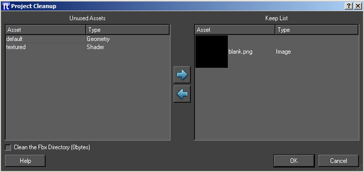
| List | Description |
| Unused Assets | This list contains all of the assets that have been located that the project cleanup script believes are not used in your project. |
| Keep List | This list contains assets that, whilst not used, you would like to keep in the project. |
To move assets from one list to the other, select the assets (either singly or multiple select), and click on the left/right arrows to move the assets from one list to the other.
NOTE: You should check the unused asset list before continuing.
The clean project tool will comprehensively find any assets which are statically used within your project. However, it may miss shaders, textures, images and anything else that is only referenced in your project dynamically. For example, shaders which are only assigned via an input or animator. As the graphics designer you should have an understanding of which assets are dynamically assigned, and move them to the keep list before continuing.
Press Ok to clean the project.
You will be asked if you want to permanently delete the assets in the unused assets list, or back them up. If you choose to backup the assets, you will be asked to pick a directory to store them in.
NOTE: Deleting assets is a permanent operation, and there is no way to recover them. If in doubt, choose the backup option.
NOTE: When backing up assets, it is good practice to choose a new, empty directory. This will make it easy to move assets back into the project if you later discover assets that you require.
Reloading the project
Your project will now be reloaded automatically to take into account the final list of assets. You should note any errors that occur and compare them with any errors that occurred before the clean operation. The list should be the same, or possibly reduced.
Testing your project
After cleaning your project, you should perform a full test of all graphics to verify that the removed assets have not had any undesired effects. In particular, you will want to check graphics that :
- Set geometries, shaders or textures using inputs or animators.
Performance Test
Provides tools for checking the performance of your graphics.
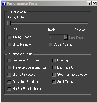
Timing Display
The timing display appears over the top of the output monitor window in Swift CG +, Swift-Playout, Swift-live and Swift-Sports. It provides detailed information on how your graphic is performing.
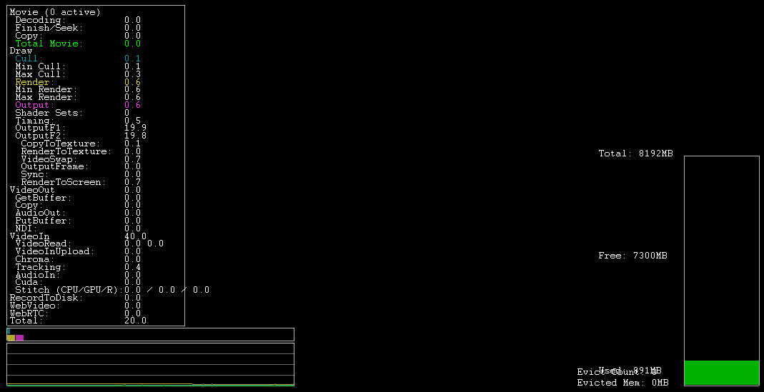
These options change the level of timing detail that is overlaid over the graphics.
| Option | Description |
| Timing Detail | Choose how much detail to display
|
| Timing Scope | The timing scope provides basic timing information on a line graph. |
| Time Base | Chooses the zoom level of the timing scope. |
Performance Tests
The performance tests deliberately alter the normal graphical rendering of your graphic in order to aid you in finding performance problems. For more information look at the Performance Troubleshooting Guide.
NOTE: All performance tests will be switched off when the performance test dialog is closed.
| Parameter | Description |
| Geometry As Cubes | Render all geometries as cubes. Tests for geometry complexity bottlenecks |
| Traverse Scenegraph Only | Do not render anything, but traverse the scenegraph. Tests for scenegraph complexity bottlenecks. |
| Gray Lit Shaders | Render all geometries with the same, lit shader. Tests for shader complexity bottlenecks. |
| Gray Unlit Shaders | Render all geometries with the same, unlit shader. Tests for shader complexity bottlenecks. |
| No Per Pixel Lighting | Turns off all per pixel lighting and Cg Effects. Tests for pixel shader complexity bottlenecks. |
| One Light | Prevents more than one light being active when rendering. Tests for lighting-related bottleneck issues. |
| Backface On | Turns back face culling on. Tests whether back face culling has a significant effect on performance. |
| Stop Texture Uploads | Stops dynamic textures from being uploaded to the graphics card. This includes movies and TMVs. Tests to see if there is a texture upload bottleneck |
| Small Textures | Replaces all textures with a single small texture. Tests to see if large textures are causing bottleneck issues. |
Keyer
Brings up the Keyer dialog, allowing the currently selected keyers to be set up.
NOTE: For Details on the keyer interfaces, see the Swift Sports Manual, and the VR Documentation.
VR Interface
The VR Interface allows you to set up a VR tracking system. See the VR documentation for further details.
Lens Calibration
The lens calibration dialog allows you to calibrate a lens for use with a VR tracking system. See the VR documentation for further details.
Browser Menu
The browsers are used to view assets contained within the projects. These can then be dragged and dropped onto the render window to be added or to update the scene.
State Browser
Shows a list of states in the current project. Drag a state onto an existing object in the render window to change the state on it’s shader.
Geometry Browser
Shows a list of geometries in the current project. Drag a geometry onto the render window to add the geometry to the scene.
Material Browser
Shows a list of materials in the current project. Drag a material onto an existing object in the render window to change the material.
Texture Browser
Shows a list of textures in the current project. Drag a material onto an existing object in the render window to change the material.
Shader Browser
Shows a list of shaders in the current project. Drag a shader onto an existing object in the render window to change the material.
Font Browser
Shows a list of fonts in the current project. Drag a font onto the render window to create a new Text Node with the selected font.
Image Browser
Shows a list of all images in the current project. Drag an image onto an object in the renderer window to update the image on the shader’s texture.
Paths Browser
Shows a list of paths in the current project
Custom Browser
The custom browser shows a number of “predefined” objects that can be dropped onto a scene.
| Object | Description |
| Ticker | Creates a horizontal scrolling ticker |
| Roller | Creates a vertical scrolling ticker |
| Teletype | Creates a teletype-style ticker |
| HisSwiftram | Constructs a hisSwiftram |
| Line Graph | Constructs a linegraph |
| Bar Chart | Constructs a Bar Chart |
| Pie Chart | Constructs a Pie Chart |
| Library Objects | Any Library objects in the project will appear in the custom browser window after the predefined types. |
Dynamic Geometry Browser
Shows a list of dynamic geometries in the current project. These are geometries that can be generated inside of Swift without requiring a separate editing package. See the Dynamic Geometry Node for more details on which geometries are available (page )
Geometry Effect Browser
Shows a list of Geometry Effects int the current project. These are effects that can be used with an Effect Node.
Layer Effect Browser
Shows a list of Layer Effects in the current project. These are effects that can be used with a Layer Node.
Drag Operations
Some browser types provide a drop down list of options on how the drop should be applied.
| Action | Description |
| Create a Sibling Node | Creates a subtree of the chosen type under the currently selected scenegraph node |
| Create an Object | Creates a new object node under the root node and adds the subtree of the chosen type to this object node |
| Add to Existing object (e.g. n1_OBJ) | Adds the subtree of the chosen type under the chosen object node |
| New Shader | Creates a new shader |
| Override | Overrides the selected texture image with the this image |
| Replace | Replaces the image on the selected texture channel |
| Create | Creates a new texture file (.txt) |
View Modes
Each browser has two modes. The user can switch between them using the buttons on the toolbar.
Icon View
Shows an icon for each asset e.g. a geometry will show an image of the actual geometry (the case in the picture).
List View
The list view options will change depending on which browser is opened. For the state, material, texture and shader assets, this is a more detailed list of attributes contained in the asset.
Editors Menu
The editors menu lets you display one of the four asset editors available in Swift. These editors can also be accessed while looking at a Shader Node in the scenegraph.
| Editor | Description |
| Shader | Shader assets contain references to a material, state, and a number of texture assets. |
| Material | Material assets contain basic colouring information |
| Texture | Texture assets contain image references and options on how they should be applied. |
| State | State assets contain settings relating to how a geometry is rendered. |
Editors
Shader, material, texture and state editing are all done from a single window with a tabbed interface to choose which item is being edited. There is a common control bar used to choose which item is being edited as well as controls for the saving and loading of items:
The contents of the drop down list will alter depending upon which tab (Shader, Material, Texture or State) is currently selected and will contain a list of all of the items of the current type.
Actions
The toolbar icons perform the following actions:
| Icon | Action | Description |
 |
Cancel | Cancels any changes made since the item was displayed in the editor |
 |
Create | Creates a new item of the type currently chosen |
 |
Delete | Deletes the item currently being edited |
 |
ReLoad | Loads the item from disk, any unsaved changes will be lost |
 |
Save | Saves the item currently being edited |
Saving Changes
Changes to shaders, materials, textures and states are not automatically saved. Changes are remembered in the editor, but the Save button must be used to make the changes permanent.
When saving state, material and textures the dialog will prompt whether the user wants to save just that item or all changed items. Choosing the Save All option will save all changes to all items of that category (state, material or texture) that have changed. Saving a shader also saves its material, state and texture.
Shader Editor
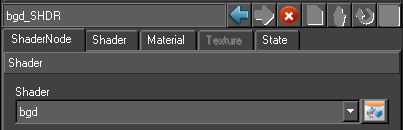
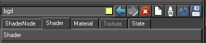
A shader consists of a material, a state and textures. A single shader can be referenced by any number of shader nodes in a graphic.
NOTE: A change to a shader will affect any objects that have a shader node that references the shader. If in doubt create a new shader.
Creating Shaders
Shaders can be created in four ways.

- by using the Create Shader button by the render window
- by choosing the option to automatically create a shader with a texture when an image is imported. See the chapter, Import (page )
- by dropping an image onto an object on to the screen from the Image browser and selecting a new shader. See the chapter, Image Browse (page )
- by using the Create tool on the Shader editor.
The user is prompted for a name and this is used for the new Shader and its components.
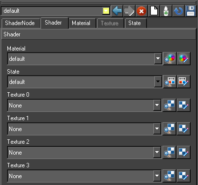
Shader Tab
| Option | Description |
| Material | Specifies the material referenced by the shader. The selected material can be changed or edited. |
| State | Specifies the state referenced by the shader. The selected state can be changed or edited. |
| Texture 0,1,2 and 3 | Specifies the textures referenced by the shader. The selected texture can be changed or edited |
Material Tab
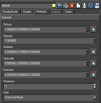
| Option | Description |
| Diffuse | Specifies the diffuse material colour used for lighting. The Diffuse colour is perceived as the colour of the object itself. It is the colour that the object reveals under pure white light. Type in RGB values or use the color wheel icon to select a colour. |
| Specular | Specifies the specular material colour used for lighting. Specular colour is what we most commonly think of as a highlight. The colour of a specular highlight is typically the colour of the light source itself. The highlight size is controlled in turn by the “Shininess” value. Type in RGB values or use the color wheel icon to select a colour. |
| Ambient | Specifies the ambient material colour used for lighting. Ambient light is generalized lighting not attributable to the direct rays from a specific light source. Without ambient light, objects in shadow would be completely black. Type in RGB values or use the color wheel icon to select a colour. |
| Emission | Specifies the emission material colour used for lighting. Emission works exactly like Ambient colour, and can be thought of as “self illumination”. Type in RGB values or use the color wheel icon to select a colour. |
| Opacity | Specify an explicit alpha value for an object via it’s material. Controls the degree of transparency of an object. Type in a normalised value, where 1 is fully opaque and 0 is totally transparent. |
| Shininess | Specifies the specular exponent of the surface. The Shininess controls the spread of specular highlights. Enter a higher value to achieve small, tight highlights. Enter a lower value to achieve a very shiny, burned out highlight. |
| Side | Specifies whether this material is set for the front, back or front and back of the object. |
Texture Tab
This page contains all the controls for setting up a shaders texturing. It handles just one texture at a time. The texture tab has 7 sub menus, each relevant to a particular aspect of how to manipulate and apply bitmapped images and video sources to the surfaces of objects.
Texture Image
Choose the image or video source to be applied in the shader.
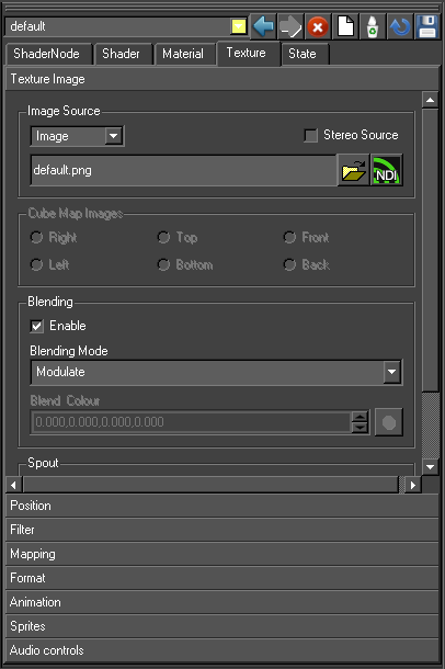
Image Source
Choose the image that should be used with this texture.
| Image Source | Description |
| Image | Use a disk-based image, TMV or movie file as the image source |
| Video IP #1 | Use the first video input channel on the graphics card as the image source |
| Video IP #2 | Use the second video input channel on the graphics card as the image source |
| Video IP #3 | Use the third video input channel on the graphics card as the image source |
| Video IP #4 | Use the fourth video input channel on the graphics card as the image source |
Using video input channels depend on having the correct hardware in the machine to provide them.
If you are using a stereo image, enable the stereo mode to send the correct part of the image to the correct “eye”
Cube Map Images
When enabled these radio buttons control which image is placed upon each face of a cube map texture. These radio buttons are only enabled if the texture format is set to cube map. When the cube map options become active (See Mapping) use the browser to locate an image file, normally in the projects /GMData/Images directory, for each of the six slots: right, left, top, bottom, front and back.
Blending
Blending determines how the image interacts with the material colour and other textures.
| Blending Type | Description |
| Modulate | multiply texture colour with material colour |
| Decal | mixes texture colour with material colour using texture colour alpha |
| Blend | blend texture colour with blend colour |
| Replace | replace material colour with texture colour |
| Add | add texture colour and material colour |
Blend Colour
Use the colour wheel icon to select a blend colour.
Sound
Enable the sound checkbox if audio is require
Position
Position is used to apply a transformation to the texture coordinates prior to applying the texture to the model – this moves, rotates and scales the texture on the object surface.
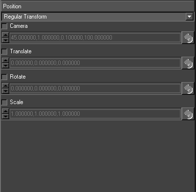
There are 3 options in the drop down menu:
| Option | Description |
| Regular Transform | Options are Translate, Rotate, Scale. These options allow the user to transform textures (images) on objects. |
| Bind to Camera | The texture translation is taken from a camera and the values above are overridden |
| Bind to light | The texture translation is taken from a light and the values above are overridden. |
Camera, Transform, Rotate and Scale are used as follows.
| Option | Description |
| Camera | a camera perspective transformation to apply to the texture coordinates. The four values are in order field-of-view, aspect ratio, near clip plane and far clip plane. This is used for projective texture e.g. the texture is like the film in a cinema projector which is projected onto the screen and audience. |
| Translate | a translation to the texture coordinates. |
| Rotate | a rotation to the texture coordinates (specified as x, y, z angles). |
| Scale | a scale factor to the texture coordinates |
Filter
Filtering controls the appearance of the texture image when it is rendered smaller or larger than its original size. There is a performance versus quality trade off with different filtering options.
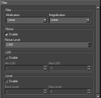
Filter
Minification
The texture minification function is used when the texture must be shrunk in size. For example if the user has a 100 pixel texture that needs to be applied to a 10 pixel wide geometry, set the minification process to one of the settings below:
- Nearest
- Linear
- Nearest MipMap Nearest
- Linear MipMap Nearest
- Nearest MipMap Linear
- Linear MipMap Linear
Magnification
The texture magnification function is used when the texture must be enlarged in size. For example if the user has a 10 pixel texture that needs to be applied to a 100 pixel wide geometry, set the magnification process to one of the settings below:
- Nearest
- Linear
Flicker Enable
Accepts a number between 0 and 16 and controls the level of Anisotropic filtering. The cost of this becomes more expensive the higher the level of flicker filtering applied. Click the checkbox and enter a value (default 2)
LOD (level of detail)
Specifies the range of level of details to use for MipMap selection. Enter minimum and maximum level of detail (default 0, 99)
Level
Specifies which MipMap levels texture data is available for/generated for. Enter Base level and Max Level values (default 0, 99)
Mapping
Enabling mapping allows texture coordinates to be automatically generated for an object. Coordinates can be generated automatically for a variety of different uses.
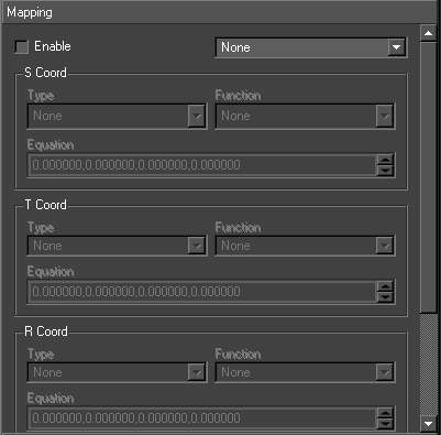
The drop down box to the right of Enable contains quick settings for commonly used texture generation options. Use the Enable checkbox and select from the drop down menu:
Default Mappings
The dropdown provides a list of useful mappings
| Option | Description |
| None | |
| Contour | Sets up the coordinate generation to produce coordinates based upon the object space location of the vertices. The texture coordinates are derived from the object space coordinates of the vertices and the texture will remain stationary on the object regardless of the viewpoint the object is viewed from |
| Projected | Sets up the coordinate generation to produce texture coordinates based upon the eye space location of the vertices. The texture coordinates are derived from the eye space coordinates of the vertices and the texture will move depending upon the viewpoint the object is viewed from. The Position tab (see ) affects the results of the coordinate generated |
| Sphere Map | Sets up the coordinate generation to treat the current texture as a sphere or environment map. The texture coordinates are derived from the viewpoint the object is rendered from and the surface normal at the vertex coordinates are being generated for |
| Cube Map | Sets up the coordinate generation to utilise the current texture as a cube map. The surface normal at the vertex is used to determine which of the six cube faces the normal is pointing towards |
S/T/R/Q Coord
Use Type to select from the drop down menu:
- None
- Object Linear
- Eye Linear
- Sphere Map
- Reflection Map Ext
Use Function to select from the drop down menu:
- None
- Texture Gen Mode
- Object Plane
- Eye Plane
Format
The page sets the format of the texture as a whole (e.g. 1D, 2D etc.) and the format of each pixel (e.g. RGBA etc.).
Target
The type of texture
| Option | Description |
| Texture 1D | The image is a 1-dimensional row of pixels. |
| Texture 2D | A normal image, texture coordinates are referenced 0-1 along both axies |
| Texture Cube Map | Consists of six 2D images, defining a cube map. The images should all be powers of 2, square, and the same size (64×64, 128×128, etc) |
| Texture 3D | the image is a 3D grid of pixels |
| Texture Rectangle | Similar to Target 2D, but texture coordinates are referenced in pixels (e.g. 0-1920 rather than 0-1) |
Internal Format
A large selection of options based on combinations of Alpha, Luminance, Intensity and RGB are available. The commonest values are RGB (RED, GREEN, BLUE) or RGBA (RED, GREEN, BLUE, ALPHA).
Wrapping
Texture wrapping controls how the texture data is referenced when texture coordinates are outside the standard range of 0 to 1 (or 0 to image width in the case of Texture Rectangle).
For a repeating pattern the mode would be set to repeat, but if only a single copy of the texture image should be displayed the mode would be set to clamp.
| Option | Description |
| Repeat | the texture is repeated i.e. the texture point referenced by the coordinates
1.5 is the same as the texture point referenced by 0.5 |
| Clamp | the texture is not repeated. When texture coordinates outside the range 0…1 are encountered the values are simply clamped to the range 0…1. This results in the colour value from the edge of the texture being used at any locations where texture coordinates are outside the 0…1 range |
| Clamp To Edge | Very similar to clamp, but ensures that the colour value that is repeated is the exact value that occurs at the edge of the texture rather than an interpolated colour |
Animation
This page sets the parameters for animated textures (for textures with a movie file as an image source as opposed to a single image).
| Option | Description |
| Bounce | Controls how the animation loops. If bounce is enabled, once the end of the animation is reached the animation will play backwards from the end back to the start rather than jumping straight from the end back to the start. |
| Frame Delay | Specifies the number of frames to delay the animation by |
| Number Loops | Controls the number of times the animation is looped. |
| Reset Image | Choose whether or not the texture will reset to its first frame when a new shader node in the scene makes use of it. |
Sprites
This page sets up the generation of texture coordinates for point sprites.
State Page
The state refers to several disparate pieces of rendering state that can be used to control the overall output of rendering. The state controls per pixel operations such as depth tests as well as items like line and point size. The complete list of items can be seen below.
Usage
The state editor is used to provide fine grained control over many aspects of the final output.
Most state parameters have both an Enable and an On/Off control.
- On/Off refers to whether or not the particular state is controlled in the Shader.
- Enable refers to whether the state is enabled. Enabling or disabling a state is only used if the particular type of state control is set to be on.
For example if depth control is set to On, this means that the depth buffer tests are affected by this Shader. Then there are two possible options:
- Enabled is checked – this means that the depth buffer tests are set by this Shader (because the control is set to on) and the test is set to be enabled.
- Enabled is not checked – this means that the depth buffer tests are set by this Shader (because the control is set to on) and the test is set to be disabled.
If a state doesn’t specify a value for a piece of state (the control is set to Off), then the state will be set to its default value (the default values are documented below).
General
The general options are added to cut down the complexity of the state editor. For a full description of each option see the relevant section.
| Option | Description |
| Reset | Enables all of the options below |
| Backface culling | Enable / disable backface culling |
| Lighting | Enable / disable lighting |
| Depth test | Enable / disable depth test |
| Transparency | Sets the blending to be SRC_ALPHA, ONE_MINUS_DST_ALPHA |
| Key | Sets the alpha blending to be ONE_MINUS_DST_ALPHA, ONE |
Depth Control
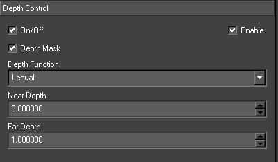
| Option | Description |
| Depth | Alters how and whether depth buffer tests are used whilst rendering |
| Depth Mask | Controls whether or not the depth buffer is written to whilst rendering. Default value is true |
| Depth Function | Controls the depth test function to use when rendering . Default value is Lequal. |
| Near Depth | Modifies the smallest possible value in the depth buffer. Default value is 0. |
| Far Depth | Modifies the largest possible value in the depth buffer. Default value is 1. |
Blending
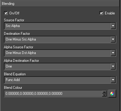
| Option | Description |
| Blending | Controls how rendered pixels are combined with existing pixels already in the output. |
| Source Factor | Controls how the colour value obtained from the object currently being rendered is used to control the output. Default value is Src Alpha. |
| Destination Factor | Controls how the colour value obtained from the screen buffer being rendered to is used to control the output. Default value is One Minus Src Alpha. |
| Alpha Source Factor | Controls how the alpha value obtained from the object currently being rendered is used to control the output. Default value is None. |
| Alpha Destination Factor | Controls how the alpha value obtained from the screen buffer being rendered to is used to control the output. Default value is None. |
| Blend Equation | Specifies an equation used to combine source and destination pixels Swiftether. Default value is Func Add.
|
| Blend Colour | Specifies a colour value to use when a constant blending factor is chosen. |
Lighting
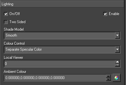
| Option | Description |
| Lighting | Controls the lighting state underneath the Shader node. |
| Two sided | Lights both the back side and front side of the object. |
| Shade Model | Smooth or Flat and indicates whether or not lighting values are interpolated across individual polygons. If the model is set to flat each polygon will be shaded with a single lighting value. Default value is Flat. |
| Colour Control | Single Colour or Separate Specular. This controls how the specular lighting is applied to the object. With separate specular the texture is modulated with the ambient and diffuse lighting terms and then the specular component is added on top to give a noticeable highlight. Using single colour means that the combined ambient, diffuse and specular terms are used to modulate the texture. Default value is Single Colour. |
| Local Viewer | 1 or 0 (interpreted as true or false). Local viewer influences how lighting calculations are performed. With local viewer enabled the vector from the point being shaded to the camera is re-computed. This results in more accurate lighting but is slower. Default value is 0. |
| Ambient Colour | Controls the global ambient colour underneath the Shader node. This is separate from the material ambient and light ambient colours. All three values (global ambient, material ambient and light ambient) are combined Swiftether when performing lighting calculations. Default value is (0,0,0,0). |
Operations
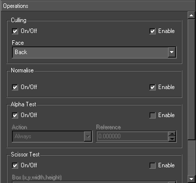
Culling
Culling refers to the removal of polygons that are not facing the camera during rendering. The culling cuts down on the amount of rendering that needs to be performed and hence improves performance.
Culling however only works when an object is a completely closed piece of geometry. Hence in certain situations culling needs to be disabled.
A polygon is defined as back facing if the normal of the polygon is facing away from the camera. Front facing polygons are ones whose normal are facing towards the camera.
Normalize
Controls whether the graphics hardware re-normalises the surface normals passed to it. This is used when a supplied piece of geometry does not have unit length surface normals. If surface normals are not of unit length lighting calculations will not behave as expected as they expect unit length surface normals. Visually normals not being correctly normalised will appear as overly bright lighting with very coarse highlights.
Alpha Test
Alpha test specifies a test function and a test value. Each pixel is evaluated by comparing the current pixels alpha value using the comparison function against the reference value and if the expression evaluates to true the pixel is rendered otherwise it is disregarded.
| Optin | Description |
| Action | The comparison function used in the alpha test.
|
| Reference | The value that the alpha is compared against |
Scissor Test
Scissor test evaluates each pixel being drawn against a bounding box. If the pixel is inside it is drawn otherwise it is disregarded.
| Option | Description |
| Box | The location and dimensions of the box. The box is specified in screen space coordinates. |
Colour Mask
The colour mask determines which colour channels are written to when pixels are written out to the display. By default all channels are written
| Option | Description |
| Red | Controls whether the red channel is written to |
| Green | Controls whether the green channel is written to |
| Blue | Controls whether the blue channel is written to |
| Alpha | Controls whether the alpha channel is written to |
Points
This page controls the parameters for rendering points. These values are only applicable if an object is being rendered using points.
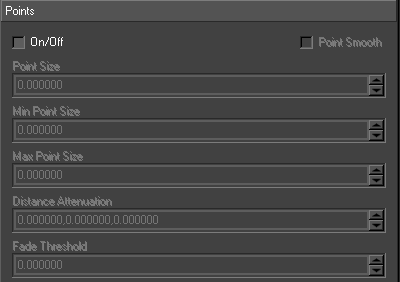
| Option | Description |
| Point Smooth | Controls whether the points are drawn using alpha blending or not to produce smooth edges |
| Points Size | Specifies the size to render the point in pixels |
| Min Point Size | Specifies the minimum size to render the point in pixels |
| Max Point Size | Specifies the maximum size to render the point in pixels |
| Distance Attenuation | Specifies constant, linear and quadratic attenuation terms for the point size. The attenuation is based on the distance of the point from the camera. |
| Fade Threshold | Is a size in pixels which if the size of a point is above it’s alpha value will be modulated to fade the point out. |
Lines
Specifies the width of any lines drawn. This value is only applicable if an object is being rendered using lines.
| Option | Description |
| Line Width | Specifies the width of the line in pixels |
Polygons
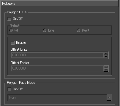
| Option | Description |
| Polygon Offset | Polygon offset affects the depth values written to the depth buffer when a polygon is rendered. |
| Polygon Face Mode | Polygon face mode controls how polygons are drawn – either as filled polygons, lines or points. Lines are drawn for each edge of the polygon or points for each of vertex of the polygon. Different drawing modes can be specified for back and front facing polygons |
Stencil
This is advanced OpenGL functionality and requires an in depth knowledge of OpenGL to use.
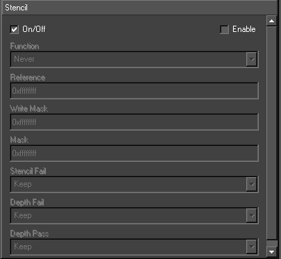
| Option | Description |
| Function | Stencil test (None, Less, Lequal, Greater, Gequal, Equal, Not Equal, Always). |
| Reference | Reference value for stencil test. |
| Write Mask | The stencil bit planes to be written to. |
| Mask | Used in the stencil test. |
| Stencil Fail | What to do if the stencil test fails (e.g. Keep, Zero, Replace, Incr, Dec, Invert). |
| Depth Fail | What to do if the depth test fails (e.g. Keep, Zero, Replace, Incr, Dec, Invert). |
| Depth Pass | What to do if the depth test passes (e.g. Keep, Zero, Replace, Incr, Dec, Invert). |
Interaction
Overview
Interaction covers all on-screen manipulation of objects within the world. This section covers:
- Interaction tools/toolbar icons
- The different camera views available in the editor and how to switch between them
- Selecting objects either on-screen or via the scenegraph
- Interacting with selected objects (Translate, Rotate and Scale)
- Altering scale and rotation pivot points
- Interacting with cameras and views
- Handling multiple selection and using tools with multiple selections
- Editable nodes
Render Window Interface
On-screen interaction is performed via the standard output window with the use of the two toolbars located either side of the main window.
Tool Bars
On the left hand toolbar are the following tools.
There are five different views available from within the editor. These are:

Camera Views
You can view the scene from a variety of different camera angles.
| Camera View | Description | |
 |
Global | Afree perspective camera that can be manipulated using all the standard interaction tools. A 3d grid is displayed while this view is active, with icon representations of the camera, lights and clip planes. |
 |
Top | An orthogonal camera constrained to always view the scene from above (from positive to negative y). |
 |
Side | An orthogonal camera constrained to always view the scene from the side (from positive to negative x). |
 |
Front | An orthogonal camera constrained to always view the scene from the front (from positive to negative z). |
 |
Current Camera | This is the view from the camera within the scenegraph currently marked as the Main Camera. This view shows how the graphic will be broadcast |
 |
Reset Views | Resets the views to their default settings. |
Annotations
These tool buttons affect what additional information is displayed alongside the graphic itself.
| Annotation | Description | |
 |
Show Grid | Displays a grid to assist layout |
 |
Show Crosshairs | This displays a crosshairs, centre screen to assist layout |
 |
Text and Action Safe | This displays text and action safe areas defined in the preferences |
 |
Wireframe | This displays a wireframe of the object selected |
 |
Normals | This displays the directions of the normals of the object selected. The normal length can be defined in the preferences |
 |
Snap to Grid | Snaps the selected objects to the defined grid |
 |
Background Checker Board | Displays a checker board on the render window. This is useful when working with transparent graphics, as you can see where graphics are and are not rendered |
 |
Show Key | Shows the key channel on the render window. White areas are opaque, Black areas are transparent. |
 |
Show Chromakey/Matting Key | When a chroma keyer or matting keyer is enabled, shows the composited output in the editor. |
 |
Show Touchable Areas | Display only geometries which Swift considers to be touchable/pickable. This is useful when working with touch nodes and touch interfaces. |
Editing Tools
Editing tools change the effect that interactions with the render window have.
Editing Tools sit below a “Swiftgle Menu”, where you select the object that you are manipulating
| Swiftgle Menu | Description | |
 |
Transforms | Allows objects to be moved around – translating, rotating and scaling. |
 |
Textures | Allows manipulation of the texture position – translating, rotating and scaling. |
 |
Text | Allows text to be selected and edited. |
 |
Maps | Allows the editing of maps |
 |
Trajectories | Edit trajectories using this tool. For more details, see the Trajectory Node documentation (page ) |
Transform Tools
| Tool | Description | Tool |
| Translate | Select this icon to translate objects in the viewport | Translate |
| Rotate | Select this icon to rotate objects in the viewport | Rotate |
| Scale | Select this icon to scale objects in the viewport | Scale |
Texture Tools
| Tool | Description | |
 |
Translate | Translate texture coordinates on the selected object |
 |
Rotate | Rotate texture coordinates on the selected object |
 |
Scale | Scale texture coordinates on the selected object |
Text Tools
| Tool | Description | Tool |
| Edit Text | Clicking on a text node will allow in-place editing of the text on that node. | Edit Text |
Map Tools
Mapping is not available in the current release.
Trajectory Tools
See the Trajectory Node for more details (page )
Other Tools
| Tool | Description | |
 |
Clear Selection | Deselected the currently selected object. This is useful when playing an animation, if the interactors are causing a distraction. |
 |
Swiftgle Text Boxes | Swiftgles all text max size boxes on |
 |
New Text Object | Creates a new text object |
 |
New Geometry Object | Creates a new geometry. |
 |
New Dynamic Geometry Object | Creates a new dynamic geometry. |
 |
New Shader | Creates a new shader |
 |
Keyframe Mode | Allows the editing of keyframes on screen |
Camera Interaction
All camera interaction is activated by pressing the left Alt key. The Control and Shift keys are used as modifiers to alter the behaviour of the interaction.
| Key | Mouse Button | Action |
| Alt | Left | Orbit the camera about a fixed point in front of the camera (camera orbit distance set in Preferences/Annotations) |
| Alt | Middle | Translate the camera in its X and Y axes |
| Alt | Right | Translate the camera along its Z axis |
| Alt | Mousewheel | Translate the camera along its Z axis |
| Alt+Ctrl | Left | Pan and tilt the camera |
| Alt+Ctrl | Middle | Translate the camera in the world X and Y axes |
| Alt+Ctrl | Right | Translate the camera in the world Z axis |
| Alt+Ctrl | Mousewheel | Roll the camera |
Shift operates as an axis lock; holding down Shift will cause all movement of the mouse to be constrained to the first direction the mouse is moved in. For example when using the camera orbit (Alt+Left mouse button) whilst holding down Shift, if the mouse is moved horizontally first the orbit will only be about the vertical axis, vertical movement of the mouse will be ignored.
Object Interaction
Overview
On-screen manipulation refers to the process of interacting with objects in the world directly from one of the camera views available in Swift. Interacting with an object is performed by selecting the object on-screen, the type of interaction control used depends upon the current mode of interaction.
Object Selection
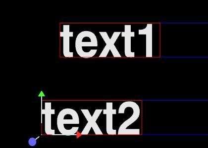
Selection of objects is performed by clicking on them with the left mouse button from within one of the camera views. Once an object is selected a red bounding box is rendered around the object to indicate that is has been selected. Multiple selection is performed by holding down the Shift key whilst picking objects in a camera view. A bounding box will be drawn around each selected object to indicate that they are selected
Clicking on Swiftgle Text Boxes
will show the blue box for each text node in the scene. This is the biggest box the text can occupy. Sometimes text cannot be selected because it is empty but this makes all texts selectable by clicking on their blue boxes.
Object Multiple Selection
Multiple objects can be selected via the picking interface as well as single objects. When multiple objects are selected they can still be manipulated using the standard tools. Objects are multiply selected by holding down the shift key. When multiple objects are selected the on-screen interaction tools are always displayed at the location of the first node. This is a useful indicator of which node was the first to be selected. Some tools (Linking and Align) perform operations that update all nodes in the selection relative to the first one.
Conventions
All interactors conform to certain conventions:
Colours are used to indicate the axis a tool or a part of a tool will operate in
| Colour | Axis |
| Red | x-axis |
| Green | y-axis |
| Blue | z-axis |
All tools have two types of operation:
| Mode | Description |
| Free | Movement can occur in any of the three axes.
Dragging an object about using the free translation causes the object to remain under the mouse cursor at all times. The actual translation caused by this moving potentially moves the selected object in all three dimensions. Movement is performed in a plane that is parallel to the camera and passes through the original location of the object. Returning the mouse to the location it was in when the free dragging was begun will return the object back to its original location. |
| Constrained | Movement is restricted to a single axis.
This mode is activated by selecting the appropriate handle on the on-screen interactor, or by holding down shift. |
Translation
Translation can be performed either by simply grabbing an object on-screen and dragging it or via the use of the axis handles on the translate tool. Dragging an object will cause it to move exactly where the mouse cursor is on-screen.
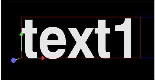
Rotation
Rotation can be performed either via the handles to produce axis constrained rotation or via clicking on the shaded sphere for free rotation.
Axis constrained rotation works by moving the handle in a circle about the centre of the rotation interactor. For example grabbing the red (x-axis) handle as shown and moving anti-clockwise around the centre of the interactor produces a rotation of 90 degrees about the x-axis.
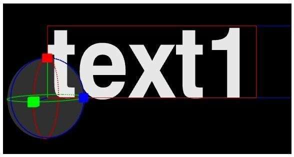
Scale
The scale tool allows axis constrained scaling. The scaling handles are always displayed at a fixed distance away from the centre of the tool irrespective of the actual scale factor of the transform.
As the scale handles are moved the length of the corresponding axes will update to reflect the change in scale, but upon releasing the mouse button the axes will jump back to their default length. The selected scale will remain applied to the object. This approach is used to make the scale tool usable when dealing with small or large scale factors.
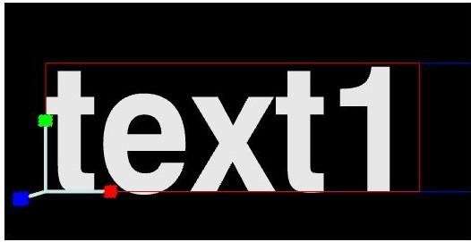
Pivot Points
Pivot points exist for scale and rotation; these can be manipulated in two different ways.
Selecting the Scale Pivot or Rotate Pivot tabs from the transform node editor.
When an object is selected on screen with the rotate or scale interactor selected, depressing the Control key will activate manipulation of the pivot points. The on screen manipulator takes the same form as the translation interactor and behaves identically.
If an item has a rotate or scale pivot offset a visual indicator of the centre of scaling or rotating will be provided. The interaction control will be displayed at the centre of rotation or scale and a dotted line will link back to the object being controlled.
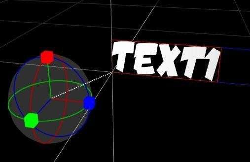
Light Interaction
The three types of light are drawn each with their own icon representative of the type of light.
Infinite lights
Represented by a ball with a line linking back to the world origin. This line represents the direction of the infinite light.
Local lights
Represented by a ball draw at the location of the light.
Spot lights
Represented by a cone and a direction. The cone is drawn at the angle of the spot light cone and the direction indicator is drawn in the direction the spot light is facing. The location of the ball is drawn at the location of the spot light.
Lights can be interacted with the standard interactors as follow:
| Tool | Action |
| Translate | Infinite, Local and Spot light positions |
| Rotate | Spot light direction |
| Scale | Spot light inner and outer cone. |
On Screen Annotations
Some node types are not displayable in the final output of Swift and these are displayed with on screen icons in the editing camera views.
Grid
A grid is displayed centered at the origin of the world. Icons are drawn for camera nodes, light nodes and clip plane nodes. The grid size and scale can be modified in preferences/annotations.
A basic view in the global edit camera will be something similar to the view shown. The annotation objects can be interacted with using all of the standard interaction tools.
Not all of the annotation objects support all of the types of interaction e.g. scaling has no effect upon cameras.
Right Click Menu
Right clicking on an object will cause a drop down menu to appear. The options in this drop down menu are outlined in the scenegraph section apart from the few exceptions listed below.
| Text Option | Description |
| Set Left HAlignment | Aligns text horizontally to the left. |
| Set Centre HAlignment | Aligns text horizontally to the centre. |
| Set Right HAlignment | Aligns text horizontally to the right. |
| Geometry Option | Description |
| Recompute normals | Recalculate the normals for the currently selected geometry. |
| Other Options | Description |
| Parents | This menu allows rapid selection of ancestor nodes of the currently selected object back up to the root node |
Edit Mode
Overview
Editing of nodes is separate from standard interaction: certain nodes (currently only Text, Trajectory, Shader nodes (texture coords)) can be edited directly from within a camera view. To edit these nodes from within the camera view double click on the object. Having a separate edit modes allows editable object to be still interacted with using the standard on-screen tools, but also be edited when required (double click swaps between the two modes).
Once Edit mode has been entered, editable objects can no longer be manipulated using the standard editing tools (Translate, Rotate, Scale). To manipulate editable objects Edit mode must be exited (via the toolbar), or by double clicking on the object.
Editing Text
Text can be edited directly on screen once Edit mode has been entered. Simply select text edit from the interaction drop down menu then click on any visible Text or double click on text in the graphics window to begin editing.
Text can be selected via the mouse and a cursor will be displayed within the text to indicate where editing will occur.
NOTE: to easily see where text nodes exist on the graphics window use the Swiftgle text box on the graphics window toolbar.
All the standard editing keys (Arrow Keys, Home, End, Delete and alpha numeric keys) are usable. For example with the text as selected above, pressing Delete will remove the selected characters.
Node Edit Toolbars
Overview
There are two specialised editors specified for editing text and geometry. Changes here may affect more than just text and geometry nodes e.g. changing the scale will affect the transform node above the text node.
The settings in these editors will be used to initialise new texts and geometries created using the tools on the toolbar to the right of the graphic screen. These settings will be applied to all selected texts and geometries eg. to change the font across several text nodes select all the text nodes and use the text toolbar editor to change the font.
Text

| Option | Description |
| Size | Sets the scale of the transform above the text node |
| Alpha | Sets the material override alpha of the shader node above the text node |
| Shader | Sets the shaders of the shader node above the text node |
| Font | Sets the font of the text node |
| Alignment | Sets the horizontal and overall alignment of the text node. |
Geometry

| Option | Description |
| Alpha | Sets the material override alpha of the shader node above the text node |
| Shader | Sets the shaders of the shader node above the geometry node |
| Geometry | Sets the geometry of the geometry node |
Scenegraph
Overview
A Scenegraph is a way of ordering the nodes contained in the scene into a hierarchy where parent nodes affect child nodes. A Scenegraph is basically a tree (really an n- tree as it can have as many nodes as required), in which some action takes place before proceeding to the children nodes. For example, if a Transform node has a Text node as a child, the Text Node will be transformed by the values contained in the transform node. Likewise, a Shader node will apply its colour and texture values to any nodes that are its children, but not to any nodes that are its parents.
Interface
The entire Scenegraph is displayed in the editor (as long as the Scenegraph viewer is selected to be displayed). Each node has a different icon; the icons can be seen in the z`node browser (usually displayed above the scenegraph). Some of the icons are colour coded.
| Tool | Description |
| Find Node | Opens a dialog to allow searching for nodes in various ways |
| Swiftgle Basic Node Editor | Opens the basic node editor, which contains a number of properties and tools which are common across all nodes. A full description can be found in the node reference (see page ) |
| Swiftgle Branch/Leaf mode | Chooses whether operations such as delete and move will affect just the selected node, or also all of its children. |
| Prune Selected Nodes | Hides (prunes) the selected nodes from the scenegraph view. This is useful when working on large scenegraphs to focus on only those parts of the scene that you are interested in. |
| Prune Unselected Nodes | Hides (prunes) all nodes apart from the selected nodes from the scenegraph view. |
| Restore Pruned Nodes | Restores (unhides) any nodes that have previously been pruned. |
| Move Node Up | Moves a node up the scenegraph |
| Move Node Down | Moves a node down the scenegraph |
Finding Nodes
Used to locate nodes in the scenegraph. The selected node will be made visible.
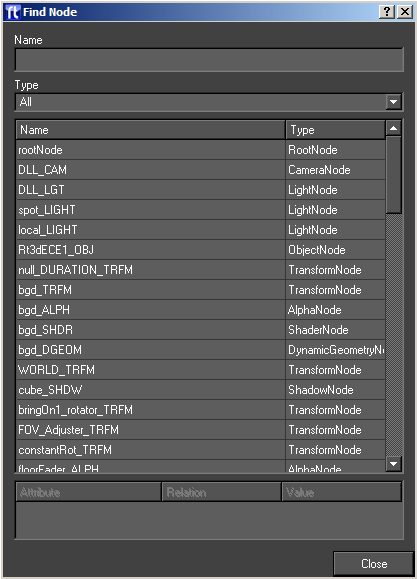
| Option | Description |
| Name | The dialog will only display nodes in the scenegraph whose name matches. |
| Type | Only show nodes that match this type |
| Node Table | displays all matched nodes and their types. |
| Attribute Table | used to refine search, nodes can be found based on the values of their attributes. The user can specify for each attribute (e.g. font for text node) a relation (equals, not equals, less than, greater than, in range, in set) and a value which is the string form of the attribute (e.g. GM_HA_Left). |
Expand/Collapse Branch
Next to each of the nodes in the Scenegraph there is a little – or a +. If there is a – next to a node then all of its child nodes will be visible in the viewer, if there is a + then they won’t be visible. If the user clicks on a – next to a node then all of the child nodes will disappear and a + will appear next to the node. If the user clicks on a + next to a node all of the child nodes will appear and a minus will appear next to the node. Being able to do this is very handy if the user is navigating the Scenegraph or wants to make it more manageable.
Node Editors
If a node is selected in the scenegraph or an object is selected in the scene (and the editor is displayed) its attributes (see node reference) will appear in the editor. Within this editor these attributes can be changed e.g. if the user has a transform node selected in the Scenegraph then the editor will contain, amongst other things, a translate X Y Z edit box. These can be changed by putting the mouse pointer over the values and using the mouse wheel, or by selecting one of them and entering a value using the keyboard and pressing enter to confirm.
NOTE: enter must be pressed after keyboard editing to confirm the change.
Node Browser
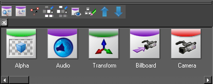
The node browser allows you to browser all of the different node types available in Swift, and drag them
Adding Nodes
Nodes can be dragged from the node browser into the Scenegraph.
Swift will prevent the user from dropping nodes into places which would result in an invalid Scenegraph. If during the dragging process the node has a circle with cross going through then the node cannot be.
Once a valid location has been chosen and the left hand mouse button has been released a small menu will appear with the following choices on it:
| Action | Description |
| Insert Inline | This adds the dropped node as a child of the node it is dropped onto adjusts any child nodes attached to the position so they are reparented to newly added node |
| Insert Above | This adds the dropped node as a parent of the node it is dropped onto, the old parent is then added as a parent of the newly dropped node. |
| Add | This adds the node on the scenegraph at the same level in the tree (see Scenegraph) as the position dropped at. |
| Cancel | Cancels the drop |
Dragging a Node
The user can select a node in the Scenegraph and drag it onto another node. As in the last section, if the node has a circle with cross going through it, then the node cannot be moved to the current location.
Once the user drops the node back into the Scenegraph a small menu will appear with the following options.
| Action | Description |
| Move the branch | Moves the node and any child nodes |
| Move the node | Move the node to the new position. |
| Link to | Creates a link between the two nodes (see Node/Basic node) |
| Copy the attributes | (only works on some nodes) Copy the dragged nodes attributes to the node the mouse pointer is over. |
| Cancel | Cancel the move. |
Right Click Context Menu
Right clicking on a node in the scenegraph will cause a drop down menu to appear. This menu will also appear if the user right clicks on the screen.
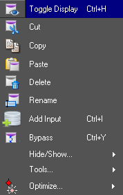
Swiftgle Display
This affects the nodes visibility in the scene.
Cut
The selected node and ALL of its child nodes will be cut out of the Scenegraph.
Copy
This will take a copy of the selected node and all of its child nodes.
Paste
This will paste the contents of the clip board (anything copied or cut from the scenegraph, and any child nodes it has) into the scenegraph as a child of the currently selected node.
Delete
This will delete the currently selected node and all of its children.
Rename Node
Type in the new name for the node and press enter to confirm.
Renaming multiple nodes at once with Regular Expressions
The user can enter a substitution command of the following form
/<old pattern>/<new pattern>/
This tells Swift to use regular expressions to replace the old pattern with the new pattern. See the web for tutorials on how regular expressions work.
Some simple examples are given below :
| Example | Description |
| /n1_/bob_/ | Replace the text n1_ with the text bob_ in all node names that contain it. |
| /^/lowerThird_/ | Adds lowerThird_ to the start of every node name |
| /$/_end/ | Adds _end at the end of every node name |
| /randomtext// | Remove random text from all node names(literally, replacing it with an empty string) |
Add input
Adds an input to the node (see Inputs for more details, page )
Hide/Show menu
The hide show menu contains several options for managing the scenegraph view.
Swiftgle lock
Locks a whole sub tree Swiftether so dragging any part of it on the graphics window will cause the entire tree to be dragged as if the top transform node has been selected.
Swiftgle Collapse children
Causes the expanded child nodes to be collapsed. Unsetting will restore the original state.
Swiftgle extended nodes
Shows or hides any extra nodes that are not normally shown in the scenegraph. This can be useful in limited circumstances for checking what is happening in a graphic.
- For a duplicate node, shows all duplicates rather than just the prototype.
- For a text node, shows all of the character meshes, which are normally hidden.
Swiftgle prune node
Hides the selected node and prevents interaction with it through the screen.
Position Menu
The position menu allows you to align multiple nodes with each other.
Align X
Applies the x position of the current node to any other selected transform nodes.
Align Y
Applies the y position of the current node to any other selected transform nodes.
Align Z
Applies the z position of the current node to any other selected transform nodes.
XYZ Spacing
Allows you to specify a spacing that will be applied to all selected transform nodes. For example, a spacing of 1,0,0 will set each transform node to be 1 unit further along the x axis than the previous.
Tools Menu
The tools menu has tools for modifying the scenegraph
Group
Adds a transform node above the selected node/nodes
Link
Creates a link between the two nodes See Links for more details (page )
Duplicate
Adds a duplicate node above the selected node
Optimize Menu
This menu contains tools for optimising a scenegraph.
Prune redundant transforms
Simplifies the scenegraph by removing transforms that have no effect on the graphic. For a transform to meet the criteria to be removed it will have no translate/rotate or scale factor and no animation or links.
Sort by shader
Attempts to improve the scenegraph by sorting it so that identical shaders are used next to each other. This reduces the number of shader sets in a scene which can increase performance.
NOTE: be aware that this can cause transparency issues on some scenegraphs.
Sort by name
Sorts the nodes under the current node by name.
Collapse to geometry
Collapses the scenegraph beneath the node selected to a single geometry.
TimeLine
The time line editor gathers Swiftether several editing functions in one place. The user can, as well as designing the animation of the graphical elements of a scene, can attach them to external data sources, group their animations in a way that is useful when Swift is controlled by other applications, set graphical events to occur at specified frames fired off by real world triggers.
Interface
The animation interface is contained within the time line editor usually found at the bottom of the Swift interface. This is shown below:
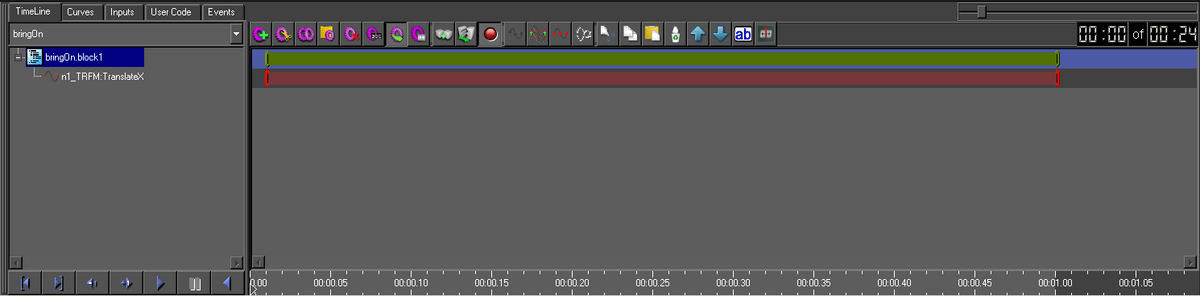
The time line has the following areas:
- Method selector – a drop down list of methods in the graphic
- TimeLine – a timeline for any animations that exist in the current method
- Curves – the editor for a particular animation
- Input – the editor for connecting graphics to external data
- Event – the editor for connection external events to actions in a graphic
- User Code – the editor for adding user custom ruby code to the graphic
- Playout Controls -the playout toolbar for playing through animations
Note: That this section will only deal with the TimeLine, Curve parts of the interface. The following sections will take the user through an example to illustrate the various aspects of animation in Swift.
Methods and Blocks
A graphic is broken by Swift into methods. Every graphic has an initialise, construct and Main method. The initialise is called when the graphic is loaded. The construct creates and populates the scenegraph. The Main method is called whenever the graphic is run. The Main method also takes care of the transitions between graphics.
| Action | Description |
| Add method | Adds a new method |
| Cut method | Cuts a method |
| Copy method | Copies the current method |
| Paste method | Pastes the last cut or copied method as a new method. |
| Delete method | Deletes the current method |
| Rename method | Renames the current method |
| Export method | Exports the method so it can be used in playout interface |
| Layoff method | Saves each frame to disk as the method is played |
Users can create their own methods. Using the methods tools on the Timeline toolbar methods can be deleted and renamed. The can be cut/copied/pasted between graphics.
Methods are also divided up by Swift into blocks. Inputs, user code and animators are all part of a block. A block is a way of logically grouping them Swiftether. A method has at least one block by default.

| Action | Description |
| Add block | Add a new block to the current method |
| Split block | Split a block into two at the current timecode. This will break animations in 2. |
| Animations Block | If set to red, Swift will wait until all animations in the block have completed before starting the next block. If this is set to green, the next block will start while this block is still running. |
A block can contain several animators, each animator animates a single node AField.

| Action | Description |
| Clean up path animators | Removes defects from the animation path |
| Translate and scale animators | Pops up the Animator Shift dialog: |
| Zero handles | Zeros the animation handles |
| Flip animations | Mirrors the animation curve |
Animator Shift
The animator shift dialog allows broad changes to be made to animators.
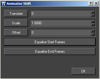
| Option | Description |
| Translate | Moves the selected animator backwards and forwards in time |
| Scale | Scales the duration of the selected animator |
| Offset | Offsets the start time of the selected animators with respect to each other |
| Equalise start frames | Makes all the start frames of the selected animators the same. |
| Equalise end frames | Makes all the end frames of the selected animators the same |
The controls below can apply to selected items, i.e. blocks or animators

| Action | Description |
| Cut | Cut current selection |
| Copy | Copy current selection |
| Paste | Paste previous cut / copy |
| Delete | Delete current selection |
| Move Up | Move current selection up |
| Move Down | Move current selection down |
| Rename | Rename current selection |
Creating Animations
We will now look at the timeline and describe how this interface works. Select the timeline tab. To create an animation drag any node from the scenegraph and drop onto the ruler at the start frame required. A small diamond marker will appear to tell where the animation will start from. This will cause Swift to pop up the dropped nodes animator selector dialog.
The user will select:
- The Animatable property (AField) to be animated
- The Type of animation
- The Range of values
- The Duration
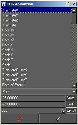
When the user accepts, an animator will be added to the block and red bar outlining the animators duration will appear.
Adjusting the Animations
The main purpose of the timeline is to allow the user to change the start/end and durations of the individual animations.
- Each block has a Green line, representing the block as a whole.
- Each animation has a Red line, indicating where the animation appears within the block.
Each line has at either end a vertical bar. The user can grab these and drag left and right to decrease/increase the duration. Grabbing the left handle changes the start frame and grabbing the right handle changes the end frame.
If the user grabs the line somewhere in the middle then both start and end frames are moved. This allows the user to move an entire animation within its block. If the user drags an animation past the end of the block the block duration will automatically increase.
If the user drags the end block handle then this will scale all the animations inside by a proportional amount. Thus it is very easy to change the timings of an entire block. Note that the user cannot drag the start frame of a block and cannot drag the entire block.
The user can also select more than one animator under block and all the operations that can be performed on a single animator can also be performed on the group.
If the timeline is longer than the width of the screen then the user can use the scale controls at the top right of the timeline to scale the whole timeline to fit.

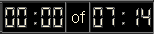
Playing Animations
The buttons located at the bottom left allow the user to play forward and back through the animation.

| Button | Description |
| Swiftgle Block/Method | When de-selected this plays through the currently selected block and when selected it plays through the entire method. |
| Goto Start | Positions the animation at its start frame |
| Goto End | Positions the animation at its end frame (either block or method) |
| Jog Reverse | Steps the animation back by one frame |
| Jog Forward | Steps the animation forward by one |
| Play | Starts playing the animation forwards. The user can use the pause button or click on the time line ruler to stop this animation. |
| Pause | Pauses the playing the animation. |
| Rewind | Starts playing the animation backwards. The user can use the pause button or click on the time line ruler to stop this animation. |
Scrubbing
You can also grab the timecode cursor with the left mouse button and drag this back and forth to scrub through an animation.

Curves editor
The curve editor is the window that is used to edit points on an animation.The curves used in Swift are Bezier curves. A knot is a point on the curve for which the user defines a value. In-between knots the shape of the curve is controlled via the Bezier curve algorithm. As well as being able to control the value at points on the curve it is also possible to control the slope of the line as it leaves knots. This is done in Swift with the red control handles attached to the knots.
There are two main important features of the curves.
- The value point represented by a yellow spot on the edit window. The represents a knot or value in the path. The vertical displacement of the point is the value of the curve at that point. The horizontal position of the point is the point in the timeline at which the value occurs.
- The red control handle for the knot. This controls the ease in and out from the knot – the gradient of the curve as it leaves a particular control point. If a knot has both an incoming and outgoing curve there would be two control handles on the knot.
To change the value or field of a value on the path simply grab it in the curve editor and drag it with the mouse. If the animation is made shorter or longer as a result of editing the curve, this will be reflected in the timeline editor. The complete curve can be flipped. The handles will be recomputed to fit the new curve.
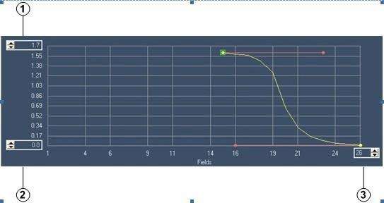
The three spin boxes on the editing canvas control the value and frame ranges.
| Option | Description |
| Max grid size | To change enter a new max size |
| Min grid size | To change enter a new max size |
| Curve duration | To extend the duration of a curve enter the new duration. |
Common Properties
The following properties are available for all animations.

Class
Specifies the type of animation:
| Class | Description |
| Path | these are curved paths that allow the user to change the rate of movement of the animation over time. They are represented using Bezier curves and knots. |
| Ramp | these are simple straight lines between a start frame/value and an end frame/value. |
| Step | These are one shot animations and allow the user to update a value at a specific frame. |
| Cyclic | These apply sinusoidal animations to variables. |
Node
This selects the node that is going to be animated
Field
Choose the animatable property (AField) that will be animated.
For a given node this is a list of all fields in that node that can be animated. Note that the fields are restricted to the animation type specified. For Cycle, Path and Ramp these are always floating point values. Step Animators will include Integers, Booleans and Strings.
Repeat
Specifies if the animation should repeat and how it should repeat.
| Repeat option | Description |
| None | Do not repeat |
| Repeat | For Ramp and Cyclic. Continues the animation infinitely. A Ramp will continue increasing the value at the ramp rate and Cyclic will continue cycling. |
| Repeat/Reset | For Ramp, Path, Cycle and Step. This is the same as Repeat except the animation will reset to the beginning when it reaches the end. |
| Reset | For Ramp, Cycle and Path. The animation will reset to its first frame value at the end. |
Link Type
The link type determines how the animator treats the starting point of the animation.
| Link Type | Description |
| Absolute | Use the value calculated from the animation. |
| Relative | Use the current field value as the start value and recalculate the path from this value. This is useful if the user does not know ahead of time the value the field will be starting from. |
| Relative Offset | Not used. |
| Offset | Use the current field value as an offset to the animation. |
Delay
This is used for text character and Duplicate node animations where the animator is animating multiple objects.
Delay offsets each animation relative to the last one, causing a more pleasant, staggered animation.
Additional Properties
All the attributes of the curve can be updated here just as they could be initialised in the New Animator dialog.
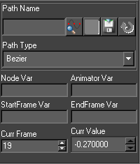
Cue on Block
Pauses for user input at the end of a block (eg. a gpi trigger or a mouse click)
Variables
Whilst most animations in Swift are well defined, acting on a specific node, with a fixed duration, it is sometimes useful to be able to alter the properties of an animation via user code.
Modifying the final value of an animator is such a common case that it is built into the Input framework. See Inputs and the Animator Destination Type for more details (page )
The following variables are less common, but very powerful when you do need them.
Node Variable
Allows you to choose which node the animation should affect via usercode. For example, you could make an animation that moves a transform node right by 1 unit. In usercode, you might have the following :
| if(someCondition) myNode = @n1_TRFM else myNode = @n2_TRFM end |
By setting the node variable to myNode, the animator will either move @n1_TRFM or @n2_TRFM, depending on if someCondition is true or false.
Animator Variable
The animator variable alters the end state of the animation. This has the same effect as setting an input to have the Animator destination type.
StartFrame Variable
Setting this variable lets you choose the starting frame of the animation in usercode.
End Frame Variable
Setting this variable lets you choose the ending frame of the animation in usercode.
Curr Frame
The frame of the current knot (when dragging). Can be used to update the frame of the current knot.
Curr Value
The current value (when dragging). Can be used to update the current knot value.
Ramp Animator properties
| Property | Description |
| Offset | Offset the ramp by this amount |
Path Animator Properties
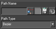
| Property | Description |
| Path Name | Paths can be saved and loaded from disk. This is done in through the Curves Editor . Paths are read from the path directory specified as part of the project. If the user specifies a path name here the rest of the path values will fill in automatically. |
| Path Type | Only Bezier is supported at present |
Step Animator Properties
| Property | Description |
| Value | The Step animator interface will change depending on the field value selected. If the Field value is a float a point edit control will display, For a boolean a check box will appear, For a string value an edit field will appear and for an integer value a spin box will appear. |
Cyclic Animator Properties
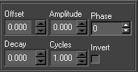
| Property | Description |
| Phase | At what point in the cycle the animation should start (0-90) |
| Amplitude | The height of the oscillations |
| Offset | Oscillate from one value to another |
| Decay | Rate at which the oscillations die off |
| Cycles | The frequency of oscillation |
| Invert | Clamp oscillations to positive or negative cycles |
Inputs
Inputs are the mechanism through which Swift associates external data with node and animator attributes. The Inputs editor is part of the Timeline editor and is accessed through the input tab.
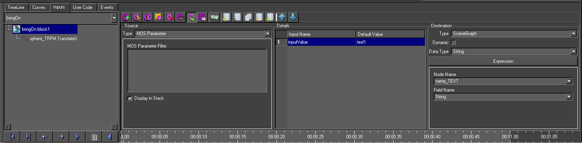
Inputs can be added, removed, cut and pasted. Inputs are added to the current block so a destination attribute can have more than one input but they must all be on different blocks.
Inputs happen in two stages. First the source data is retrieved. Second, this data is written to the destination. Any user code specified for the block is run between these two stages. This is why input sources have script variables associated with them. The source data is assigned to this variable in the graphic. The user code can then manipulate this script variable. The results of this manipulation will be then written to the destination.
All destination data will be automatically converted to an appropriate form before it is written. For example, an input on a Text nodes font field will be converted from a string to a pointer to a Swift font.
An input on an animator will change the final value of the animation and cause it to be recalculated. An input can be put on a Step animator. When the Step animator is animated the input is evaluated. This allows inputs to be run at a specific frame not just the start of a block.
Details
This lists all the inputs on the current block. Change the block and the list will change. More than one input can be selected and selected inputs can be deleted, copied and cut.
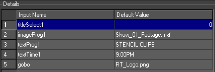
| Option | Description |
| Input Name | The name of the input. It is recommend the user uses sensible names which describe what the input does. For example, lineWidth, showBarChart, translateX |
| Default Value | The value to set the input to if none is received. |
Source
The user selects the source type for the input. There are nine types of input sources.
| Source Type | Description |
| Widget | The source is a widget in a user interface supplied with the graphic. |
| MOS Parameter | The source is from a name/value pair sent to the method by some external means, for example a MOS connection. |
| Database | The source is a database query |
| Script Variable | The source is an existing script variable inside of Swift. |
| Constant | The source is a constant value |
| SceneGraph | The source is the current value associated with part of the scenegraph. |
| Touch Parameter | The source is a touch parameter when this method has been triggered by a touch event. |
| Swift Sports | The source is data generated in SwiftSports. |
| Command | The source is the output of a command run externally to Swift. |
Widget
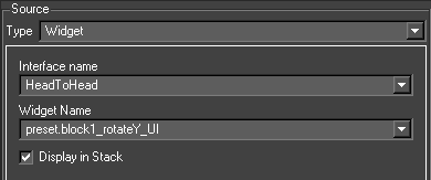
The interface widgets come from user interfaces. A user interface is associated with a graphic in the Graphic editor. The user interfaces for a project are stored in the Template graphics directory. The interface can be laid out in Qt Designer externally to Swift and then imported. Alternatively, Qt Designer can be run up for the graphic chooser. When the interface is saved, it is saved automatically to the Templates directory. Swift can also automatically generate interfaces if required.
When Swift is in Playout mode and a graphic is selected, if it has an associated user interface, this is popped up under the stack (if display in stack is set to true). The user enters values and stacks the graphic. These values will be the sources for Interface Widget inputs.
Almost any widget can be used. If a list is used, normally its contents would be retrieved as a string. If its position is required just end its name in ‘_ascii_’. It is worthwhile naming the widgets in a consistent manner eg. for a QComboBox of fonts for a Text node called title, titleFontCB would be useful.
Display in Stack
If this is set then this parameter will be listed with the method when it is stacked in Playout mode.
MOS Parameter
The MOS Parameter source type allows access to any name/value pairs of data that have been made available to the method.
The xml MOS messages received by Swift as part of the Remote protocol will contain parameters as name/value pairs. Swift will use the name of this input to retrieve the value for this name from the list of name value pairs. This value it then written to the destination.
It is also possible to add your own parameters in user code, which is useful when calling methods from within other methods.
Filter
Only used when generating interfaces. This allows customisation of the widget created from an input.
If the input updates a font/shader/geometry/texture then the contents of this is used as a regular expression to limit the items in the combo box widget normally produced for these types of inputs (e.g. a texture image being updated and the filter is
/home/Swift/*.tga – this filter will cause the file chooser widget generated to default to the directory /home/Swift and the file chooser filter will be set to .tga files).
Otherwise this can be used to override the default creation of a line edit and replace this with a combo box. The filter would then contain the location of a file used to set the contents of the combo box (e.g. a text string being updated. Normally a line edit would be generated and the value entered into this would update the text string. If filter is specified to be a file which contains on different lines Left Right, a combo box would be generated with Left and Right as the two choices). When one of these is selected the value will be added to the text string.
Display in Stack
If this is set then this parameter will be listed with the method when it is stacked in Playout mode.
Database
The database source allows you to query a database, and use the result of the query as the data for the input.
- Databases are set up via the Project Settings dialog. (See Page )
There are two forms of the database source editor. A full SQL select statement can be entered into one (allowing all the power and flexibility of SQL data selection). The other is simpler and builds an SQL statement up from its component sections. This makes it easier for an SQL novice.
At the moment the input source is evaluated ie. when its associated block is run, the database is accessed and the statement run on it.
Variable Interpolation
A powerful feature of database queries is that you can modify them based on existing parameters in the system. This can be done for global variables and for MOS parameters.
In order to do this, use square brackets in part of you database query. For example :
| SELECT name FROM addressbook WHERE address = ‘[$currentAddress]’ |
Here, $currentAddress is a Ruby global variable that we have previously set up with an address. Note that in order for this to be a correct sql statement, we still need to quote the result with ‘’ outside of the square brackets.
Alternatively, the value that we use might be passed to the method. To access the method data, specify the parameter name directly.
| SELECT name FROM addressbook WHERE address = ‘[currentAddress]’ |
Here, currentAddress would have been set up externally via e.g. mos, another Swift method, a touch event, etc.
Default values for interpolation
When running in the editor, quite often there is no data available. You can choose a default value by adding :<defaultValue> to the square brackets, as follows :
| SELECT name FROM addressbook WHERE address = ‘[currentAddress:Unit 6, Hurlingham Business Park, Sulivan Road, London, SW6 3DU, UK]’ |
Edit SQL
The user can move between the two interfaces and the statement (or as much has been entered) will be transferred.
NOTE: Complex statements cannot be handled by the simple SQL editor. In this situation, Swift will stay in the full SQL editor to avoid corrupting the SQL statement.
Database
The database of the source – from the project database list
Table
A list of the tables in the database. Only one can be selected. To do table joins use the complete statement entry interface
Where
Insert the where clause here (minus the WHERE)
Column
A list of the columns in the selected table. If selected the column is added to the Details widget
Details
This determines what columns (and manipulation of those columns) are retrieved.
Eval
This evaluates the statement and puts the result into the combo box.
Database Statement
When using the “full” mode, The complete SQL statement is shown here.
Script Variable
This source type allows access to a ruby script variable that has been previously set up in the graphic. For example, a script variable that was the output of a previous input can be piped into another input.
Constant
This value is read in from the default value specified in the input details table.
Scenegraph
Touch Parameter
Swift Sports
This source provides access to a number of Swift Sports specific variables.
- For more details, see the Swift Sports Manual.
Command
Destination
All input destinations share the two combo boxes below.
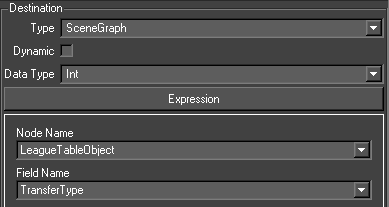
Dynamic
A dynamic input will be evaluated every time the input is run. In most situations this should be checked.
If an input is not dynamic, it will only be evaluated at the start of the method, the first time that method is run. This can be useful if you are using dynamic data sources, and want to be sure that they don’t change halfway through a graphic.
Data Type
This sets the datatype (string, float, int etc) of the source. If the source is going to be manipulated in user code, it is sometimes useful to set the datatype of the script variable
There are five types of input destinations
| Destination Type | Description |
| ScriptValue | The data is stored in a script value, nothing else happens |
| SceneGraph | The data is pushed to an animatable property (AField) on a node. |
| Animator | The data is used as the end value of an animator |
| MethodData | The data is parsed as a list of name/value pairs and used to create new data that can be used in future blocks. The data can be accessed using the MOS Parameter input type. |
| SwiftSports | The data is used to run one of a number of Swift Sports specific actions. |
Scenegraph
The evaluated source of the input will be converted and written to this field when the block is run.
Node Name
The destination node in the scenegraph
Field Name
The field on the node selected above
Script Value
This creates a ruby script variable and assigns the source to it.
Animation
This lists the animators on the current block as <node_name>.<field_name>. The evaluated source of the input will be written to the final value of the animator when it is added to the node. For a Path animator, this will cause the path to be recalculated.
Animator Node Name
This contains the node:field value
NOTE: If the target node is part of a Duplicate nodes prototype node, the results of the source evaluation will be a list and will be distributed among the duplicates. If the source is a database, the list will be the results of the SQL statement. If the source is a constant value, the source will be divided in to a list of strings using ‘~’ as a separator. MOS Parameter and Interface Widget sources are handled similarly.
Method Data
Sports
This destination type contains actions that are specific to Sports.
User Code
This page allows to user to enter the user code for the current block. The use code block can be made blocking by selecting the toolbar option.
- Refer to the chapter on user APIs for more information on user code
Events
Events are used to trigger actions in Swift. The Events editor is part of the Timeline editor and is accessed through the Event tab. The Event editor allows users to define a trigger that will execute a given action when the event occurs. The event interface is split into three sections:
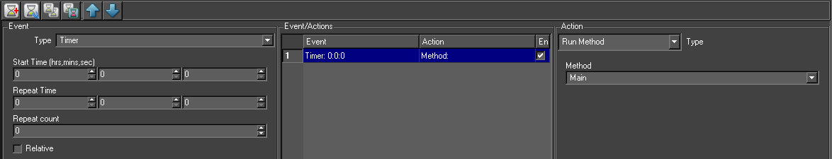
| Section | Description |
| Event | This shows the currently selected event. |
| Event/Actions | This lists all the events in the graphic. |
| Action | Shows the action for the currently selected event. |
Events are global to the graphic, they are not specific to methods or inputs.
When a graphic is loaded the events are loaded and active (unless specifically created disabled)
For example, the clock will start for any relative timer based events.
In Playout mode events will become ‘live’ when the graphic is taken to air and will remain ‘live’ until the graphic is taken off air or another graphic is loaded, in which case any events contained in the new graphic will become ‘live or if the event is disabled.
Events will not be triggered from within the editor.
Events (event trigger)
Swift has ten different types of events – Timer, Timecode, Database Trigger, GPI, Mouse, Keyboard, mix, WiiMote and touch.
Timer Events
The Timer event can provide an extremely accurate timing mechanism provided the system is set up to use a network time protocol. See the systems admin to check this is the case. Otherwise, it is possible the system clock may drift compared to a house clock. The Timer event allows the user to trigger an action based upon two distinct conditions depending on whether the ‘relative’ check box is checked.
When Relative is unchecked
This is used to trigger an event at either a certain time (Start Time), using the system clock. The event can then be repeated any number of times (Repeat count) at a set duration (Repeat Time) after the start time expires e.g. repeat 3 times every 10 secs after the start time.
The repeat count may be set to ‘ALWAYS’ in which case the action will always trigger at the repeat duration until the graphic is closed.
When relative is checked
This is used to trigger an action at a time relative to when the graphic is run. It is essentially a simple timer that allows the action to trigger at a given duration (Repeat Time) a set number of times (Repeat Count).
In the image below repeat time is 10 sec, so the event will trigger 10 seconds after the graphic is taken to air.#
Start Time
When to start the event (hrs:mins:sec)
Repeat Time
When to repeat the event (hrs:mins:sec)
Repeat Count
How many times to repeat the event. This will repeat the event at the time specified in the repeat time up to the value set. To keep repeating the event set this to ‘always’.
Relative
Switches between the two modes.
Timecode Event
The Timecode event can provide an extremely accurate timing mechanism based on time code fed into Swift. Swift receives time code source in two ways (set up in Preferences);
| TimeCode | Description |
| Embedded | timecode from SDI in |
| Serial | Swift will read time code via the clip plugin selected in Swift Sports, or via Sony 9 pin serial |
The time code event will trigger an event at either a certain time (Start Time), using the time code source. The event can then be repeated any number of times (Repeat count) at a set duration (Repeat Time) after the start time expires e.g. repeat 3 times every 10 secs after the start time.
The repeat count may be set to ‘ALWAYS’ in which case the action will always trigger at the repeat duration until the graphic is closed.
| Option | Description |
| Start Timecode | Time code to start the event |
| Repeat Time | When to repeat the event |
| Repeat count | How often to repeat the event |
Database Trigger Event
Triggers an event based on a database value. Swift will poll the database at the frequency set up in the interface (update freq). When the value being polled changes Swift will pick this change up in its next poll and trigger the action setup in the event. The event will trigger whenever the value changes. Note that if the value is updated but is not changed the event will not trigger.
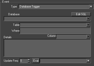
| Properties | Description |
| Database | Name of the database to use |
| Table | A list of the tables in the database. |
| Where | Insert the where clause here (minus the WHERE) |
| Column | A list of the columns in the selected table. If selected the column is added to the Details widget |
| Details | This determines what columns (and manipulation of those columns) are retrieved. |
| Update Freq | The number of seconds the event polls the database, 0 means as fast as possible. Set this to the required updated frequency of the data, the lower the number the faster the event polls the database. NOTE a low number can affect the overall performance of Swift |
| Eval | This evaluates the statement and puts the result into the combo box for test purposes |
GPI Event
Triggers events based on GPI inputs. These are simple on/off hardwired inputs. The input is edge triggered on the 01 edge. Every time Swift receives the trigger it will fire the action setup.
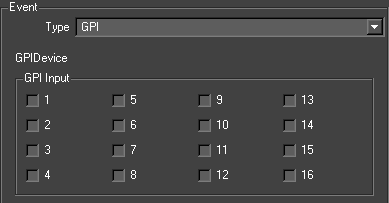
| Property | Description |
| GPI Device | Swift currently supports two devices:
|
| GPI Input | The GPI input used for the event |
Mouse Event
A mouse button can be used as an event trigger; also a keyboard modifier can be used to prevent ‘accidental’ mouse clicks. Every time Swift receives the mouse trigger it will fire the action setup.
| Property | Description |
| Mouse Event Type | The mouse button to use |
| Mouse Modifier | The keyboard modifier to use.
Note: the mouse must be clicked inside of the application. ie. the playout interface must have focus. |
Keyboard Event
A key on the keyboard can be used as a trigger; a modifier can be added to stop ‘accidental’ key presses. Every time Swift receives the keyboard trigger it will fire the action setup.
The key to use as the trigger also any modifier.
Note: the mouse must be clicked inside of the application. ie. the Playout interface must have focus.
Method Event
Swift allows methods to trigger events. Any method created in Swift can be used for the trigger. This can be used to ‘link’ methods so one method triggers an event to play another event.
There are two types of trigger point;
At Start
The action will be triggered before the method is taken to air.
At End
The action will be triggered after the method has been taken to air.
Method Name
The method to use as the trigger
Method Trigger Point
This sets when the event is triggered. At Start: Before the method is played At End: After the method has finished.
Mix Event
Swift allows mix targets to be used to trigger events.
Mix Target ID
Which mix target ID to use (see mix documentation).
Visible Trigger
Enables an event to be triggered from the mix target specified above becoming visible. If this is not checked then the event will trigger when the target becomes invisible.
WiiMote Event
It is possible to attach a wiimote controller to Swift, and trigger events using it.#
Touch Event
Touch events are triggered when the user interacts with a graphic using touch nodes.
- These events are associated with a particular touch node, rather than the graphic as a whole.
For more details, see the Swift Touch Manual
Events/Actions List
This is a list of all the events that exist in the graphic. They are in the order event action. As mentioned before events are a graphic wide asset not a method or block wide asset. So ANY events that exist in this graphic will appear in this list.
Action
Once an event is created it must have an action setup. This is what the actual event will trigger. Swift has five types of actions
| Action | Description |
| Run Method | Run a method |
| Update Value | Update a scenegraph AField |
| Cue | Cue the current block |
| Run Graphic | Run a graphic |
| Swift Sports | Various Swift-Sports specific actions |
Run Method
This will run a Swift method. The method is selected from the drop down list. The list will contain all the methods that exist in the graphic.
Update Value
This will update a field in a node in the scenegraph. The Node is chosen from the Node Name drop down and the required field from the Field name drop down.
Cue
This will cause a cue point to be released. It only has an effect if the graphic is currently waiting on a cue point.
Run Graphic
Runs a new graphic
Swift Sports
There are a number of Swift Sports specific actions that can be chosen. See the Swift Sports Manual for more details.
Graphic Object Transitions
Object Nodes
Graphics rarely exist independently. Graphics are designed as part of a system and transitions between graphics have to be smooth and managed. In Swift, this is implemented using Object nodes. All graphic elements in a graphic are parented to Object nodes.
A graphic will consist, as far as transitions are concerned, of a list of Object nodes. Swift manages the transitions between graphics by managing the transitions between the Object node lists.
The user can define special methods (AnimateOn, AnimateAllOn, AnimateOff, AnimateAllOff, AnimateBetween) for each Object node, all prefixed by the Object node name.
If an Object node is in both graphics, the AnimateBetween for the Object node is called. If it is in the previous graphic but not in the current, one of the AnimateOff methods is called. If it is not in previous graphic but is in the current, one of the AnimateOn methods is called. These methods will exist in the graphics where the Object node is created.
ObjectNode Order
When playing a playout stack of graphics, the order that the graphics are played will determine the order that object nodes appear in the scenegraph. This is not always desirable. For example, if you have a Top-Right logo graphic and a full form graphic, you want the Logo graphic to always be rendered after (and top of) the full form graphic.
By default, new graphics are added at the end of the scenegraph, which means they are rendered last (and on top of existing graphics).
So in our example, Playing the Full Form graphic first, and the Logo graphic second, will give us the the correct scenegraph, with the FullForm object first and the Logo object second.
However, Playing the Logo graphic first, and the Full Form graphic second will end up with the Logo object in the scene first, behind the full form object.
This can cause rendering problems, especially when working with transparent graphics.
To solve this, each object node has an Order that you can set up. Order is just an integer value, and defaults to 0. Swift will guarantee that when you add multiple object nodes to the scene, object nodes with a higher order value will always appear after object nodes with a lower order value.
You can choose any order values for your object nodes that you like. For example, for 3 object nodes A, B and C, the following will all achieve the same results.
- A = 1, B = 2, C = 3.
- A = 5, B = 6, C = 7,
- A = 100, B = 200, C = 300
It is recommended that you decide on a convention that is suitable for your graphics project as to which values you should use. The following is an example convention that you might pick:
| Graphic Type | Order Range |
| Background graphics (movie beds, etc.) | 0-50 |
| Full Form graphics | 100-200 |
| Lower Third graphics | 300-400 |
| Logos and idents | 500-600 |
By choosing spaced out values, we allow ourselves the ability to add “inbetween” values easily if the need arises.
Interface
This is the edit interface for Object nodes.
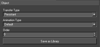
The behaviour of an Object nodes is decided by its Transfer and Animation types. There are three Transfer types for an Object node.
| Transfer Type | Description |
| Default | The default behaviour for the objects. If a new graphic appears and the object is not in the new graphic, the object will be removed.If the object is new, it will be added. If the object is in both graphics, a between move will be called. |
| Transient | An object can appear in two graphics but have a different form (e.g. a hisSwiftram object with different values). If objects like this are marked transient, a version of the object (e.g. with the new hisSwiftram values) is created during the transition and added to the new graphics object list. Transition proceeds as if both objects had default type. The original is animated off and the new one animated on. The original is then cleared and the new one renamed to take the originals place. |
| Persistent | These objects are not removed even if they are not mentioned in a graphic. They can only be removed by changing the objects type. |
There are two Animation types:
| Animation Type | Description |
| Default | When an Object node is animated on, the AnimateAllOn method is called. When an Object node is animated off, the AnimateAllOff method is called. |
| OffOn | When an Object node is animated on, the AnimateOn method is called. When an Object node is animated off, the AnimateOff method is called. |
Transition Table
This lays out the complete table for calling methods according to an objects Transfer and Animation types.
| Transfer Type | Animation Type |
| Default | Default |
| Default | OnOff |
| Transient | Default |
| Transient | OnOff |
| Persistent | Default |
| Persistent | OnOff |
The transition methods are called in the transfer method called at the top of every graphic Main method. That means the transition from graphic A to graphic B is done when running graphic B after having constructed the scenegraph for graphic B. At this moment all the objects from both graphics co-exists.
Library Objects
Some objects are used and used again in graphics projects e.g. a hisSwiftram in a general election program. The hisSwiftram may show different data and be in a different setting but it is essentially the same object, its scenegraph has the same structure, its inputs and animations are similar. Library objects are Swifts way of encapsulating all this data into a single reusable object.
Creating a Library Object
Create a graphic as usual by selection New… on the Graphic menu but select the Library check box. As well as the Root node the default scenegraph will contain an Object node tmpObject and the six basic methods describe above will be created except that the graphic name will be used as a prefix. Proceed as usual adding nodes to the tmpObject to create the scenegraph. Supply animations and inputs for the all the Animate methods.
Library Graphic
The Object node is contained in a graphic stored in the Library directory. This graphic is similar to non-library graphics in its layout.
| ####################################################### # # Swift CG + Graphics: dev # # Tue Aug 15 07:29:40 2021 # # This file is automatically generated. Only add code # to those sections marked startUserBlock()/endUserBlock() # #######################################################class Lll < Gm::GMObjectNode attr_reader :light1 attr_reader :transform1 attr_reader :shader1 def initialize(script,parent,name,type,transfer,animation) super(script,parent,name,type,transfer,animation) @script = script end def Construct(data) #Construct @light1 = Gm::GMLightNode.new(self,”light1″) @transform1 = Gm::GMTransformNode.new(@light1,”transform1″) @shader1 = Gm::GMShaderNode.new(@transform1,”shader1″) @text1 = Gm::GMTextNode.new(@shader1,”text1″) if (! self.initialised) end #Initialisation @light1.setAmbient(1,1,1,1) @light1.setDiffuse(1,1,1,1) @light1.setSpecular(1,1,1,1) @light1.setPosition(1,1,3) @transform1.setTranslateV(-0.661112,-0.215736,0) @shader1.setShader(“text”) @shader1.setUsePerPixelLighting(false) @shader1.addActiveLight(“light1”) @text1.setFont(“VAG Rounded Demibold”) @text1.setString(“DEFAULT”) @text1.setTaintType(Gm::GM_TT_StringChanged) @text1.layout() @text1.setLayoutNodesReady(true)if (! self.initialised) end#Initialisation Stage 2 endself.initialised = truedef LllAnimateAllOff(data)end@script.startBlock(“LllAnimateAllOff.block1”) @script.endBlock(“LllAnimateAllOff.block1”) def LllAnimateAllOn(data) @script.startBlock(“LllAnimateAllOn.block1”) def LllAnimateBetween(data) end @script.startBlock(“LllAnimateBetween.block1”) def LllAnimateOff(data) end @script.startBlock(“LllAnimateOff.block1”) def LllAnimateOn(data) end @script.startBlock(“LllAnimateOn.block1”) |
The graphic contains a class which drives not from GMScript but from GMObject. The library graphic contains a single Object node and all the scenegraph is parented to this Object node. Script variables ie. Variables that point to nodes are made accessible outside the graphic.
Using a Library Object
When Swift is restarted, the Library Object just created will appear in the Custom browser. Create a new graphic and drag the Library Object onto the screen. Swift will prompt for a name for the Object node. A copy of the Library Object Object Node will be inserted into the scenegraph with all its nodes prefixed with the name supplied. This Object node will not be editable. The library graphic should be loaded and that edited.
Node Reference
This section describes how all of the nodes available in Swift work.
Node/Basic Node
As well as existing as a separate node in Swift, the basic node is the foundation that all other nodes are built upon.
Usage
A basic node can be dragged anywhere in the scenegraph. It is generally used to group nodes.
To access the basic node editor for ANY node click on the ‘Swiftgle Basic Editor’ located the top of the node browser.
Links
Links connect node attributes Swiftether. A link contains the source and destination nodes and attributes and the mapping between them. A classic use is to link the size and position of a square geometry to a text’s position and size. The geometry will the fit the text exactly whatever the contents of the text. This is the only way to fit geometry to a text (short of using user code) where the contents of the text is dynamic (eg. in a ticker).
When a node is created its AFields are set up, these are basically the nodes attributes. They can be linked to attributes of other nodes e.g. a Transform node sets up TranslateX, translateY and TranslateZ (amongst others, see Transform node section for full list).
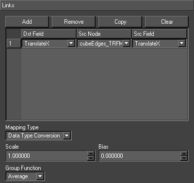
| Option | Description |
| Dst Field | The destination field of the current node |
| Src Node | The source node |
| Src Field | The source field in the source node. |
The link is evaluated on every traverse of the scenegraph. A list of the attributes from all the sources is compiled. From this list, the value of the attribute in the destination node is derived. There are two methods for deriving the destination value.
Data Type Conversion
| Option | Description |
| Scale | This is multiplied with the result of the group function |
| Bias | This is added to the result of the group function |
| Group Function | The specified function (e.g. Average) is applied to all the source field values |
| Expression | The specified expression is applied to all the source field values. For example, if there are three sources “(p1+p2+p3)/3.0” is equivalent to the group function Average |
The best possible match between source and destination is made based on the data types. For instance, if the source is a float and the destination is a string data type, the float is written into the string contents. The most important case is float-to-float because the source can be scaled and biased.
| FromTo | String | Float | Int | Bool | Enum |
| String | Copy | Read from string | Read from string | Read from string | Use Enum maps |
| Float | write into string | Copy with scale and bias | Convert | NA | NA |
| Int | write into string | Convert | Copy | Convert | Convert |
| Bool | write into string | NA | Convert | Copy | NA |
| Enum | Use Enum Maps | NA | Convert | NA | Copy |
Range Mapping
The user specifies a set of ranges of source values and corresponding destination values. If the source value falls within one of the source value ranges, the destination field is assigned the destination value. See this example:
| Source Value | Destination Value |
| -100000.0 | |
| -0.1 | GM_VA_Top |
| 0.1 | GM_VA_Centre |
| 100000.0 | GM_VA_Bottom |
This mapping is to link the vertical alignment of a Text node to the y scale of a Transform node (ie. a hisSwiftram column with text on top). If the scale is positive then the destination value will be GM_VA_Bottom and the text will sit on top of the column. If the scale falls between -0.1 and 0.0, the destination value will be GM_VA_Centre and the text will straddle the base of the column. If the scale is negative the destination value will be GM_VA_Top and the text will sit just below the column. These values are calculated every frame and the decision where the text sits will dynamically follow the scaling of the column.
Miscellaneous Options
These options are available for all node types.
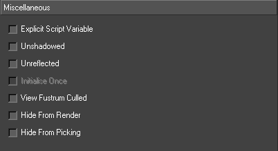
| Option | Description |
| Explicit Script Variable | Creates explicit script variables for nodes for which this is set |
| Unshadowed | These nodes are not included in the shadow map calculation if under a Shadow node |
| Unreflected | These nodes are not included in the reflected scene if under a Mirror node |
| Initialise Once | For nodes above object nodes, if this is set the node will only initialised in the first graphic it appears in. It is not initialised in subsequent graphics. |
| View Frustum Culled | Whether view frustum culling affects the node. |
| Hide From Render | Do not draw this node while rendering the scene. The node will still be drawn when picking. This is useful when working with touch nodes. |
| Hide From Picking | Do not draw this node when picking. This is useful when working with touch nodes. |
Alpha Node
Modifies the alpha value of all Shader nodes below it.
Usage
The Alpha node is useful when there is a large number of geometries that the user wants to fade in or out at the same time. Rather than changing the opacity of each individual Shader node, the user can instead place an Alpha node in the scenegraph above all the geometries.
Alpha and Bias both allow you to change the alpha value and the results are slightly different. If in doubt, use the Alpha property.
The user can have Alpha nodes that affect other Alpha nodes; the effects of the multiple Alpha nodes will be cumulative.
Since the alpha mode works by modifying the result of a Shader node, the alpha node will only affect the rendering of 3D objects if a shader is reached before the Geometry node.
Interface
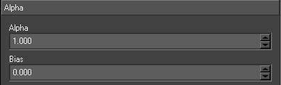
| Parameter | Description |
| Alpha | Fades everything by an equal percentage, between 0 and 1. When the alpha value is set to 1.0, all shaders will retain their current alpha values, when the alpha value is set to 0.5, all shaders will be half as opaque as they were originally, when the alpha value is set to 0, all shaders will be fully transparent. The alpha value will never make a shader more opaque than it was originally, but guarantees that all objects will fade to full transparency at the same time. |
| Bias | Adds a value to the alpha of all shaders, between -1 and 1. A value of 0 means that shaders will have their original values. A value of -0.5 will decrease the alpha of all shaders by 0.5 – so if a shader was originally half transparent, it will now be fully transparent, while a shader that was fully opaque will now be half transparent. Bias can also be used to make shaders more opaque – if a shader has an alpha value that makes it fully transparent, by setting the bias to 1.0, the shader will become fully opaque. |
Billboard Node
Aligns child nodes so that they always face towards the camera.
Usage
Place a Billboard node into the scene and add any nodes to be billboarded as its children.
The billboard will rotate itself towards the camera by pivoting around an Axis.
NOTE: Always place above the transform node of the object required to be billboarded. This avoids getting into issues where a non-uniform scale factor on your object can cause odd behaviour.
Interface
| Properties | Description |
| Axis | The axis around which the billboard will pivot itself to orientate towards the camera. |
Camera Node
Provides a camera for the scene.
Usage
Whenever a node or item from a browser is dropped onto the screen and a scenegraph is automatically created, the first node inserted under the Root node is a Camera node. The camera is setup according to the screen drop preferences. Camera nodes can be edited via the camera editor but can also be interacted with using the mouse on the screen.
Camera Tab
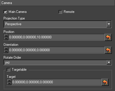
| Property | Description |
| Main Camera | If true, this is the main camera in the scene, and it’s viewport and aspect ratio are set from the video preferences. |
| Remote | This allows the user to hook this camera up to external control (VR) |
| Projection Type | The type of camera projection to use. |
| Position | The position of the camera |
| Orientation | The rotation of the camera. The order that the rotations are applied is governed by the Rotate Order. |
| Rotate Order | Specifies the order in which the rotations are applied. |
| Targetable | Enables whether the camera has a target. The target can be accessed in the global camera view. Moving the target will move the camera so it always faces towards the target. |
| Target | The targeted coordinates |
Camera Projection Types
| Projection Type | Description |
| Perspective | a normal, perspective projected camera |
| Frustum | another way of specifying a projected camera, by specifying its frustum |
| Orthographic 2D | a camera that shows an orthographic (no perspective) projection of the world, with no limits on the 3D data shown. |
| Orthographic 3D | a camera that shows an orthogonal (no perspective) view of the world, with limits on how close/far from the camera something is for it to be shown |
| Pixel aligned | used for laying out 2D style graphics where particular pixel locations and dimensions are important. |
Frustum Tab
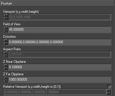
| Property | Description |
| Viewport | The part of the output window that the camera will output to, specified as a rectangle using x, y, width, height. If this is the main camera, the viewport will be disabled and taken from the video preferences (as in the image above) |
| Field Of View | The camera’s horizontal field of view, in degrees. |
| Aspect Ratio | The aspect ratio between the horizontal and vertical fields of view of the camera. If this is the main camera, the aspect will be disabled and taken from the video preferences (as in the image above) |
| Z Near Clip Plane | The closest an object can be to the camera and still be drawn. A values in the range of 0 to 1 is recommended as a starting point. This in most cases should not be zero. |
| Z Far Clip Plane | The furthest an object can be from the camera and still be drawn. Values here depend on the scales of the objects, but a typical value is between 100 and 5000. |
| Relative Viewport | This defines the viewport as a fraction of the video output size. To set a viewport to be a quarter of the video out size (regardless of video format) centered on the middle of the screen, set this to (0.25, 0.25, 0.5, 0.5). |
Clip Plane Node
Provides a clip plane in the scene, which causes only those parts of the scene under the clip plane and that are in front of the clip plane to be drawn.
Usage
The clip plane can be used to perform a number of useful effects, such as animated wipes of 3D geometry, and providing an on-screen hole through which objects can pop in and out. Clip planes can be animated.
The clip plane is an infinite plane that divides space into two distinct, separate pieces. The clip plane is defined using a rotation that rotates the plane at the origin, followed by a translation that is used to position the clip plane away from the origin.
When clipping simple, convex 3D objects, Clip Capping can be used to generate an artificial “cap” on the portion of the object that is being clipped.
When using per-pixel lighting, you can also use a soft clip, which provides a gradiented fade out for the clip, rather than a hard on/off test.
Interface
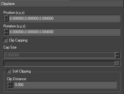
| Property | Description |
| Position | The position of the clip plane, relative to the origin. |
| Rotation | The orientation of the clip plane. relative to the origin. |
| Clip Capping | Enables capping of solid objects that have been clipped. |
| Cap Size | Control the size of the cap object; this will need to be altered to suit the object being clipped. |
| Cap Shader Node | The shader node used to take the cap shading properties from |
| Soft Clipping | Enabled soft clipping. This uses a soft edge to the clip plane rather than a hard edge. Requires per-pixel lighting to be enabled. |
| Clip Distance | The distance over which the soft clipping goes from not clipped to fully clipped. |
Clock Node
The Clock node provides the ability to render several different types of timers on screen. The clock can display the system time (with an offset), the elapsed time since a specified time and countdown clocks.
Usage
The user creates a Clock node above a text node. The clock time is then written into that text on every frame. Step animators can be used to set, start and stop the timer.
Interface
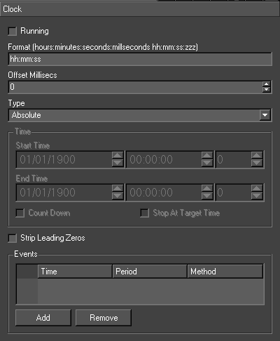
| Property | Description |
| Running | Starts and stops the clock |
| Format | The format of the text the clock node writes into the text node. The fullest format possible is hh:mm:ss:zzz (eg. 23:59:59:999). The colons can of course be replaced by and character. ap can be used for am/pm |
| Offset Millisecs | When displaying the system time, this offset can be used to match an external clock |
| Type | There are three types of clock – see below |
| Start Time | The time the clock will start at |
| End Time | The end time for the clock |
| Countdown | The clock counts down to zero time. |
| Stop At Target Time | The countdown clock stops when the zero time is reached and doesn’t count through to the next day. |
Clock Types
| Clock Type | Description |
| Absolute | shows the system time |
| Supplied Time Plus Elapsed Time | shows the clock counting up from supplied time |
| Supplied Time Minus Elapsed Time | shows the clock counting down from the supplied time to the zero time |
Events
An event is a method that is called when a certain time is reached
| Property | Description |
| Time | Time from supplied time at which the first event is triggered |
| Period | The event is re-triggered at intervals of this period after the first event time |
| Method | The method that will be called as an action of the event |
| Add | Add an event |
| Remove | Remove selected event |
Notes and Exceptions
Internally, the system clock is used to keep track of the time and not the counting of fields. This means time does not become incorrect when frames are dropped.
Cloth Node
This node simulates a rectangle of cloth under the action of field and mechanical forces
(e.g. gravity and wind).
Usage
The user drops a Cloth node from the node browser on the screen. The cloth starts in a horizontal position and falls under the influence of gravity. The user can then set the size, resolution, constraint update and timestep to get a cloth of the right size and stiffness. Then a wind force can be added. The forces can be animated in the usual way.
Interface
| Property | Description |
| Grid Resolution | The number of grid lines. |
| Constraint Update | The number of times the constraints on the cloth are resolved per frame. The more times, the better the simulation but the more time taken to display the cloth. |
| Grid Size | The actual size of the cloth. |
| Time Step | The time taken for each display of the cloth in simulation time – should match the field display time for extra realism. |
| Forces | A list of the forces on the cloth. The user can add, remove and update forces. The user specifies the force type (0 – field force, 1 – mechanical force), direction and magnitude. |
| Spheres | A list of spheres that the cloth can collide with. The user can add, remove and update spheres. The user specifies the location and radius of each sphere. |
DepthSort node
Sorts geometries based upon their relative positions, also sorts geometry polygons so that they are correctly sorted from back to front.
Usage
A depth sort node is designed to solve issues that arise from drawing polygons in the wrong order, particularly with semi-transparent objects.
Drawing transparent objects in the wrong order will give an incorrect result on the screen. The DepthSort node ensures polygons are drawn from back to front, which means that transparent geometries will always be drawn correctly.
To use a depth sort node, drag it into the Scenegraph and parent those nodes to it that need to be sorted in the correct order.
Interface
The DepthSort node does not have a user interface.
Notes and Exceptions
The algorithm used by the DepthSort node is a compromise between accuracy and speed – some cases of polygon overlapping are not handled correctly.
Use of a depth sort node requires that a geometry be drawn in a non-optimal way and is comparatively slow – only use a depth sort node to sort out issues that cannot be solved in other ways. For instance, if rendering a transparent sphere with semi-opaque land masses, the user can achieve the desired transparency-correct effect using less rendering by drawing the sphere once with a clip plane so that only the back part of the sphere is drawn, and then again with the clip plane reversed so that only the front of the sphere is drawn.
Duplicate
Provides a mechanism for duplicating a group of nodes and all their attributes.
Usage
The user first creates the group of nodes to be duplicated e.g. the transform, shader, text and geometry nodes for a text and strap. These nodes are grouped under a single transform node. This group is referred to as the prototype node group. A Duplicate node is then inserted above this node either by dragging the duplicate node type onto the scenegraph or by using the scenegraph context menu to select the node and using the Tools -> Duplicate option. The number of duplicates and their layout is setup using the duplicate node editor. Next, the user can add inputs and animations to all the duplicates by adding them to the prototype nodes. The inputs and animations are copied to all the duplicates. Animations can be staggered by setting an animation delay on the editor.
Interface
Layout Type
The duplicates are laid out horizontally, vertically and by depth independently of each other. If the type is Default, the duplicates are positioned with respect to each other using the offset value. No account is taken of the size of each duplicate so they may overlap. If the type is not Default, two things happen. First, the size of each duplicate is calculated and they are laid out so they don’t overlap. The offset is used as spacing between consecutive duplicates. Second, the order of the duplicates is determined by the type rather than the sign of the offset.
Alignment
Once all the duplicates are laid out, the whole duplicate node can be aligned (just like text) about its position. For example, if the vertical alignment is Bottom the whole duplicate node will be positioned so it sits on its y position; if it is Centre it will be centered about its y position and if it is Top the top of the duplicate node will sit at its y position.
Offset
If the input type is Default, these are the distances between consecutive duplicates in x, y and z. Otherwise, these are the spacing between consecutive duplicates. To fit all the duplicates into a fixed distance, set the offset to this distance and check the appropriate box above the offset. If more duplicates are added the spacing between the duplicates will decrease.
Duplicates
| Property | Description |
| Set Number for database | When updating a duplicate via an input, if this is checked, the number of entries in the duplicate will automatically adjust based on the amount of data recieved. The minimum and maximum limits are respected. |
| Number | The actual number of duplicates |
| Min | The minimum number of duplicated allowed. |
| Max | The maximum number of duplicates allowed. |
Animation Delay
Animations on any duplicate will be offset by this number of frames from the previous duplicate.
Current Page
This facilitates paging of a Duplicate node. This field can be set by an input or a step animator. Swift will automatically replace the tag ‘<CURRENT_PAGE>’ in an inputs select statement with this value when it created the duplicates.
Update
Most but not all edits of the prototype node group are percolated down to the duplicates. This forces all the changes to be copied down and the duplicates laid out.
Dynamic Geometry
This node provides a set of simple 2D and 3D configurable geometric shapes.
Usage
The Dynamic geometry node has its own browser. Geometries ranging from triangles to torii can be dragged from the browser onto the screen. In fact for most of the geometries, a standard geometry is created internally and configured via the dynamic geometry editor. The only exceptions are Plugin and Teapot dynamic geometries. All geometry based dynamic geometries can be saved to the project as a standard geometry.
Interface
| Property | Description |
| Type | The type of shape this dynamic geometry represents |
| Multi-Texture | When checked, the dynamic geometry will generate textures coordinates for all 4 texture units. Otherwise, texture units will only be available for the first texture unit. |
Dynamic Geometry Types
The following dynamic geometry types are available. Each has its own set of properties, which will be details below.
| Type | Description | Icon |
| Triangle | A simple triangle |
 |
| Rectangle | A rectangle, with options for round corners and skewed |
 |
| Circle | A flat circle |
 |
| Sphere | A Sphere |
 |
| Cone | A cone |
 |
| Cylinder | A cylinder |
 |
| Fustrum | A frustum |
 |
| Cube | A cube |
 |
| Torus | A torus |
 |
| Teapot | A teapot |
 |
| Dodecahedron | A dodecahedron |
 |
| Octahedron | An Octahedron |
 |
| Tetrahedron | A Tetrahedron |
 |
| Icosahedron | An Icosahedron |
 |
| Plugin | Plugins allow dynamic geometry node to bo expanded with new shapes | |
| Ribbon | Draws a ribbon between two trajectory nodes |
 |
Triangle
| Property | Description |
| Vertex 1 | The x, y, z of the first vertex |
| Vertex 2 | The x, y, z of the second vertex |
| Vertex 3 | The x, y, z of the third vertex. |
Rectangle
| Property | Description |
| X Size | The size along the x axis (width of rectangle) |
| Y Size | The size along the y axis (height of rectangle) |
| Radius | The radius of the rounded corners. The minimum value of 0.000001 turns off rounded corners. |
| Dangle | The increment in the angle along the rounded corners |
| X Offset | Offset along the x axis from the default position (-1,1) |
| Y Offset | Offset along the y axis from the default position (-1,1) |
| X Resolution | The number of divisions along the x axis |
| Y Resolution | The number of divisions along the y axis. |
| X Delta | Skews the rectangle, by offsetting the top vertices by this number of units relative to the bottom. Produces a rhomboid shape. |
| Size To Texture | When checked, the rectangle will automatically size itself to the size of the texture on the shader that is being used to render it. When this is checked, X Size and Y Size behave as scale factors, and should normally be left at 1.0 |
Circle
| Property | Description |
| Radius | The radius |
| Radius Resolution | The number of divisions along the radius. |
| Angle Resolution | The number of divisions along the circumference |
Sphere
| Property | Description |
| Radius | The radius |
| Slices | The number of divisions longitudinally |
| Stacks | The number of divisions latitudinally. |
Cone
| Property | Description |
| Base Radius | The radius of the base |
| Top Radius | The radius of the top |
| Height | The height |
| Slices | The number of divisions along the circumference of the base |
| Stacks | The number of divisions along the height. |
Cylinder
| Property | Description |
| Radius | The radius |
| Height | The height |
| Slices | The number of divisions along the circumference of the base |
| Stacks | The number of divisions along the height. |
| Direction | The orientation of the cylinder |
Frustum
| Property | Description |
| Field of view | The horizontal field of view, in degree’s. |
| Aspect | The aspect ratio between the horizontal and vertical fields of viev |
| Z Near | The minimum Z |
| Z Far | The maximum Z |
| X Offset | Changes the X offset of the end |
| Y Offset | Changes the Y offset of the end |
Cube
| Property | Description |
| X Half Size | The distance from the origin that the cube extends along the x-axis. Since the cube extends in both directions along the x axis, this distance is half the total length along the x-axis. |
| Y Half Size | The distance from the origin that the cube extends along the y-axis. Since the cube extends in both directions along the y axis, this distance is half the total length along the y-axis. |
| Z Half Size | The distance from the origin that the cube extends along the z-axis. Since the cube extends in both directions along thez axis, this distance is half the total length along the z-axis |
| Section texture | This decides how the cube is textured |
Torus
| Property | Description |
| Inner Radius | The radius of the inner edge |
| Outer Radius | The radius of the outer edge |
| Sides | The number of divisions along the outer circumference |
| Rings | The number of divisions along the circumference of a cross-section. |
Teapot
| Property | Description |
| Grid | Number of polygons the teapot is drawn with |
Dodecahedron
No user interface
Octahedron
No user interface
Tetrahedron
No user interface
Icosahedron
No user interface
Plugin
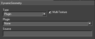
| Property | Description |
| Plugin | The name of the plugin |
| Source | This string is passed to the construct for the plugin |
The user can create a Swift plugin an import into the Plugins directory using the Import tool. The plugin should implement this api:
| extern “C” void *<plugin_name>_pConstruct(void *,char *); extern “C” void <plugin_name>_pDisplay(void *); extern “C” void <plugin_name>_pDestruct(void *); extern “C” void <plugin_name>_pLayout(void *, GLfloat *xmn,GLfloat *ymn,GLfloat *zmn, GLfloat *xmx,GLfloat *ymx,GLfloat *zmx); |
The method pConstruct is called when the node is created and pDestruct when it is deleted. The Source is passed to the pConstruct method. A pointer to data internal to the plugin is returned from the pConstruct and passed to all the other methods. The pDisplay method is called when the node is displayed.
Ribbon
A ribbon is created by specifying two trajectory nodes. These supply the bottom and top edges of the ribbon. Each trajectory is subdivided.
| Property | Description |
| Bottom Trajectory Node | The trajectory node that defines the bottom of the ribbon |
| Top Trajectory Node | The trajectory node that defines the top of the ribbon. |
| Number Points | The number of points along the trajectory. |
DynamicTexture Node
Render part of the scenegraph to a texture image.
Usage
The Dynamic Texture node allows the user to draw a scene into a texture, which can then be applied to geometries in the same way as any other texture. This is a powerful technique that opens up many possibilities. For example, it can used it to map moving, dynamic text onto an object, such as a sphere.
To use, drag a Dynamic Texture node into the scene, and attach nodes that are required to be drawn into a texture. The scene above the dynamic texture should be complete; it should have transforms, lights, and a camera as well as geometries. It is also possible to drag a transform node onto a shader node to create a dynamic texture subtree from the transform node.
Instead of rendering the nodes directly to the screen, the nodes will be rendered into a Texture, which the user can choose through the interface. The user can also choose how often the texture should be updated. The Dynamic Texture node effectively becomes a root node for rendering into the texture.
Interface
| Property | Description |
| Clear Colour | The colour to clear the texture to before rendering into it |
| Texture | The texture that is to be drawn into. |
| Update Frequency | The frequency (in fields) at which the texture is updated |
| Update Type | Determines how the dynamic texture node updates the texture
|
| Use FBO | Uses Frame Buffer Objects rather than Pixel Buffer Objects to render the dynamic texture. This is a technical detail, and usually this should be left checked. |
Effect Node
Provides an interface to cgfx files which can be used to create visual effects such as corona glow and motion blur. By default a project doesn’t contain any effects.
Usage
The node is inserted above the nodes to be affected and the effect is selected. The effect can be adjusted by tweaking the parameters. Several effects can be selected in the one node.
The drawing effect and all the parameters and what widgets to use for each parameter are contained in the .fx file that describes the effect. New effects can be imported into Swift using the import tool.
Interface
Effect Type
Geometry – geometry only effects
Post Process – full screen effects
Available Effects
This is a list of all of the effects available in the project.
- Name – the name of the effect.
- Stackable – indicated whether the effect can be combined with other effects.
- Icon – generated by the author of the effect and copied into the CGPrograms directory.
Active Effects
The current effects active on the effect node.
Name
The name of the selected effect
Type
The type of the selected effect.
Parameters
These are the parameters for the currently selected effect. These can be saved, animated and inputs can be set on them.
Name
The parameter name
Value
The parameter value (the default value is contained in the .fx file).
Extruder Node
Creates geometries by extruding a contour along a spine. The contour is a two dimensional cross-section. The spine is a three dimensional path. The contour is swept along the spine creating a geometry. For example, the line graph from the custom browser uses extruder nodes to render the line.
Usage
Swift uses the gle extrusion library to implement extrusion. Swift maintains a list of extrusion assets (just like geometries). These extruders can be created, edited and saved. There is a directory in each project (Extruders) in which they are stored. Extruder nodes use extruder assets to render extruded objects (just like Geometry nodes use geometry assets).
The simplest usage is to add an Extruder node under a Shader node. This will popup the Extruder node editor. The user can then create a new extruder asset using the asset creation tool (just like when creating a new shader asset). This new asset can be edited using the extruder editor.
The Extruder node provides an afield Spine. This takes a tilde separated list of points eg. for a vector along the x-axis it should be -1~0~0~1~0~0. The Extruder node also provides these afields designed to render just a part of the extrusion: spineSectionStart and spineSectionEnd can be used to pick out a section of the extrusion along the spine, spineSectionT can be used to animate between these the start and end values.
Interface
The interface has two sections: the node editor and the asset editor. The asset editor is accessed by pushing the button labelled “…” from the node editor interface.
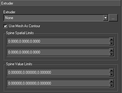
| Property | Description |
| Extruder | The extruder asset to be rendered. Click on the button to edit the selected extruder asset. |
| Use Mesh as Contour | Use the meshes of any Geometry or Text node under this Extruder node as the contour to be extruded. The contour in the extruder asset will be ignored but all the other attributes will be used to create the extrusion. |
| Spine Spatial Limits | Scales the input spine. |
| Spine Value Limits | Scales the input spine. |
The asset editor is popped up from this editor.
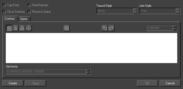
Cap Ends
Draw a cap at the ends of the extrusion.
Close Contour
Close the contour.
Save
Saves the extruder.
Extruder editor
The extruder editor has three tabs, one for editing the contour, one for editing the spine and one for editing the bevel.
In the contour editor, the user can draw the contour by adding, inserting, deleting and dragging points. Every change to the contour can be undone and redone. The user can refine the grid and points always snap to this grid. Then end points of the contour are drawn as red and green squares. The normals at each point are shown as blue vectors.
UpVector
The parameter value (the default value is contained in the .fx file).
In the spine editor, the user can draw the spine by adding, inserting, deleting and dragging points. Every change to the spine can be undone and redone. The user can refine the grid and points always snap to this grid. Then end points of the contour are drawn as red and green squares. The start and end vectors are not used as part of the extrusion but determine the direction of the start and end faces. The user can also change the view of the spine (between front, side and top views).
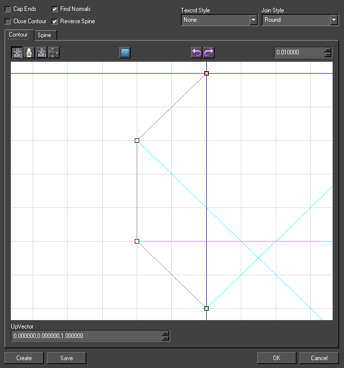
TRS
Transformations for the contour at this point. The contour (defined in the xy plane) can be translated in x and y, rotated about the z-axis and scaled in x and y..
Fog Node
Provides a fog effect in the scene. Fog causes objects to fade the transparency and/or a particular colour the further away from the camera that they get.
Usage
Drag a Fog node onto the scene and attach nodes to it.
Interface
| Property | Description |
| Mode | Sets the mode of fog, which determines how quickly the density of the fog changes |
| Start | Used in the Linear fog mode to indicate when fog should be at 0 opacity. |
| End | Used in the Linear fog mode to indicate when fog should be at full opacity |
| Density | Used in the exponential fog modes to determine the density of the fog. Higher values result in more dense fog, |
| Colour | The colour of the fog. As the fog gets thicker, all colours tend to the fog colour. |
| Hint | Fastest or Nicest, determines whether Swift will aim to render the fog as fast as possible, with a possible degradation of quality, or to aim for the highest quality visible effect, which may be a little slower. |
| Distance Mode | Sets how the z values for objects are calculated. Eye Plane (worst quality, fastest to render), Signed Eye Plane, and Eye Radial (best quality, slowest to render. |
Fog Modes
| Mode | Description |
| Linear | Fog linearly interpolates from no fog at the start z value, up to fully opaque fog and the end z value. |
| Exp | Fog gets exponentially thicker the further from the camera, based on the density of the fog. |
| Exp2 | A more drastic exponential curve than Exp. See the glFog man page for more details and equations |
Geometry Node
Used to draw 3D objects in the scene.
Usage
Geometries are imported into the project from either Maya objects, or FBX files. Once they are in the project, the easiest way to add one to the scene is to open the geometry browser, and drag the required geometry into the scene.
A geometry node is a container that groups together one or more mesh nodes. Each mesh node can optionally have a Shader node. This is all handled internally to the geometry, all that is required is to choose the geometry from the list of those available in the user interface and the correct meshes and shaders will be constructed automatically.
A Geometry node can be saved into .geo file with a name the same as the node.
The nodes inside of a geometry node are automatically generated based on the geometry that is loaded. Therefore, making most changes to the nodes inside of a geometry will be overwritten when the graphic is next loaded.
The following operations are permitted on nodes inside of a geometry.
- Changing which shader a Shader Node points to will be saved out and recalled when the graphic is reloaded.
- You can use Inputs, Links and animators on nodes inside of a geometry node, these will be saved out and recalled when the graphic is reloaded.
Interface
| Property | Description |
| Geometry | The geometry that will be loaded and used by this geometry node |
| Compute TBN Matrix | When the Geometry node is saved to a geometry, the TBN matrix will be computed and saved as well. The TBN Matrix is used by a number of effect shaders for things such as bump mapping. |
Layer Node
Layers allow you to separate out parts of a graphic so that they can be handled independently. Different layers can be sent to different outputs if Swift is configured for layer routing.
Usage
A layer node causes all of its children to be rendered separately from the rest of the scenegraph, and are then all layers are composited Swiftether at the end of the render.
Layers are always composited in scenegraph order, with layers appearing later in the scenegraph being composited on top of layers which are earlier in the scenegraph.
Layers never interfere with each other – for example if you have layer 1 and layer 2, everything in layer 2 will always appear in front of layer 1, regardless of where objects are in 3D space.
It is possible to apply full screen effects to layers using CG shaders, and animate their parameters. This works in the same way as it does on the effect node.
An example of when layers are useful is if you are rendering a virtual reality set and a set of 2D lower thirds on the same renderer. By using layers, you can guarantee that the straps will always be in front of the virtual set.
Layer Routing
Layer routing is a mode that Swift can run in, where all output must be driven through layers.
Layers can be assigned to different render targets. Layers will only appear on the outputs to which they are assigned.
The available render targets are:
| Render Target | Description |
| PC Monitor (interface) | The output to the computer monitor |
| SDI 1 | The output on the first SDI video output |
| SDI 2 | The output on the second SDI video output (Swift must be configured for two SDI outputs) |
Layer Routing and SDI 2 must be enabled via the Preferences Video Tab (see page )
Interface
| Property | Description |
| Layer Output | check the outputs that this layer should appear on. If layer routing is not active, all layers will be composited to all outputs. |
| Active effect list | the top list shows all cg effects that will be applied to this layer. |
| Effect parameter list | the bottom list shows all parameters of the effects in the active effect list. |
LensFlare Node
This node provides a lens flare effect. A set of images are displayed along a line from the camera to a specified light source. These images are bill boarded. These images mimic visual artifacts caused by imperfections in a real world camera lens.
Usage
The user drops a Lens Flare node from the node browser onto the screen and compiles the list of images in the editor and specifies a light. After it is setup, the Lens Flare node works automatically and tracks both the camera and the light.
Interface
| Property | Description |
| Lens Definition | The list of images that make up the lens flare effect. |
| Light flare | identifies which of the lens effects are created by light flares |
| Light flare scale | This allows the user to scale up the light flares |
| Active Lights | The light to track. Only one can be usefully specified. |
Lens Definition
| Property | Description |
| Shader | the shader for the image |
| Colour | colour to be mixed in with the shader |
| Separation | the distance along the line from the camera to the light to this image |
| Size | the size of each image in screen pixels |
Light
Provides a light source in the scene.
Usage
Unless the shaders have lighting calculations turned off, the user will need one or more lights in the scene in order to light the materials.
Lights come in three forms.
| Type | Description |
| Infinite | Light source that shines at the scene from a point infinitely far away. Because of this, lighting is directional only; the position of an object in the scene never effects the lighting, only the rotation of the object. An example of an infinite light source would be the sun. |
| Point Light | Light source that has a position, but no direction. They shine in all directions. An example of a point light is a light bulb. |
| Spotlight | Light source that has both position and direction. They shine in a specific direction, from a specific location, in a tight beam, depending on the cutoff. |
Interface
Light
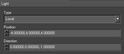
| Property | Description |
| Type | The type of light, can be Infinite, Point or Spotlight. |
| Position | For Point and Spotlights, determines the position of the light source. For Infinite light sources, determines the general direction from the origin that the light is coming from. |
| Direction | Only used for spotlights, specifies the direction the spotlight is pointing in |
Colour
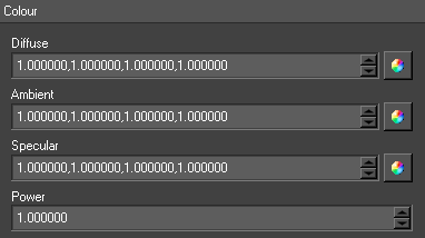
| Property | Description |
| Diffuse | Sets the diffuse colour intensity that comes out of the light source. A value of 0,0,0 means black diffuse, a value of 1,1,1 means full (white) diffuse |
| Ambient | Sets the ambient light level that comes out of the light source. A value of 0,0,0 means no ambient, a value of 1,1,1 means full (white) ambient |
| Specular | Sets the specular light level that comes out of the light source. A value of 0,0,0 means no specular, a value of 1,1,1 means full (white) specular |
Spot Light
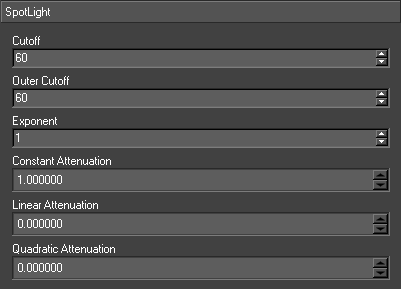
| Property | Description |
| Cutoff | The angle of the inner side of the penumbra in degrees. |
| Outer cutoff | The angle of the outer side of the penumbra in degrees. |
| Exponent | Determines the falloff of light as it moves further from the direction of the light source, causing falloff as it moves towards the edge of the beam. It is a value between 0 and 128, with 0 being a uniform distribution, and 128 being the most focused in the center of the beam. |
| Constant Attenuation | Determines how light falls off with distance. The light intensity is divided by the constant factor. |
| Linear Attenuation | Determines how light falls off with distance. The light intensity is divided by the linear factor multiplied by distance. |
| Quadratic Attenuation | Determines how light falls off with distance. The light intensity is divided by the quadratic factor multiplied by the square of the distance. |
Activation
The user can setup what shader nodes are lit by this light.
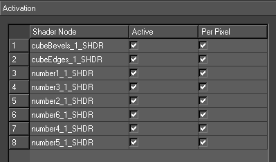
| Property | Description |
| Table | Shows all the shader nodes in the scenegraph Active – whether the light is active on the shader node Per pixel – whether per pixel is active on the shader node |
| Show Children | Will only show shader nodes that are children of the light |
| Show all | Will show all shader nodes |
| Active | Sets the light active on all the shader nodes in the table |
| Per Pixel | Sets per pixel on all the shader nodes in the table |
LOD Node
Enables Level-Of-Detail on nodes attached to it.
Usage
The LOD Node allows the user to perform Level of detail on geometry, based on the distance of the geometry from the camera. Add a LOD node to the Scenegraph, and attach nodes that are desired to be analysed to it.
The LOD node only works on its children. In the child node go to the Basic node attributes page and set the distances over which it should be used.
For example, the user may have HighResGeom, MidResGeom and LowResGeom in the scene, representing the same object at different levels of detail. The user might give the HighResGeom model a range of 0-20, the MIdResGeom a range of 20-50, and the LowResGeom one a range of 50-100000
The Level Of Detail information should be provided on a Transform Node above the geometry that you want to LOD. (See page )
Be careful not to leave gaps between the ranges; this will call the children to vanish completely from the screen when processed at those levels!
Interface
The LOD node does not have a user interface.
Matrix Node
Provides allow direct manipulation of the viewing matrices used to render the scene. This is a very specialised operation, and you will be unlikely to need it.
Usage
The Matrix node allows the user to change any of the three matrices (ModelView, Projection and Texture), either by multiplying the current contents with the specified matrix, or by completely replacing it and loading a new one.
Interface
| Property | Description |
| Mode | Choose the matrix that is affected. The projection matrix is used to project the 3D view into a 2D projection, the modelview matrix is used to position elements in the 3D world. |
| Action | The action to use when applying the matrix. ModelView will replace the current matrix with the new one, multiply will multiply the matrices Swiftether |
| Matrix | This 4X4 area allows the user to enter their new matrix |
Mirror Node
Allows a simple, flat, geometry to be used to render a mirrored copy of a portion of the scene..
Usage
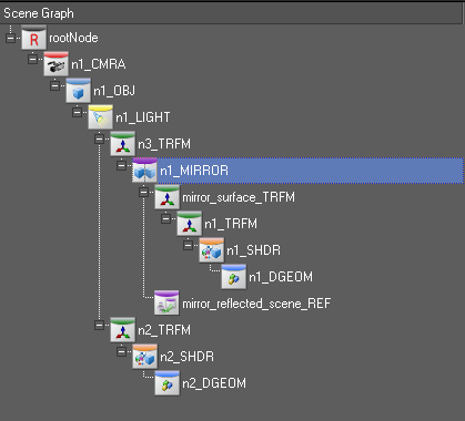
The user creates two node trees – one for the mirror surface (e.g. a floor) and one for the scene to be mirrored. A Mirror node can then be inserted into the scene. A transform node is added under the Mirror node. In the example scenegraph, n1_Mirror is the Mirror node. The mirroring surface is mirror_surface_TFRM. A reference node is also added under the mirror node called mirror_reflected_scene_REF this is set to reference n2_TRFM. The Mirror node takes care of drawing the reflected scene and the mirror. The reflected scene is the drawn after the mirror. The position and orientation of the reflecting plane is set in the Mirror node editor.
Interface
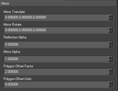
| Property | Description |
| Mirror Translate | Translate the reflection plane (not the mirror geometry) |
| Mirror Rotate | Rotate the reflection plane |
| Reflection Alpha | Make the reflected scene transparent |
| Mirror Alpha | Constant alpha value for the whole mirror (useful for blending mirrors in VR) |
| Polygon Offset Factor/Polygon Offset Units | Allows tweaking of certain hardware display parameters to reduce interference between the reflected scene and the mirror geometry. |
Object Node
Semantically groups nodes Swiftether, to be used with transition logic to get from one graphic to another.
For more information on transitions, see Graphic Object Transitions (page )
Usage
When a new scenegraph is created an object node is automatically added. When the user adds new nodes the scene they are given the option to either add these to this object node or create a new one. This means that object nodes group all the rest of the nodes in the scenegraph. If the user is only going to use a single graphic then object nodes are not important
When the user has several graphics in a project the problem exists of managing graphical elements across these graphics. Object nodes are Swift’s way of handling this, particularly when transferring between graphics. They do this by grouping Swiftether graphical elements. The graphic then consists of one or more of these groups of graphical elements. Handling transitions between graphics comes down to handling transitions between their object nodes i.e. what nodes to keep, what nodes to get rid off and what nodes to bring on.
Swift distinguishes between object nodes using their name Swift will not allow two object nodes with the same name in a single graphic. However the user can name object nodes with the same name in a different graphic in the same project. If Swift is running a graphic and then loads another graphic with an object node with the same name as the currently running script Swift will consider both of these object nodes to be the same and preserve them across the transition.
The user can control how the object nodes are kept, removed or added by setting parameters on the object nodes and specifying methods to animate the graphic appropriately e.g. if taking off a graphic it animates it off. These methods have to have special names, this is how Swift locates them. NOTE: for further information see the Scenegraph Transitions chapter
Only some nodes can exist between the Root node and Object nodes (for example, Camera, Transform and Light nodes). Objects nodes should not be parented to Object nodes.
Interface
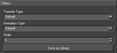
| Property | Description |
| Transfer Type | This determines what happens to the object node across a graphic transition. |
| Animation Type | This determines how animations are applied when doing transitions |
| Order | Order value determines the order in which object nodes are added into the scenegraph. Higher order numbers will appear after lower order numbers in the scenegraph. |
Transfer Types
For more information on transitions, see Graphic Object Transitions (page )
| Transfer Type | Description |
| Default | The default behavior is that objects that are in the first graphic but not in the second are removed. Objects that are in the second graphic but not the first are added. Objects in both are retained. |
| Persistent | The Object node will always survive the transition |
| Transient | The purpose is to have an object, say hisSwiftram, with different configurations across several graphics.The Object node is copied, The original is animated off and deleted, The copy is animated on, The copy is renamed as the original |
Animation Types
For more information on transitions, see Graphic Object Transitions (page )
| Animation Type | Description |
| Default | Uses methods AnimateAllOn/AnimateAllOff/AnimateBetween |
| OffOn | Used so an object always animates off, and then back on, even if it is used in both graphics
Uses AnimateOn/AnimateOff instead on AnimateBetween. |
Save as library
Converts this object node into a library graphic.
ParticleSystem Node
A particle system is a way of representing fuzzy objects e.g. smoke, which have no discernable shape.
Usage
The node type is dragged from the node browser and dropped on the screen. It should start with the default effect with is a Spray. The node parameters can be then updated and animated until the effect desired is achieved.
Interface
General
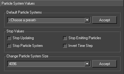
| Property | Description |
| Default Particle Systems | The particle system comes with eight preset particle systems. They are Spray, Fountain, Rain, Explosion, Jet, Fire, Snow and Smoke. When one of these is chosen all the preset values will be filled into the particle system dialog box |
| Accept Default | Accepts the currently chosen default particle system and modifies the particle system accordingly |
| Stop updating | Stops the particles system from being updated, this means no new particles will be emitted and the current particles positions will not be updated |
| Stop emitting particles | This prevents any new particles being introduced into the particle system, however the currently alive particles will continue |
| Stop particle system | This both stops updating and displaying the particle system |
| Invert time step | This inverts the time step which is used to update the particles, this will cause the particles system to ‘run backwards’ |
| Change Particle System Size | This is the physical size of the particle system; there are five different sizes. The smaller the size of the particle system the faster it will run but the less particles that will be available. NOTE: Even if the particle system size is set to 1048576, if the user doesn’t have the number of particles emitted per frame (see initial values section) up high enough the number of particles wont ‘fill’ the entire particle system |
| Accept | Resize the particle system |
Initial values
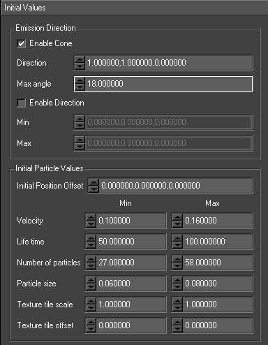
| Property | Description |
| Emission Direction | The initial direction that the particles are emitted in. |
| Cone | The particles are emitted and will travel in the specified direction. However they will also be effected by the max angle this is the size of the cone. |
| Enable | Enable the cone emission |
| Direction | The direction of the cone axis |
| Max Angle | The angle of the cone |
| Direction | The particles are emitted and will travel in the direction specified. E.g. If the user just wants the particles to travel along both the negative and positive X then all they have to do is set -1 in the min for X and 1 in the max for X. |
| Enable | Enable direction emission |
| Min | The min direction vector |
| Max | The max direction vector |
| Initial Particle Values | A range of values to initialise each particle. A min and max value is supplied and each particle is give a random value between them. |
| Initial Position Offset | This is the offset along each axis that the particles will be emitted, not to be confused with the direction of the particles. E.g. if this was set to 5,0,0 then the particles would be emitted from a random place along the x axis between +5 and -5. The actual values for the options below will be a random value between the min and max values. |
| Velocity | Initial velocity of the particles when emitted. |
| Life Time | Life time of each of the particles. |
| Number of Particles | The number of particles that will be emitted per frame. |
| Particle Size | The size of the particles. |
| Texture Tile Scale | The scale of the texture on the particle. |
| Texture Tile Offset | The offset of the texture on the particle. |
Forces
These forces affect the motion of the particles,
NOTE: the forces are accumulative, so if the user puts a -0.02 in the –X on gravity and +0.02 in the
+X on wind these two will cancel each other out.
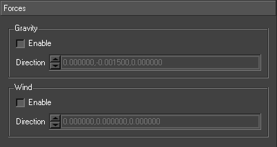
| Property | Description |
| Gravity | The gravity force that effects the particles motion |
| Enable | Enable the force |
| Direction | The direction that the force is exerted |
| Wind | The wind force that effects the particles motion |
| Enable | Enable the force |
| Direction | The direction of the wind force |
Colliders
These are all the colliders that appear in the scene that the particle system can interact with.
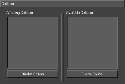
| Property | Description |
| Affecting Colliders | These are the colliders that the particle system is currently colliding with (if the any of the particles are actually hitting the collider and collision is enabled in the collider (see particle collider section)) |
| Disable Collider | This disables the collision between the currently selected collider and the particle system. The collider is moved from the affecting colliders list into the available colliders list |
| Available Colliders | These are all the colliders in the scene |
| Enable Collider | The currently selected collider will be moved into the affecting colliders list and the particle system will be able to collide with it. |
Particle Collider
This node provides an extension to the particle system node, by adding objects for the particles to collide with.
Usage
There are two types provided:
| Type | Description |
| Sphere | The particles will collide with any point on the surface of the sphere |
| Plane | This is an infinite plane so the particles will collide with ANY point on this plane |
Interface
Options
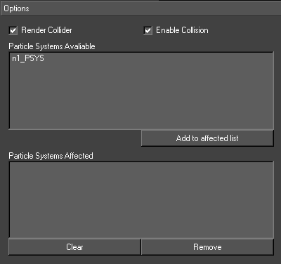
| Property | Description |
| Render collider | Whether the collider is visible or not |
| Enable collision | Whether the collision is enabled on the collider |
| Particle systems available | This is a list of any particle systems in the scene |
| Add to affected list | This will add the selected particle system to the affected list |
| Particle systems affected | These are all of the particles affected by the collider NOTE: this is only if enable collision is turned on in the options page of the collider |
| Clear list | This will remove all the particle systems from the list, so no particle systems will be affected by the collider |
| Remove from affected list | This will remove the selected particle system from the list; this particle system will no longer be affected by the collider |
Sphere
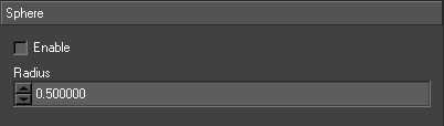
| Property | Description |
| Enable | Makes the particle collider a sphere collider |
| Radius | This is the radius of the collider sphere |
Plane
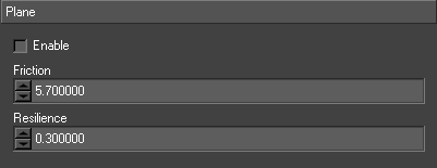
| Property | Description |
| Enable | Makes the collider a plane collider |
| Friction | The friction of the collision |
| Resilience | The resilience of the collision |
Plugin Node
NOTE: On linux, new plugins can be loaded dynamically at run time. On Windows, plugins cannot be loaded at runtime. However, Windows comes with a number of useful built-in plugin nodes that can be used.
This allows almost any extension to Swift. Using this node the user can implement their own nodes.
Usage
The user must create a plugin which implements the following api.
| extern “C” void *<plugin_name>_pConstruct(); extern “C” void <plugin_name>_pDestruct(void **data); extern “C” void *<plugin_name>_pCopy(void *data); extern “C” void <plugin_name>_pDisplay(GMNode *node,void *data, GMValueList *parameterList); extern “C” void <plugin_name>_pPush(GMNode *node,void *data, GMValueList *parameterList); extern “C” void <plugin_name>_pPop(GMNode *node,void *data, GMValueList *parameterList); extern “C” void <plugin_name>_pRecurse(GMNode *node,void *data, GMValueList *parameterList,GLint frameCount); extern “C” void <plugin_name>_pTraverse(GMNode *node,void *data, GMValueList *parameterList,GLint frameCount); extern “C” void <plugin_name>_pGetParameters( GMValueList *parameterList); |
This api tracks the methods that Swift invokes on its default nodes e.g. when Swift traverses a Plugin node the pTraverse is called.
| Method | Description |
| pConstruct | Create any internal plugin data structures |
| pDestruct | Destroy any data created by pConstruct |
| pCopy | Copy any data created by pConstruct |
| pTraverse/pRecurse | Specialised methods called by Swift when the scenegraph is traversed. Can be used to traverse the Plugin node differently. For example, these can be implemented to traverse the nodes under the Plugin node more than once |
| pPush/pPop | If a node is not a leaf, these are the main traverse methods |
| pDisplay | If the node is a leaf (ie. no children), this is the main traverse method |
| pGetParameters | Return a list of parameters to be set through the interface |
Interface
The parameters table is filled out from a list returned by the plugin (_pGetParameters).
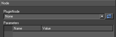
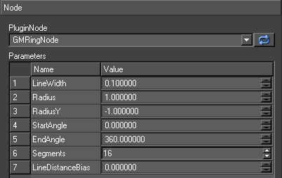
| Property | Description |
| PluginNode | A list of all the projects plugins. Some may be unsuitable for Plugin nodes. |
| Parameters | A table of the plugin supplied parameters. Values can only be entered as strings. |
Reference
Refers to another part of the Scenegraph, and renders it at the referenced position in the Scenegraph.
Usage
Imagine that the user has a complex part of the Scenegraph, and requires it to be rendered multiple times. For example, perhaps the user wants to create a reflection effect. The user could duplicate the entire contents of all nodes which make up the reflected scene, but this is wasteful, in both resources and the time that will be taken keeping the copies synchronised. An alternative is to use the reference node.
The Reference node allows the user to refer to part of the scene, and render it at the current location. The nodes are parsed exactly as if they had existed, parented to the reference node, all along.
A reference node cannot reference a tree that includes itself. This includes trees with reference nodes that themselves reference the same reference node.
Interface
| Property | Description |
| Referred Node | The node that is being referenced; this node and its attached children will be rendered in place at the reference node. |
| Reference outside of current graphic | Check this if the reference is from a different graphic. This allows the user to reference a node outside of the current graphic, only relevant when using object transfers. |
| Shadows | Disables shadowing for nodes referenced |
| Animations | Disables animations for nodes referenced. This prevents animations from occurring twice, causing “double speed” animations. |
| Per Pixel Lighting | Disables per pixel lighting for nodes referenced |
| Animation offset | The referenced subtree will be rendered with all animations offset by the given amount. This allows the same subtree to rendered “staggered” animations. |
RigidBodySystem Node
Creates a rigid body system of all the rigid body enabled transform nodes below it.
Usage
Insert this node above the transform nodes which will be the rigid bodies in the system.
This will create a rigid body floor object (i.e. a flat plane extending to infinity in all directions at y = 0) by default
Interface
| Property | Description |
| Gravity | The gravity of the system (-9.8 as default). |
| TimeStep | The duration of each step in the simulation (0.04 by default i.e. a frame). |
| Extent | The extent in x, y and z of the system. |
| RESET | Resets all rigid bodies in the system |
RigidBodyJoint Node
This node models a joint between two rigid bodies.
Usage
Insert this node above two rigid body enabled transform nodes. There are two joint types Point-to-Point and Hinge.
Interface
| Property | Description |
| Type | The type of the joint. |
| Pivot in 0 | The pivot location in the first object |
| Pivot in 1 | The pivot location in the second object |
| Axis in 0 | The axis of rotation in the first object |
| Axis in 1 | The axis of rotation in the second object |
Root Node
The base node of any scenegraph.
Usage
The Root node is the base node of any Scenegraph. The user cannot create additional root nodes, or move the root node from the parent of the tree.
The root node is responsible for clearing the image before each draw of the screen, and allows the user to choose exactly how this is done. The user can add a background image for alignment purposes while designing the graphic, or clear to a particular
colour. The user can change the cleared z buffer depth, enable the stencil buffer, and enable the accumulation buffer.
Interface
| Property | Description |
| Colour | The colour that the background will be cleared to. The four colour values are RGBA. By clicking on the Colour Select icon, the user can bring up a colour browser to choose the colour. Clicking the enable checkbox will enable or disable clearing of the colour |
| Depth | The z depth value the background will be cleared to. Should be a value between 0 and 1, with
1.0 being the cameras z far value, and 0 being the cameras znear value. Clicking the enable checkbox will enable or disable clearing of the depth buffer. |
| Stencil | Enables or disables clearing of the Stencil buffer bit planes. When enabled, the value determines what the stencil bit planes will be cleared to. |
| Accumulation Buffer | Enables or disables the accumulation buffer. |
| Background | Chooses a shader that could be used to display a background image. This is mainly used for development of graphics, to allow accurate alignment of 3D objects to a screenshot. |
Select Node
A select node is used to display only dynamically chosen child nodes.
Usage
Insert this node above the nodes to be displayed. The afield Frame is provided to allow the used to chose what sub-node is displayed. This can be done by attaching a link or input to this afield or to animate the afield in the usual way.
A Select node can be used to achieve two important effects.
Firstly, it allows you to “animate” between a sequence of geometries. For example, you could generate a sequence of geometries representing a smashed window inside of Max or Maya, and import the sequence into Swift. Using a select node, you could then animate between each geometry.
Secondly, it allows for a simple way to make a choice between two different subtrees. Consider creating a league table graphic inside of a duplicate. You may want to display rows with different layouts depending on if a team had gone up, gone down, or stayed in the same place. Using a select node, you can create all three layouts, and choose between them on a row-by-row basis.
Interface
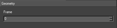
| Property | Description |
| Frame | The “frame” of the select node that should be rendered. The first child beneath the select node is “frame 0”, the second child is “frame 1”, and so on. |
Shader Node
Sets the current shader in the Scenegraph. Note that the shader, material, texture and state tabs of this interface are covered in the Shaders section of the documentation.
Usage
The shader node allows the user to set the current shader in the Scenegraph. All meshes that are drawn afterwards in the Scenegraph will use this shader.
Shaders themselves are assets, and cannot be directly animated. The user can animate a Shader’s properties via a shader node, allowing a change in the material colour, and the texture transforms for each texture.
Interface
Shader
Select the shader to use in this shader node.
- You can use the drop down to select a shader.
Alternatively, clicking the shader browser button

will open the shader browser allowing visual selection of the desired shader.
Material Override Editor
This allows the user to override the material properties set by the shader referenced by the shader node.
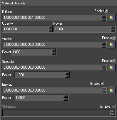
| Property | Description |
| Enable | Overrides needs to be enabled in order to affect the material. By default, all overrides are switched off. |
| Diffuse | Overrides the diffuse colour on the material, allowing it to be animated. |
| Opacity | Overrides the opacity on the material, allowing it to be animated. In order to be able to override opacity, the user needs to enable the override on the diffuse colour as well. |
| Ambient | Overrides the ambient colour on the material, allowing it to be animated. |
| Specular | Overrides the specular colour on the material, allowing it to be animated. |
| Emission | Overrides the emission colour on the material, allowing it to be animated. |
| Shininess | Overrides the shininess on the material, allowing it to be animated. |
Texture Override Editor
This allows the user to override the texture properties set by the shader referenced by the shader node.
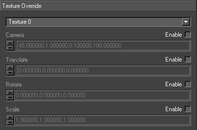
| Property | Description |
| Texture Dropdown | Selects the texture unit. The current implementation allows 4 texture units, from Texture 0 to Texture 3. |
| Camera | Overrides the camera part of the texture transform. |
| Translate | Overrides the translation part of the texture transform. |
| Rotate | Overrides the rotation part of the texture transform |
| Scale | Overrides the scale part of the texture transform |
Lighting Editor
Allows the user to select what lights, light this shader node.
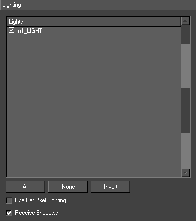
| Property | Description |
| Lights | All the lights in the scene |
| All | Set the shader node active in all the lights |
| None | Remove the shader node from all the lights |
| Invert | Inverts current light selection |
| Use Per pixel lighting | Enables per pixel lighting |
| Receive shadows | Enables receive shadows on the shader node |
Misc Editor
Allows the user to select Load Movie Paused option..
| Property | Description |
| Load Movie Paused | Loads a movie clip paused at the start of the clip |
Shadow Node
Shadows all the geometries and texts underneath against each other using the specified light.
Usage
Simply insert the Shadow node above the scene to be shadowed. The user can specify a Light node or the details of a light node.
There are two types of shadows – hard and soft. Hard shadows have a hard edge and are quicker to calculate. Soft shadows look best and are more realistic but are expensive and should be used sparingly. There is no difference in how they are setup.
Shadowing works by calculating a shadow map by looking at the scene from the lights view and capturing the depth values of the visible objects (ie. the distance from the light
camera to each pixel). The shadow map is used as a texture when the scene is rendered for real. A per-pixel comparison between the pixel depth and its light depth is used to decide when a pixel is in shadow. The first cost of shadowing is drawing the scene twice (this can be mitigated by limiting the objects drawn. A flag can be set on any node using the Basic node editor so it will not be drawn into the shadow map). The second is the use of the shadow map. This is accelerated on nVidia hardware. Soft shadows involve a jittering technique which makes this phase particularly expensive.
Shadow maps also suffer from aliasing effects just like any texture. The map has to have sufficient resolution to give a smooth edge to the shadow but large shadow maps are costly in time and resources.
Interface
Shadows
| Property | Description |
| Type | Choose between soft or hard shadows |
| ClipPlane | The near and far planes for the light camera. The closer they are the better. It makes the values in the shadow map more accurate and the depth comparison more robust |
| Resolution | The resolution in pixels of the shadow map |
| Shadow Offset | These offsets help with robustness and accuracy of the depth comparison |
| Softness | Controls the softness of the edge of a soft shadow |
| Minimum Intensity | Controls the blackness of the shadow |
Light
| Property | Description |
| Light Dropdown | Light used for the shadow (must be a spot light) |
| Custom Light | Enables the user to set up a custom light (rather than use one in the scenegraph) |
| Position | Position of the light |
| Direction | Direction of the light |
| Field of View | Field of view of the light |
Skinning Node
Overview
Swift contains a full character skinning implementation, that allows an artist to import skinned meshes, skeletons and forward-kinematic animations from existing 3d animation packages and control and trigger animations from within Swift.
Workflow
Creating and Animating Skinned Characters
A person skilled in 3D Modelling and animation software will be required to create the skinned characters within a 3D animation package. For 3D modelling, a package such as Maya or 3D Studio Max can be used. For Animation, a program such as Motion Builder is recommended.
Exporting/Importing to Swift
Swift imports skinned characters using the FBX file format. You should export your character from your 3D Modelling package and import it into Swift like other meshes.
Import into Swift using the standard Swift import dialog. Swift will recognize that the mesh contains skeleton information, and will automatically create a correct skeleton file, save any poses in the FBX file as animations, and construct a scenegraph containing the skinning node and the mesh.
Adding a skinning effect node to the scenegraph
Whilst the skinning node will correctly set up the mesh to render a skinned character, you need to use an effect node with the correct CG shader for your situation to render it correctly. Since the CG shader that you use depends on how you want to light your scene, and exactly which textures you are using there may be a choice of cg shaders to use. Contact RT Software graphical services for advice on the correct CG shader to use for your circumstances.
Choosing a Skeleton
If the skinning node does not have a skeleton selected, you should select the correct skeleton for that mesh into the skinning node.
NOTE: Meshes will only work with the skeleton that was designed to work with them. Trying to use any other skeleton will likely cause very broken results.
Animations
There are a number of levels at which a graphics implementer can choose to animate a character. The correct choice will vary based on the requirements of the graphic.
Bone Animations
Bone animations are the most direct animations that can be applied to a skinned character. When bone animations are enabled on the skinned node, you can connect animations and inputs up directly to specific bones in the skeleton to animate them.
Bones are exposed on the skinning node as a number of animatable fields representing the various animatable properties of the bone.
All fields for a bone are named in the same way.
- Rotation properties are named <boneName>RX/RY/RZ
- Translation properties are named <boneName>TX/TY/TZ
- Scale properties are names <boneName>SX/SY/SZ
For example, if your skeleton contains a bone named Head, you will see AFields for the following :
HeadTX, HeadTY, HeadTZ, HeadRX, HeadRY, HeadRZ, HeadSX, HeadSY, HeadSZ
Pros
- Bone level animations give you the finest level of control over the skeleton within Swift
Cons
- Very unwieldy and impractical if trying to animate an entire skeleton
- Not suitable for crossfading animations
- As they are directly animated via the Swift timeline, it can be difficult to animate them alongside other Swift based graphics.
Example Uses
- Animating a character head to follow a point separately from the animations of the rest of the body
- “Tweaking” an existing animation, for example, altering an existing posed animation to better match circumstances.
Track Animations
Track animations allow you to run pre-created animations in a way similar to how movies work.A track animation will animate all bones for the skeleton required for that animation, for example, a walk cycle, would be treated as a single track animation.
To create a track animation, import an FBX file containing the animation into Swift. Swift will automatically create the animation file that will be used by the track animation system.
Track animations are stored in GMData/Skeletons/Animations
Deleting Track Animations
- To delete an existing track animation from the project, browse to GMData/Skeletons/Animations and delete the corresponding .ani file.
Multiple Tracks and crossfading
Swift supports two simultaneous track animations. This allows two animation cycles to run at the same time. It is possible to smoothly switch from animation to another by animating the crossfade animatable field. This allows you to for example, transition from a walk cycle to an idle cycle without having the animation cut in between.
AFields controlling Track 1 are have the prefix Trk1, AFields controlling track 2 have the prefix Trk2.
Controlling Track Animations
Controlling a track animation is similar to how you control animated textures.
First, select the animation that you wish to use. This can be set directly via the skinning node interface, or using the Trk1Animation and Trk2Animation AFields via an input or step animator.
You now have two choices on how to animate the track. You can choose to animate the fields parameter directly allowing you direct control over which frame of animation plays and when. To do this, animate Trk1Frame or Trk2Frame.
Alternatively and quite often more usefully, you can make the animation run outside of the timeline by using the Run and Loop options.
Set Trk1Run/Trk2Run to true to start the animations playing automatically, set them to false to pause the animation.
By default, when the animation reaches the last frame, the Run project will be set back to false, and the animation will stop. By setting Trk1Loop/Trk2Loop to true, the animation will loop indefinitely.
Pros
- A good compromise between simple methods and allowed control
- Can crossfade between animations allowing for smooth animations without a large amount of effort.
- Can control animations at a frame-accurate level, or set animations to run until further notice with no further intervention.
Cons
- You still need to use methods to control animation transitions.
- Updating multiple skinned nodes at the same time can be hard to implement
- Making idling characters pick between random idles requires a lot of manual effort to implement
State Map animations
State maps give you the ultimate level of animation automation in Swift.
With state maps, the skinning node takes over control of the track animations, and will automatically select a new animation and crossfade without intervention from the operator.
To enable state maps on a node, select “Use State Maps” on the skinning node editor, or call @skinningNode.setUseStateMaps(true) from user code.
When using state maps, you control the skinned mesh indirectly by setting a target location, angle and required velocity for the skinned node to use to get there.
- TargetX, TargetY and TargetZ specify a location that the skinned node aims to reach. It will attempt to get there using the target velocity, and will then idle (select states with a velocity of 0) until given further instruction.
- TargetAngle chooses the direction that the skinned node will face in whilst idling.
- TargetVelocity chooses the velocity that the skinned node will aim to achieve whilst travelling to the target.
State Map File Format
The state map should be created in the same directory that contains the skeleton (GMData/Skeleton) and should be named with the .MAP extension.
For example, given a skeleton called Player
- The skeleton file will be located at
- GMData/Skeleton/Player.SKL
- The state map should be called
- GMData/Skeleton/Player.MAP
The file format is a simple, text readable format that can be edited by hand. Here is an example state map
| startStateMap mySkeleton startState animRunning velocity 0.1 probability 1.0 endState startState animWeightShift velocity 0.0 probability 1.0 endState endStateMap |
Every file begins with startStateMap, followed by the name of the skeleton that the file is for. This should match the name of the .MAP file, without the extension.
Each state is defined using startState/endState. After startState, you specify the name of the Track Animation that this state defines.
- Each state contains the following information that allows a correct animation to be picked for a given circumstance.
- Velocity gives the correct velocity for this animation state. When the skinning node chooses a new animation, it will pick one that matches the velocity that it needs. This allows the skinning node to choose idle animations at rest, and walk/run animations as appropriate.
- Probability is used when multiple states match the desired criteria for animation. For example, it is common to have multiple idle animations, any of which is appropriate for a character standing still. Probability allows an additional random weighting of animations so that idles will cycle in a more dynamic and natural way.
Pros
- Using state maps in conjunction with touch nodes and duplicates allow for the quick and easy set up of highly interactive presenter-driven graphics that would be very difficult or impossible to produce any other way
Cons
- You have limited control over what animation will run and when, except by modifying the state map.
Interface
| Property | Description |
| Skeleton | Choose the skeleton that this skinning node will use. This should be the skeleton that the mesh beneath the skinning node expects, otherwise you will get broken results. |
| Enable Bone Animation | Set to true if you are using the bone editor or bone afields to manipulate the skeleton. It is on by default. Turn it off for a small performance benefit. |
| Enable State Map | Set to true to enable the state map on this skinning node. This will disable the track editor, as the state map automates this part of the interface. |
| Track Editor | Both tracks behave in the same way |
| Animator | Select the Track animator to apply on this track. |
| Frame | Displays the current frame of animation. You can edit this value to “scrub” through the animation. |
| Run | Check this box to make the animation play automatically. |
| Loop | Check this box to make the animation loop indefinitely. If this box is not checked, the animation will only play to the last frame, and then run will become unchecked. |
| Crossfade | Determines how much of the track 1 and track 2 animations are used. Has no effect if only one track has an animation selected into it. A value of 0 means that only track 1 is used, A value of 1 means that only track 2 is used. |
| Bone Editor | Allows the manual editing of bone properties. These values are only applied if Enable Bone Animation is checked |
| Bone | The drop down box allows the selection of which bone in the skeleton you wish to modify |
| Translate | Modify the Translation of the bone |
| Rotate | Modify the Rotation of the bone |
| Scale | Modify the Scaling of the bone. |
SkyBox Node
Displays a complete 360 degree scene with just six images – normally used as a background.
Usage
This node tracks the camera and draws an axis aligned cube around it. The cube is textured using a cube map texture which needs six images. Provided the images are generated carefully an impression can be given of a complete 360 degree scene. Six images are taken along the positive and negative x, y and z axes with a camera field of view of 90 degrees. A shader with a texture containing these images is created and the mapping is setup using the texture editor and selecting the sky box option.
Interface
| Property | Description |
| Type | The geometry to be displayed (cube/sphere) |
Sort Node
This node sorts the geometries under it by shader.
Usage
The aim of the node is to speed up render by reducing redundant shader changes by drawing all geometry with the same shader Swiftether. This node should really only be used on nodes that change. The render of static nodes should be optimised using the Optimize tool on the scenegraph editor.
The node is inserted above the nodes to be sorted. The node mains two lists of nodes – opaque and translucent. Nothing is displayed while the nodes are traversed; nodes are accumulated in the Sort node. The two lists are then sorted and displayed.
The Sort node handles Transform and Clipplane nodes i.e. The transformations and the clipping are applied correctly to the sorted list. Other nodes may but are not guaranteed to work.
Interface
| Property | Description |
| Draw Translucent Last | By default translucent objects are drawn last but sometimes this is not wanted. This offers the option to draw these objects in the sort order. |
StateOverride Node
Use the state assignments in this node in preference to the state assignments in subsequent Shader nodes.
Usage
The state is the graphical state and controls a variety of aspects of the gpu – depth sorting, blending, lighting etc. It is detailed in the chapter on Shaders. The user sets a state on this node and any state assignments in it are in preference to the state assignments in subsequent Shader nodes.
For example, in VR some graphics need to be behind the presenter and some in front. This could be done with two graphic sources but it is better done by controlling the blending state of different parts of the scene. No alpha is written for those parts of the scene which are chroma keyed into the background. Alpha is written for those parts of the scene mixed on top of everything else. The scene is divided into parts each with their own StateOverride – one has blend state for the alpha of GL_ZERO/GL_ZERO and the other GL_ONE/GL_ONE. Simply by moving objects from one StateOverride tree to another it is moved from in front of the presenter to behind the presenter.
State Override contains a SOForeground and SOBackground default state overrides in the drop down list to achieve foreground and background keying.
Interface
| Property | Description |
| State | The state to user to override the other states. |
Trajectory Node
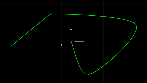
Trajectory nodes define editable paths in three dimensions. The user supplies knots and the trajectory node fits b-splines through them. Trajectory nodes can be linked to Transform nodes to move objects or to Camera nodes to move camera along the defined path.
Creating a trajectory
Drag a trajectory node into your scenegraph. a trajectory is used in a similar way to a transform node – you can place objects on top of it.
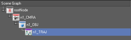
Change your camera to one of the Orthographic cameras (Front, Top or Side)
Make sure that the trajectory node is selected, and select the Trajectory Tools menu on the top right hand side of the output window, and select the

Add Points tool.
Click on the display to add points (also known as knots) to the trajectory. You will see a green trail , and see the points that you have clicked as blue dots. The currently selected knot will have a red dot.
To delete a point, right click on it, and on the right click menu, select trajectory…->delete
To move an existing point, use the standard transform tools (Translate, Rotate, Scale)
| Trajectory Operation | Description | |
 |
Insert Point | Inserts a point into the trajectory at the point at which you click. |
|
|
Add Point | Adds a new point to the trajectory, at the end of the trajectory. |
Right Click Trajectory Menu
When you right-click a point, the following options are available to you that are specific to Trajectories. These are on a submenu called Trajectory….
| Option | Description |
| Corner | Change the point to be a corner point – there is no ease in and ease out or control on outgoing tangent |
| Smooth | Change the point to be a smooth point – the ease in and ease out and tangents are automatically compute |
| Bezier | Change the point to be a bezier point – the user controls the ease-in and ease-out and tangent using the handles provided |
| Bezier smooth | Change the point to be a smooth bezier point – the user controls the ease in and ease out and tangent using the handles provided with a separate control for incoming and outgoing lines of the point. |
| Delete | Deletes this point from the trajectory,. |
Using a trajectory
Trajectories define a path through 3D space. They can be used as a special type of transform node, and they can be used in conjunction with other nodes to render paths inside of the graphic.
As a Transform Node
Any nodes placed beneath a trajectory will be transformed by the trajectories current position. By default, the “current” position of the trajectory is at the start of it’s path, but this can be changed by animating the SplinePosition AField between 0 and 1.
0 is the start of the trajectory’s path, 1 is the end of the trajectory’s path.
Additionally, three afields are provided by this node (CurrentTX, CurrentTY and CurrentTZ). These fields can be linked to fields in other nodes to, for instance, move objects.
Rendering a trajectory
Trajectories by themselves have no rendering capabilities. However, there are two nodes that can be used to render a trajectory.
A Dynamic Geometry Node can render a Ribbon using two trajectories to define the shape. See page for more details on how to use a Ribbon.
The SplineRenderNode plugin node can render a trajectory as a line.
Interface
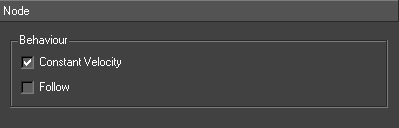
| Option | Description |
| Constant Velocity | If selected then the distance the point moves along the curve with each time step is constant otherwise velocity between point depends on the distance between the points. |
| Follow | If selected then computes a rotation as well as a translate to make an object face forwards along the direction of the curve otherwise only computes a translation. |
Text Node
Provides support for text.
- For details on how to import fonts into Swift, see Importing Fonts (page )
- For details on how to use the Quick-access text toolbar, see page
Usage
There are all the text specific capabilities from animating kerning and individual character attributes to importing fonts in various formats and languages, an experienced user would expect. But more than this, text as a graphics object is fully integrated into all other parts of Swift, from shading text using the cgFX framework to incorporating text into tickers, tables and other data objects. This section deals only with the core Swift text interface, editing contents and setting and animating character attributes.
A Text node can be created either by dragging and dropping from the Font browser or by using the New Text tool. In either case a Transform node, Shader node and Text node will be created. The Text node can be edited using the main text editor, the main window toolbar text editor or by interacting with the text directly on the screen.
The main text editor allows the editing of all the Text node fields.
The on-screen editing is for the content only. It is edited much as text is edited in a WYSIWYG editor. Characters can be typed in at a cursor, deleted, cut and pasted. The cursor can be moved about using the arrow keys. Sections can be highlighted.
To examine the substructure of nodes under a Text node, click on the Scene Graph Text node with the right mouse button depressed and select ‘Show/Hide Extended Nodes’.
The Text node is either drawn as textured squares or as meshes of triangles. Either way, the text can be shaded by the associated Shader node just like geometry. This means text can be lit and textured and have effects applied to it.
Text Markup
Markup changes the display of attributes of sections of the content by inserting HTML type tags. As the tag is typed into the editor, it will change its appearance on screen and may even disappear. Its not possible to edit on screen directly. They are usually included in inputs or in parameter lists when Swift is driven remotely.
| Attribute | Example |
| Shader | <s default>some content</s> |
| Font | <f Swis721_BT_Bold>some content</f> |
| Underline | <u>some content</u> |
| Strikeout | <so>some content</so> |
| Extrude | <e>some content</e> |
| Outline | <o>some content</o> |
| Kerning | <k 0.1,0,0,0>some content</k> |
| DropShadow | <ds 0,0,0,0.5,0.1,0.1>some content</ds> |
| Translate | <tv 0,1,0>some content</tv> |
| Scale | <sv 0.1,0.1,1>some content</sv> |
The ‘~’ character is drawn as a square. So a textured shader in a shader tag and the tilde character can be used to insert smiley characters (even animating ones) into text.
Editing Text on Screen
Double clicking on the text puts the editor into on screen editing mode for editable nodes. Select text and the cursor shows up at the selected character. Move the cursor using the arrow keys. Move to the start of the string using the Home key. Move to the end using the End key. Delete characters using the Backspace key. Type to insert characters. Select and highlight a part of the contents by dragging cursor. Type over the highlighted section or delete it using the Backspace key. Changes on the screen should be matched by changes in the contents widget on the TextNode editor (including cursor position and highlighting).
Click on the text with the right mouse button with the control key held down. This pops up a menu of editors. Choose ‘text1’ and the TextNode editor appears on the bottom right of the interface.
Interface
Content
This interface handles the content of the Text node.
| Property | Description |
| Contents | this contains the contents of the Text node in UTF-8 encoding and so supports the full range of languages supported by the operating system |
| Font | this is a complete list of the fonts in the project. This can be set on highlighted spans. |
Alignment
The characters are laid out the positional information in the font file. This includes character-character kerning information and the handling of graphic and non-latin fonts. This comes as part of the font file. The Text node editor also allows other forms of positioning control
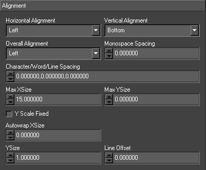
| Property | Description |
| Horizontal Alignment | The horizontal alignment (Left/Centre/Right) |
| Vertical Alignment | The vertical alignment (Bottom/Centre/Top) |
| Overall Alignment | Combined with the Horizontal alignment this determines the x position of each line of a block of text. For example, if a Text node is Left aligned, all the lines line up with x = 0.0. If the Overall alignment is Centre, the longest line is found and this is used to centre the whole text about its y axis |
| Monspace Spacing | Enforces a fixed spacing of characters for this text, regardless of whether the font was monospaced or proportionally spaced. Setting this to 0 disables monospaced spacing. |
| Character/Word/Line Spacing | This changes the spacing between characters, words and lines. Swift fully uses the layout information in any font. These are used to tweak the basic kerning and leading. This can be set on highlighted spans. |
| Max XSize | This fits the whole string into a certain horizontal extent. If the width of the text exceeds this value the whole text node is scaled so it fits |
| Max YSize | This fits the whole string into a certain vertical extent. If the height of the text exceeds this value the whole text node is scaled so it fits |
| Y Scale Fixed | Sets the Y size to be fixed when text exceeds the max X size |
Styles
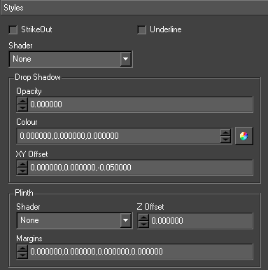
| Property | Description |
| Strike Out | This draws a line through the middle of the text. This can be set on highlighted spans. |
| Underline | This draws a line under the text. This can be set on highlighted spans. |
| Shader | This draws the text with the specified shader. This can be set on highlighted spans. |
| Drop Shadow | This draws the text twice. Once in unshaded and possibly translucent black. This can be set on highlighted spans. |
| Opacity | the translucency of the shadow text. |
| Colour | the colour of the shadow text. |
| XY Offset | the offset of the shadow otherwise its completely behind the text. This can be set on highlighted spans. |
| Shader Plinth | This displays a square behind the text which is the same size as the text |
| Shader | the shader of the plinth (if None no plinth is displayed) . |
| Z Offset | the plinth is displayed at the Text node depth plus this offset. |
| Margins | the plinth is scaled to fit the text plus these margins. |
| TeleType Cursor | This displays a square on the last visible character in a text. |
| Shader | the shader of the cursor (if None no cursor is displayed). |
| Z Offset | the plinth is displayed at the Text node depth plus this offset. |
| Minimum Width | The teletype cursor adjusts to the size of the current character. This allows a minimum width for the teletype cursor to be picked. |
| Margins | the plinth is scaled to fit the text plus these margins. |
Advanced
Advanced text rendering options
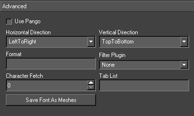
| Property | Description |
| Use Pango | Use the pango library for fonts. This takes full account of the machines Locale when laying out text. |
| Horizontal Direction | Override the font’s default direction of the text for horizontal scripts. |
| Vertical Direction | Override the font’s default direction of the text for vertical scripts. |
| Format | This is used to reformat the contents. There are four options – string (e.g. “S %s”), float (e.g. “F %0.1f”), integer (e.g. “I %04d”), date (e.g. “D %HH:%mm:%dd”). |
| Filter Plugin | The user must create a plugin which implements the following api. extern “C” char *<plugin_name>_pFilter(char * string); This is used to alter the text contents before the text is laid out. |
| Character Fetch | This attribute is only useful in Ticker nodes. It controls the number of characters fully processed into Swift nodes in a single frame. If the contents of a Text node inside a slug of a Ticker node is large (e.g. several thousand characters), Swift can drop a frame trying to process the complete contents in a single frame. Setting character fetch spreads the load. |
| Tab List | The width of each tab. This should be a comma separated list of floats. |
| Save Font As Meshes | Saves the font character out as individual meshes. Used in conjunction with the Just-In-Time asset loading preference to avoid loading all the fonts completely at load time. |
Character
This interface allows the fields of individual characters to be edited and initialised. Text nodes can be animated character by character. This is how Swift implements the zipping of text. The animations are setup for each character and then staggered.
Complex effects can be achieved by adding several animation types. The animators are added by dragging the Text node onto the timeline in the usual way and choosing one of the character fields (e.g. CharacterA).
Combining animation of text characters with vertical tickers can produce a teletype effect. Follow the instructions in the Ticker section of this manual to create a vertical ticker with a Text node which had a character animation fading on each character in turn. To complete the effect, select the trigger event to be when the text is fully visible and elect to pause the ticker until the animation completes. The ticker will scroll up bring into view the invisible text. When the invisible text is completely visible, its animation will be triggered. The scrolling will stop until the animation is complete. The text will be animated on character by character.
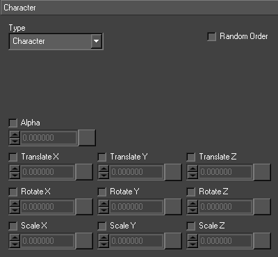
Extrusion
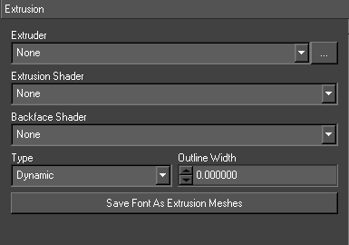
Texture Override Node
Use the texture assignments in this node in preference to the texture assignments in subsequent Shader nodes.
Usage
The user sets a texture on this node.
Interface
| Property | Description |
| Texture 0 | The texture to override texture 0 |
| Texture 1 | The texture to override texture 1 |
| Texture 2 | The texture to override texture 2 |
| Texture 3 | The texture to override texture 3 |
Ticker Node
Provides support for tickers.
Usage
A Ticker in Swift is a continuously moving stream of graphic items. This can be classic tickers moving right to left across the screen. It can also be credit rolls moving up/down the screen. The graphic item can be as complex as the user is prepared to build.
To create a ticker popup the custom browser and drag the required ticker type onto the screen (there are three possible tickers – ticker/roller/teletype).
Interface
Ticker
This sets general ticker attributes
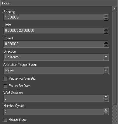
| Property | Description |
| Edit | Swaps the ticker between Edit and Live modes. When editing, the slugs are displayed stationary. In live mode, the ticker animates as it would in live mode. |
| Spacing | The distance between the slugs. |
| Limits | The limits at which the Ticker node draws two clip planes. The slugs appear through one clip plane and disappear into the other. |
| Speed | The amount the slugs move in a frame. It can also be negative for left-to-right and bottom-to- top tickers. |
| Direction | The direction of the ticker to either Horizontal or Vertical. |
| AnimateOffMethod | If the ticker has a numberCycles greater than zero, there is no way to know from a scripting point-of-view when the ticker has stopped. It is impossible to clean up any graphical items that may frame the ticker. If the user supplies an AnimateOff method, the method is called when the ticker runs out of data. |
| Animation Trigger Event | Animators on a slug’s nodes have a special type Trigger. These animators can be triggered on certain events. |
| Pause for Animation | Pause until the trigger animation is complete |
| Pause for Data | When the last slug is fully on, the ticker stops streaming the slugs until more data is available. This is only applicable to tickers with network and interface data types and gives the effect of slugs being pushed onto the ticker. |
| Wait Duration | The ticker pauses for this number of frames after each slug becomes visible |
| Number of Cycles | The number times to repeat a batch of ticker data. In a database ticker a batch is the result of the select statement etc |
| Reuse Slug | Saves away old slugs then they are removed and if any new slug contains the same data it uses the save version. |
| Notify on Slug Removal | This is only applicable when controlling Swift externally using the MOS protocol. It sends a message back to the client whenever a slug is removed. |
Source
The ticker can be automatically driven by different data sources. It is updated on each frame. Existing slugs are moved. If there is room, another slug is created and fed from the specified data source. If a slug drops of the end it is removed.
The type of the data source – None, Database, MOS Parameter or Widget.
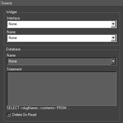
Database
A database is supplied with the installation. Select the database and specify the select statement. This statement should have the form ‘SELECT <slugName>,<slugContents> FROM …’. The contents contains a tilde separated list of values used to update the updateable fields. Swift retrieves the data from the database when the Ticker node has to create a new slug and the data previously retrieved is exhausted. This provides the data for the next set of slugs.
MOS parameter
The controlling program sends a special UPDATETICKER command to Swift. This is detailed in the section on Remote Control.
Interface
Select a user interface and a widget from it. The Ticker node gets its data from this widget. The widget is usually a LineEdit, one line containing the slug Node name and the next containing the contents. Swift uses QT to create user interfaces and their widgets.
Update
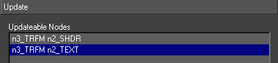
Before specifying the data source, first select what nodes are to be updated. Click on the Update tab. This contains a list of all Shader, Geometry and Text nodes in the slug. Only these nodes can be updated by the data source.
Fixed Slugs
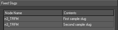
The user can specify the slugName and contents directly in a table on the interface. This data is the saved to the graphic. The Ticker node will cycle around the list of slugs indefinitely or until the number of cycles is reached.
| Button | Description |
| Add | Add a new slug |
| Remove | Removes selected slug |
| Clear | Clears all the slugs |
Transform Node
Positions objects in the scene, performing translates, rotates, scales and shears, taking pivot points into account.
Usage
Transform nodes are used to position objects in the 3D scene.
A transform node has basic Translation, Rotation and scaling. The rotation order of the three axes can be chosen.
As well as basic transforms, the transform node also has support for rotate and scale pivot points, and shearing.
A transform node can be associated with a Mix Target so that it will track the mix target.
Any option with an orange arrow next to it

can be reset by clicking this button.
Level of Detail
The user can choose the distance from the camera at which the transform node becomes activated. By default, this is set to all values, but by choosing specific range values, the user can set up automatic Level Of Detail.
Create a Scenegraph that contains all of the different Levels of detail for the same geometry that is required. Each Geometry should have a unique transform (although they may also share a common transform)
Set the Level of detail ranges for the transforms for each geometry so that each only activates within the desired range, so the highest level of detail geometry would only be active close to the camera, the next geometry would only be visible in the mid range, and the next level of detail would only be activated at a distance.
Finally, add a LOD Node above the transforms. This will manage which transforms are visible depending on distance. (see page )
Interface
Transform
This contains general transformation attributes.
| Property | Description |
| Translate | The translation to be applied by the transform. |
| Rotate | The rotation to be applied by the transform. The order of the axis rotations is determined by the rotate order. |
| Scale | The scaling factor to be applied by the transform. |
| Link Scale | If Link Scale is set, then the Y and Z values of Scale will be locked to the same value as the X value. |
| Keep Aspect | Will keep the aspect ratio constant regardless of scale |
| Pixel space Scale | Interprets the scale values as pixel sizes, regardless of distance from the camera. |
| Rotate Order | Chooses the order that the rotate axes are applied in the transform. Euler Angle rotations are order dependant – a rotation of xyz is not guaranteed to produce the same results as the same rotation applied zyx. |
Scale Pivot

| Property | Description |
| Point | The pivot point from the origin of the transform around which the scale will take place. |
| Offset | A translational offset that is applied after the scale has taken place. |
Rotate Pivot
| Property | Description |
| Point | The pivot point from the origin of the transform around which the rotation will take place. |
| Offset | A translational offset that is applied after the rotate has taken place. |
Shear/Orientation
| Property | Description |
| Shear | Sets the shear part of the transform |
| Rotate | Sets the rotation orientation of the transform |
Mix
This sets the attributes for setting up Mix tracking on this node.
| Property | Description |
| Enable | Enables this transform to track a Mix TV Target. |
| Target Type | Whether using single or cube target types |
| Target ID | The ID of the target to track. |
Rigid Body
This sets up this node up as a rigid body. If there is a Rigid Body System node above it will behave in the scene as a rigid body i.e. it wall fall under gravity and impact other rigid bodies in the scene. This page is used to set up the rigid body properties for this node and its sub-tree. See the Rigid Body System Node for more details (page )
| Property | Description |
| Enabled | Enable this transform node and its subtree as a rigid body. |
| Type | The type can be either Dynamic (a full rigid body interacting with other rigid bodies and acted on by forces), Static (a rigid body that is not acted on by forces even the impact ones of other rigid bodies) and Kinematic (a rigid body that can be moved using animations). |
| Centre of Mass | The position of the centre of mass of the body. This might be different from the centroid of the transform node and its sub-tree. |
| Linear Damping | The damping of the linear velocity (i.e. how fast a body slows up). |
Level Of Detail
Target
Video Screen Node
Renders the selected video input channel full screen and screen aligned.
Usage
Add a video screen node to the scenegraph, requires a shader above it. The shader must have lighting disabled and no texture.
Interface
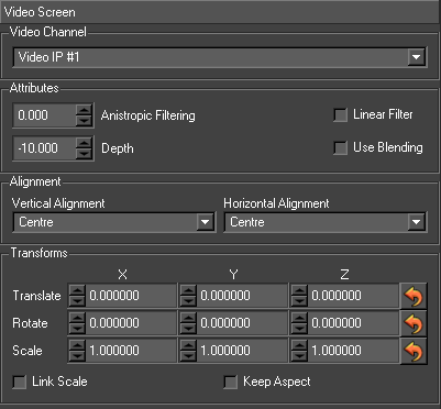
- Video Channel 1
- Selects first video in channel on video card
- Video Channel 2
- Selects second video in channel on video card (if available)
- Depth
-
- Z Depth of the video screen node within the scene
- Allow Transforms
- Enables the use of transform nodes on the video screen node
- Use filter
- Enables anisotropic filtering
- Filter Level
- Level of anisotropic filter
- Calc Transform
- (Allow transforms must be set) will cause video in to be rendered full screen, regardless of transform.
Warp Node
Provides a method for deforming geometry.
Usage
This node is only effective on objects that are per pixel lit.
The Warp node is inserted above the nodes to be warped. Both geometry and text will be affected. The user supplies cg code. In the Vertex/Normal Function case, this code will be used to warp both the vertex and its normal.
Notes and Exceptions
The recalculation of the normal is an approximation and may cause unwanted lighting effect.
Functions
These are the cg functions that effect the warping of the geometry.
| Vertex/Normal Function | Vertex / Normal function code |
| Normal Function | Normal function code |
| Colour Function | Colour function code |
| Texcrd Function | Texture coordinates function |
| Apply | Applies the cg data to the warp node |
Parameters
These parameters are passed through to the code that warps the vertex and can be used as variables in the code. They can be animated and have inputs set on them in the usual way.
Z Depth Node
Draws only the nearest faces of any child geometry node. It is mainly used to clean up transparency and makes only the faces nearest the camera visible – obscured faces will not be drawn.
File Formats
Project File
This file contains all the details of a project
- a user supplied description
- the location of all the graphic and data directories
- the details of all databases
For the setup information for VR/Mix/Pierro see the VR Manual. All files and directories in the project are relative to the location of the project file itself.
| startProject ./Simple.prj startScript scriptDirectory “./GMScript” libDirectory “./GMScript/Lib” templateDirectory “./GMScript/Template” saveDirectory “./GMScript/Save” layoffDirectory “./GMScript/Layoff” stackDirectory “./GMScript/Stacks” endScript startData dataDirectory “./GMData” imageDirectory “./GMData/Images” geometryDirectory “./GMData/Geometry” fontDirectory “./GMData/Fonts” materialDirectory “./GMData/Materials” textureDirectory “./GMData/Textures” stateDirectory “./GMData/States” shaderDirectory “./GMData/Shaders” pathDirectory “./GMData/Paths” lineStyleDirectory “./GMData/LineStyles” storage DeviceDirectory “./GMData/StorageDevices” pluginDirectory “./GMData/DynamicObjects” soundsDirectory “./GMData/Sounds” cgProgramDirectory “./GMData/CGPrograms” fbxDirectory “./GMData/Fbx” extruderDirectory “./GMData/Extruders endData startDatabase test driverName “QMYSQL3” hostName “localhost” userName “root” databaseName “test” endDatabase endProject |
| File Attribute | Description |
| scriptDirectory | the base directory that contains all of the other graphic directories. |
| libDirectory | stores library graphics. See libraries. |
| templateDirectory | stores graphics. |
| saveDirectory | when working in a system where the user modifies graphics in order to generate revised versions rather than using a Menu Interface, the save directory will save out the templates to be displayed. |
| layoffDirectory | stores layoff graphics. See layoff |
| stackDirectory | stores stacks of graphics that can be loaded in and played. |
| dataDirectory | the default data directory containing all other data directories |
| imageDirectory | stores all images used in the project |
| geometryDirectory | stores all 3D model data used in the project |
| fontDirectory | stores all fonts used in the project |
| materialDirectory | stores all materials used in the project (diffuse, specular, ambient lighting) |
| textureDirectory | stores all of the textures used in the project. |
| stateDirectory | stores all state information used in the project |
| shaderDirectory | stores all shaders (combinations of materials, states and textures) used in the project. |
| pathDirectory | stores all bezier paths used in the project. |
| lineStyleDirectory | stores all line styles used in the project. |
| storageDeviceDirectory | stores details pertaining to storage devices accessible to the project |
| pluginDirectory | stores DSOs and Plugins used by the project. |
| soundsDirectory | stores any sound files |
| cgProgramDirectory | stores CG Programs, which are used to produce complex graphical effects. |
| pluginDirectory | stores DSOs and Plugins used by the project. |
| fbxDirectory | stores any fbx files imported into the project |
| extruderDirectory | stores all extruder files used in the project |
Shader File
| startShader default material default state default endShader |
| File Attribute | Description |
| material | the material of the shader |
| state | the state of the shader |
| texture | the texture of the shader. |
State File
| startState default depthEnable GL_TRUE depthFunc GL_LEQUAL depthMask GL_TRUE depthRange 0.000000 1.000000 blendEnable GL_TRUE blendFuncSeparate GL_SRC_ALPHA GL_ONE_MINUS_SRC_ALPHA GL_ONE_MINUS_DST_ALPHA GL_ONE blendEquation GL_FUNC_ADD blendColour 0.000000 0.000000 0.000000 0.000000 cullEnable GL_TRUE cullFace GL_BACK normalizeEnable GL_TRUE colourMask GL_TRUE GL_TRUE GL_TRUE GL_TRUE lightingEnable GL_FALSE lightingTwoSide 0.000000 lightingShadeModel GL_SMOOTH lightingLocalViewer 0.000000 lightingColourControl GL_SEPARATE_SPECULAR_COLOR lightingAmbient 0.000000 0.000000 0.000000 0.000000 scissorEnable GL_FALSE alphaFuncEnable GL_FALSE stencilEnable GL_FALSE endState |
Texture File
| startTexture default target GL_TEXTURE_2D minFilter GL_LINEAR magFilter GL_LINEAR sWrap GL_REPEAT tWrap GL_REPEAT rWrap GL_REPEAT envMode GL_MODULATE anisotropicValue 2.000000 image 1 “default.png” internalFormat GL_RGB endTexture |
resetImage
Image Location of imaging used, usual stored in GMData/Images
- soundEnable: Whether sound is enabled endTexture
Material File
| startMaterial default diffuse 1.000000 1.000000 1.000000 1.000000 specular 0.000000 0.000000 0.000000 1.000000 emission 0.000000 0.000000 0.000000 1.000000 ambient 0.000000 0.000000 0.000000 1.000000 shininess 1.000000 side GL_FRONT_AND_BACK diffusePower 1.000000 specularPower 1.000000 ambientPower 1.000000 emissionPower 1.000000 endMaterial |
| File Attribute | Description |
| Diffuse | The basic colour |
| Specular | The colour of the highlight |
| Emission | The colour of any light emitted |
| Ambient | The colour of the object in shadow |
| Shininess | The size of any specular highlights |
| Side | Which side of the object faces are lit. |
Geometry File
| startGeometry default startMesh default dataFormat GL_TRIANGLE_STRIP displayMethod GM_DM_Direct_DL vertexList 4 0.0 0.0 0.0 0.0 1.0 0.0 1.0 0.0 0.0 1.0 1.0 0.0 normalList 4 0.0 0.0 1.0 0.0 0.0 1.0 0.0 0.0 1.0 0.0 0.0 1.0 texcrdList 2 4 0.0 0.0 0.0 1.0 1.0 0.0 1.0 1.0 texcrdList 2 4 0.0 0.0 0.0 1.0 1.0 0.0 1.0 1.0 texcrdList 2 4 0.0 0.0 0.0 1.0 1.0 0.0 1.0 1.0 texcrdList 2 4 0.0 0.0 0.0 1.0 1.0 0.0 1.0 1.0 strip 4 1 0 3 2 endMesh endGeometry |
CGFX Bindable State
User APIs
Scripting Language
Overview
This section describes the structure of the graphics created when using the Swift CG + and design interface. For the most part users don’t have to worry about the script being created behind the scenes. However, knowledge of the scripting system can open up a whole level of graphic and content creation that goes far beyond the Swift CG+ interface. Swift uses the Ruby ( ) scripting language to encapsulate the information and commands given in the Swift CG+ interface. Ruby is a complete interpreted, object- orientated scripting language. To understand how the script works the user will need a basic understanding of Ruby. There is an excellent manual at and users are urged to read the first couple of chapters. The rest of this section assumes the reader is familiar with ruby and its syntax. Because Ruby is a language in it’s own right the user can include any of the tools/libraries provided by ruby to do such things as
- Database queries
- Mathematical functions
- Image control and manipulation
- TCP and Internet communication
- AI,
- Physics,
- Chat,
- CrypSwiftraphy,
- Audio
- and more…
For more details on ruby, see http://www.ruby-lang.org. As well as familiarisation with Ruby it may also be useful to look at the Swift scripting language reference manual. This contains descriptions of all the commands available within the scripting language.
Viewing and editing scripts
The scripts saved out from Swift are ascii files that end in .rb. To view these offline the user will need an editor of some sort. On Linux platforms the user can use any of the favourite text editors such as vi, emacs or kwrite. On Windows the user can use Notepad or Wordpad, just remember to always save the file as a text based file.
Basic Script
When the user creates a new script in Swift a basic script gets saved out into the Template directory. Run up Swift and create a new script called ‘Basic’. Goto the Templates directory (or where ever it has been saved) and open it up in the chosen editor. The user should see something similar to what is shown below.
| #encoding: UTF-8 ####################################################### # # TOG-3D Graphics: tOG-3D 4.6.5_r27811_64 # # Mon Jan 17 12:22:12 2022 # # This file is automatically generated. Only add code # to those sections marked startUserBlock()/endUserBlock() # #######################################################class Basic < Gm::GMScriptdef initialize(rootNode) super() self.setExportMethods([“Main”]) self.setIsLibrary(false) self.setVersion(“tOG-3D 4.6.5_r27811_64”) enddef Construct(data) self.swap() Gm::GMRootNode.rootNode.setClearColour(0,0,0,0) Gm::GMRootNode.rootNode.setClearDepth(1)# Save Links to Nodes above Object Nodes# Save Explicit Script Variables# Construct Blockself.startBlock(“Construct.block1”) self.endBlock(“Construct.block1”) # Set Objects Initialised # Save Events # Set Current Method/Block def Main(data) self.startBlock(“Main.block1”) |
When a script is created in Swift a new class is created. Script, Graphic and Class are all terms that describe the same thing – a Ruby script. A class within Swift contain methods that can be run from Swift. Methods, in turn, contain blocks which partition the method into manageable chunks. The user can think of the class as a small program in it’s own right. The script controls what happens to Swift when the user runs the graphic. In fact, what it does is manipulate the Scenegraph to add, change and animate node in the Scenegraph.
As may be seen all scripts include a header with the creation date and the version of Swift the script was created with. There is also a warning that user code may only be added between start/endUserBlocks(). This will be explained later. Next comes the code itself. All scripts in Swift are contained within a class definition. The class name in this case is Basic and is always the same as the filename. Indeed, if the filename and class definition are different Swift will give an error when it loads. On the same line as the class definition is ‘ < Gm::GMScript ‘. This means Basic is a class that inherits a pre- existing class called GMScript. The Gm:: tells ruby that GMScript exists within the namespace of GM. GM is the library that loads when Swift loads and is the core module that contains all the classes, functions and methods for graphic control and rendering. GM stands for ‘Graphics Module’. The class definition is delimited with an ‘ end ‘ keyword at the end of the file. All scoped constructs end with the ‘ end ‘ keyword.
Contained within the class definition are three methods . Methods are sections of code that can be called from within Swift and allow a user to encapsulate graphic operations. These methods are always present in a script.
Initialize Method
The initialize(RootNode) method is the constructor for the script. It gets called when the script is loaded. Loading and running a script are two separate functions within Swift. A script may be loaded well before the script is run. It is used to register the script with Swift so it knows about it. For example, in the Menu interface, initialize get called when the script is stacked into the stack list. The parameter RootNode passed into the initialize method is the node that appears at the top of the Scenegraph in the editor. It is there to enable users access to the Scenegraph in custom scripts.
The initialize method first calls the super() function. This calls the initialize method in the parent class of Basis. In Swift’s case this is always the constructor for GMScript. The user doesn’t really have to worry about this.
The next line calls self.setIsLibrary(false) . This is read as ‘self dot setIsLibrary’. self is a keyword within ruby scripts and means the name following the dot is a method that exists in this script or its parent. In this case the method setIsLibrary exists within GMScript. The parameter false is passed into this method. Note that this is the ONLY method contained within a Swift script that does not take the data parameter. The upshot of ‘self dot set is library false’ is to tell Swift that this script is not a library script. The fact that the user can reference methods contained within the GMScript is one of the most powerful features of Ruby in particular and object orientated languages in general. The user will see this used over and over again if the following sections. The end marks the end of this method.
Construct Method
The construct method is the method that constructs the Scenegraph. It gets called when the script is run. As we progress the user will see that this contains commands to create and initialise the nodes within the scenegraph. The parameter passed into this method is data . Data is a parameter that is used to pass information between Swift and Ruby. It contains name value pairs obtained from network, database and Gui’s. The user will see examples of this later. As shown above this method only contains the self.swap() command. This is an internal method again contained within GMScript and is used for the object->object transfer described in . This always appears at the top of Construct.
Main Method
The Main method is, as it sounds, the main method for this script. It gets called immediately after the Construct method when the script is run. Again, Main gets passed the data parameter. As the user will see as this section progresses, it contains input definitions, blocks and animations that get run by default. However, before this there is the call to self.transfer() . This method does the actual object->object transfer described in section . Thus, any animate off/on or between methods will get called during this transfer.
Adding some content
Now lets add some content to the scene and see what effect this has on the script. From the Text browser in Swift drop a font onto the scene and save the script. Now re- open the Basic script. The user should see something similar to the script below:
| #encoding: UTF-8 ####################################################### # # TOG-3D Graphics: tOG-3D 4.6.5_r27811_64 # # Mon Jan 17 12:24:19 2022 # # This file is automatically generated. Only add code # to those sections marked startUserBlock()/endUserBlock() # #######################################################class Basic < Gm::GMScriptdef initialize(rootNode) super() self.setExportMethods([“Main”]) self.setIsLibrary(false) self.setVersion(“tOG-3D 4.6.5_r27811_64”) enddef Construct(data) self.swap() @n1_CMRA = Gm::GMCameraNode.new(Gm::GMRootNode.rootNode,”n1_CMRA”) @n1_OBJ = Gm::GMObjectNode.new(self,@n1_CMRA,”n1_OBJ”,”Generic”,Gm::GM_ONT_Default,Gm::GM_ONA_Default) Gm::GMRootNode.rootNode.setClearColour(0,0,0,0) Gm::GMRootNode.rootNode.setClearDepth(1) @n1_CMRA.setProjectCamera(true) @n1_CMRA.setViewport(0,0,1920,1080) @n1_CMRA.setPerspective(45,1.77778,0.1,1000) @n1_CMRA.setPosition(0,0,10) @n1_CMRA.setOrientation(0,0,0) @n1_CMRA.setUpVector(0,1,0) @n1_CMRA.setRotateOrder(Gm::GM_RO_yxz) @n1_OBJ.setOrder(0)# n1_OBJ Construct @n1_LIGHT = Gm::GMLightNode.new(@n1_OBJ,”n1_LIGHT”) @n1_TRFM = Gm::GMTransformNode.new(@n1_LIGHT,”n1_TRFM”) @n1_SHDR = Gm::GMShaderNode.new(@n1_TRFM,”n1_SHDR”) @n1_TEXT = Gm::GMTextNode.new(@n1_SHDR,”n1_TEXT”)# n1_OBJ Initialisation if (! @n1_OBJ.isInitialised()) @n1_LIGHT.setEnabled(true) @n1_LIGHT.setAmbient(1,1,1,1) @n1_LIGHT.setDiffuse(1,1,1,1) @n1_LIGHT.setSpecular(1,1,1,1) @n1_LIGHT.setPosition(1,1,3) @n1_TRFM.setSelected(true) @n1_SHDR.setShader(“text”) @n1_SHDR.setUsePerPixelLighting(false) @n1_SHDR.addActiveLight(@n1_LIGHT.getLibraryNamespace() + “n1_LIGHT”) @n1_TEXT.setFont(“Default”) @n1_TEXT.setString(“text1”) @n1_TEXT.layout() @n1_TEXT.setLayoutNodesReady(true) end# n1_OBJ Set# n1_OBJ Links if (! @n1_OBJ.isInitialised()) end # Node Events # n1_OBJ Stage 2 Initialisation # Save Links to Nodes above Object Nodes # Save Explicit Script Variables # Construct Block self.startBlock(“Construct.block1”) # Set Objects Initialised # Save Events # Set Current Method/Block def Main(data) self.startBlock(“Main.block1”) |
As the user can see the only method that has been filled out is Construct. This contains all the code to construct and initialise the nodes that got added in the Scenegraph when the text was dropped. The user can see that nodes are created using new. Thus, the first node in the scene after the RootNode is a camera. This is constructed as:
| @n1_CMRA = Gm::GMCameraNode.new(Gm::GMRootNode.rootNode,”n1_CMRA”) |
We mentioned before the relevance of Gm:: and it appears here as well. In this case it is used to specify the GMCameraNode class. Thus Gm::GMCameraNode.new is calling the ‘new’ method in the GMCameraNode class which is the constructor for a camera node. It takes two parameters. The first is ‘rootNode’ and is the name of the parent to which this node should be attached. In this case its the GMRootNode constant Gm::GMRootNode.rootNode . The second parameter is the name of the node being constructed – “camera1” . This method call returns a value @camera1 which is the camera node itself. The @ in front of the name signifies that this is a class variable i.e. it is contained within the class ‘ Basic ‘. The user cannot access this variable outside of Basic (i.e in another script) without a reference to the class Basic as well.
Now that we have a reference to the node we can then call methods on the node directly. The user can see this in the lines after the camera node construction. For example,
@camera1.setViewport(0,0,1024,576)
is calling the method setViewport with relevant parameters to set up the camera viewport. Refer to the scripting language reference manual for an explanation of what this command does. The user can see after the camera construction and initialisation that all the other nodes get constructed followed by the node initialisation. If the user edits any of the nodes in the Swift CG + interface and resave the graphic the script will update to reflect these changes.
There is one important aspect to the Construct method that is worth mentioning. This is related to object initialisation. ObjectNodes are discussed in and are a way of organising objects in the scene for script->script transitions ( ). All nodes below an ObjectNode will get initialised within the if block starting with if (!@object1.initialised) . All nodes above the object node and below the root node will get initialised outside of this if expression. This is important when the user runs from one script to another. If the object node is common between the two scripts then it does NOT get re-initialised. In fact, the object node (and all nodes below this) will not even get re-constructed. They are in effect shared between the two scripts. It is assumed that within the project the user has essentially one camera that will be common to all scripts that need to work Swiftether.
Blocks
Now that we have some content we can now see what effect adding animations and inputs have on the scene. From the TimeLine editor select the Main method and add a block and save out the script. Below is what the user should see for the Main method
| def Main(data) self.transfer()self.startBlock(“Main.block1”) self.endBlock(“Main.block1”)self.startBlock(“Main.block2”) self.endBlock(“Main.block2”) end |
A Block has been created with the name Main.block1. The name is arbitrary but should be unique within this script. This is the name the user will see in the TimeLine editor.
Clip Blocks
Now use the time line to create a keyframe animation on the text and save the script. The user will see that the block get filled out as shown below.
| def Main(data) self.transfer()self.startBlock(“Main.block1”) self.startClipBlock(true) @n1_TRFM.setAnimator( Gm::GM_AC_Path, Gm::GM_AGT_Manual, @n1_TRFM.pTranslateX(), Gm::GM_AT_Absolute, Gm::GM_AR_None, “ip=,nv=,av=,sf=,ef=”, 0, [1,-4.000000,10.000000,0.000000,0.000000,0.000000, 50,0.000000,0.000000,0.000000,10.000000,180.000000]) self.endClipBlock(true) self.endBlock(“Main.block1”)self.startBlock(“Main.block2”) self.endBlock(“Main.block2”) end |
A sub block inside the main block has been created called a clip block. Clip blocks contain all animations for that block. The animators themselves store the information available under the animation interface. Note that animations do NOT start as soon as the animator is set on the node. Instead, they are queued up and all start when endClipBlock is run. Thus endClipBlock does not return until the animators have completed. Thus each block has a frame duration equal to the longest animator within that block.
Input and Update blocks
There are two more sub blocks that can appear within each main block that are related to inputs. From the Swift CG + or add an input and save the script. Main should now look like this:
| def Main(data) self.transfer() data.setInput(“Main.block1″,”inputValue”,false,true,Gm::GM_DT_String,Gm::GM_IP_Constant, Gm::GM_OP_ScriptValue,nil,nil,””,””,””,””)self.startBlock(“Main.block1”) self.startInputBlock(false) _inputValue = data.getParameter(“inputValue”) self.endInputBlock(false)self.startClipBlock(true) @n1_TRFM.setAnimator( Gm::GM_AC_Path, Gm::GM_AGT_Manual, @n1_TRFM.pTranslateX(), Gm::GM_AT_Absolute, Gm::GM_AR_None, “ip=,nv=,av=,sf=,ef=”, 0, [1,-4.000000,10.000000,0.000000,0.000000,0.000000, 50,0.000000,0.000000,0.000000,10.000000,180.000000]) self.endClipBlock(true) self.endBlock(“Main.block1”)self.startBlock(“Main.block2”) self.endBlock(“Main.block2”) end |
Two things have been added here. The first is an instruction to the data class passed into Main to add and input (setInput). This allocates storage for this input and sets up the relevant links between source and destination. All inputs added to blocks in a method will appear at the top of the method. Within the main block another sub block has been created called InputBlock. This contains the line scriptValue1 = data.getParameter(“constValue1”) which returns the value associated with constValue1. Note that data.setInput appears outside of the main block and contains a reference to the block it is attached to. The reason for this is related to whether the user has created the input as dynamic or not. If the input is not dynamic then the data value is evaluated when data.setInput is called. If it is dynamic then the input is evaluated when the parameter is fetched in data.getParameter. This allows the user to spread the data fetch over the running of the method and means that dynamic inputs are not evaluated until the last possible moment ensuring the user gets the most recent value. This would be important if, for example, if the user had a cue point before the getParameter.
Now go back to this script and change the destination to Scenegraph and update the String field value of the text and save. The script will now look like:
| def Main(data) self.transfer() data.setInput(“Main.block1″,”inputValue”,false,true,Gm::GM_DT_String,Gm::GM_IP_Mos, Gm::GM_OP_SceneGraph,@n1_TEXT,@n1_TEXT.pString(),””,””,””,”Changed text”)self.startBlock(“Main.block1”) self.startInputBlock(false) _inputValue = data.getParameter(“inputValue”) self.endInputBlock(false)self.startUpdateBlock(false) @n1_TEXT.setString(_inputValue) @n1_TEXT.layout() self.endUpdateBlock(false)self.startClipBlock(true) @n1_TRFM.setAnimator( Gm::GM_AC_Path, Gm::GM_AGT_Manual, @n1_TRFM.pTranslateX(), Gm::GM_AT_Absolute, Gm::GM_AR_None, “ip=,nv=,av=,sf=,ef=”, 0, [1,-4.000000,10.000000,0.000000,0.000000,0.000000, 50,0.000000,0.000000,0.000000,10.000000,180.000000]) self.endClipBlock(true) self.endBlock(“Main.block1”)self.startBlock(“Main.block2”) self.endBlock(“Main.block2”) end |
A new block called an updateBlock has been added. This block is responsible for calling any update methods associated with an input. In this case it must set the string and call layout. Note that the setString method is passed the input value from getParameter.
User Blocks
The last sub block type that can appear in a method block is called a user block. A user clock allows the user to add custom code to each block that gets called when the block is run. Thus, Swift scripts are completely extensible. The user can see that the placement of user code sub block allows values obtained from inputs to be modified before they are applied to the scenegraph or animators. User code may also be added to the initialize and constructor methods. Note that for the initialize method code adding a block isn’t needed to add user code.
User Code
Overview
All of a Swift scene is scriptable. Although a suitably large portion of the scripting potential is exposed via Swift’s editor interface, there are still times when the user will want to achieve something that is not directly possible. For these situations, the user can use user code.
User code allows the user to add their own ruby scripting code at strategic locations in the Swift script in order to achieve the desired result.
User code differs from editing the script manually by hand, as it is marked up by the editor so that it knows that it is user code and will load/save it correctly.
See the <scripting> documentation for a thorough examination of scripting code. User code is block based – each animation block has its own User Code Block.
Changing Input Results using User Code
Quite often, it is useful to be able to take an input and modify it’s value before applying it to the Scenegraph. Take a simple example. The input provides a true/false value (either via a checkbox in the interface, or via a database entry). The user wants an object to turn red if the answer is true, and blue if the answer is false. How is this achieved? One answer is to write some user code in order to perform the logic.
Whenever the user creates an input, destination variable name must be chosen. This becomes a variable in Ruby, that can then manipulated using user code.
Let’s take the example given above, and see how this works.
We have the following inputs to control the material colour from a database query SELECT isTrue FROM myTable
| Src Name | Src Query | Dst Node | Dst Field | Dst Variable Name |
| RedInput | SELECT isTrue FROM myTable | shaderNode | MaterialDiffuseR | redColour |
| GreenInput | SELECT isTrue FROM myTable | shaderNode | MaterialDiffuseG | greenColour |
| BlueInput | SELECT isTrue FROM myTable | shaderNode | MaterialDiffuseB | blueColour |
We have one input per material colour element. In this case, we want the red green and blue components to be controlled by the same value from the database, but each could be controlled by a separate value.
A true/false query coming into Swift will give us the value of 1 for true, and 0 for false. So, in the above case, if isTrue is true, our material will be set to the colour 1,1,1 (white), and if it is false, will be set to 0,0,0 (black).
Now, here is where usercode comes in.
The evaluation of inputs is split into two sections. The Input stage, where the source is queried and stored in the destination variable. and then the Update stage, where the contents of the destination variable are applied to the destination. We can place user code between these two stages in order to change the value of the destination variable.
Input Stage Ordering
The order is:
| Stage | Description |
| Input Stage | We gather the data for the input and put it into the destination variable (in this case, we evaluate SELECT isTrue FROM myTable and store it into redColour, greenColour and blueColour) |
| User Code Stage | User code is executed. The user code can modify the destination variables. |
| Update Stage | We apply to values in the destination values to the Scenegraph. Let’s take a look at user code to turn the material Red if true, and Green if false. |
| if(redColour == 1.0) redColour = 1.0 greenColour = 0.0 blueColour = 0.0 else redColour = 0.0 greenColour = 1.0 blueColour = 0.0 end |
Here, we have made use of the fact that redColour, greenColour and blueColour all contain the same value, and so we have tested just redColour to determine the value for all three – red, green and blue.
This example shows a simple case of logic, but it is possible to produce very complex logic. For instance, the user could calculate a value for a text field based on the input result of several fields worth of data.
Set Node Variable
The node variable let’s the user name a node in user code, and alerts the editor that we want to use this node as the source of an animator. This is used when we want to choose which node should be effected by an animator at runtime. The user sets the variable in user code by doing :
| myNode = @transform1 |
Then, go to the animator that is required for use, and set it’s node Variable to myNode. Now, we are animating @transform1 indirectly via myNode.
The advantage of this is that we can apply logic to determine which node should be animated. Taking our colour example from above, we might decide that if the result is true, we want to shake an object called @transform1, and if false we want to shake an object called @transform2
We could do this using a node variable and the following user code :
| if(redColour == 1.0) myNode = @transform1 else myNode = @transform2 end |
Set Animator Variable
The user can set an animator so that the end keyframe is determined by the result of an input. This is directly set up when the user uses an input that attaches to an animator. However, the user can also connect the last keyframe of an animator to any script variable created. To do this, go to the curve editor and set the animatorVariable to the variable desired to be assigned to the last keyframe.
Then, assign a value to that variable in user code.
| myAnimationVariable = 20.0 + @transform1.getTranslateX() |
If this was applied to an animation that moved transform1.getTranslateX(), each time the block was called, transform1 would slide 20 units to the right across the scene.
Document Summary
This manual has covered the Design & Edit mode of Swift in varying levels of detail. After completing the tutorial, the user should be familiar with basic operations in Swift, including creating a project, creating scripts, and setting up scripts to be viewed.
The reference section has provided the user with a wealth of information concerning Design & Edit, covering every aspect of the mode. Although it is not required that the user read the entire section before using Swift, it is recommended that the user keep this guide on hand at all times when using Design & Edit mode, so that it can be consulted as necessary.
Further Reading
Following this guide, the reader is advised to read another manual that relates to the function he wishes to perform in Swift. The other available manuals are:
| Manual | Description |
| Live Manual | For operation of Swift controlled from external applications |
| Playout Manual | For operation of Swift using the built in playout |
| VR Manual | For using Swift in a VR situation |
| Swift Sports Manual | For using Swift in a Sports situation |
