Swift Live
The RT Software render engine had been encapsulated into a dll to enable its integration into other vendor’s applications. This allows high-end, data-controlled graphics to be integrated into other playout applications.

Reference Manual
| About | Description |
| Revision | |
| History | 16/12/2016;
Updated from 25/11/2020 |
| Authors | Sean Kirwan; Naomi Pilbeam; |
Overview
The RT Software render engine had been encapsulated into a dll to enable its integration into other vendor’s applications. This allows high-end, data-controlled graphics to be integrated into other playout applications.
These graphics can be scheduled in the same way other graphics are scheduled. There are special event types for RT graphics.
The integration of the RT renderer into other render pipelines is intended for scheduled playout of graphics. This is not appropriate for the immediacy of live or gallery based playout.
Swift Live (a HTML5 application running inside a Chrome browser) allows an operator to select graphics, specify data for them, preview them and play them out through connected devices running the RT DLL.
The HTML5 application is served by another application (tOG DataServer) which also provides login, session, security, data and control services. Another application (tOG Render) provides preview services.
Installation
An up-to-date installation of the Chrome web browser is required to run Swift Live.
The tWCD page is served by tOG Data Server. tOG Data Server has a dedicated manual detailing it’s installation and configuration.
Warning: Chrome updates can sometimes break WebRTC. For instance it is broken in version 87 but works in 86. This results in the preview and live windows not showing the WebRTC stream. The update of Chrome can be disabled by renaming the folder C:Program Files (x86)GoogleUpdate. To revert Chrome, download the standalone installer, uninstall Chrome and then reinstall.
Configuration and Setup
RTSW Folder
The full system is contained within a single folder RTSW located on the Data/Preview Server. This folder gathers together all the applications, configuration files and data files of which the system consists. It also contains any per-user state files.
It has the following sub-folders:
- RTSW/bin -executables and scripts (for tOG DataServer and tOG Render),
- RTSW/conf – configuration files (for tOG DataServer and tOG Render),
- RTSW/logs – status log files,
- RTSW/projects – graphic projects,
- RTSW/sessions – files associated with a specific session. Preferences, saved pages, etc,
- RTSW/website – Swift Live HTML5 application,
- RTSW/website/TOGWebControl/templates – saved generic templates
- RTSW/website/TOGWebControl/pages – files containing the saved status of the interface (this includes entries in all text boxes, selections on all menus and the status of all the buttons).
Preferences
Preferences are stored in JSON files in RTSW/sessions/session_name/AppData/TOGWebControl/Preferences on the Data/Preview Server. Multiple preference files may exist. When a user opens TWCD they will be prompted to select from the available preferences.
The following is a code snippet that can be used to create a preferences file. The given values are the default values that are used if the preference is not set.
| { “projectName”: “”, “projectsFolder”: “”, “imagesDirectory”: “”, “defaultPage”: “”, “defaultEditor”: “Graphic”, “overrideCss”: “”, “debugCss”: “false”, “layoutCss”: “”, “allowLoadProjects”: “true”, “loadChannelProjects”: “false”, “defaultDatabaseName”: “”, “defaultDatabaseHost”: “”, “defaultDatabaseUsername”: “”, “defaultDatabasePassword”: “”, “defaultDatabaseType”: “QODBC”, “defaultTranslateX”: “Current”, “defaultTranslateY”: “Current”, “defaultRotateZ”: “Current”, “defaultScaleX”: “Current”, “defaultScaleY”: “Current”, “actionsPerPage” : “15”, “actionsPerRow” : “5”, “actionsPerColumn”: “3”,”stackNotification”: “false”, “runningOrderNotification”: “false”, “jobNotification”: “false”,”stackAutoLoad”: “false”, “runningOrderAutoLoad”: “false”, “jobAutoLoad”: “false”, “screen1Source”: “render1”, “screen2Source”: “render2”, “basicEditorInterval”: “0”, “liveMachineSessionsPath”: “”, “logFileName”: “”, “userType”: “”, “validationType”: “none”, “lockoutTime”: “0”, “bindEnterToTake”: “false”, “clearPageBeforeAutomaticReload”: “false”, “clearPageBeforeLoad”: “false”, “actionButtonLayoutStyle “: “Page”, “autoMoveToNextButton “: “false “, “autoLoopOnLastButton “: “false “, “autoPreviewNextButton”: “false “, “autoPreviewWhenSelect”: “false “,“autoTakeButtonWhenClick”: “false”,“autoPreviewFromParameters”: “false”, “actionButtonSelectionKey”: “alt|ctrl|plus”, “autoSavePeriod”: “0”, “channelSelection”: “”, “scrollDirection”: “up”, “hideActionButtonLockedDiv”: “false”, “hideActionButtonProtectedDiv”: “false”, “hideActionButtonIconDiv”: “false”, “hideActionButtonPageNumber”: “false”, “command1Value”: “”, “command1Label”: “”, “command2Value”: “”, “command2Label”: “”, “command3Value”: “”, “command3Label”: “”, “autoUpdateButtonNames”: “false” |
projectName – the project that will be loaded on startup. If blank then no project will be loaded.
projectsFolder – the folder in which to find the default project. If this is blank it will look for the project in <session_folder/../projects.
imagesDirectory – unused.
defaultPage – the name of the page that will be loaded on startup. If blank then no page will be loaded.
defaultEditor – the name of the editor type which a newly created action will be assigned.
overrideCss – specifies a css file that will be applied to TWCD on startup. This can be used to restyle the interface.
debugCss – setting to true turns off css optimisation, making editors slower to load but easier to develop.
layoutCss – specifies a css file that will be applied to TWCD on startup. This can be used to relayout the interface. There are several default options listed below.
allowLoadProjects – if true the LOAD PROJECTS button is shown and the user can manually load projects.
loadChannelProjects – if true the project to load into a channel is determined by the name of the channel. The channel name is structured as <project>__
defaultDatabaseName/Host/Username/Password/Type – the details of the database which the control will try to connect to.
defaultTranslateX/TranslateY/RotateZ/ScaleX/ScaleY – position at which to place new graphic nodes in the Generic editor. If the value is Current, then the current value is used. If it is a signed number this is used to offset from the current value. Otherwise the number is used directly.
actionsPerPage/actionsPerRow/actionsPerColumn – the number of actions to be shown per action page. The default values are 15/5/3.
stackNotification/runningOrderNotification/jobNotification – if these are false then when the loaded stack, running order or job changes on the disk, reload it without confirming with the use.
screen1Source/screen2Source – these decide which preview channels (by index) are shown on the two screens on the Swift Live interface.
clearPageBeforeAutomaticReload/clearPageBeforeLoad – if these are true then clean the action buttons before loading the stack, runningOrder, job or saved page.
basicEditorInterval – not used.
liveMachineSessionsPath – not used.
logFileName – not used.
userType – not used.
validationType – this has three values – none/manual/automatic.
lockoutTime – this value specifies the time, in milliseconds, for which an action shall be locked for after being ‘taken’ on a live machine. While locked, an action has a greyed out appearance.
bindEnterToTake – if true then the Enter button will cause a take on the live channel.
actionButtonLayoutStyle – this can take two values – Page/List – and affects how buttons are laid out and whether there is a scrollbar to move around the buttons (List) or left/right pushbuttons to move between pages of action buttons.
autoMoveToNextButton – if true the next non-empty action button is selected when the current button reaches its final click.
autoLoopOnLastButton – if true and if there is no action button to move to (as in the preference autoMoveToNextButton) then the first non-empty button is selected.
autoPreviewNextButton – if true this will preview the graphics automatically as action buttons are taken to air. When the first button is taken live,
autoPreviewWhenSelect – if true when an action button is selected (using Alt+nnn) the button will be previewed.
autoTakeButtonWhenClick – if true when an action button is selected (using Alt+nnn etc) the button will be taken to air.
autoPreviewFromParameters – if true when a parameter is updated a preview of the graphic will also be updated (the new value is used to update a node in the preview rather than the whole preview being run again).
actionButtonSelectionKey – this specifies what keypresses can select an action button. The options are separated by bars. The options can be alt, ctrl or plus. So alt|ctrl allows the user to depress alt or ctrl keys while entering the action button number (and on release the action button will be selected). Plus allows the user to enter the action button number (using the keypad) and then press the + key on the keypad to select the button.
autoSavePeriod – if this is non-zero then the currently loaded page is saved periodically.
channelSelection – this is a comma separated list of channel names. This list is used to set the channel selection when a graphic is selected and clicks are created.
numberActionButtons – this sets the number of action buttons. The default value is 999 and the maximum is 9999.
manageProjects – if true then this will use the ManageProject command to load a project. It will not load a project if it is already loaded – an explicit LOAD PROJECT can be used for loading a changed project.
simpleGraphicEditor –
playAbortGraphic – if true this plays the AbortGraphic before playing any graphic and saves the AbortChannel.txt graphic when the TAKE LIVE button is pressed. This allows for the aborting of queued up graphics.
hideLockedButton – if true then the Locked button is hidden.
layoffInterval – this is the duration in millisecs (not frame accurate though) of the interval between the clicks in the laid off movie. The total duration will be the sun of these intervals plus the duration of all the clicks.
layoffDirectoryName – the folder into which the movie is written when an action button is laid off.
scrollDirection – direction of scroll for action button list (in List layout mode).
hideActionButtonLockedDiv – action button configuration, hide the lock button.
hideActionButtonProtectedDiv – action button configuration, hide the protect button.
hideActionButtonIconDiv – action button configuration, hide the icon.
hideActionButtonPageNumber – action button configuration, hide the page number.
command1Value – remote command to run.
command1Label – command button label.
command2Value – remote command to run.
command2Label – command button label.
command3Value – remote command to run.
command3Label – command button label.
autoUpdateButtonNames – update action button names using graphic and parameter values.
User Types
User types specify what permissions a user has for a given session. Currently there is only one user type, the ‘User’. If required it is possible to define additional user types with varied permissions.
- User – This user has the full range of permissions by default. They can load projects into session and create/edit action buttons. Users can also sync local project data with the master copy.
User type is specified in the admin interface of Swift Live in the ‘Session Manager’ menu.
Renderers
Swift Live is able to connect to RT renderers, whether an instance of RT DLL or tOG Render. Once connected to a renderer, the control can control it and display its output. Swift Live will connect to the renderers that are specified in the session properties. To do this, login as an admin and go to the ‘Manage Session’ menu. There is a section titled ‘Live Machines’. The ‘Renderers’ are the live output and ‘Preview’ is used to preview the graphic without broadcasting.
Basic Operator Workflow
This section goes through the basic process of using Swift Live to setup and render an image. It assumes that the environment is configured and ready. The session, user and preferences data are set up and that the preview and live renderers are setup and running.
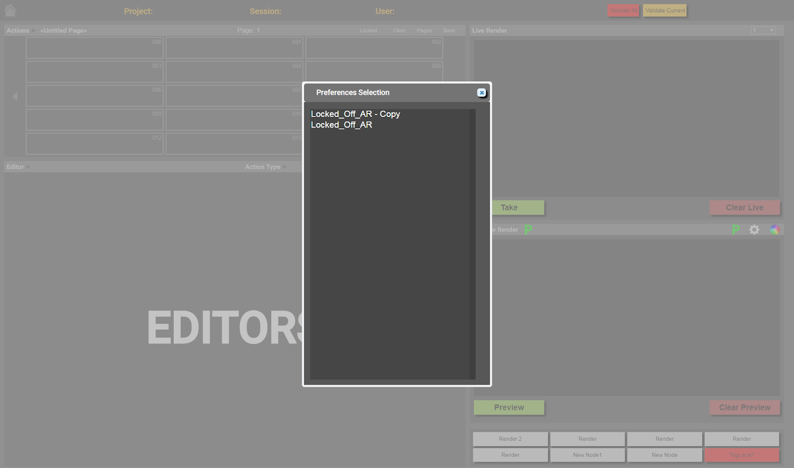
When opening Swift Live the user is shown the ‘Preferences Selection’ dialog and selects a preference. Next, a project must be loaded. This is done by clicking the ‘Load Project’ button in the top right corner. Once a project has been loaded the user can start creating actions to use.
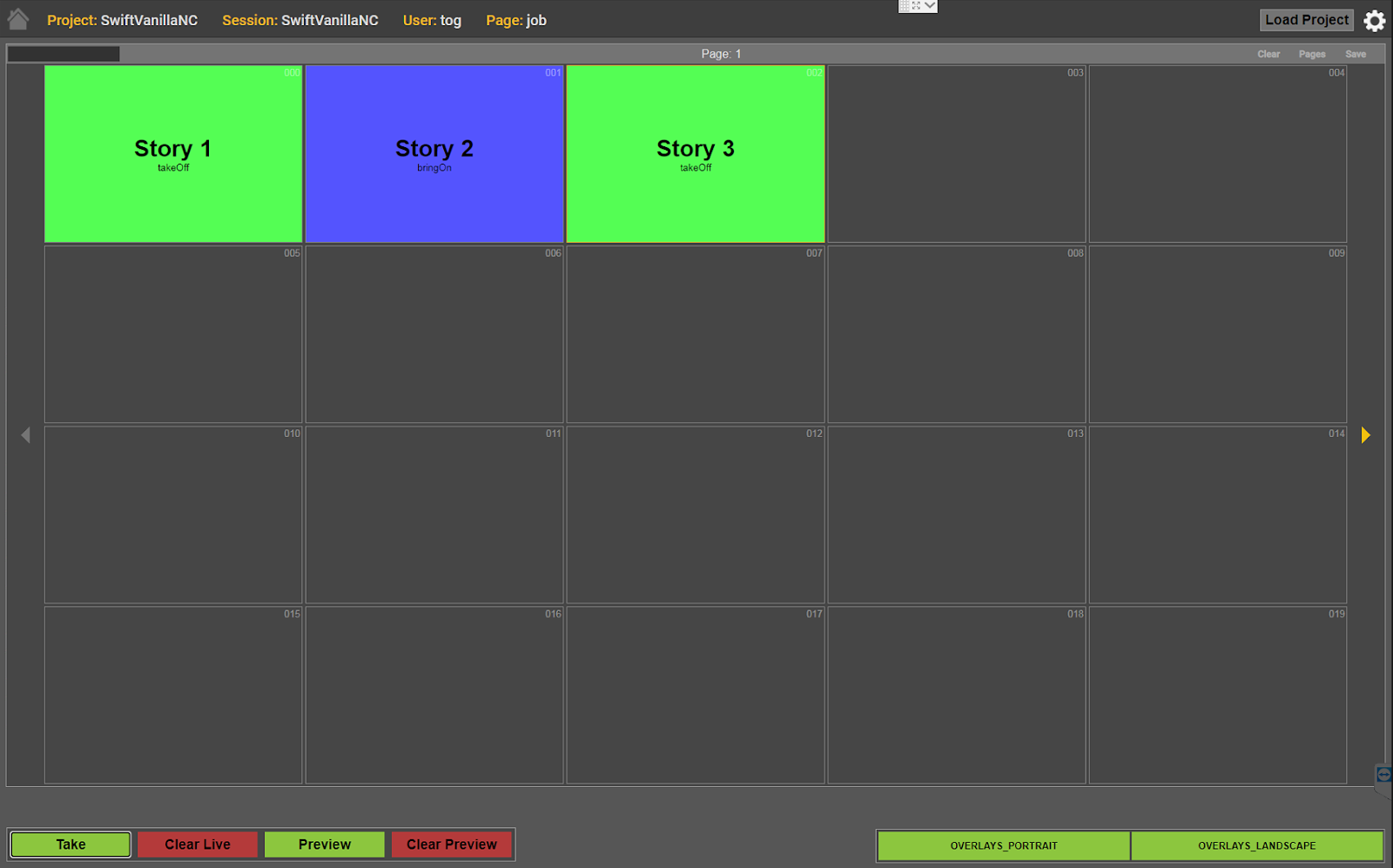
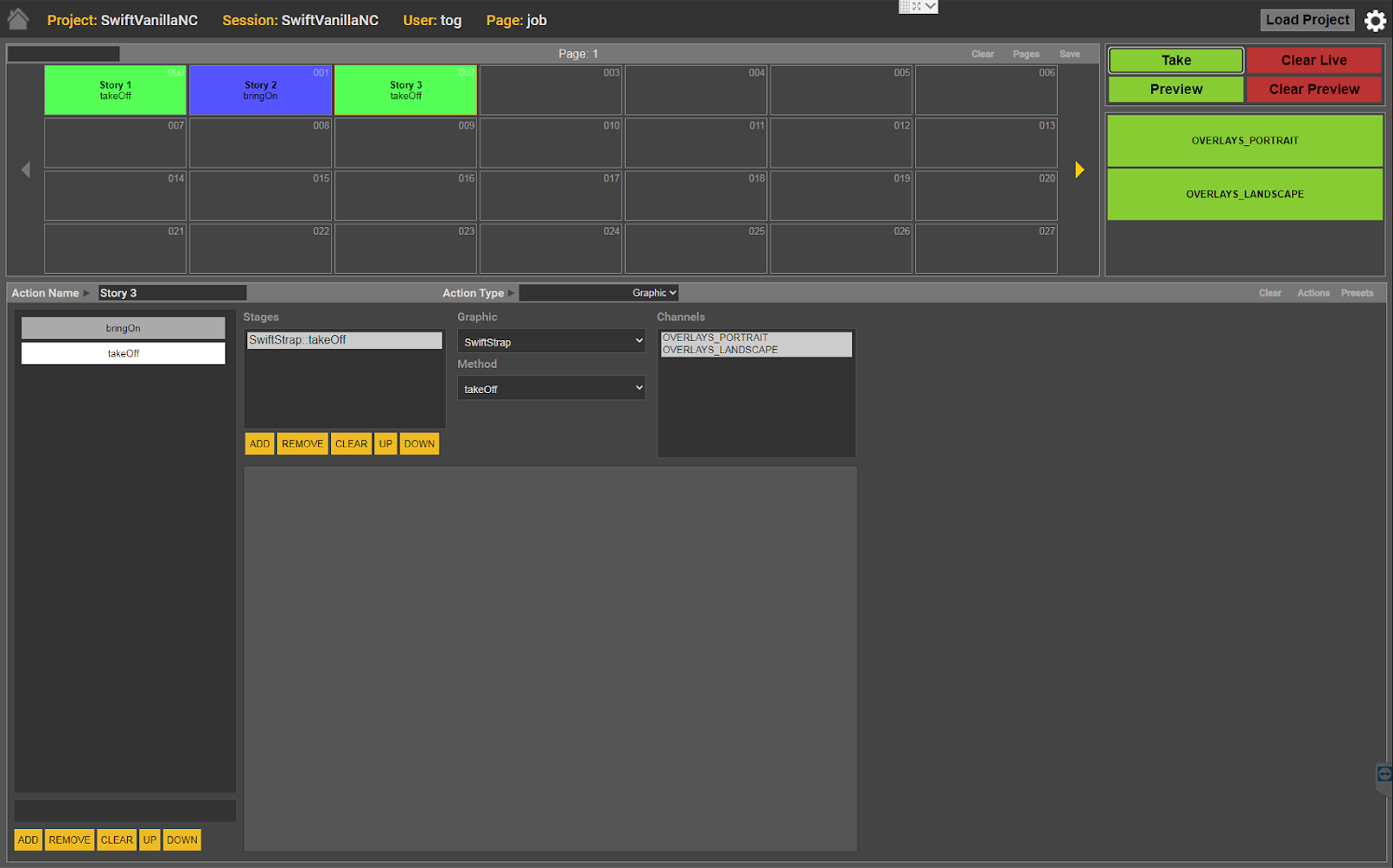
Clicking on an empty action button will create an action in that slot. The ‘Editor Box’ will populate with the graphic editor. Clicking on the ‘Graphic’ combobox will display a list of available graphics. Once a graphic is selected some ‘clicks’ must be setup. Clicks are composed of two elements: the method that is to be run and associated data. For this example a basic graphic will be used. It will require a click to display and a click to remove.
The graphic editor starts with one click created and ready for setup. The ‘Method’ combobox contains a list of all methods the current graphic has available. The bring on method is selected and this click is now ready to use. Clicking the ‘Add’ button above the click stack will create a new click at the bottom of the stack. The click is automatically selected. The bring off method is selected and this click is ready to use.
Actions need to be tested before being live rendered. This is done by pressing ‘Preview’ at the bottom left of the ‘Preview Box’. If configured correctly the first click will be run, showing the graphic. Previewing won’t automatically select the next click. Selecting the second click and clicking preview should play the graphics outro animation. Once an action has been tested, remember to select the first click again.
If the action is setup correctly then it can be saved. Clicking ‘Save’ in the title bar of the ‘Action Box’ will open a dialog asking for the name to save the page under.
When ready to live render, select the action to be rendered, ensure the correct click is selected and click ‘Take’, found in the bottom left of the ‘Live Box’. When you ‘take’ an action it automatically selects the next click.
Interface Anatomy and Details
This section details the Swift Live interface. The images will show the default look and layout of the page.
Preferences
Using CSS, custom graphics and layouts can be implemented. The default CSS file can be found at ‘RTSW/website/TOGWebControl/css/TOGWebControl.css”. It is recommended to create and edit a copy of this file instead of directly editing it. The custom CSS file should be moved to the sessions preferences folder at ‘RTSW/sessions/session_name/AppData/TOGWebControl/preferences’. The file can be referred to from a preferences file via the ‘overrideCss’ property.
When the control page loads the user will be presented with the prompt shown below. It lists any found preferences files and allows the user to load one if desired.
Overview
The following shows the main interface of Swift Live.
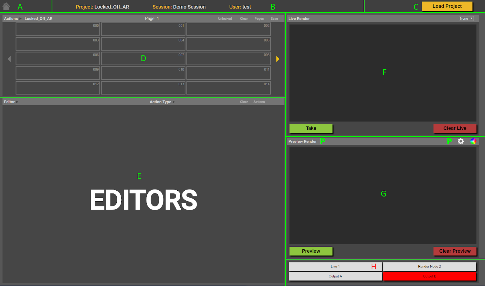
A – Home Button. Goes back to the data server’s ‘Session Select’ page.
B – Session Data. Shows info about the current session.
C – Load Project. Opens a file browser dialog, which is used to load a different project.
D – Actions Box. Contains the actions that provide data for the renderers to operate on.
E – Editor Box. Area where the editor interface is displayed.
F – Live Box. Shows output from a live renderer and contains live render controls.
G – Preview Box. By default this shows output from the preview renderer. The title bar contains buttons which can be used to switch between showing the preview rendered, options, or keyer controls (if the user has keyer permissions).
H – Render Status Box. This area shows the status of the session’s live render machines.
Actions Box
The actions box displays actions, which contain data to be sent to the renderers. By default the control supports 999 actions per project but this can be changed using the numberActionButtons preference.
There are 4 modes that the actions box can operate in, with 2 different looks. The modes of operation are detailed later.
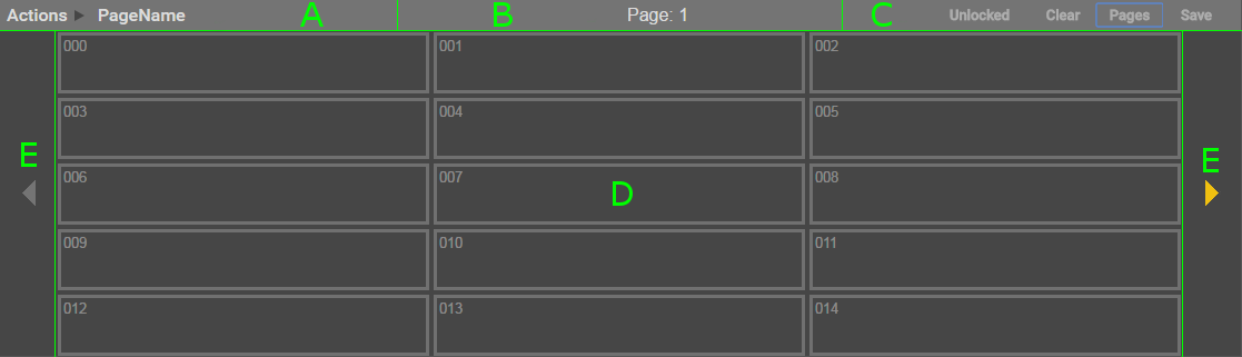
Layout A
Layout A is shown when the actionButtonLayoutStyle preference is set to ‘Page’. Layout A shows the actions organised into pages with 15 actions per page. 15 is the default number of actions per page. The value can be changed, and is set in a session’s preference json file. Arrows at either side of the box are used to increment/decrement the page number. If the arrow is grey, there are no more pages in that ‘direction’.
A – Page Name. The name of the page if it has been saved or loaded.
B – Page Number. Shows the current page number.
C – Action Options.
D – Action Buttons. Shows the actions as buttons. 15 are shown per page.
E – Page Navigation. Click to change the shown page.
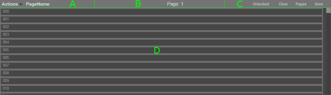
Layout B
Layout B is shown when the preference actionButtonLayoutStyle is set to ‘List’. It shows the actions as a list with a scroll bar to navigate them.
A – Page Name. The name of the page if it has been saved or loaded.
B – Page Number. Shows the page that will be displayed when changed back to layout A.
C – Action Options.
D – Action List. Shows actions as a list that is scrollable.
Action Options
Locked/Unlocked – Click to toggle whether action buttons can be dragged or are locked to their current location.
Clear – Opens a dialog asking the user to confirm whether they want to clear all actions.
Pages – Opens a dialog showing saved pages of actions. Pages can be saved and loaded through this interface.
Save – Opens the save dialog asking for the name to save the page under. This is a shortcut to the save dialog accessed from the ‘Pages’ dialog.
Action Button Controls
Clicking on an action button will select it. Selected buttons have a yellow border. Holding ‘ctrl’ and clicking on a button will add/remove it from the current selection. When multiple buttons are selected, the ‘Take’ and ‘Preview’ buttons will change to ‘Take Ganged’ and ‘Preview Ganged’.
Regardless of which operating mode is selected, you can hold ‘alt’ and type the action number to select it and jump to it.
Buttons can be dragged onto other button slots triggering the following actions:
- Dragging a button onto an empty slot will move the button.
- Holding ‘ctrl’ while doing this will copy the button to the empty slot.
- Dragging a button onto an occupied slot will open a dialog asking if you wish to swap the buttons.
- Holding ‘ctrl’ while doing this will open a dialog asking if you wish to overwrite the destination button.
Operating Modes
Note: The following has been replaced by a set of preferences – actionButtonLayoutStyle , autoMoveToNextButton, autoLoopOnLastButton and autoPreviewNextButton. Manual Page is setup by setting actionButtonLayoutStyle to Page and the rest to false. Manual Running Order is setup by setting actionButtonLayoutStyle to List. Auto Take Page View is setup by setting autoMoveToNextButton to true. Auto Preview and Take Live is setup by setting autoMoveToNextButton and autoPreviewNextButton to true. This makes it possible to have auto take and preview with a List layout.
Swift Live features different ‘operating modes’. These can affect the look and user interaction with the control. The operating mode is set in the ‘Settings Box’, accessed by clicking the gear icon in the top right corner. The ‘Settings Box’ section shows the exact location of the option.
Manual Page
Uses layout A. The default mode of the control. Works as described in ‘Action Button Controls’.
Manual Running Order
Uses layout B. Works as described in ‘Action Button Controls’.
In the ‘Settings Box’ there is a checkbox that will enable ‘Auto Take’. When enabled, clicking on an action will live render the current method and select the next.
Auto Take Page View
Uses layout A. Clicking on an action will live render the current method in its list and select the next method. The current position in the method list is remembered if another action is clicked on.
Auto Preview and Take View
Uses layout A. The first click on an action will render to preview the first method in its list. Subsequent clicks will render to live the current method, select the next method and render it to preview. The current position in the method list is remembered if another action is clicked on.
Action Button States
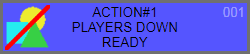
Empty
Layout A
Layout B
This action slot does not contain an action. It can be clicked on to create a new action.
Graphic Missing
Layout A
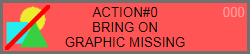
Layout B

This state means that the action lacks a valid graphic. One must be selected in order to be valid for playout.
Method Missing
Layout A
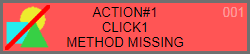
Layout B

This state means that the action lacks at least one valid method. Methods control how the graphic behaves, and so at least one must be setup for the action to be valid.
Parameter Missing
Layout A
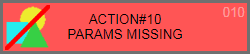
Layout B

This state means that at least one of the action’s methods has a parameter which is missing some data.
Ready to Render
Layout A
Layout B

This state means that the action is available to be previewed or live rendered.
Graphic Icon

Action buttons will display an icon representing their graphic if one is available. If one can’t be found, this graphic will be shown. Icons for graphics are generated using TOG Edit.
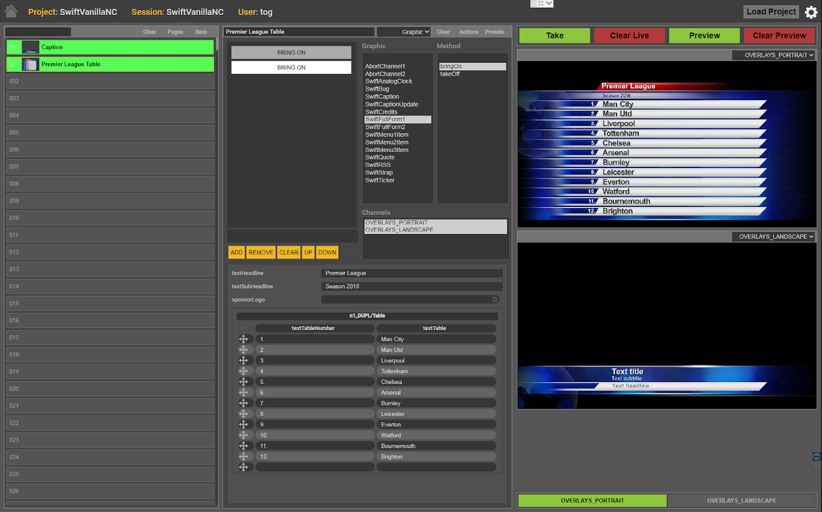
Editor Box
The editor box is where the data associated with actions are set. There is a default editor available. Graphics often have an editor created to help manage data entry. Details on creating editors can be found in the “Editor Internals’ section.
A – Action Name.
B – Editor Selection Combo-box. Used to select from the available editors.
C – Editor Options.
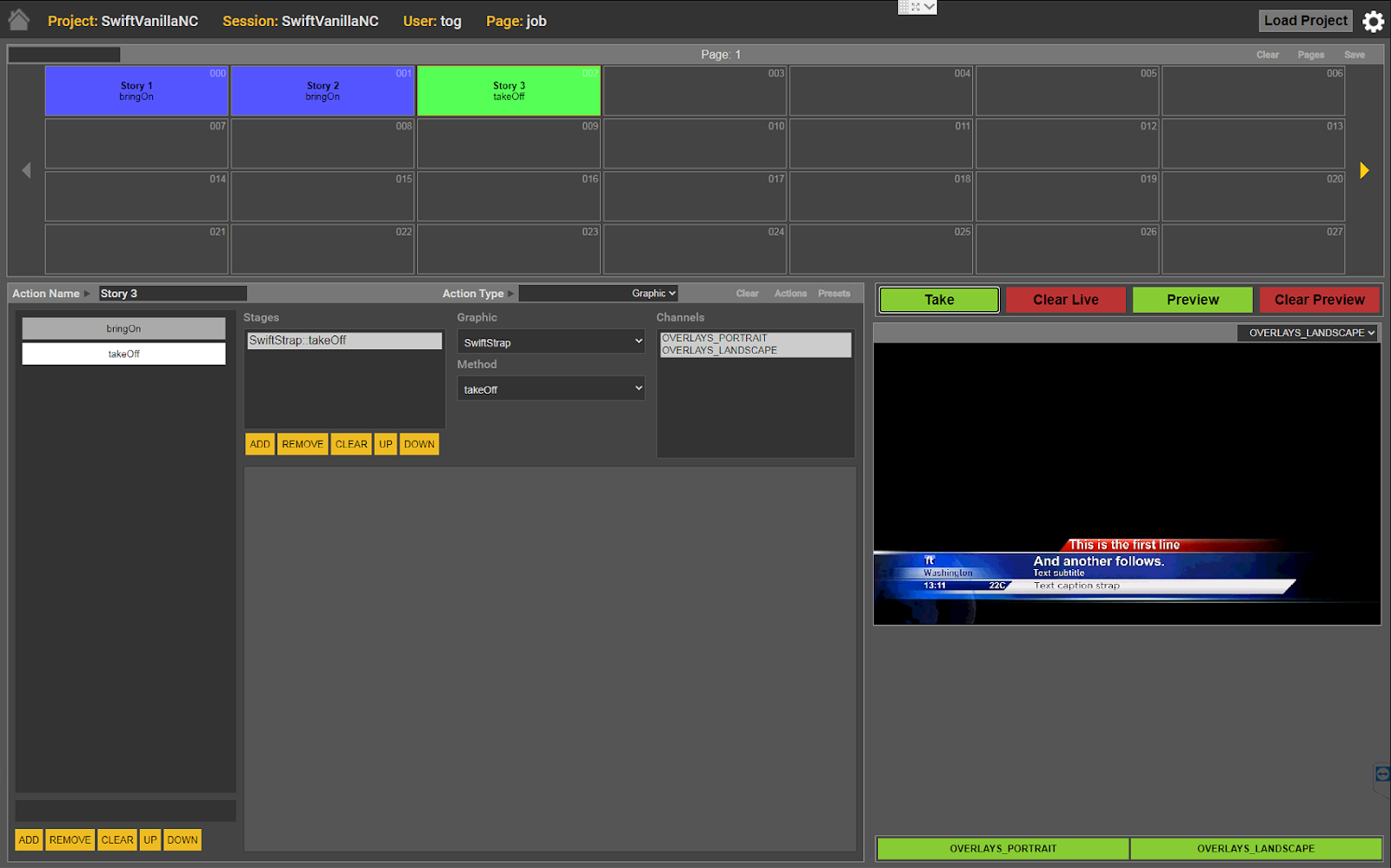
Default Graphic Editor
The default graphic editor is shown annotated below. Not all editors will look the same as this. When creating a custom editor, it is helpful to the user to follow this layout where possible.
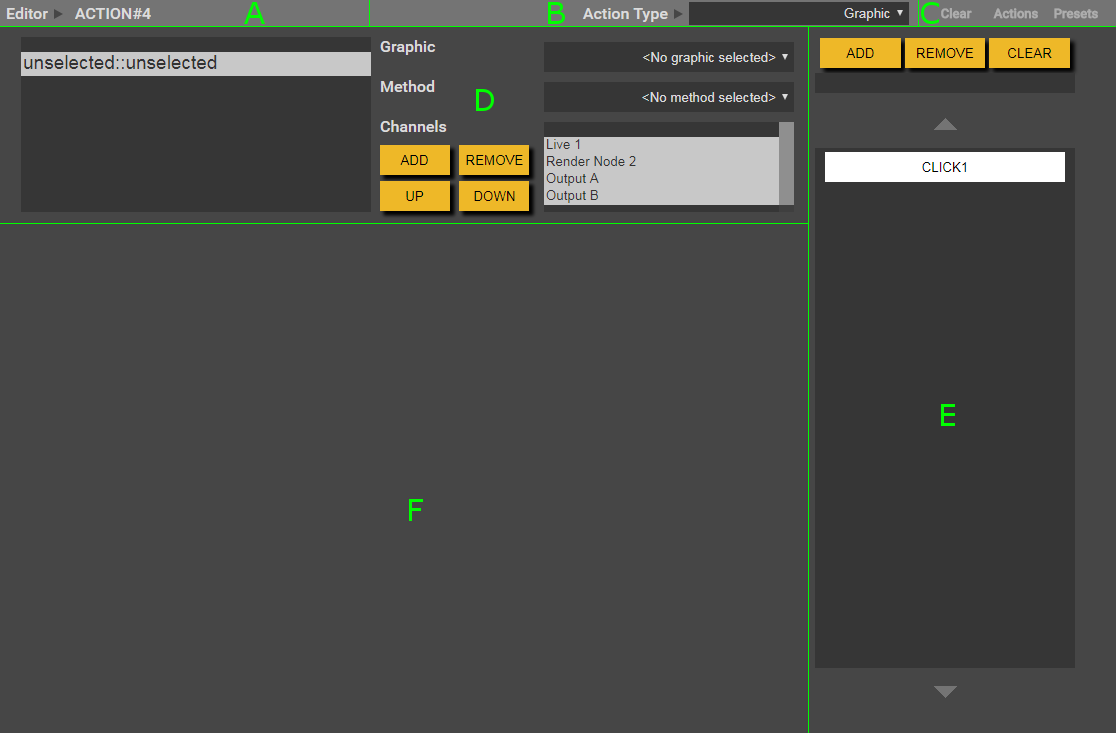
A – Action Name.
B – Editor Selection Combo-box. Used to select from the available editors.
C – Editor Options.
D – Editor Settings. This section contains various different settings available in the editor. First a graphic must be selected in the ‘Graphic’ combobox. Then the ‘Method’ combobox will show the methods associated with the graphic. The ‘Channels’ list is used to specify which channels the graphic should be shown on when rendered.
E – Method List. Displays the methods that have been setup and the order that they should be triggered in. These are often referred to as ‘clicks’. These are displayed in groups which can be navigated through using the arrows above and below the list.
F – Data Entry. Data for the currently selected method is entered here.
Basic Editor
The basic editor provides very basic functionality for a graphic. There is no click/method interface as it only uses the ‘bring on’ and ‘bring off’ methods. When it is live, the button changes from blue to green.
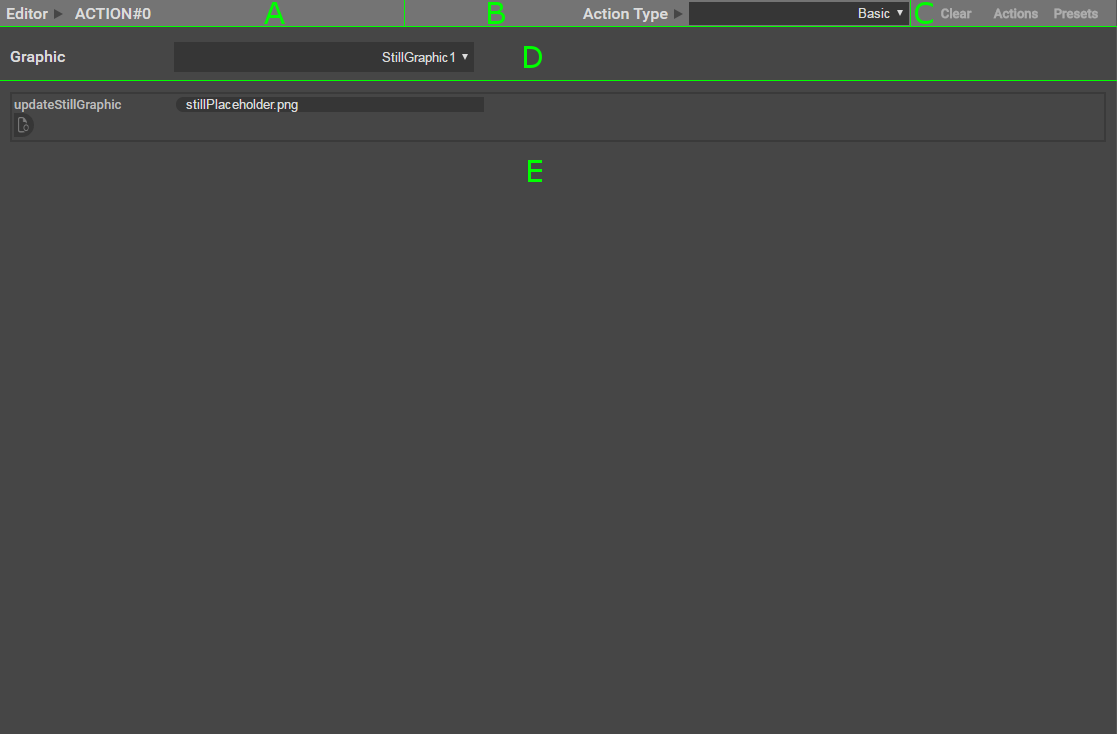
A – Action Name.
B – Editor Selection Combobox. Used to select from the available editors.
C – Editor Options.
D – Graphic Combobox. Used to select from available graphics.
E – Data Entry. Used to enter required data. Automatically adjusts to the graphics needs.
Editor Options
Clear – Remove the action that this editor belongs to. Can be used to delete a single action.
Actions – Opens the actions dialog. Can be used to save and load the current editor state.
Presets – Opens the presets dialog. Can be used to edit, save, and load preset data. The available preset options are defined by the graphic artist when creating the graphic.
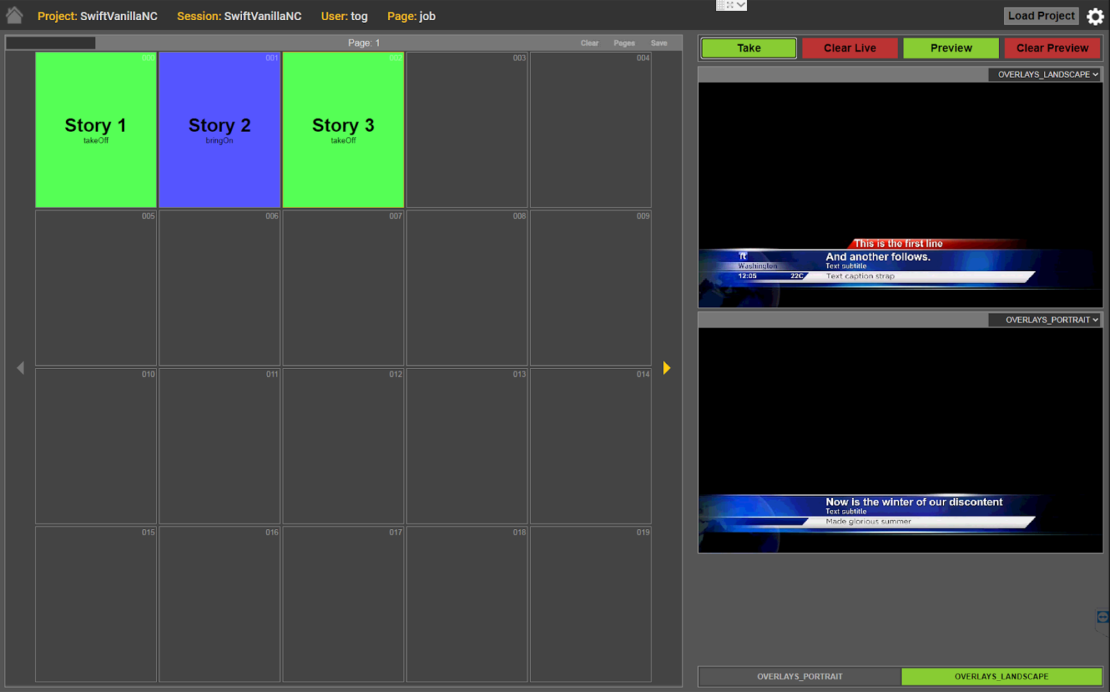
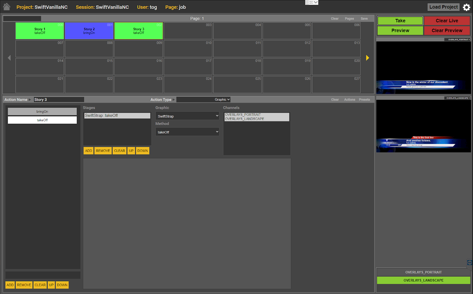
Live Box
This section controls the connected live renderers and displays their output. Connections to live renderers are controlled from the ‘Live Renderer Connections Panel’ in the ‘Preview Box’.
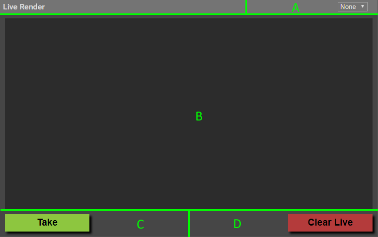
A – Renderer Output Selection. This dropdown box shows the channel numbers for each live render machine, as specified on the session management page of the data server. This means that a channel number will show even if the channel is not currently connected, or hasn’t been configured correctly.
B – Renderer Output. Shows the output from the currently selected renderer. If no output is detected, the pictured grey background is shown.
C – Take Button. Transmits the current method for any selected actions to the live renderers. If multiple actions are selected the button will show ‘Take Ganged’.
D – Clear Button. Signals the live renderers to clear their current state.
Preview Box
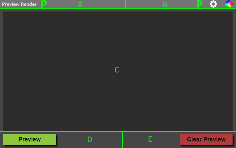
A – Current Display Icon. Shows the name of, and button icon for the currently displayed content.
B – Content Buttons. These buttons change the contents of the preview box. The currently supported modes are: Preview Render, Settings, Keyer Settings.
C – Renderer Output. Will display the output feed from the preview renderer, when available.
D – Preview Button. Transmits the current method for any selected actions to the preview renderer. If multiple actions are selected the button will show Preview Ganged’.
E – Clear Button. Signals the preview renderer to clear its current state.
Settings Box
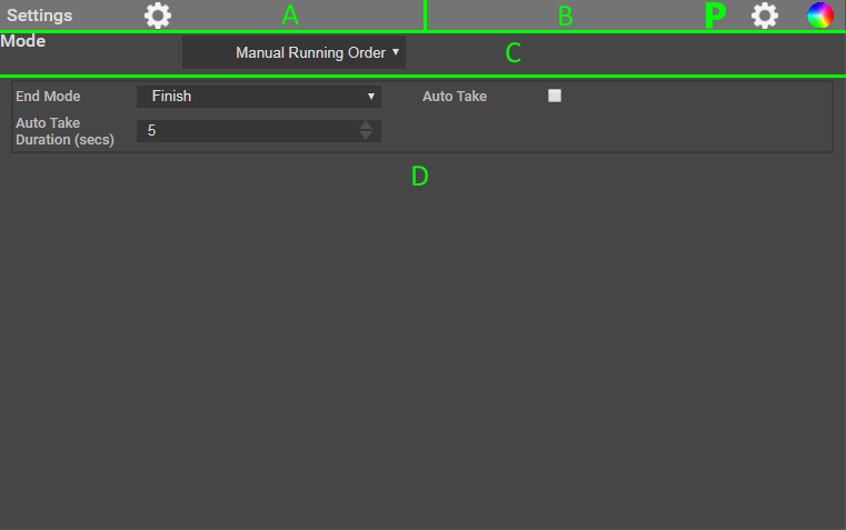
A – Current Display Icon. Shows the name of, and button icon for the currently displayed content.
B – Content Buttons. These buttons change the contents of the preview box. The currently supported modes are: Preview Render, Settings, Keyer Settings.
C – Action Page Layout. This dropdown controls the look of the action page, and run mode.
D – Options. Displays any options applicable to the current action page layout selection.
Keyer Box
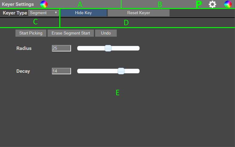
A – Current Display Icon. Shows the name of, and button icon for the currently displayed content.
B – Content Buttons. These buttons change the contents of the preview box. The currently supported modes are: Preview Render, Settings, Keyer Settings.
C – Keyer Type Selection. This dropdown box contains a list of the keyer types supported by the control. When a new keyer type is selected, the type change request is sent to the rendered. The window will show a message indicating that it’s waiting for a response. Once a response is received, the settings and values for the new keyer type will be shown. If this process fails, try changing the currently selected live channel, and then change it back.
D – Universal Key Controls. These buttons are common to all keyer types. ‘Show Key’/’Hide Key’ will show or hide the current areas which are keyed. ‘Reset Keyer’ sets the key back to its default value.
E – Segment Keyer Controls. The segment keyer is the only keyer which has a slightly different Swift Live interface to the tOG keyer interface.
‘Start Picking’ is the equivalent of tOG’s ‘pick’ button. Unlike the tOG equivalent, it acts as a toggle. Once clicked, it is replaced by the ‘Stop Picking’ button.
‘Erase Segment Start’ is the equivalent of the tOG workflow of clicking the ‘Erase’ checkbox, then clicking ‘pick’.
Live Renderer Connections Panel
This panel displays the status of all live renderers. The renderers are organised in the order they are specified in the session configuration. Clicking on a renderer’s display will toggle enable/disable the connection to that renderer. Hovering the mouse over a renderer’s button will display a tooltip containing the contents of the ‘Description’ field set for that machine.
If no renderer is specified for a given slot, it will not have an icon here.
If a renderer is specified the renderers name will be shown.
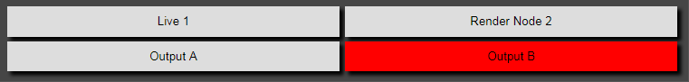
If a renderers background is:
- Green, the renderer is connected.
- Red, the renderer is not connected and reconnection attempts will be made.
- White, the renderer has been manually disabled by the user.
Presets
Presets allow for greater control over the positioning and scaling of graphics. They are setup at the graphic design and implementation stage. The implementer creates a method called preset with inputs on the graphic elements that will need interactive updating. This covers a wide variety of graphic elements – positions, sizes, shaders, colours and fonts can all be put under the control of the operator.
Presets are stored in each action button and can be edited using the presets editor. This is opened by clicking the ‘Preset’ option in the ‘Editor Titlebar’. The preset editor provides a list of preset method inputs for each graphic used by the action. The values shown initially are the default values of the inputs.
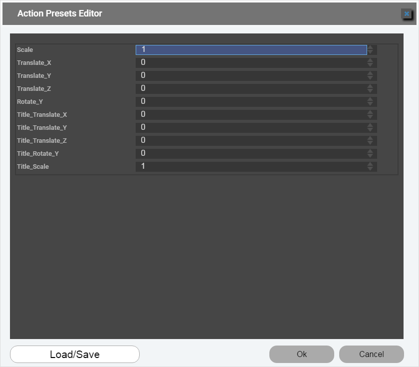
The operator can play through an action to any point and then open the preset editor, change the values and immediately see the effect on the graphic. For example, this allows for the interactive positioning of graphic elements such as text within a VR set.
The combination of presets can then be saved to a single file (using the ‘Load/Save’ button) which is stored on the Data/Preview Server (shared between different users) . This is added to the list of presets on the main interface. This allows the operator to save presets that can be applied to a set of similar graphics.
A presets file that has the same name as an editor type will automatically be set on an action button which uses that editor. For example, a presets file called Map with be set on an action that uses an editor called RTMapActionEditor when that editor is selected for the action button.
Graphic Validation and Cueing
Validation
Graphic validation is checking an asset needed by a graphic is available before the graphic is played to air as part of an action.
If the asset is available (the database or web service is on-line or the image/movie is on the render machine) then the status button reflects this and changes to the ready colour (blue by default) – if it is missing on any of the render machines then the button will stay the error colour (red by default).
The validation check (supported by the Validation function in the editor API) is performed across all configured action buttons at regular intervals. The connected render is sent commands to check for the presence of an image/movie assets or the availability of a database or web service asset.
Cueing
Graphic cueing is the running of the graphic a fixed period before it is brought on.
At the moment this is done only in the Basic editor. This editor handles only graphics with bringOn, takeOff and cueGraphic methods. The operator selects a graphic and supplies the parameter data for the bringOn method. Actions using this editor have two clicks – one to bring the graphic one and one to take it off.
But on the first click the cueGraphic is run and then a fixed period later the bringOn method. Two things are done by the cueCraphic:
- caching of data – data can be cached. This caching can be implicit. For example, a movie can be prepared for playout by running its input but not starting the movie. This makes frame accurate playing of the movie more likely when the bringOn is called. The caching can be explicit. Database and web server inputs will have their results cached for use by a subsequent method (in this case bringOn) if they are run inside a cueGraphic method. This eliminates any delay caused by data access when the bringOn is called.
- validation and abort – in the cueGraphic parameter data can be validated and if the data proves to be invalid an outcome status can be set on the graphic which will prevent its bringOn and takeOff methods being played. This means that graphics with invalid or incomplete data will not be transmitted.
Editor Internals
The editor is an HTML5 application. Apart from the Graphic editor which is supplied with the installation, RT Software can supply or develop other editors. A customer with HTML5 skills can develop their own custom editors.
It consists of three files (for the Graphic editor these are RTGraphicActionEditor.html, RTGraphicActionEditor.css and RTGraphicActionEditor.js). These files are found in the Swift Live folder. The name must conform to the “RT*ActionEditor” format (the * is added to the list of editors when the application is loaded).
The javascript file contains a javascript class that implements a specific API. The general form of the class is (for a classed called Generic):
| var RTGenericActionEditorType = function() { var name; var data;this.name = “RTGenericActionEditor”;// the API methods go here. }var genericActionEditorType = new RTGenericActionEditorType(); twcdEditorTypes.push(genericActionEditorType); |
The class consists of the following:
- ‘data’ object – this contains all the data separate from the methods in the class. This separation makes it possible to load/save the data for the action buttons in a general, non-editor specific way.
- API functions – these functions are used by Swift Live to carry out operations common to all editors
General
- Construct() – construct the editor class instance,
- GetName() – return the name of the editor,
- GetDisplayName() – return the display name for the editor,
Playing out graphics
- Validate(action,channel) – validate the parameters of the graphic/methods used in an action,
- GetAssetList() – returns a list of session assets required by the graphic.
- Play(previewControl, presets) – play a click of the action.
Managing the data
- InitialiseData() – initialise the class data object,
- SetData(data) – set the class data from a serializable json object,
- GetData() – return the class data as a serializable json object,
- Reset() – reset the class data object (when clearing the renderers),
- GetStage() – gets the current stage?,
Managing the appearance of the action button
- UpdateStatus() – set the displayStatus of the editor,
- PopulateActionButton(action,actionPB) – set the appearance of the action button from the displayStatus of the action.
Managing the presets
- GetPresetGraphics() – return a list of graphic names used by the editor,
- GetPresets() – return the class presets array,
- GetPreset() – return the current preset,
- SetPresets(presets) – set the class presets array,
- SetPreset(preset) – set the current preset.
Managing the interface
- InitialiseInterface() – initialise the interface,
- PopulateInterface() – populate the interface with data.
When an editor is selected for an action button, the class is instanced.
The editors also have access to the ‘twcdState’ object. This object is defined within the Swift Live class and contains data essential for the function of control. ‘twcdState’ contains some useful data for editors, such as which project has been loaded, user preferences, session data and live render channel data. Which file to consult?
Additional Script/Manifest Files
.data Manifest File
The control is capable of connecting to external databases, and using data from them to populate compatible graphics. In order to do this, the control needs to generate an interface to allow the user to browse and select which data is to be used. This interface has two parts: a database or graphic specific interface, and an editor specific interface. The data manifest file defines the database/graphic interface, as well as containing the queries themselves.
The basic structure of the file:
| [ { “method” : “bringOn”, “groups” : { “AttackFlow” : { “filters” : [ { “name” : “Season”, “value” : “2016”, “metadata” : { “Intent” : “List”, “DatabaseQuery” : “” } } ], “DatabaseQueries” : [ ] } } } ] |
The ‘method’ parameter states the graphic method which the following groups will be available to. Each group has two parts: a series of filters which form the actual control UI, and the database queries which will use data from those filters to provide data for the graphic to use.
The filters require a name which is shown on the interface, a default value, and relevant metadata. The metadata requires an intent, which states the datatype that the filter’s query will return,, as well as any supplementary parameters such as min/max values. The metadata also includes the database query to be used to fill out that filter.
The ‘DatabaseQueries’ object contains one or more sql queries. This is the set of queries which provides data to the editor specific interface, which control which actual values populate the graphic.
The control accepts a modified form of sql. By enclosing filter names in ‘<>’, that filters value can be substituted into the query.
For example:
| “SELECT DISTINCT FootballCompetitions.id, name FROM FootballCompetitions, FootballEvents WHERE FootballCompetitions.season_id = ‘<Season>’ AND FootballCompetitions.id = FootballEvents.competition_id ORDER BY FootballCompetitions.season_id;” |
This query will take the selected value from the ‘Season’ filter, and substitute it for ‘<Season>’. Multiple substitutions can be used per query. Take care to avoid creating a circular dependency between filter queries. If filter A uses the result of filter B in its query, then filter B should not use the result of filter A in its own query.
Example
The following is an example database interface.
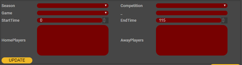
The following data manifest file extract was used to generate this interface.
| “method” : “bringOn”, “groups” : { “AttackFlow” : { “filters” : [ { “name” : “Season”, “value” : “2016”, “metadata” : { “Intent” : “List”, “DatabaseQuery” : “” } }, { “name” : “Competition”, “value” : “15”, “metadata” : { “Intent” : “List”, “DatabaseQuery” : “” } }, { “name” : “Game”, “value” : “8”, “metadata” : { “Intent” : “List”, “DatabaseQuery” : “” } }, { “name” : “_”, “value” : “”, “metadata” : { “Intent” : “String” } }, { “name” : “StartTime”, “value” : “0”, “metadata” : { “Intent” : “Int”, “MinLimit” : “0”, “Maxlimit” : “115” } }, { “name” : “EndTime”, “value” : “115”, “metadata” : { “Intent” : “Int”, “MinLimit” : “0”, “Maxlimit” : “115” } }, { “name” : “HomePlayers”, “value” : “8”, “metadata” : { “Intent” : “MultiList”, “DatabaseQuery” : “” } }, { “name” : “AwayPlayers”, “value” : “8”, “metadata” : { “Intent” : “MultiList”, “DatabaseQuery” : “” } } ] |
.manifest-extra File
Manifest files usually contain all of the required manifest and metadata for a graphic. In certain circumstances, additional data is required. This data goes into the manifest-extra file.
The file contains a list of groups of data. Each group contains the name of the graphic method the data is related to, and a list of parameter datasets. Each parameter set contains the name of the parameter the data is related to, and the additional metadata.
The basic structure of the file:
| [ { “method” : “preset”, “parameters” : [ { “name” : “VRHologram”, “metadata” : { “Caption” : “VRHologram Phase”, “Group” : “Distortion”, “Intent” : “Int” } } ] }, { “method” : “bringOn”, “parameters” : [ { “name” : “selectVideo”, “metadata” : { “Caption” : “Video Selection”, “Group” : “”, “Intent” : “Image” } } ] } ] |
Metadata Listing
The following details the metadata that you can insert into a manifest-extra file to override default behaviour.
Intent – The intent describes the object’s type.
String : Stores a string value.
Int : Stores an integer value.
Float : Stores a single floating point value.
Point : Stores 1 or more floating point values that together represent a coordinate e.g. (x,y,z), (u,v), (x,y,z,w).
Bool : Stores a boolean value.
Colour : Stores floating point values that represent a colour.
URL : Stores a url address.
File : Stores the path to a file.
Image : Stores an image.
Date : Stores a date.
List : Stores a list of values.
Shader : Stores the name of a shader.
Font : Stores the name of a font.
Geometry : Stores the name of a geometry.
MultiList : Stores a list of values, but displays them in a multiline scroll box instead of a single line combobox.
MultiLineString : Stores a string that spans multiple lines.
MinLimit : Describes the minimum value that can be stored.
MaxLimit : Describes the maximum value that can be stored.
ItemList : For list-like objects, describes the list of possible options for the objects. The list is a tilde (~) seperated list of names. For example, “A~B~C” defines 3 items called A, B and C.
ValueList : For list-like objects, describes the correct value to use for the item, which may be different to ItemList. For example, enums may have a name stored in ItemList, but the enum value is stored in valuelist.
Group : A name, that an auto-generated interface can use as a hint to organise objects in a sensible way. For example, in a transform node, the Translate,Rotate and Scale afields might all be grouped in a group called “Translate/Rotate/Scale”, while pivot points might be in a group called “Pivots”.
DatabaseQuery : The database query which is run to populate a filter field.
Customising the WebControl interface
WebControl is a standard HTML5/CSS/Javascript application. It is possible to apply an additional CSS file in order to change the look of the interface without needing to change any application files.
The CSS override file is specified in the Preferences file (see the Preferences section for more details)
Generally, you will place the CSS file in the preferences directory next to the preference file.
- You can have multiple preference files, which the user selects between when joining a session. Therefore, it is possible to customise the interface in different ways for different use cases.
- Whilst Editing an overrideCSS file, it is useful to specify debugCss = true in the preference file as well. This turns off certain optimisations, which will mean that Swift Live will perform more slowly, but will be easier to inspect the override css file from within chrome.
- Once you have finished editing the css file, turn “debugCss” back to “false”
In the preference file, specify the css file to use. For example :
| { … “overrideCss”: “myOverrideCSS.css”, “debugCss”: “true”, … } |
Now, create the myOverrideCSS.css file and join the web session.
To work out which css elements to override, join the session in chrome and press F12. This brings up the chrome development tools. From here, you can inspect elements, to determine which css overrides to apply. You can also apply changes in realtime to see what effect they have on the interface.
Once you have determined the changes that you want to make, add them to the override css file, and reload the page to verify that your changes do what you want.
A tutorial on CSS and the chrome development tools is outside of the scope of this document. There are plenty of tutorials on the web.
Changing the number of actions per page
If you are modifying the CSS in order to change the number of actions on a page, it is necessary to tell Swift Live via the following setting in preferences :
| { … “actionsPerPage” : “15” … } |
This will ensure that the correct number of buttons are created, and that paging left/right through the buttons works correctly.
Interface Layouts
There are a set of special layouts supplied as part of the applications. They are supplied as CSS files that can be used to supply the LayoutCss preference. The user can of course supply their own layout css file – the supplied set should cover some common use-cases.
| Layout_ActionsColumn.css
|
Layout_ButtonsOnly.css
|
| Layout_HideEditor.css
|
Layout_HideLive/Preview.css
|
| Layout_ScaleLivePreview.css
|
Layout_HideLivePreview.css
|
Newsroom Features
Special features have been added to support typical Newsroom workflows – notably speed of configuring action buttons and the loading of MOS rundowns.
The preferred configuration for newsroom is as follows:
- Set actionButtonLayoutStyle to true,
- Set autoMoveToNextButton to true,
- Set autoPreviewNextButton to true,
- Set autoPreviewWhenSelect to true,
- Set numberActionButtons to 999,
- Set the defaultEditor preference to Graphic,
- Set the layoutCSS preference to Layout_ActionsColumn.css,
- Set the screen1/2Source to preview1 and preview2,
- Set the simpleGraphicEditor to true.
It is also useful to set the preferences playAbortGraphic and manageProjects to true.
An alternative to autoPreviewNextButton is to use autoPreviewWhenSelect. The button will be previewed when selected – either directly as a result of being clicked on or selected using keystrokes or indirectly as a result of autoMoveToNextButton. This enabled a preview/live workflow by default.
Keystrokes
| Keystroke | Command | Category |
| Ctrl+nnn (from keypad)
Alt+nnn (from main keyboard) nnn and + (from the keypad) |
Select action buttons. | |
| Ctrl+1 – focus on the graphics list
Ctrl+2 – focus on methods Ctrl+3 – focus on channels Ctrl+4 – focus on first parameter Ctrl+5 – focus/select button name |
Focus on lists in the Graphic Editor. It is also possible to tab between the items. | |
| Ctrl+6 – add a click
Ctrl+7 – remove a click Ctrl+8 – initialise the clicks Ctrl+[ – move up click Ctrl+] – move down click Ctrl+< – goto previous click Ctrl+> – goto next click. |
Click management on the Graphic Editor. | |
| Alt+C – copy action buttons
Alt+X – cut action buttons Alt+V – paste action buttons Alt+D – move action buttons down Alt+U – move action buttons up Alt+< – goto previous (non-empty) button Alt+> – goto next (non-empty) action button Ctrl+Drag – copy/swap button Drag – move button |
KSC_CopyButton
KSC_CutButton KSC_PasteButton KSC_MoveDownButtons KSC_MoveUpButtons KSC_PreviousAction KSC_NextAction |
Editing the list of action buttons. |
| PageUp – go to the next page
PageDown – go to the previous page Meta+PageDown – goto the first page Shift+PageDown – go back half a page Alt+PageDown – go back by one button Alt+PageUp – go forward by one button Shift+PageUp – go forward half a page Meta+PageUp – go to the last page MouseWheel (when in Page layout mode) |
KSC_PageIncrement
KSC_PageDecrement KSC_GotoStart KSC_GotoPrevHPage KSC_GotoPrevButton KSC_GotoNextButton KSC_GotoNextHPage KSC_GotoEnd |
Moving between pages of action buttons. |
| Alt+S find an action button | KSC_SearchButtons | Find an action button by searching across the names. |
| Alt+Ctrl+C – clear the page
Alt+Ctrl+L – load the page Alt+Ctrl+S – save the page |
KSC_ClearPage
KSC_LoadPage KSC_SavePage |
Popup the dialogs to manage pages. |
| Alt+Shift+C – clear the action
Alt+Shift+L – load the action Alt+Shift+S – save the action |
KSC_ClearAction
KSC_LoadAction KSC_SaveAction |
Popup the dialogs to manage actions. |
| Enter – take live
Ctrl+Enter – take preview Shift+Enter – take live and move to next Alt+Backspace – take off graphics Ctrl+Backspace – clear off graphics Shift+Backspace – take off current graphic F1 – clear live F2 – take preview F3 – clear preview |
KSC_TakeLive
KSC_TakePreview KSC_TakeLiveAndMoveToNext KSC_TakeOffAllActionsLive KSC_ClearAllActionsLive KSC_TakeOffCurrentActionLive KSC_ClearLive KSC_TakePreview KSC_ClearPreview |
Manage graphic transmission. |
| F4 – select all channels
F5 – select channel 1 F6 – select channel 2 F7 – select channel 3 F8 – select channel 4 F9 – toggle channel selection |
KSC_SelectAllChannels
KSC_SelectChannel1 KSC_SelectChannel2 KSC_SelectChannel3 KSC_SelectChannel4 KSC_SwapChannels |
Select all or individual channels or toggle the channel selection. |
| Alt+Ctrl+Z – lock selected actions
Alt+Ctrl+X – protect selected actions |
KSC_ToggleLockedSelectedActions
KSC_ToggleProtectedSelectedActions |
Lock action buttons from being taken off air and protect them from being cleared. |
| Alt+P | KSC_EditPresets | Popup the presets dialog. |
Load Page Containing MOS Running Order
The MOS Gateway application can be configured to save MOS Running Orders (that come from the NRCS) to the pages folder. This file will be called after the running order name with .page as its extension and will appear to WebControl as a saved page. When a running order page is loaded, MOS stories are converted to action buttons – the storySlug is used as the action button name. Items with an RT payload within the story are converted to clicks within the action button. The itemSlug is used as the click name. The click, graphic, method and parameters are extracted from the item payload.
Multiple Projects
Different projects can be loaded into channels in two ways – either by using the preferences channelNProjectName where N is the index of the channel or by naming the channel to start with <project_name>__HD. The double underscores demarcate the project name. The HD is just an example. So if two channels of graphics are required – one HD and the other SD. one approach is to create two projects – a HD one and an SD one – which have the same graphic , method and inputs but where the graphic elements are arranged differently. The manifests loaded for each project will be the same, the options presented by WebControl will work for both projects and the commands sent by WebControl to both renders will be similar but the rendered output can be different.
Selecting Channels
Action buttons are played out on the channels selected in their channels list (in the Graphic Editor only). This can be overridden as follows:
F4: allow all the channels (this means the channels list in the button is used).
F5/F6/F7/F8: allow only channels 1/2/3/4.
F9: if have two channels toggle between them.
The current channel selection is displayed on the lower right of the interface. It is also possible to select/deselect channels by clicking the buttons.
Selecting Graphic
When an action button is selected using Alt+nnn (or Ctrl+nnn or nnn/+ where the nnn keys are on the keypad), the focus is set on the graphic list (in the Graphic Editor). The operator can use the Up/DownArrow buttons to select individual graphics. This will not select a method. Using Ctrl+Up/DownArrow buttons will select the bringOn method and set the focus on the first parameter.
AutoComplete
All text entry (and area) boxes have autocomplete enabled on them. The autocomplete uses the files in the folder sessions/<session>/AppData/TOGWebControlDesk. If a file with the name <currentgraphic>_autoCompleteOptions.txt exists that that file is used. It uses the file autoCompleteOptions.txt by default.
Job Files
A job file is a plain text file that describes a page of action buttons. The first line must be “#job”, comment lines start with #, blank lines are allowed and tabs are significant. The file mainly consists of sections each describing one action button and these sections consist of subsections describing clicks.
| #job
# comment |
where:
number : the number of the action button (000 to 999),
channel_list : a comma separated list of channel indices (for example 1,2),
name : the action button name,
graphic_name : the name of a graphic in the action button click (1 tab),
method_name : the name of a method in the graphic (2 tabs),
input_* : the inputs in the order they are in the method.
For example:
| #job
# first story |
This creates a page with one action button. The action button has two clicks both using the graphic SwiftCaption. The first has run the bringOn method with two specified parameters. The second click has the takeOff method.
Keystroke Preference
These can be added to the session preferences and maps a keystroke onto a sequence of actions or graphic methods. This does not select anything on the interface and so can be run while setting up other actions.
The preference name has the form:
| KS <keystroke> |
The preference value has two formats. One runs an action (this is checked for first) and has the form:
| <actionbutton_name>[,<actionbutton_name>] |
The other runs a graphic method directly and has the form:
| <graphic_name>:<method_name>[,<graphic_name>:<method_name>] |
An example of the first would be:
| “KS Ctrl+Q” “ACTION#0,ACTION#1” |
This will run the actions named ACTION#0 and ACTION#1 in that order when Ctrl+Q is pressed.
An example of the second would be:
| “KS Ctrl+Q” “SwiftBug:bringOff” “KS Ctrl+W” “SwiftBug:takeOff” |
These keystroke preferences will bringOn and takeOff the bug.
Add Click Specialisation
A click (which consists of a Graphic/Method/Channels/Inputs) can be added to an action button by either clicking the ADD button or using the keystroke Ctrl+6 (Ctrl+7 removes a click etc). When a click is added, if there is a method other than bringOn/takeOff that method is set on the click and the focus is set on the first parameter.
Ticker Entry Format
Each ticker node has an associated list of story “types” (these are just subtrees in the graphic scenegraph). A simple ticker would just have one story type and this would be a subtree containing a single text. In the SwiftVanillaNC project, the graphic SwiftCredits has two slugs – one called Text whose subtree consists of a single text and one called Image that consists of a rectangle that shows an image and sizes to that image.
The contents of a ticker can be set using a Contents input. The data passed to the input should have the general form:
| <ticker> <slug name=”slug_node_name”>slug_node_contents</slug> </ticker> |
where:
slug_node_name : the name of the slug node that will be configured
slug_node_contents : the contents used to configure the slug node.
For example:
| Image=Company1Logo.png Company1 name and information Image=Company2Logo.png Company2 name and information |
This should be converted into the following:
| <ticker> <slug name=”Image”>C:/Users/RTSW/Desktop/TickerImages/Company1Logo.png</slug> <slug name=”Text”>Company1 name and information</slug> <slug name=”Image”>C:/Users/RTSW/Desktop/TickerImages/Company2Logo.png</slug> <slug name=”Text”>Company2 name and information</slug> </ticker> |
This data is then set on the ticker node and it creates four slugs on the ticker (Image, Text, Image and Text).
The conversion can either be done by WebControl before it sends the command to run the ticker graphic or by the graphic itself (by usercode).
To make WebControl do the conversion, start the ticker input text with the tag #ticker:
| #ticker Image=Company1Logo.png Company1 name and information Image=Company2Logo.png Company2 name and information |
Omitting the #ticker tag will cause WebControl to pass over the input text to the graphic without conversion. The graphic in user code can then do the conversion. The usercode in the SwiftCredits graphic is as follows:
| imagesFolder = “C:/Users/RTSW/Desktop/TickerImages” defaultSlugName = “Text”xmlContents = “<ticker>n”lines = _Contents.split(“n”) for i in 0..lines.length()-1 line = lines[i]sections = line.split(“=”) if (sections.length == 1) slugName = defaultSlugName else slugName = sections[0] endslugContents = line slugContents = slugContents.gsub(slugName+”=”,””) if (slugContents.include?(“.png”)) slugContents = imagesFolder + “/” + slugContents end xmlContents += “<slug name=”” + slugName + “”>” + slugContents + “</slug>n” xmlContents += “</ticker>n” data.setInputValue(“bringOn”, “Contents”,xmlContents) |
Managing Update Graphics
There are two options to control graphics that, as well as having the standard bringOn and takeOff methods, have an update method (or methods) as well. The desired behaviour is for the graphic bringOn to be run and then a series of updates (with different inputs) before the graphic is taken off.
The first option is to stack several clicks with one action button. Apart from the first and last clicks (bringOn and takeOff), the rest would call the update method – each of which will have their own data.
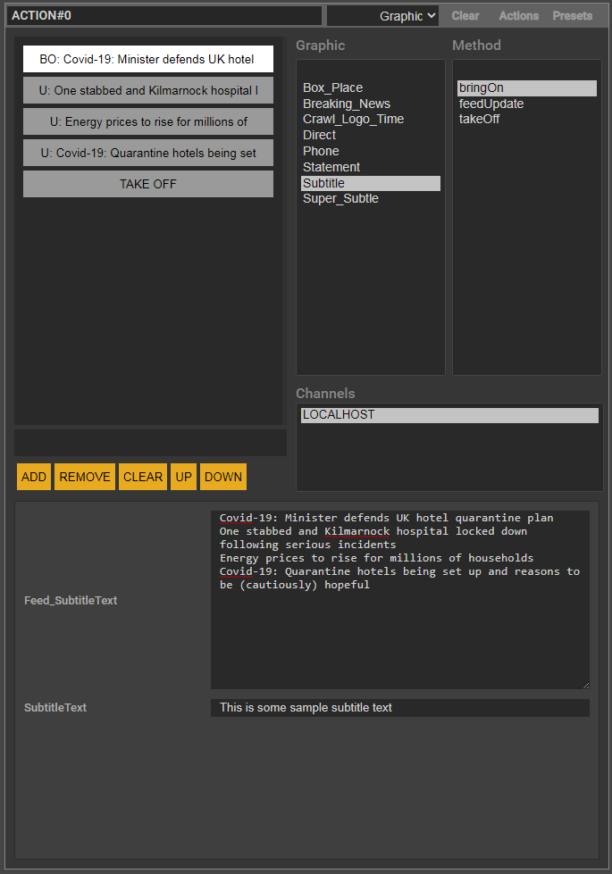
This process can be speeded up in WebControl using Feed inputs. Add an input to the bringOn method called Feed_<inputname>. Its destination should be ScriptValue and its filter should include “Intent:=MultiLineString”. This will appear on the WebControl interface as a multiline text entry box. The first line entered will be used to populate the input in the bringOn called <inputname>. Any other lines will cause a new click to be added to the button with a single stage and the update method of the graphic set on it. If lines are removed the corresponding clicks will be removed. The clicks in the button and their contents dynamically reflect the contents of the Feed input value. A whole series of graphic updates can be setup by cutting and pasting a block of text into the Feed input. It is also possible to feed multiple inputs by including their names in the name of the Feed input (for example, Feed_<inputname1>_<inputname2>.
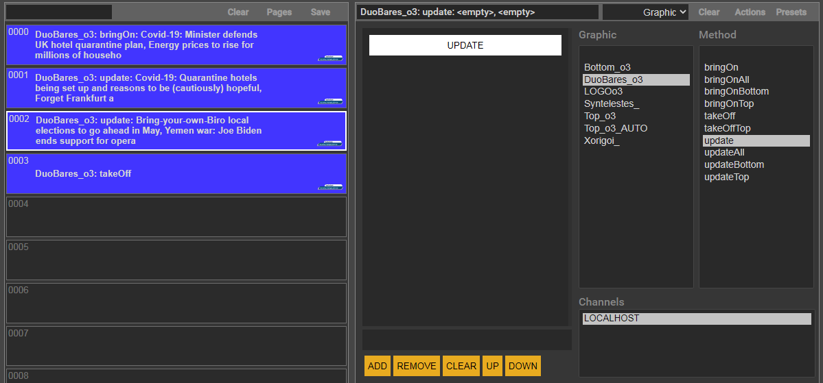
If there is no Feed input in the bringOn method of an update graphic selected on an action button, the action button will be populated with only one BRINGON click. If a following action button is similarly configured, it will only have an UPDATE click. WebControl checks for the first previous action button using this graphic. This makes setting up and configuring a sequence of action buttons using an update graphic quite simple. Furthermore WebControl tracks the on-air status of the graphic and if an operator selects an action button with an UPDATE click, WebControl will play out a bringOn method with the data in the button. It is recommended to add an extra button and change the update method automatically selected on it to the takeOff method.
More Managing Update Graphics
Some graphics which use the bringOn/update workflow in the previous section may also need graphic side control of bringOn and update details.
The following is based on a two line strap graphic (with a top line and a bottom line). The bottom line is always present but the top line should be brought on or taken off depending on the value of the input supplied to it. If it is blank it should not be displayed. This will require the implementation of extra methods – bringOnAll, bringOnBottom, bringOnTop, takeOffTop, updateAll, updateTop, and updateBottom. All these should take inputs and set them on text nodes. The bringOn and update methods should have two inputs (with the same names) but the destination of these inputs should be ScriptValue.
| if (_UpdateText1 == “”) self.bringOnBottom(data) else self.bringOnAll(data) endcurrText1 = @PanwBara_textTEXT.getString() currText2 = @KatwBara_textTEXT.getString()# if no top required and there is no top => update the bottom if (_UpdateText1 == “”) and (currText1 == “”)if (currText2 != _UpdateText2) self.updateBottom(data) end# if no top required and there is a top => take off the top and update the bottom elsif (_UpdateText1 == “”) and (currText1 != “”) self.takeOffTop(data) if (currText2 != _UpdateText2) # if a top is required and there is no top => bring on the top and update the bottom. self.bringOnTop(data) if (currText2 != _UpdateText2) # if a top is required and there is a top => update all. if (currText1 != _UpdateText1) && (currText2 != _UpdateText2) if (currText2 != _UpdateText2) |
Clearing the channels
The most direct is the CLEAR LIVE and CLEAR PREVIEW buttons on the interface. These will abort any graphics playing on the live or preview channels respectively (these buttons respect the channel selection setup by F4/5/6/7/8/9).
If the playAbortGraphic preference is set to true, when a graphic is taken to air (TAKE LIVE) WebControl first plays the graphic AbortChannelN (where N is the channel index) on all the non-disabled open live channels. The AbortChannelN graphic stays in the scenegraph and looks for the AbortChannelN.txt file and if it finds it it aborts any graphics that are queued up (possibly because of over-clicking on the TAKE LIVE button). When the CLEAR LIVE button is clicked a file is written to the session folder for each non-disabled open live channel (called AbortChannelN.txt where N is the index of the channel). This will “signal” the AbortChannel graphic to clear any unwanted queued graphics.
The keystroke Alt+Backspace will run the takeOff methods of all the graphics that are on-air. It scans all the action buttons that are on-air (green) and makes a list of the graphics they use and then runs the takeOff method of these graphics. If these methods are non-blocking they will be all done at the same time – otherwise they will be done in the order they appear in the action button page.
Selecting Action buttons
The simplest way to select an action button is to click on it. There are a few keystroke options:
Alt+nnn – where nnn are the number keys on the main part of the keyboard
Ctrl+nnn – where nnn are the number keys on the keypad (with numlock on).
Alt+</> – will move up and down the action button list.
It is not necessary to always specify the three digits (for example, Alt+1 will select the 001 action button). The sequence is to press the alt/ctrl button, press the number keys (up to three of them) and then release the alt/ctrl – only then will the action button be selected.
If the action button has been configured then it is selected and the editor is populated with this configuration. If the action button has not been configured, it is configured with the default editor. If the default editor is the Graphic Editor then the focus is set on the Graphic list box.
Populating Multiple Inputs
This is a graphic side method of feeding multiple inputs from a single input. The example in the SwiftVanillaNC project is the SwiftQuote graphic. The first input (textName) is used to set another input (image) as follows:
| if (_image == “”) _image = “C:/Users/RTSW/Desktop/TickerImages/” + _textName + “.png” end |
The image name is made up using a fixed folder (TickerImage) path, the textName input and the extension .png. For example, if the textName input is set in the WebControl interface to be Ireland then the image will be set to C:/Users/RTSW/Desktop/TickerImages/Ireland.png. The graphic shows Ireland as the textName and Ireland.png as the image.
Multiple Copy
Select a number of action buttons using Ctrl+MouseClick. These can then be copied or cut using Alt+C or Alt+X and pasted by first selecting an action button (using Alt+nnn or clicking) and then Alt+V. The action buttons are pasted in number order. Existing buttons are not overwritten. Incoming action buttons are inserted around existing action buttons. The cache of copied buttons is maintained after a page is cleared or another page is loaded. The cache of cut actions is cleared out when a page is cleared.
Layoff Action Button
Action buttons can be laid off to disk as movies (with alpha). This is setup by two preferences described in the preference section above. These preferences describe the duration and location of the movie. If these preferences are not given values the LAYOFF button will be hidden.
The movie name will be the action button name and its extension will be determined by the movie format specified in the renderer preferences. The interface will lock while the movie is written to disk.
If the project contains a graphic called LayoffMovie this will be used to start and stop the layoff (by running its bringOn and takeOff methods). Otherwise the StartLayoff and EndLayoff commands in the Remote WebProtocol are used (provided the version of the renderer supports these commands). The LayoffMovie graphic can be extended to perform other functions (for example, record the layoff to a database).
Note: graphic methods that are run as part of the layoff have their blocks set to blocking (even if they are non-blocking).
Lock/protect Action Buttons
Action buttons can be locked or protected using the keystrokes Alt+Ctrl+Z and Alt+Ctrl+X (these work across multiple selected buttons) or by clicking the L and P buttons on the action button.
Graphics from locked actions buttons will not be taken off or cleared from air when the live channels are cleared using Alt+Backspace, Ctrl+Backspace or using the CLEAR LIVE button.
When the user changes the graphic, method or any of the parameters of a protected action button, the user will be prompted to confirm these changes. The user is protected from accidentally changing the buttons contents.
Interface Hints in Input Filters
The following can be added to the filter text entry box in Swift for any input and they will be used by WebControl when creating the interface control for an input:
Intent:=MultiLineString
This sets the html control type to be a MultiLineString (with number of rows set to 5).
NumberRows:=<number>
This sets the number of rows in a html textarea control (it sets the rows attribute).
Access:=Read
This will make any html input readonly. It adds the readonly attribute to the input html tag.
ControlType:=Int|Float|Point|Bool|Colour|URL|Folder|File|Image|Date|List|Shader|Geometry|Font|MultiList|MultiLineString|Text
This will determine the actual control used. Note: it should be appropriate to the input node afield.
MinLimit:=<number>
MaxLimit:=<number>
Step:=<number>
Precision:=<number>
These are used by Int and Float control types.
ItemList:=<comma separated list>
ValueList:=<comma separated list>
These are used by List and MultiList html controls to initialise the select options and their values.
Creating Clicks from Data
Adding clicks to an action button and filling out the data for each one individually can be time-consuming. WebControl allows you to create multiple clicks automatically based on the data supplied to a single bringOn input. You do this by adding a specially named multi-line input to the bringOn method of a graphic. The graphic must have an update method (called update).
For example, a graphic called Subtitle has an bringOn method with an input called SubtitleText and an update method called SubtitleText. To setup WebControl to show a series of subtitles would require adding several clicks to an action button and entering the text for each one.
Alternatively, add an input called Feed_SubtitleText to the bringOn method. This should be a multi-line input (add “Intent:=MultiLine” to the input Filter). This input will then show up as a multi-line text box on WebControl. Any text entered into this box will be split into separate lines. The first line will be used as the value of the SubtitleText input on the bringOn. For every other line a click will be added to the action button and will appear on the interface. Its method will be set to the update method and the value of the SubtitleText will be set to the line. The click name will include the first 40 characters of the line. The first click will be the current one.
The action button will be in a state ready to be taken to air.
Troubleshooting
To check the control is working properly, the engineer should check the connections between the various components:
- ping the ICE machine from the control machine,
- use netstat or WireShark or equivalent application to check that the web server port have been opened on the ICE machine,
- turn on web debugging by setting GM_DL_WebServer to true in RTDLLSetup.xml – this will write the web json to the log file.
- use the Chrome websocket monitoring tools (Ctrl+I to Inspect Elements).
- virus-checkers such as Kaspersky can interfere with websocket packets and it may be necessary to disable scanning of the ports used by websockets.
